Standard Web page
Chapter 1:
Choosing a Layout Design
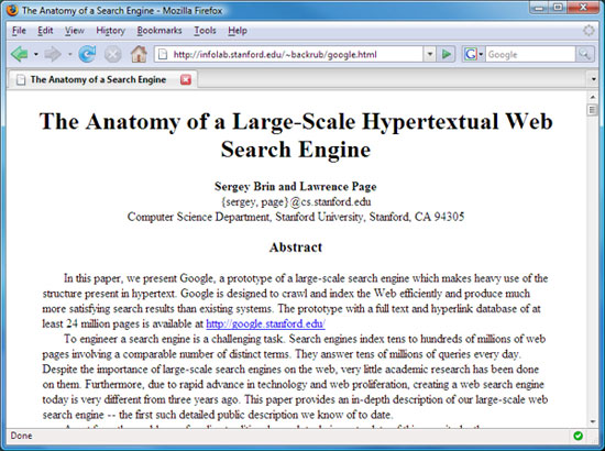
In the early days of the Web, most pages online were scholarly works. They didn't use fancy layouts. Typically, they were just text with the occasional picture and table. The first item in the Supplementary Material section for this lesson, written by Google creators Sergey Brin and Lawrence Page, is a good example. Traditional HTML was designed to allow people to create Web pages like that one.
With the commercialization of the Web came the desire to create Web sites with some character. Web site owners were looking for ways to create a recognizable, consistent identity for their sites. The concept of the page layout was born.
A page layout gives each page within a Web site a similar look and feel. You're probably familiar with the components of a page layout. Typically it involves things like a header and perhaps a navigation bar near the top of each page, one or two sidebar columns down the sides of the page, and perhaps a footer at the bottom of the page.
As you may have guessed, this lesson is about page layouts. In this chapter, you'll learn about three basic types of layouts used in most Web sites today. The three types of layouts are fluid, fixed, and elastic.
The Fluid Layout
The fluid layout (or liquid layout) is one that scales (sizes itself) to the width of the Web browser window. The wider the Web browser window, the wider the page content. There is never any empty space around the page content.
The image below shows an example. On the left, we see the page with a narrow browser window. Text wraps to fit within the window so the user doesn't need to scroll left or right to see the text.
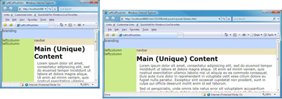
On the right, you see the same page in a wider browser window. Again, the content stretches to fit the window. There's no horizontal scroll bar at the bottom of the screen and no empty space around the content. In fluid layouts, percent (%) is the primary unit of measure for defining the widths of elements.
The Fixed Layout
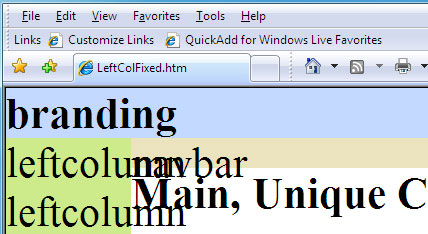
A fixed layout is one in which the width of the content is static and doesn't change. For example, the image below shows a page layout that has a fixed width of 760 pixels. When the browser window is narrower than 760 pixels, some content is cut off. The user has to scroll left and right using the horizontal scroll bar at the bottom of the browser window.
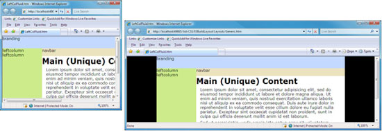
On the right, we see the same page with the browser window wider than 760 pixels. The content stays at its width of 760 pixels. Empty space (shown in black above) fills the gap at the left and right sides of the content.
Fixed layouts use pixels (px) as their primary unit of measure for defining element widths.
The Elastic Layout
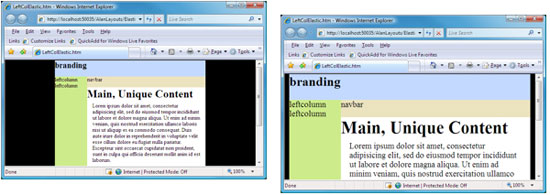
The elastic layout is similar to the fixed layout in that the content has a specific width. That width doesn't change as the user widens and narrows the Web browser window. However, unlike the fixed layout, the elastic layout allows elements to scale to the user's preferred text size. Let me explain what that means.
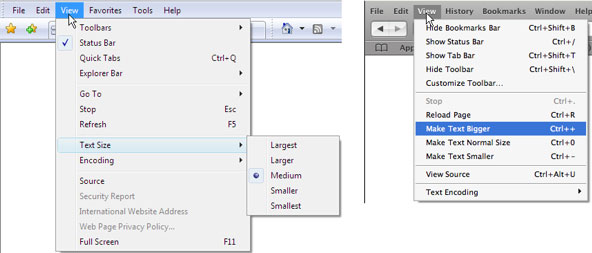
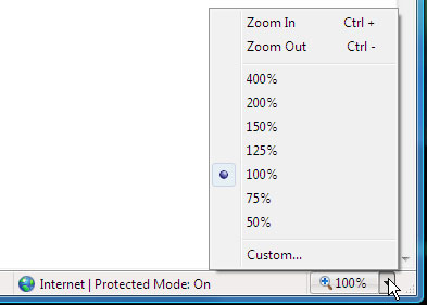
All Web browsers offer users some means of changing the size of text in Web pages. For example, in Internet Explorer, users can choose View > Text Size and then a larger or smaller size, as shown at left below. Safari, Firefox, and other browsers offer similar options on their View menus, as shown on the right.
Somewhere, a clever user noticed that in most sites, increasing the text size did not increase the size of the elements in which that text is contained. In some cases, text can become too large to wrap within its container. Instead, the text spills out and overlaps neighboring text.
The creation of the elastic layout solved this problem. As the user increases and decreases the text size, the elements that contain the text increase and decrease with it so text doesn't spill out of its containing boxes.
A page with an elastic layout might look like the example at left when viewed at normal text size. If the user increases the text size, the text grows. But so do all the elements that contain that text, as in the example at right. The layout looks the same, proportionally, regardless of the user's preferred text size.
Many modern browsers have switched from using a Text Size method of magnification to a Zoom method of magnification. The Zoom method magnifies the container, which allows fixed-layout sites to look and act more like elastic layouts. That's a big plus for older sites that would fall apart when the user magnified the text.
In terms of how you write the code, the only real difference between fixed and elastic layouts is that in a fixed layout you rely mainly on the px (pixels) unit of measure to define widths. In the elastic layout, you rely more on the em unit if measure, where 1em equals roughly the height of a line of text (16px at the default font size). It sounds complicated but it's really not. We'll use the em unit of measure for many of our working examples. But keep in mind that they are just examples, and you are free to design your pages using whatever unit of measure you feel most comfortable with.
Let's move over to Chapter 2 now and get back to basics, starting with planning your layout.
Elastic layouts rely on the em unit of measure. A measure of 1 em equals the font size of text and is roughly equal to 16 pixels. We'll be using the em unit of measure quite a bit in this course. So, you'll get to see plenty of examples. For now, let's move on to Chapter 2 and design a page layout.
Chapter 2:
Planning a Page Layout
Web design for fun usually involves opening up your WYSIWYG editor and diving right in. Be spontaneous, have fun, and play around until things look good. That's how most people get started, and it's a good way to learn.
But the spontaneous, learn-as-you-go approach doesn't work so well for bigger, more serious Web sites. In the bigger leagues, design, planning, and maintaining creative control are the keys to success.
The first step in the process is to design the page layout. The layout includes elements that will appear on every page within the site to give it a consistent look and feel. There's no limit to how you can lay out a page. But businesses tend to like things done a certain way.
Typically, this requires putting company or site information at the top of the page to let users know where they are. That strip across the top of the page is sometimes called the branding bar. Beneath that, you'll generally put a navigation bar that makes it easy for users to get around the site.
The main content area appears under the branding and navigation bars. This is where the real meat (content) of the page appears. In many Web sites, it's the only area that's unique on each page.
As you've probably seen, many sites use sidebar columns next to the main content area. The column can be to the left of the content or to the right. Or you can have both a left and right column. A lot depends on how much stuff you have to put into the columns.
At the bottom of each page, you may want a footer that contains copyright information, links to previous and next pages, the date that the page was last updated, or other information.
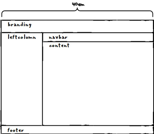
With those basic elements in mind, a good first step in designing a layout is to step away from the computer. Grab a pencil and some paper, and just sketch things out. Give each major layout element a short descriptive name. Those are the names you'll use in your code to identify each section. So, it's best to stick with lowercase letters and avoid blank spaces.
Also, think about how wide you want the layout to be. For a fluid layout, you want the layout to always stretch to the width of the browser window. If that's what you want, then 100% would be an appropriate width.
For a fixed layout, you might use 760px as your layout width. That's a good choice, because a person viewing the page with an 800 x 600 resolution could still see the whole page without having to scroll left and right.
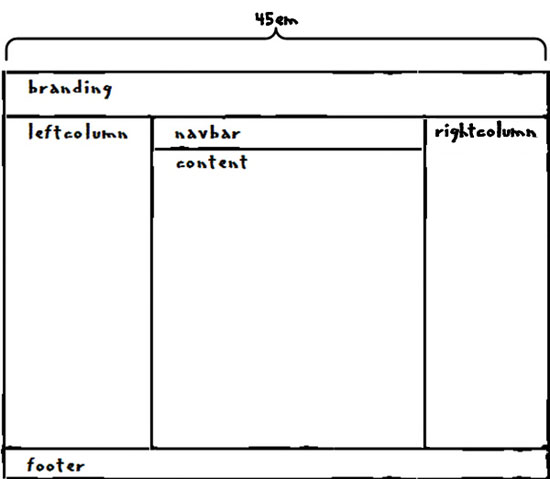
For an elastic layout, a width of 40 to 45em is usually good.
|
Your hand-drawn layout doesn't need to be anything fancy. Just a simple sketch will do. And make note of the width you've decided upon. The image below shows the sketch we'll use as our working example.
That's enough to get you started. You can refine the layout later as you build it.
Next, it's time to create the Web page that defines the layout to the Web browser. If your background is in traditional HTML, your first inclination might be to create a table that resembles the layout. But that's not really the best approach. The table tags are intended for traditional tables like the kind you see in print and the image below.
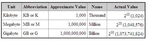
It certainly makes
sense to use HTML table tags to create tables like the one above, even
today. After all, that's what the HTML table tags are for. But for page
layouts, you're better off using divisions (div tags) and CSS styles.
And it's easier than you might think. Follow me to Chapter 3 to see what
I mean.
Chapter 3:
Creating the Layout Page
Once you have your basic layout down on paper, the next step is to create a Web page that has the necessary XHTML tags to define each section. That will be a standard Web page with the usual .htm or .html filename extension.
Go ahead and create a new, empty Web page using the editor of your choice. Let's name it layout.htm. If you don't have a fancy WYSIWYG editor that puts in all the required tags for you, copy and paste those tags from below into an empty text document.
 <!DOCTYPE html PUBLIC "-//W3C//DTD XHTML 1.1//EN"

"http://www.w3.org/TR/xhtml11/DTD/xhtml11.dtd">

<html xmlns="http://www.w3.org/1999/xhtml">

<head>

    <title></title>

</head>

<body>
</body>
</html>
That takes care of all the tags that every XHTML page requires. The next step is to add some tags to define each major element of the layout. We'll use a pair of div tags to define each of those elements. But don't just throw in a bunch of div tags. Let's think this through and plan ahead a little. We'll work smarter now so we don't have to work harder later.
When you're adding <div> and </div> tags to your page, it always helps to put an XHTML comment next to each closing </div> tag. This is a good idea, because as you add content to a div, the gap between the opening <div> tag and its closing </div> tag widens. With time, it's easy to lose track of which closing </div> goes with which opening <div>. And that can lead to confusion and loss of creative control later down the road.
The comments don't have any effect on how the page looks in the Web browser. The comments are simply notes to yourself in your markup (code). Every XHTML comment starts with these four characters, with no blank spaces between any of the four characters:
<!--Each comment ends with these three characters, again with no blank spaces between the characters.
-->For example the tags for the branding division, with a little sample text thrown in for viewing and testing, will look like this:
<div id="branding">
I am in the branding division.
</div><!-- End branding -->In the sample page we're building, those will be the first tags under the <body> tag because the branding bar is the first (topmost) element on the page. Put the div tags for the branding division right under the <body> tag of your own page now.
Working your way down, and left to right, the leftcolumn element comes next in your page layout. So, the next tags in the page will be those for the div element named leftcolumn, with some sample text and a closing comment. Go ahead and add those tags, shown below, to your page now.
<div id="leftcolumn">
I am in the leftcolumn division.
</div><!-- End leftcolumn -->
|
Still working our way down and left to right, the div tags for the navbar, content and footer divisions come next, in that order. Here are those tags, which you can add to your own page now:
<div id="navbar">
I am in the navbar division
</div><!-- End navbar --><div id="content">
I am in the content division
</div><!-- End content -->
<div id="footer">
I am in the footer division
</div><!-- End footer -->
And here is the whole page with all the tags and comments in place. Your page should look the same:
<!DOCTYPE html PUBLIC "-//W3C//DTD XHTML 1.1//EN"
"http://www.w3.org/TR/xhtml11/DTD/xhtml11.dtd">
<html xmlns="http://www.w3.org/1999/xhtml">
<head>
<title></title>
</head>
<body><div id="branding">
I am in the branding division
</div><!-- End branding -->
<div id="leftcolumn">
I am in the leftcolumn division
</div><!-- End leftcolumn -->
<div id="navbar">
I am in the navbar division
</div><!-- End navbar -->
<div id="content">
I am in the content division
</div><!-- End content -->
<div id="footer">
I am in the footer division
</div><!-- End footer -->
</body>

</html>
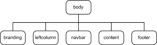
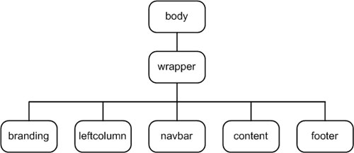
Here is the document tree for layout.htm as it stands right now. Each division is a child of the body element.
When you view the page in a Web browser, it won't look anything like our planned layout. In fact, it will just look like the five lines of text below.
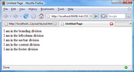
The page looks the way it does because only the default browser styles are being applied. They are cascading down from the body element to each division. That's okay, because you can style anything you want, any way you want, using CSS. Let's get started by creating a style sheet.
Creating the Style Sheet
To make the page look like our intended layout, we'll need some CSS styles. Go ahead and create a new, empty style sheet now, using whatever method you like.
Name your style sheet layoutstyles.css, and put it in the same folder as the layout.htm page. At the top of the style sheet, add a simple comment as a reminder of the page's filename. Unlike HTML comments, CSS comments start with /* and end with */ (again, no blank spaces between the characters). So, at first your style sheet contains only:
/* layoutstyles.css */Make sure you save the style sheet after you create it, even though it only contains the one comment.
|
Of course, any styles you put in this style sheet will apply only to pages that link to the style sheet. So, the layout.htm page needs a <link /> tag to link to this style sheet we're about to build.
You need to add the link tag shown below between the <head> and </head> tags of your layout.htm page. While you're there, make layout.htm the title of the page. That way, you'll see that name as a reminder when viewing the Web page in a browser. So, between the <head> and </head> tags of your layout.htm page, you should have two tags in between, as below:
<head>
<title>layout.htm</title>
<link href="layoutstyles.css" rel="stylesheet" type="text/css" />
</head>Now we're ready to start adding some
style rules to our style sheet. Before we do, I'd like to give you some
tips and tricks for maintaining creative control over all aspects of
the Web sites you develop. Come on over to Chapter 4.
Chapter 4:
Maintaining Creative Control
Losing creative control of a Web site is a very common problem. You may know what I mean. For example, say you want to change something on one or more pages in the site, or there's some problem you need to fix. Trying to figure out how and where to make the change or fix the problem can be like trying to find the proverbial needle in a haystack. Often, in the process of looking and trying, you make things worse rather than better.
There are three reasons why we lose creative control over our Web sites. The first is overuse of WYSIWYG editors. While we're happily clicking and drawing away, it's piling up mountains of tags, styles, and JavaScript code into the page source. Trying to figure out what's going on in all that source code later isn't easy.
The second reason is we change, add, and delete the code too much without checking our work as we go along. You do dozens of things in your page source without ever checking to see how the page looks in the browser. Then, when you do view the page in your Web browser, it's a mess. So, now you have to figure out which of the dozens of things you did recently is causing the problem.
The third reason stems from not understanding the big picture of how everything works. Every element you create has a default style that comes from the browser default style sheet. CSS exists so that you can override those default styles with your own. But you have to understand the default style to understand what styles to apply and how to get exactly what you want.
The cure to these blues is to write at least some code yourself, and check your work often. Not only does this help you maintain creative control, it also lets you experiment and try things out. It speeds up the learning process, because you can see the browser default styles and you can see the effect of every style you apply right after you apply it.
To check your work often, open the page you're working on in one or two Web browsers. Firefox 2 is a good one because it's very standards-compliant. If you're using Windows, Internet Explorer 7 would be a good second choice. If the page looks okay in those two browsers, it will probably look okay in all the rest.
If you're using a Mac, your best bet would be to use Safari 3 as your test browser. Use Firefox as a second browser, if you like. But stay away from older browsers like Internet Explorer 5. The results you get from old browsers don't really show you how the vast majority of people will experience the page. You always want to target current browsers first. If necessary, you can make adjustments for older browsers later.
Save and Refresh
Regardless of what browser (or browsers) you use, getting immediate feedback on changes you make to you page or style sheet is a simple two-step process:
We'll try it out in a moment.
Use Temporary Borders
Most elements you put on a page have hidden borders around them. That's because your page would not look very attractive if every single element had a border around it. But sometimes, when you're creating a page or style sheet, it helps to temporarily make borders visible so you have a better sense of what's really going on with the default browser styles.
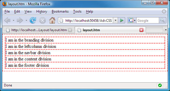
Let's give it a whirl by putting some temporary borders around all of the elements in the layout.htm page. You can do this by using the universal selector to put a border around every element on the page. Let's use a dashed red border to make sure the border is clearly visible. At the top of your style sheet, just under the comment we added earlier, add type or paste in the new universal style rule and comments below.
/* layoutstyles.css *//* Universal style rule */
*{
/* Temporary borders */
border:dashed 1px #f00;
}
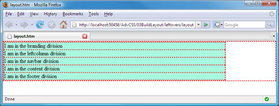
Save the style sheet after adding that style rule. Then, refresh the page in your Web browser. Here's how the page looks in Firefox after adding the red borders.
|
Here's why the page looks the way it does. By default, the body element is as wide as the browser window and just tall enough to contain all the page content. The outermost border you see in the page is surrounding the body element. As you widen and narrow the browser window, you can see the body element widen and narrow right along with it.
Now, let's look at the divisions. By default, every division is as wide as its containing block. Right now, the body element is that containing block, because every division is defined between the <body> and </body> elements in the page. As you widen and narrow the browser window, the divs widen and narrow too, in order to stay the same width as their containing block, the body.
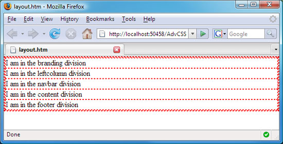
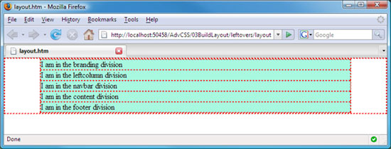
So, what about that little gap around all the divisions? By default, Web browsers add some margins and padding to elements. There are some subtle differences among browsers in terms of which elements they apply margins and padding to and how much they apply. And for that reason, many professional Web developers block all the browser default margins and padding. We can do the same right now by setting all margins and padding to zero in the universal style rule for our page, like this:
/* layoutstyles.css *//* Universal style rule */
*{
/* Block all browser default margins and padding */
margin:0;
padding:0;
/* Temporary borders */
border:dashed 1px #f00;
}
Save the style sheet after making that change, and refresh the browser. In the browser, the empty space surrounding the divs disappears.
Right
now we have the makings of a fluid page layout. So, what if we want to
create a fixed or elastic layout? Let's move on to Chapter 5, and I'll
show you how to do that.
Chapter 5:
Changing the Layout Type
To create a fixed or elastic layout, we can put all of the divs we have into a narrower containing block. That narrower containing block will be another division that surrounds the divisions we already have. Web developers often refer to that narrower containing block as a container or wrapper because it contains (wraps around) all the divisions within it.
To add a narrower containing block, you need to open the layout.htm page. Then, right under the <body> tag, type in the div tag required to start a new division. We'll name this one wrapper. To ensure that all other divisions are contained within the wrapper, you must start the division right under the <body> tag, above the <div> tag for the branding bar. You can put a comment above the wrapper as a reminder to its purpose, as below.
<!-- Wrapper sets the layout width -->
<div id="wrapper">Go ahead and type that comment and tag into your layout.htm page now, right under the opening <body> tag.
To ensure that all other divs are contained within the wrapper, the closing </div> tag for that division must be down at the bottom of the page, just above the closing </body> tag. You can add a comment to it as a reminder of which division it closes. You can put the tag and comment below into your layout.htm, just above the closing </body>
</div><!-- End wrapper -->Here is how the entire layout.htm page looks now with the new tags for the wrapper division added in. Notice how all of the other divisions are now contained within the tags that define the wrapper division.
<!DOCTYPE html PUBLIC "-//W3C//DTD XHTML 1.1//EN"
"http://www.w3.org/TR/xhtml11/DTD/xhtml11.dtd">
<html xmlns="http://www.w3.org/1999/xhtml">
<head>
<title>layout.htm</title>
<link href="layoutstyles.css" rel="stylesheet" type="text/css" />
</head>
<body><!-- Wrapper sets the layout width -->
<div id="wrapper">
<div id="branding">
I am in the branding division
</div><!-- End branding -->
<div id="leftcolumn">
I am in the leftcolumn division
</div><!-- End leftcolumn -->
<div id="navbar">
I am in the navbar division
</div><!-- End navbar -->
<div id="content">
I am in the content division
</div><!-- End content -->
<div id="footer">

I am in the footer division

</div><!-- End footer -->
</div><!-- End wrapper -->
</body>

</html>
Adding the wrapper div has changed our conceptual document tree, as below. The wrapper is now parent to all the other divisions because all those other divisions are contained within the tags that define the wrapper.
Save the layout.htm page. Refresh the browser if you like. But you won't see much of a change, because right now, the wrapper is like any other unstyled division—it's as wide as the page body. Let's change that by creating a style rule for the wrapper in our layoutstyles.css page.
You used the tag <div id="wrapper"> to define your wrapper division. So, the style rule for that division in your style sheet has to look like this:
#wrapper{
}Let's start by giving the wrapper a specific width and a background color. We'll use 40em as the width to create an elastic layout. The background color is just to make the wrapper plainly visible on the browser window and can be any color you want. Let's use a light blue for now, #A8F7DF. You're not making any big commitment here; you can change that color at any time.
#wrapper{
width:40em;
background-color: #A8F7DF;
}Save the style sheet, and refresh the browser to see the effect. So long as your browser is wider than 40em (640pixels), you can see that each division is now as wide as the wrapper, not as wide as the page, like this:
Confused? Don't be. Recall that, by default, every division is as wide as its containing block. The wrapper is now that containing block. So, now each of our divisions is as wide as the wrapper. In other words, each division inherits its width from the parent element, the wrapper.
Here's another fact about divs: By default, a div's background color is transparent. Therefore, the background color of the parent element shows right through. In other words, each div inherits the background color of its parent. If you look at our document tree, you can see that the wrapper is now the parent to all our other divs. The #wrapper style says the wrapper color is light blue. But that same background color shows through all the wrapper's child elements. So, all of the divisions are light blue too.
Center the Wrapper
Now, let's center the wrapper on the page. We can use the modern CSS technique of setting the left and right margins to auto.
We don't need to add any margin space above or below the wrapper
though. So, we can keep those set to zero by using two measurements with
the margin property. When you follow margin with two measurements, the
first measurement applies to the top and bottom margins. The second one
applies to the left and right margins. So, now add margin: 0 auto; to our wrapper style rule, as below.
#wrapper{
width: 40em;
background-color: #A8F7DF;
/* Center the wrapper */
margin: 0 auto;
}Save the style sheet, and refresh the browser. So long as your browser window is wide enough to show the whole wrapper and some empty space around it, you can see that the wrapper is now centered on the page, like this:
There's still some work to be done. But that should be enough to keep you busy until the next lesson. I know you may be anxious to see how all of this comes together. But for now, the important thing isn't the immediate gratification of seeing the final result.
If you want immediate gratification, you can always throw together the layout in a WYSIWYG editor using tables. But that won't get you the kind of deep understanding you need to harness the full potential of Web development with CSS and XHTML. There's a learning curve to fully understanding the big picture. And that requires time, practice, study, and some patience.
Easy access to the facts is also important. To that extent, the assignment for this lesson will help you prepare for getting quick access to the official W3C document for all XHTML tags and all CSS properties. The Supplementary Material section offers links to Web sites that contain related information. And, as always, the Discussion Area is open to post your questions.
Conclusion
In
this lesson, we got off to a good start by drawing a layout. Then, we
created a page with the necessary div tags to implement the layout. The
rest will take place in an external style sheet, which we started
working on. We'll work on it some more in Lesson 4, to turn our
hand-drawn layout into an actual working layout. See you there!
Supplementary Material
|
The Anatomy of a Large-Scale Hypertextual Web Search Engine http://infolab.stanford.edu/~backrub/google.html |
| Click this link for an early paper on the design philosophies behind the Google search engine. It's a good example of how most pages looked in the early days of the Web when traditional HTML reigned supreme. |
|
Web Page Layouts Shouldn't Use Tables http://webdesign.about.com/od/layout/a/aa111102a.htm |
| This page sums up all the reasons why professional Web developers have stopped using tables for page layout. |
|
Why Tables for Layout Is Stupid http://www.hotdesign.com/seybold/ |
| Here's a somewhat comic book-like approach explaining why using tables for page layout isn't such a good idea. |
|
Lengths http://www.w3.org/TR/CSS21/syndata.html#length-units |
| Here you'll find the W3C's explanation of the various units of measure. As is typical of W3C documentation, it's woefully terse and technical. But these are the facts, nonetheless. |
|
Elastic Lawn http://www.csszengarden.com/?cssfile=/063/063.css&page=0 |
| This link is an example of an elastic layout. Change the text size with View > Text Size in Internet Explorer, or CTRL + + and CTRL + - in Firefox or Safari, and watch how everything scales to the current text size. |
|
Tableless Layouts With Dreamweaver CS4 http://www.adobe.com/devnet/dreamweaver/articles/css_2c_tableless.html |
| Here's a tutorial on creating tableless page layouts using Dreamweaver. |
|
CSS Page Layout Basics http://www.adobe.com/devnet/dreamweaver/articles/css_page_layout_basics.html |
| From Adobe and Dreamweaver, this page provides a tutorial on creating page layouts with div tags and floats. |
|
Sample CSS Page Layouts http://www.maxdesign.com.au/presentation/page_layouts/ |
| Here you'll find some sample page layouts from Max Design. These all use div tags and floats. |
|
CSS Layouts http://www.dynamicdrive.com/style/layouts/category/C9/ |
| This link takes you to still more sample page layouts from the folks at Dynamic Drive. |
|
CSS Layout Techniques: For Fun and Profit http://www.glish.com/css/ |
| Here you'll find a quick overview of layout techniques with links to many additional resources. |
FAQs
<link href="layoutstyles.css" rel="stylesheet" type="text/css" /> <link href="css/layoutstyles.css" rel="stylesheet" type="text/css" /><!DOCTYPE html PUBLIC "-//W3C//DTD XHTML 1.1//EN"
"http://www.w3.org/TR/xhtml11/DTD/xhtml11.dtd">
<html xmlns="http://www.w3.org/1999/xhtml">
<head>

 <title>layout.htm</title>

 <link href="layoutstyles.css" rel="stylesheet" type="text/css" />

</head>
<body>
<!-- Wrapper sets the layout width -->

<div id="wrapper">
<div id="branding">
I am in the branding division
</div><!-- End branding -->
<div id="leftcolumn">
I am in the leftcolumn division
</div><!-- End leftcolumn -->
<div id="navbar">
I am in the navbar division
</div><!-- End navbar -->
<div id="content">
I am in the content division
</div><!-- End content -->
<div id="footer">
I am in the footer division
</div><!-- End footer -->
</div><!-- End wrapper -->
</body>

</html>/* layoutstyles.css */
/* Universal style rule */
*{
/* Block all browser default margins and padding */
margin: 0;
padding: 0;
/* Temporary borders */
border: dashed 1px #f00;
}
#wrapper{

    width: 40em;

    background-color: #A8F7DF;

    /* Center the wrapper */

    margin: 0 auto;

}
Assignment
|
 Tip:
To convert from pixels to em units, divide the pixel measurement by 16.
The Heights.htm, Widths.htm, and ConvertPPE.htm pages in the
AdvCSSCourse folder you downloaded in Lesson 1 can help you work with
widths and heights.
Tip:
To convert from pixels to em units, divide the pixel measurement by 16.
The Heights.htm, Widths.htm, and ConvertPPE.htm pages in the
AdvCSSCourse folder you downloaded in Lesson 1 can help you work with
widths and heights. Note: Even if the column were on the right, you'd still put the tags for the column next. We'll talk about that in the next lesson.
 Caution:
Don't confuse the style sheet (layoutstyles.css) with the Web page
(layout.htm). The style sheet contains only CSS style rules and CSS
comments, no XHTML tags. The page is the .htm file that contains all of
the XHTML tags. It's important to understand the difference and to
always be aware of which one you're editing!
Caution:
Don't confuse the style sheet (layoutstyles.css) with the Web page
(layout.htm). The style sheet contains only CSS style rules and CSS
comments, no XHTML tags. The page is the .htm file that contains all of
the XHTML tags. It's important to understand the difference and to
always be aware of which one you're editing!