Divs stacked up
Chapter 1:
Understanding Floats
Welcome back! In this lesson, you'll learn about CSS floats. Like all CSS properties, you'll find floats are a tool for creativity. The better you understand how floats work, the better you'll be able to apply them in creative ways to your own Web sites. So, in this chapter, you'll learn what floats are and how they work in general. Then, we'll look at how you can apply floats in a more specific and practical way to a sidebar column in a page layout.
A floated element is one that appears next to subsequent elements in
the page rather than above those subsequent elements. You can use the
CSS descriptor float:left to make a block element float to the left of subsequent elements. Or you can use float:right to make an element float to the right of subsequent elements.
So, what are block elements and subsequent elements? A block element (also called a block-level element) is any boxy element that doesn't normally flow along with words in sentences. Things like headings, tables, and divs are examples of block elements.
The term subsequent element has to do with the order of tags in the markup. For example, consider the following XHTML tags:
<body>

<div id="block1">
  Block 1
</div>
<div id="block2">
  Block 2
</div>
<div id="block3">
  Block 3
</div>
</body>
Block 1 is the first element in the page body. So, both Block 2 and Block 3 are subsequent to Block 1. Block 3 is subsequent to Block 2. Nothing is subsequent to Block 3.
Often, the best way to understand how things work is to experiment. But you don't want to experiment with pages you've put a lot of effort into getting to look just right. It's better to create a separate practice page. This way, you won't mess up anything that you already have.
For these exercises, create a practice page named floatsdemo.htm. Enter the following code by typing it yourself or by copying and pasting it into your page.
<!DOCTYPE html PUBLIC "-//W3C//DTD XHTML 1.1//EN"
"http://www.w3.org/TR/xhtml11/DTD/xhtml11.dtd">
<html xmlns="http://www.w3.org/1999/xhtml">

<head>
<title>floatsdemo.htm</title>
<style type="text/css">
/* Start of internal style sheet */
#block1{
  background-color:#f00; /*red*/
}
#block2{
  background-color:#0f0; /*green*/
}
#block3{
  background-color:#0ff; /*blue*/
}
#block4{
  background-color:#ff0; /*yellow*/
}
#block5{
  background-color:#ccc; /*silver*/
}

/* End of internal style sheet */
</style>
</head>
<body><!-- Start elements -->
<div id="block1">
  Block 1
</div>
<div id="block2">
  Block 2
</div>
<div id="block3">
  Block 3
</div>
<div id="block4">
  Block 4
</div>
<div id="block5">
  Block 5
</div>
<!-- End elements -->
</body>
</html>
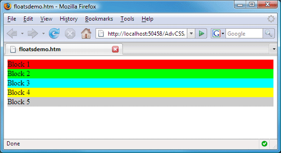
When you view the floatsdemo.htm page in a browser, you see the divisions stacked up, one atop the other, in the same order as the tags that define those elements. Each division is as wide as the browser window and just tall enough to contain its content.
Right now, we have no floated elements. Let's float Block 2 by adding float:left; to its style rule.
#block2{
  background-color:#0f0; /*green*/
float:left;
}
Save the page, and refresh your browser. Here's how the page looks with Block 2 floated to the left:
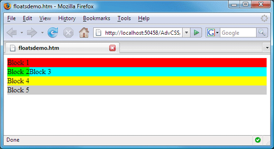
Block 1 is unaffected by the float because the tags that define Block 1 aren't subsequent to the tags that define Block 2.
But wait a minute. It looks as though Block 2 is only floating to the left of Block 3. Why isn't it floating next to Block 4 and Block 5, too? Every div is only as tall as it needs to be to contain its content. Right now, Block 2 isn't tall enough for Block 4 and Block 5 to float next to it. So, Block 4 and Block 5 wrap under Block 2.
If Block 2 were taller, then Blocks 4 and 5 would be next to Block 2.
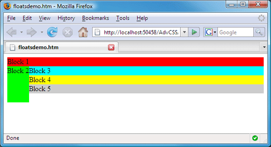
To prove this, you can make Block 2 taller by giving it a specific
height using the CSS height property. Let's make Block 2 5em tall by
adding a height:5em; descriptor to its style rule.
#block2{
  background-color:#0f0; /*green*/
  float:left;
  height:5em;
}
Save and refresh your browser to see Block 2 at its new height. Now that it's taller, you can see that it does indeed float to the left of all its subsequent elements.
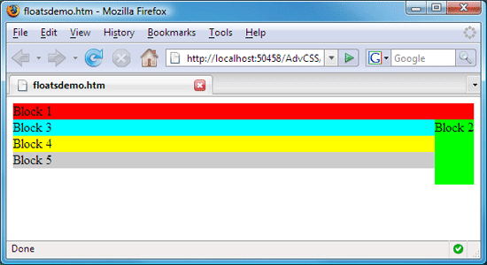
Now, suppose you change the #block2 style rule so that Block 2 floats
to the right of subsequent elements rather than to the left of them?
Change float:left to float:right in the #block2 style rule using the following code.
#block2{
  background-color:#0f0; /*green*/
  float:right;
  height:5em;
}
Save and refresh your browser to see the results in the browser. Block 2 now floats to the right of its subsequent elements, Blocks 3 through 5.
Floating Two Divisions
Let's take this a step further. Suppose you want Block 2 to float to the left and Block 3 to float to the right of their subsequent elements. When you have one floated element right after another in a page, they both float next to the subsequent unfloated elements. Let me show you what I mean.
In your editor, make Block 2 float to the left, and then make Block 3 float to the right. Give Block 3 some height, too. To do this, change the #block2 and #block3 style rules using the code below:
#block2{
  background-color:#0f0; /*green*/
  float:left;
  height:5em;
}
#block3{
  background-color:#0ff; /*blue*/
  float:right;
  height:4em;
}
Save and refresh your browser to apply the new style rules. Block 2 now floats to the left, and Block 3 floats to the right of subsequent elements.
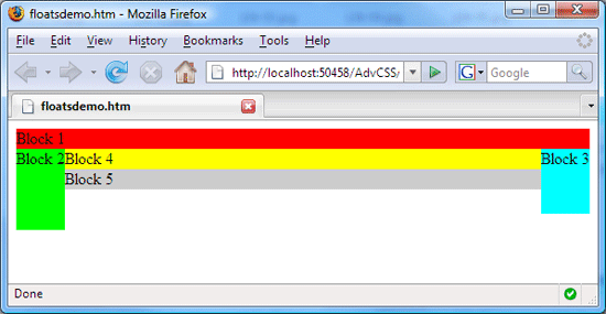
Keep in mind that it's not only the style rules that are making things play out this way. It's the order of the tags in the page, too. Blocks 2 and 3 float beside Blocks 4 and 5 because the <div> and </div> tags that define Blocks 4 and 5 are subsequent to the <div> and </div> tags that define Blocks 2 and 3. Block 1 is unaffected by the floats because, in the page, the <div> tags that define Block 1 are above the tags that define the floated elements.
Let's head over to Chapter 2 now and look at some more things you can do with floats.
Chapter 2:
More Fun With Floats
As
you learned in Chapter 1, you can use the CSS float property to make
any block element float to the left or right of subsequent elements in a
page. There may be times when you want an element to clear a float. That is, you want to make an element not be next to a floated element. For that, you'll use the CSS clear property.
Clearing Floats
The CSS clear property makes a subsequent element wrap underneath a floated element. Here's a list of acceptable values for the clear property.
To try one, add clear:left to the style rule for Block 5, like this:
 #block5{

     background-color:#ccc; /*silver*/

     clear:left;

 }
That new clear:left style
descriptor tells Block 5 to be under the floated element on its left.
Save the change, and refresh your browser. Block 5 dutifully obeys and
clears the float to its left, wrapping under that element.
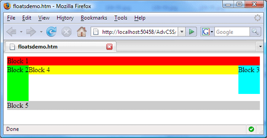
So, why does Block 5 also clear Block 3? This is because a div will never be curved. All CSS and XHTML elements are rectangular. So, there's no way for the left side of Block 5 to be under Block 2 and then curve up so its right edge is next to Block 3. CSS and XHTML don't work that way, because elements never curve.
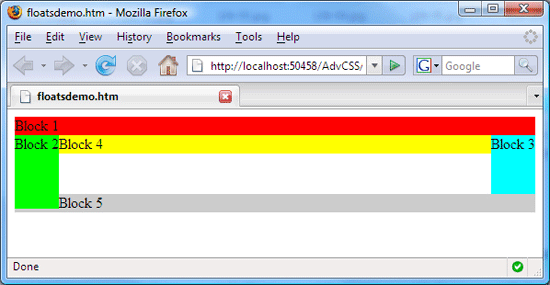
Let's see what happens if we tell
Block 5 to clear the right-floated element rather than the left-floated
element. Change your #block5 style rule to clear:right.
#block5{

     background-color:#ccc; /*silver*/

     clear:right;

 }
Save and refresh your browser after making that change. Block 5 now clears the float only on the right, as you see below. Block 2 still floats to the left of Block 5 because we said nothing about clearing that float, and Block 2 is tall enough to be next to Block 5.
We could also tell Block 5 to clear both floats, like this:
#block5{

     background-color:#ccc; /*silver*/

     clear:both;

 }
Make that change to your #block5 style rule, then save and refresh your browser to see the result.
Notice in the example above that clear:both produces the same result as clear:left.
That makes sense, because Block 2 is the taller of the two floated
elements. So, clearing Block 2 on the left is the same as clearing both
elements in this example.
Floating Multiple Elements
You
aren't limited to floating one or two elements per page. You can float
as many as you wish. For example, suppose you change all the style rules
in floatsdemo.htm so that every element contains a float:left descriptor and no clears, like this:
#block1{

     background-color:#f00; /*red*/

     float:left;

 } #block2{

     background-color:#0f0; /*green*/

     float:left;

 } #block3{

     background-color:#0ff; /*blue*/

     float:left;

 } #block4{

     background-color:#ff0; /*yellow*/

     float:left;

 }
 #block5{

     background-color:#ccc; /*silver*/

     float:left;

 }
Each division obeys the style rules by floating to the left of its subsequent elements. Block 1 floats to the left of Block 2, which floats to the left of Block 3, which floats to the left of Block 4, which floats to the left of Block 5.
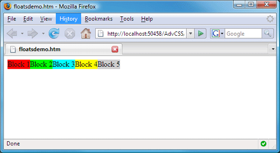
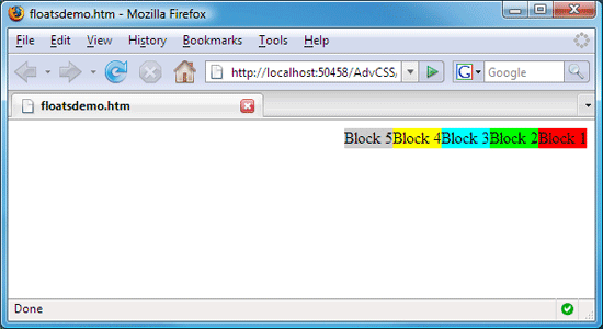
Now change all of those float:left descriptors to float:right.
#block1{

     background-color:#f00; /*red*/

     float:right;

 } #block2{

     background-color:#0f0; /*green*/

     float:right;

 } #block3{

     background-color:#0ff; /*blue*/

     float:right;

 } #block4{

     background-color:#ff0; /*yellow*/

     float:right;

 }
 #block5{

     background-color:#ccc; /*silver*/

     float:right;

 }
Save and refresh your browser. The divs obey the new rules. Block 1 floats to the right of Block 2, which floats to the right of Block 3, which floats to the right of Block 4, which floats to the right of Block 5.
You can do all kinds of fun and creative things with floats. Just playing around with some floated elements, as we have, is a good way to experiment and learn.
|
Floating Two Divs Side-By-Side
If an element is as wide as the page, you can't float anything next to it. There's a simple reason for that. If an element is already as wide as the page, there's no room beside it for anything else to fit! So, other elements have to wrap down underneath the floated element.
To illustrate, let's use an example with two divisions floating side-by-side. Looking at the code below, you'll see that it contains two style rules named #div1 and #div2. The style rules state that div1 should float next to all subsequent elements on the page. Down in the page body, you can see the div1 and div2 elements to which those style rules apply. Each of those div elements contains a number of words. In your practice page, enter the following code:
<!DOCTYPE html PUBLIC "-//W3C//DTD XHTML 1.1//EN"


"http://www.w3.org/TR/xhtml11/DTD/xhtml11.dtd">


<html xmlns="http://www.w3.org/1999/xhtml">


<head>


  <title>FloatsDemo2.htm</title> <style type="text/css"> #div1{


       background-color:#ff0;


       float:left;


  } #div2{


       background-color:#0ff;


  } </style></head>


<body><div id="div1">


Div1 div1 div1 div1 div1. Div1 div1 div1. Div1 div1 div1 div1 div1. Div1 div1 div1 div1 div1. Div1 div1 div1 div1 div1.


</div><div id="div2">


Div2 div2 div2 div2 div2. Div2 div2 div2 div2 div2. Div2 div2 div2 div2
div2. Div2 div2 div2 div2 div2. Div2 div2 div2 div2 div2. Div2 div2 div2
 div2 div2. Div2 div2 div2 div2 div2.


</div></body>


</html>
As you view the page above in a Web browser, you don't see a whole lot of floating going on.
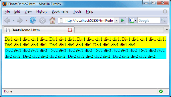
The reason why text from div2 isn't next to div1 is simple. There isn't enough room for text from div2 to fit next to div1. In other words, div1 is just too wide.
To get div2 up next to div1, you need to give div1 a specific width. The exact width is up to you. But it needs to be narrow enough to leave some room for the words in div2.
To illustrate, let's give div1 a width of 12em.
#div1{

   width:12em;

     background-color:#ff0;

     float:left;

}
When you view this in the browser, you'll see that div1 has the specified width. And that leaves plenty of room for content in div2 to move up next to that floated div1 element.
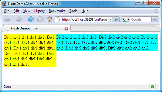
By giving the div1 a narrow width along with the float:left,
you leave plenty of room for div2 to scoot up beside it. This is how
we'll make the leftcolumn in our layout.htm page float to the left of
the navbar and main divs in that page.
Let's head over to Chapter 3 now and see how that works.
Chapter 3:
Styling Our Layout
In Lesson 3, we sketched out a page layout on paper. Then, we created a page named layout.htm that contains all the tags necessary to implement that layout. We also created a style sheet named layoutstyles.css. Currently, it doesn't contain all the styles necessary to make our page layout look the way we want. But it will soon.
If you lost track of the layout.htm file, here's how we left it in Lesson 3.
<!DOCTYPE html PUBLIC "-//W3C//DTD XHTML 1.1//EN"

"http://www.w3.org/TR/xhtml11/DTD/xhtml11.dtd">

<html xmlns="http://www.w3.org/1999/xhtml">

<head>

  <title>layout.htm</title>

  <link href="layoutstyles.css" rel="stylesheet" type="text/css" />

</head>

<body>

<!-- Wrapper sets the layout width -->

<div id="wrapper">
  <div id="branding">

   I am in the branding division

  </div><!-- End branding -->
  <div id="leftcolumn">

   I am in the leftcolumn division

  </div><!-- End leftcolumn -->
  <div id="navbar">

   I am in the navbar division

  </div><!-- End navbar -->
  <div id="content">

   I am in the content division

  </div><!-- End content -->
  <div id="footer">

   I am in the footer division

  </div><!-- End footer -->
</div><!-- End wrapper -->

</body>

</html>
|
|
We also created a style sheet named layoutstyles.css in Lesson 3. In case you lost track of that one too, here it is:
/* layoutstyles.css */

/* Universal style rule */

*{

/* Block all browser default margins and padding */

  margin: 0;

  padding: 0;

/* Temporary borders */

  border: dashed 1px #f00;

}
#wrapper{

  width: 40em;

  background-color: #A8F7DF;

/* Center the wrapper */

  margin: 0 auto;

}
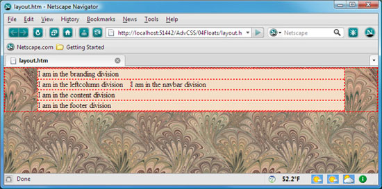
If you view layout.htm in a Web browser, it still doesn't look much like our planned layout. Right now, it looks more like this:
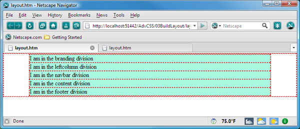
Our layout needs only one simple float. We need to make the leftcolumn division float next to subsequent elements. We also need to give leftcolumn a specific width so there's room for subsequent elements to scoot up next to it. You can make it any width. And if you don't know exactly what width you'll need, you can pick a number out of a hat, just to get things rolling. Then, you can make adjustments later, if necessary.
Let's use a width of 12em as our starting point. Remember, we're putting the style rules for our layout in an external style sheet named layoutstyles.css. So, open that up and add the following style rule to it.
#leftcolumn{

   width:12em;

   float:left;

}
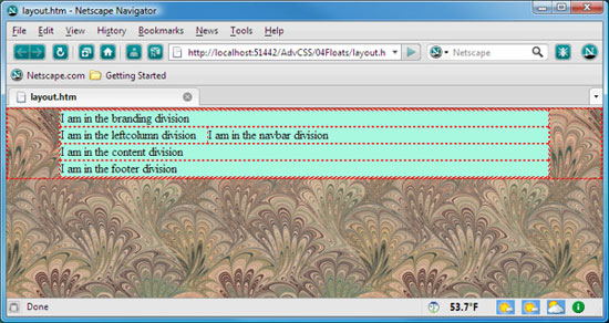
Save the style sheet, and refresh your browser to see the effect. The leftcolumn division is 12em wide and floats to the left of the navbar div. (I zoomed in a little on the example below so you can better see the details).
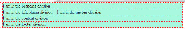
The layout still doesn't look like much. But that's because each division contains only a small amount of text. The leftcolumn div isn't tall enough to force all subsequent divisions to float right. But that's okay, because right now, design is our only focus. And it's always good to focus on one thing at a time. We'll worry about content later.
Speaking of design, there's plenty more we can do to layout.htm to get the look and feel we want. Come on over to Chapter 4, and I'll show you what I mean.
Chapter 4:
Styling the Page Body
Our layout.html page is slowly taking shape. We used the CSS width: and float:
properties to ensure that the leftcolumn division will be narrow and
float next to subsequent divisions. There's plenty more you can do to
style layout.htm to your liking. In this chapter, we'll look at ideas
for styling the page body and wrapper divisions.
Styling the Body Element
Every Web page has a body element. It's the element that's defined by the <body> and </body> tags in the page. Our page body is white because we've never styled it to be some other color. But we can certainly change that.
For example, maybe you'd like your page body to be darker. Let's add a body{} style rule that makes the page background a dark blue (#184B94). We don't have a style rule for the page body right now. But we can certainly add one to layoutstyles.css. Here's how the style rule looks if you want to make the page body that dark blue color. Like all style rules in our working example, it goes in your layoutstyles.css file.
body{
background-color: #184B94;
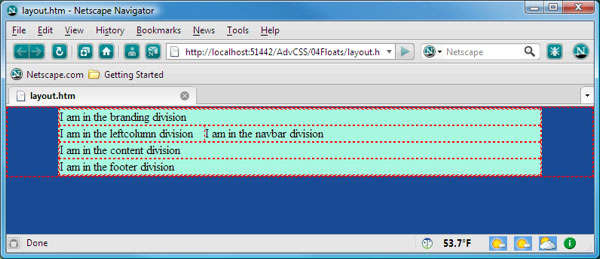
}Save the style sheet, and refresh your browser to see the new background color applied to the page. The wrapper retains its background color, light blue, because it's in front of the page background.
You don't have to use a background color. You can use a background image instead to apply a pattern or texture. Use the background-image CSS property to define a background image. The syntax is:
background-image:url(relativePath);You must replace the relativePath with the actual relative path for the image you want to use as the background. For example, let's suppose your Web site includes a subfolder named images. Inside that subfolder, you have an image like the one below. Its name is fabric01.jpg.
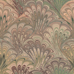
To use that image as the background for the layout.htm page, you'd change the body{} style rule in layoutstyles.css like this:
background-image:url(images/fabric01.jpg);
|
In the Web browser, the image tiles to fill the entire page background, like you see below. The wrapper's background color still covers the background image because the wrapper is on top of the page body.
Keep in mind that this is just a general example. It would only work if you actually had the folder and file in your own site. But, of course, you can use any background image you like in your own Web site.
If you ever start exploring other people's style sheets, you might notice that they often specify both a background color and a background image. There are three reasons for this. For one, if you have pictures turned off in your Web browser, you won't see the background image. You'll see the background color instead.
Also, if the user's Internet connection is slow, it might take a while for the background image to get to the computer. But the background color shows immediately. So, the user sees the specified background color while waiting for the background image to appear.
Finally, if the background image contains a transparent color, the background color of the page body will show through the transparent parts of the background image. So, the third reason for specifying both a background color and a background image is to control what color shows through any transparency in the background image.
Specifying both a background color and a background image for an element is a common practice. CSS offers a shorthand property for defining both. The syntax for the shorthand property is:
background:color url(relativePath);
|
The color should be the hex code for the background color, and the image should be in the url(relativePath) syntax. So, if you wanted to specify a brown background color and a background picture like fabric01.jpg in your images folder, the body{} style rule would look like this:
background: #856E5E url(images/fabric01.jpg);Optionally, you can follow the image URL in the background:property with settings for background-repeat, background-attachment, and background-position. Those values let you control the tiling, scrolling, and position of the background image. For more information, refer to some of the background image resources in the Supplementary Material section for this lesson.
Of course, you're not limited to applying background images and colors to the page body either. You can apply any background color, any background image, or both to any element in your page.
Let's move on to Chapter 5 now and look at some ways you might tweak your #Wrapper style to fine-tune your page layout.
Chapter 5:
Styling the Wrapper
As you may recall from previous lessons, we put a wrapper division in our layout.htm page to convert it from a fluid layout to an elastic layout. The main purpose of that wrapper division is to constrain the widths of all other divisions in the layout so they don't stretch to the full width of the Web browser window.
The wrapper in the layout.htm page is defined by these tags:
<div id="wrapper">
</div><!-- End wrapper -->
All of the main divisions that define our page layout (branding, navbar, sidebar, content, main, and footer) are contained within the wrapper. That wrapper division gets its style from the #wrapper{} style rule in layoutstyles.css. That style rule looks like this:
#wrapper{

   width: 40em;

   background-color: #A8F7DF;

   /* Center the wrapper */

   margin: 0 auto;

}
The width:40em descriptor makes the layout 40em wide. We used the em unit of measure to make the wrapper elastic so it grows and shrinks to whatever text size a user selects in the Web browser while viewing the page.
The background-color property gives the wrapper its light blue color. The color shows through all the divisions in your page because you haven't colored any of those divisions. And, by default, an unstyled div is transparent. So, the background image of the wrapper shows right through each div inside the wrapper.
Of course, you're not stuck with the light blue color. You can change it at any time. In fact, that light blue wrapper color clashes with our chosen background image. Don't you think a beige color might look a little better? So, how do you change that background color? It's easy! Just change the color in the background-color property.
#wrapper{

   width: 40em;

   background-color: #F4DEC8;

   /* Center the wrapper */

   margin: 0 auto;

}
After saving that change to layoutstyles.css and opening (or refreshing) layout.htm in your Web browser, the wrapper shows the new beige background color.
You know, it would be cool if some of that background image showed through above the branding division, not just at the sides and bottom. But how can you move the whole wrapper down so there's some page body above it? That's easy, too. You just have to put some empty margin space above the wrapper.
But wait a minute. You already have a margin descriptor in your #wrapper style rule. And you need both the left and right margins to be set to auto to keep the wrapper centered horizontally on the page. So, how can you set just the top margin to some specific number and still keep the left and right margins set to auto?
Well, as it turns out, the margin shorthand style rule does allow you to set all four margins, independently, clockwise from the top. In other words, you can specify all four margins using this syntax in the margin property:
margin: top right bottom leftSo, if you make the top margin a specific height, say 20 pixels and keep the right and left margins at auto, then you should be able to move the whole wrapper down without messing up anything else. Here's how the #wrapper style rule looks after making the appropriate change. (I also changed the comment above the descriptor to explain what it's doing.)
#wrapper{

   width: 40em;

   background-color: #F4DEC8;

/* Put 20px margin above the wrapper */

/* Set right and left to auto for centering */

   margin: 20px auto 0 auto;

}
After making that change and refreshing the layout.htm in your browser, you see that the whole wrapper has a 20-pixel tall margin above it. In other words, it moves the whole wrapper down 20 pixels without changing anything else.
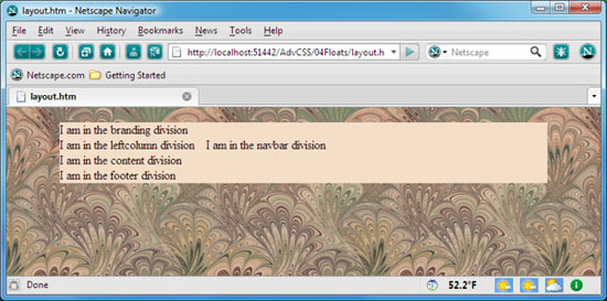
That looks better. Those dashed red borders aren't exactly pretty. But remember, those are only temporary until we get a sense of what's really going on behind the scenes as we develop the page. You can temporarily take those out by commenting out the border descriptor in the universal style rule of the style sheet, like this:
/* Universal style rule */

*{

  /* Block all browser default margins and padding */

    margin: 0;

    padding: 0;

  /* Temporary borders */

  /* border: dashed 1px #f00; */

}
After making and saving that page and refreshing layout.htm in the browser, you can see how things are shaping up without the borders.
Of course, you could have just removed the descriptor that's putting in the temporary borders. But then if you ever wanted to see the borders again, you'd have to re-type that descriptor in from scratch. Commenting it out makes it easier to turn the borders on and off at will.
Conclusion
Well, our layout.htm page is looking a little better. It still looks a bit weird, though, because it doesn't contain any real content. Right now, it just has those little placeholder sentences. But that's okay. Best to focus on one thing at a time, and right now, we're focused on the general look and feel of the layout.
We're slowly and deliberately designing and building the layout because this is how to maintain creative control over things. And you can learn a lot about all the little details of how CSS and XHTML really work as you go. This is how to gain the level of understanding and skill that allows the masters to create the kinds of amazing pages you see in sites like CSS Zen Garden.
Putting all of your style rules in an external style sheet is a good idea, because you never know what the future holds. A year or two from now, there may be dozens of pages in your Web site, all sharing the same basic page layout. And you might decide it's time to give the site a stylistic facelift. That'll be easy, because you'll only need to tweak some styles in your external style sheet. There's no need to go through the hair-pulling frustration of digging through mountains of messy code in dozens of pages trying to figure out what and where to make changes.
Taking the time to do things right early in the development process really saves you a lot of time in the long run. Of course, you do have to be willing to give up the immediate gratification and ease of point-and-click WYSIWYG editing tools. But it's a small price to pay for the creative freedom and power you gain from having a deep understanding of how CSS and XHTML work.
In the next lesson, you'll create some more style rules to add extra pizzazz to your site. We'll focus on how you can use descendant selectors in your style rules, like the pros do, to take full control of every single element in the site. See you there!
Supplementary Material
|
FloatTutorial http://css.maxdesign.com.au/floatutorial/index.htm |
| Here is a great resource for anyone looking to get a better understanding of floats. You'll also find examples of using floats to display graphic images in a tabular format without using tables. |
|
CSS Float Property http://www.w3schools.com/css/pr_class_float.asp |
| You'll find a brief but useful description of the CSS float property along with some examples in this site. |
|
Floats http://www.w3.org/TR/CSS21/visuren.html#floats |
| Here's the full story on floats from the W3C. |
|
Color Palette Generator http://www.cssdrive.com/imagepalette/ |
| Do you already have a background image in mind for a site? Wondering exactly what colors it contains? Send the picture to this site to find out. |
|
Top 10 Resources To The Perfect Color Scheme for Web Designers http://speckyboy.com/2008/01/13/top-10-resources-to-the-perfect-color-scheme-for-web-designers/ |
| Like the title says, this page provides links to various online resources for designing great color schemes for your site. |
|
CSS Background http://www.w3schools.com/css/css_background.asp |
| Click this link for some great examples and reference materials on using background images. |
|
CSS Background Image Guide - CSS tutorial http://www.tutorialhero.com/tutorial-52-css_background_image_guide.php |
| Check this link out for a quick tutorial on using background images. |
|
Background-image http://webdesign.about.com/od/beginningcss/p/aacss7bg.htm |
| This page provides some good information on using background images. |
|
Dreamweaver: Simple Styling with CSS http://www.adobe.com/devnet/dreamweaver/articles/css_simple_styling.html |
| Dreamweaver users can click this link for a tutorial on styling layouts and using backgrounds in Dreamweaver. |
|
Colors and Backgrounds http://www.w3.org/TR/CSS21/colors.html#propdef-background-attachment |
| This link takes you to a W3C page of all the CSS properties concerning colors and background images. |
FAQs
background-image:url(relativePath);background-image:url(mytexture.jpg);background-image:url(images/mytexture.jpg);background-image:url("images/my texture. gif");<div id="branding">
I am in the branding division
</div><!-- End branding -->
<div id="navbar">
I am in the navbar division
</div><!-- End navbar -->
<div id="leftcolumn">
I am in the leftcolumn division.
</div><!-- End leftcolumn -->
|
Assignment
 <!DOCTYPE html PUBLIC "-//W3C//DTD XHTML 1.1//EN"
"http://www.w3.org/TR/xhtml11/DTD/xhtml11.dtd">
<html xmlns="http://www.w3.org/1999/xhtml">
<head>
    <title>Client Layout</title>
    <link href="clientstyles.css" rel="stylesheet" type="text/css" />
</head>
<body>

<div id="wrapper">

<div id="branding">
    branding
</div><!-- End branding -->

<div id="leftcolumn">
   leftcolumn
</div><!-- End leftcolumn -->

<div id="rightcolumn">
    rightcolumn
</div><!-- End rightcolumn -->

<div id="navbar">
    navbar
</div><!-- End navbar -->

<div id="content">
    content
</div><!-- End content -->

<div id="footer">
    footer
</div><!-- End footer -->

</div><!-- End wrapper -->
</body>
</html>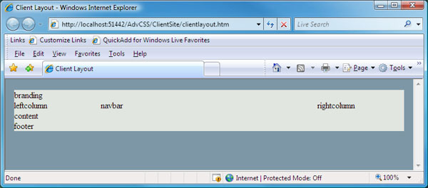
/* clientstyles.css */

/* Block all default margins and padding */
* {
  margin:0;
  padding:0;
}

body{
  background-color:#7E97A6;
}

/* Wrapper contains the layout */
#wrapper{
  width:45em;
  margin: 20px auto 0 auto;
  background-color:#E2E6E0;
}

#leftcolumn{
  width:10em;
  float:left;
}

#rightcolumn{
  width:10em;
  float:right;
}  Important: The FloatTutorial link in the Supplementary Material section offers some cool and imaginative ways to use floats.
  Note:
Don't confuse layout.htm and layoutstyles.css from Lesson 3 with
clientlayout.htm and clientstyles.css from that lesson's assignment.
Note:
Don't confuse layout.htm and layoutstyles.css from Lesson 3 with
clientlayout.htm and clientstyles.css from that lesson's assignment.