 Tip:
The LoremIpsum.txt file in the AdvCSSCourse folder contains similar
nonsense text. You can use it to copy and paste nonsense text to any
page at any time.
Tip:
The LoremIpsum.txt file in the AdvCSSCourse folder contains similar
nonsense text. You can use it to copy and paste nonsense text to any
page at any time.
Chapter 1: Thinking in Styles
Hello, and welcome back! In today's lesson, we're going to create some style rules for the main content division of our page layout. Along the way, we'll talk about some general strategies for making the most of CSS. We'll start with a term you'll likely come across as you explore resources for Web developers on the Internet: semantic markup.
If you open the layout.htm file and look at the tags you've added, you'll notice things are still fairly clean and uncomplicated in the body section of your page. Under the head, there's just a pair of tags that define the page body. Inside the body are pairs of div tags that define the wrapper, branding, navbar, content, and footer divisions. And there's a sentence of text in each division:
<body>

<!-- Wrapper sets the layout width -->

<div id="wrapper"> <div id="branding">

 I am in the branding division

 </div><!-- End branding --> <div id="leftcolumn">

 I am in the leftcolumn division

 </div><!-- End leftcolumn --> <div id="navbar">

 I am in the navbar division

 </div><!-- End navbar --> <div id="content">

 I am in the content division

 </div><!-- End content --> <div id="footer">

 I am in the footer division

 </div><!-- End footer -->
</div><!-- End wrapper -->

</body>
Right now, your layout.htm is a good example of what CSS experts refer to as semantic markup. All the tags define what each element is, but not how the content looks. For example, you don't see anything that would affect the style of the elements.
There are no align= attributes or <font> and </font> tags. You have no <br /> tags or characters trying to push things into position and no <table>, <tr>, or <td> tags.
You just have clearly named divisions, comments, and a little sample text. That's a good thing. That's what semantic markup is about— keeping stylistic matters outside of the tags as much as possible.
Creating semantic markup isn't difficult. It's mainly about breaking the old habit of creating and styling each element in each page, one page at a time. You want to try to stop thinking in those terms and start thinking of designing the general look and feel of the entire Web site.
Many developers and designers work with nonsense text (also called placeholder text) when designing the look and feel of a site. This allows the designer to stay focused on the style of the text rather than on specific content in a site.
Open your layout.htm page for editing. Remove the sentence I am in the content division from between the tags that define the content division.
Copy
and paste the following nonsense text into the page to replace the
sentence you just deleted. Make sure you put the nonsense text between
the <div id="content"> and </div><!--End content -->
tags in the page. You'll be creating styles for the content division
here; so, you need to put the nonsense text in that content division to
check your work as you go.
<h1>Lorem ipsum</h1><p>Lorem
 ipsum dolor sit amet, consectetur adipisicing elit, sed do eiusmod
tempor incididunt ut labore et dolore magna aliqua. Ut enim ad minim
veniam, quis nostrud exercitation ullamco laboris nisi ut aliquip ex ea
commodo consequat.</p> <ul>

<li>Quis autem vel eum iure reprehenderit.</li>

<li>Voluptate velit esse, quam nihil molestiae consequatur.</li>

<li>Et harum quidem rerum facilis.</li>

</ul>
<p>Nam libero tempore, qumme soluta
 nobis est eligendi optio, lumque nihil impedit, quo minus id, quod
maxime placeat, facere possimus, omnis voluptas assumenda est, omnis
dolor repellendus. Temporibus autem quibusdam et aut officiis debitis
aut rerum necessitatibus saepe eveniet, ut et voluptates repudiandae
sint et molestiae non recusandae.</p>
|
Save
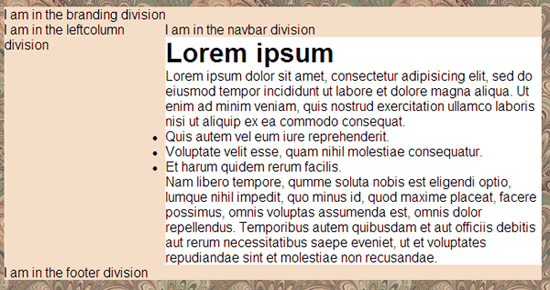
the page, and view it in your browser. You might be shocked to see the
results. You might assume you did something wrong. Before you jump to
conclusions, this is what the page looks like even with the nonsense
text properly placed between the <div id="content"> and </div><!-- End content --> tags.
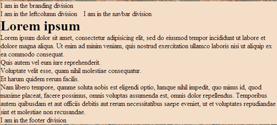
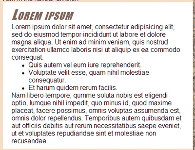
Surely, this doesn't look right. The new nonsense text isn't supposed to be in the leftcolumn division. So, what's up? The fact is everything is working exactly as it should.
By default, a division is only as tall as it needs to be to contain its content. The leftcolumn division contains only one sentence of text; so, it's quite short. It's just tall enough for the sentence I am in the navbar division to be up next to it. All the rest of the text on the page naturally wraps under that short leftcolumn division.
But this isn't how you want the page to look. So, now the question is, how do you make it look the way you want it to look?
I'll tell you what everyone else does. They set the left margin of the content division equal to the width of the leftcolumn division. That'll prevent text from the main content division from reaching the left side of the page.
Let's mosey on over to Chapter 2 and give it a try.
Chapter 2:
Styling the Content Division
Now that you have some sample text in your layout's main content division, you can start styling that division and its elements. You need to fix the left margin so that the text in the content division doesn't wrap under the leftcolumn division. Since margins are a stylistic (CSS) thing, you'll define the margin in the style sheet (layoutstyles.css), but not the page.
Open your layoutstyles.css file. Take a quick look at the #leftcolumn{} style rule so you can see how wide you've made the leftcolumn. In the code below, you can see that column is 12em wide.
#leftcolumn{

  width:12em;

  float:left;

}
So, that means you want to make the left margin of the content division 12em wide, too. It's easy to forget that if you later change the width of the leftcolumn, you'll also need to change the left margin of the content division. So, you'd be wise to write a little note to yourself in your code as a reminder. Make sure you enclose the reminder in the correct CSS comment characters, like this:
#leftcolumn{

 /* Remember, content left margin must match this width */

  width:12em;

  float:left;

}
The reminder is just that—a reminder. You still
have to create a style rule to set the left margin of the content
division to 12em. So, add a new style rule for the content division.
Remember, its selector needs to be #content because the division is
named using id="content" in the div tag of the page. You
might as well write yourself a little note in that style rule, too, as a
reminder that the left margin of the content division always needs to
match the width of the leftcolumn division. Here's how you can type up
that style rule in your style sheet:
#content{
/* Left margin must match leftcolumn width */
margin-left:12em;
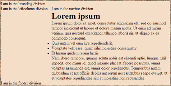
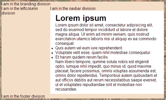
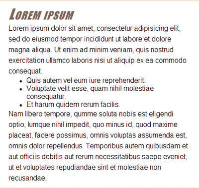
}Save your style sheet, and refresh the page in your browser. That's more like it!
Of course, you can style your content division any way you want. If you browse around the Web and look at sites that use this sort of layout, you might notice that many use black text against a white background for their main content division. They do that because virtually all readability studies have shown that people are more inclined to read black text against a white background than any other color combination. It's no coincidence that most print publications—newspapers, books, and magazines—also use black text against a white background.
For the sake of example, let's just see how our current content division looks with the black-on-white color combination. To make it happen, just add two more descriptors to your current #content style rule.
#content{

 /* Left margin must match leftcolumn width */

  margin-left:12em;

  background-color:#fff;

  color:#000;

}
Save the style sheet after making your changes. The content division now has the white background color and black text.
Things are still looking a little strange inside that content division. This isn't a big deal. You just have some more styling to do. Let's start with a base font.
Setting a Base Font
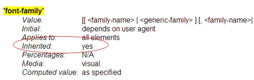
Before you start assigning fonts to individual elements in a site, be aware that the CSS font-family property is an inherited property. That means when you apply it to an element in your page, it applies to that element plus all descendants of that element.
Not all CSS properties are inherited properties that cascade down the document tree. You can tell which ones are when you look them up in the W3C specs. When you look up font-family in the W3C specs, you see yes next to Inherited.
|
Right now, the document tree for our layout.htm page looks like this:
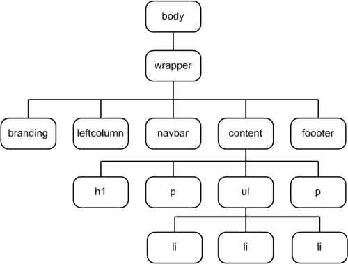
So, if we set a font for the body element, which is up high in the document tree, that new font should apply to all the text that's currently in the page. Let's try it.
Let's suppose that rather than use the browser default serif text, you want to use a sans-serif font. You always want to create a font wish list, because you never know exactly what fonts are on a user's computer. So, let's specify Arial and Helvetica as our preferred fonts and the generic sans-serif font as a last resort.
You already have a style rule for the body element in your layoutstyles.css file. So, add a font-family descriptor to that style rule now.
body {

  background: #856E5E url(images/fabric01.jpg);

  font-family: Arial, Helvetica, sans-serif;

}
Save your style sheet, and refresh your browser. Now all the text in the page takes on the new font.
All the text on the page takes on the new font for two reasons:
Let's head over to Chapter 3 now and create some style rules to make the text look better.
Chapter 3:
Styling the Content
Division Elements
You still have more work to do in the content division of your layout. Things are looking a little strange because, like many professional Web developers, you put a universal style rule in your style sheet to block all browser default margins and padding. You'll see that kind of thing often in style sheets. It looks like this:
*{

  margin:0;

  padding:0;

}
Blocking all the default margins and padding leaves the responsibility of defining those things to you. You don't want to be random and haphazard about it. You want to be very specific about how you apply some of your styles. This is how you maintain creative control over an entire Web site.
For now, let's focus on styling the content division. The text inside the content division could use a little empty space around it. You can use the CSS padding property to put some extra space around the inside border of the content division. Unlike the margin property, which puts extra empty space outside an element, the padding property puts extra space inside the element.
The padding property is a shorthand property like margin. You can specify padding for four sides individually in top, right, bottom, or left order. Or you can use two units of measure, where the first one applies to the top and bottom, and the second applies to the left and right. Or you can use one unit of measure to define all four edges.
For
your working example, put 10 pixels of padding at the top and bottom of
the content division and 20 pixels at the left and right sides. You
already have a style rule for the content division in layoutstyles.css.
So, you want to add a padding:10px 20px; to that #content style rule.
#content{

 /* Left margin must match leftcolumn width */

  margin-left:12em;

  background-color:#fff;

  color:#000;

 padding:10px 20px;

}
Padding always has the same background color as the element to which you apply it. So, now, we have a little extra white space around text in the content division. If you save the style sheet and refresh the page in the browser, it should look like this.
Things look a little better, but there's still more you can do. You might give the heading a different font and some color. You could create a style rule that applies to all headings in all divisions. But you don't know how you might use headings in the branding and other divisions. So, you could use a descendant selector to create a style rule that applies only to headings in the content division.
A descendant selector is a style rule that has two or more element names or types, separated by a blank space. For instance, to create a style rule for h1 elements in the content division only, we need a new style rule that looks like this:
#content h1{

}
You need a # sign in front of content because that refers to this tag: <div id="content">. You don't need a # sign in front of h1 because h1 is an XHTML element expressed with <h1> and </h1> tags.
The order of the names in the selector is important. The h1 must come after #content in the selector. This indicates that inside the division named content, this style applies to all h1 elements. The style rule has no effect on h1 elements outside the division named content.
How you style h1 elements in the content division is entirely up to you. You can use any valid CSS properties you like. Here's an example where I've applied several CSS properties to h1 elements in the content division. I've also put in a little comment above the style rule as a reminder of its purpose. You can add that comment and style rule to the bottom of your layoutstyles.css file now to try it out:
/* Applies to h1 elements in the content division */
#content h1{
font-family: Charcoal, Impact, sans-serif;
color:#806659;
font-weight:normal;
font-style:italic;
font-variant:small-caps;
letter-spacing:0.08em;
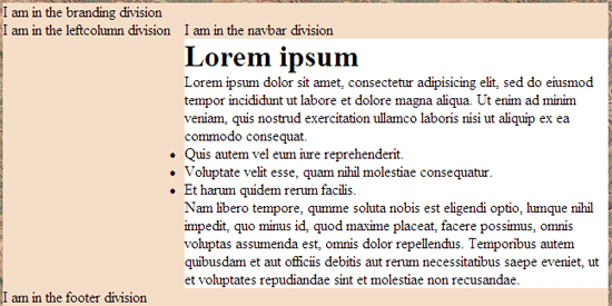
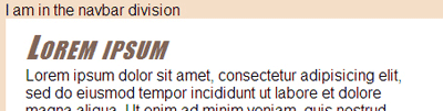
}Save your style sheet, and refresh your browser. Here's how the new style rule looks when applied to the h1 element in the content division:
|
You don't need to stop there. You can create style rules that apply to paragraphs and lists in the content division as well. For instance, that unordered list in the content division still looks goofy. Adding a little extra padding to its left side would indent it more and probably make it look better.
But once again, you don't necessarily want to create a style rule that applies to all unordered lists in all divisions. You just want to style unordered lists in the content division for now. So, your style rule for the unordered lists needs a selector.
#content ul{}
Exactly how much left padding you add to unordered lists is up to you. Why don't you try 40 pixels for the padding and see how that looks? Once again, you can put a comment above the style rule as a reminder to its purpose. So, go ahead and add the following comment and style rule to your layoutstyles.css now.
/* Applies to unordered lists in the content division */

#content ul{

  padding-left:40px;

}
Save your style sheet, and refresh your browser. Every item in the unordered list moves in by 40 pixels.
The content division looks a little better now. But don't you think the text might look a little better with some spacing between the lines?
You can use the line-height property to put some extra space between the lines. The em unit of measure is good for specifying line heights, because it scales to the text size. If you want double-spacing, just set the line height to 2em (twice the font size). If you want one-and-a-half spacing, use 1.5em. Let's try 1.5em, but let's not set everything to that line spacing. Let's use it on paragraphs in the content division for starters. Add this style rule to your layoutstyles.css file:
#content p{

  line-height:1.5em;

}
Save and refresh to see how it looks. Note the extra space between lines in the paragraphs.
That looks a little better, except the unordered list looks a little out of place with single spacing.
Before we jump in and change it, let's head over to Chapter 4 and consider our options.
Chapter 4:
Applying a Style Rule
to Multiple Elements
As you've seen, CSS is a very flexible language for designing Web sites. In the previous chapter, you learned to use descendant selectors to create style rules that apply to multiple elements in the content division only.
You can also create a style rule that applies to multiple elements. The main trick is to separate each element that the style applies to with a comma. For example, here's a style rule that applies to h1, h2, and h3 elements in the division named content.
/* Styles h1, h2, and h3 style rules in the content division */

#content h1, #content h2, #content h3{

  font-family: Charcoal, Impact, sans-serif;

  color:#806659;

  font-weight:normal;

  font-style:italic;

  font-variant:small-caps;

  letter-spacing:0.08em;

}
Putting all those selectors into one style rule saves you from having to create three separate style rules that apply the same style. Also, it ensures that the headings in the content division share those stylistics attributes. If you ever want to change something in all the headings, you need only make the change in that one style rule.
Of course, when you use a single style rule to style multiple elements, you can't put in descriptors that make the elements different from one another. You can only put in descriptors that make them the same.
However, you can still add style rules for the individual elements that do make them different. For example, you could set a size for each type of heading by adding three more style rules under that one, like this:
/* Styles h1, h2, and h3 style rules in the content division */

#content h1, #content h2, #content h3{

  font-family: Charcoal, Impact, sans-serif;

  color:#806659;

  font-weight:normal;

  font-style:italic;

  font-variant:small-caps;

  letter-spacing:0.08em;

}/* Size h1 headings in the content division */

#content h1{

  font-size:2em;

}
/* Size h2 headings in the content division */

#content h2{

  font-size:1.5em;

}

/* Size h3 headings in the content division */

#content h3{

  font-size:1.25em;

}
So, now, the headings all share some stylistic attributes, varying only in size.
You can also change the style of any single style. For example, let's say you don't want the h3 headings to be italic. For whatever reason, you want them to have the normal font style. Not a problem. You just have to add one more descriptor to the #content h3 style rule that says those headings should show normal text rather than italics, like this:
/* Size h3 headings in the content division */

#content h3{

  font-size:1.25em;

  font-style:normal;

}
Go ahead and replace your current #content h1 style rule and comment with the one above. And then add in the smaller style rules that size each of the heading styles.
You won't see any change in the page because there aren't any h2 or h3 elements in the content division right now. One of the nice things about working with nonsense text is that you can just throw in any element or content into the page to try things out.
Let's move on to Chapter 5 and talk about that some more.
Chapter 5:
It's All About the Site
As I've mentioned many times, one of the big challenges with traditional HTML is the whole act of creating and styling every element and page one at a time. We're not really doing that here. Here we're creating a style sheet that will apply to all the pages in a site. In other words, we're designing a Web site, not a bunch of individual elements.
When you do get around to creating the actual pages, you won't have to style the elements individually at all. Every heading, list, and paragraph you put into every page will obey the styles you set forth in your external style sheet automatically. In other words, you'll still have semantic markup because all the styling will be out in the external style sheet.
You can get a sense of that by opening the layout.htm in an editor and just sticking in some new elements that abide by the new style rules you put in the style sheet. But do keep in mind that those style rules apply only to h2 and h3 elements in the content division. So, to test them out, you have to put the new h2 and h3 elements in the content division of the layout.htm page.
While you're at it, add any other elements you think you might use in your actual site. For example, do you think you might need numbered lists in your site? No problem. Just stick one into layout.htm. Go ahead and put the following tags and text in the content division of layout.htm:
<h2>Heading Two Here</h2>

<h3>Heading Three Here</h3>
<ol>
<li>I am an ordered list</li>
<li>Yippie yie yo ki-yay</li>
<li>End of ordered list</li>
</ol>
|
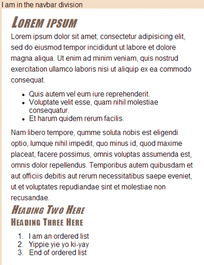
Save your page, and refresh your browser. If necessary, scroll down to where you put in those headings and verify that they obey the new style rules. Here's how things should look in that part of the content division:
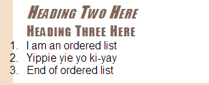
So, you can see that the h2 and h3 elements indeed obey the style rule set in the style sheet.
So, why does the ordered list look so wacky? There's a very simple reason for that. We haven't put anything in our style sheet that says how we want those elements to look. But hey, it's never too late to add or change styles. Nothing is set in stone.
You have a couple of
choices here. You could create a new style rule for ordered lists in the
content division. Or, if you just want them to have the same basic look
and feel as unordered lists, you can add a comma and #content ol to the #content ul style rule you already have in layoutstyles.css, as shown below.
/* Applies to all lists in the content division */
#content ul, #content ol{
padding-left:40px;
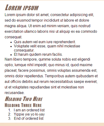
}Notice in the style rule above, I also changed the comment—not for any technical reason, but now the comment accurately describes the true purpose of the style rule. Save your style sheet, and refresh your browser window to see how things are shaping up. Your ordered list is now indented like the unordered list.
Now that I look at it, both of those lists could stand to have a little more space above and below them. You can change that by adding some padding to the top and bottom of the ul and ol elements. Keep the 40-pixel left padding. Set the top and bottom padding to 10 pixels, and leave the right padding set to zero. You can do that by changing the padding descriptor in the style rule for ul and ol elements in the content division, like this:
/* Applies to all lists in the content division */
#content ul, #content ol{
padding:10px 0 10px 40px;
}Save your style sheet, and refresh your browser to see how that looks.
Of course, there's no reason to stop there. You can just keep styling things to your heart's content until everything looks just the way you like. There's virtually no limit to how you can style things. And you're never stuck with anything you don't like.
Compared to doing things the old traditional HTML way, this really is a whole new way of doing Web design and development. It's even a completely new way of thinking about Web sites. It takes some getting used to. But the rewards are great. In the long run, you'll create much better sites in much less time, and those sites will be much easier to grow, maintain, and modify. That's why the vast majority of Web sites today use CSS external style sheets.
Conclusion
Much of modern Web development centers around the concept of semantic markup, or separating content and structure from presentation. You put all your tags, text, pictures, and such in your Web page (the .htm or .html file), just as in traditional HTML. But for the most part, that's all you put in the page. Try to avoid using stylistic attributes like align= and <font> and </font> tags as much as possible. Do all your styling with CSS.
It also helps to think in terms of designing a Web site, not just individual elements on individual pages. CSS is rich with tools and techniques to design your site anyway you wish. And it's very flexible. You're never stuck with any particular style. You can add or change a style rule in a style sheet at any time.
Remember that the goal isn't for all of us to create exactly the same Web site. The goal is to understand the tools and techniques available so you can design and create your own Web sites. The examples are just that—examples. Feel free to use them, abuse them, tweak them, or reject them according to your own tastes and needs.
In the next lesson, you'll learn techniques for organizing your style sheets and some cool tips and tricks for styling elements.
Supplementary Material
|
Guide to Semantic Markup http://www.blue-anvil.com/archives/guide-to-semantic-mark-up |
| Click this link for a quick, no-nonsense guide to semantic markup. |
|
Semantics, HTML, XHTML, and Structure http://brainstormsandraves.com/articles/semantics/structure/ |
| Here's another page that provides a good overview of semantic markup and using the right tags in the right places. |
|
Lorem Ipsum http://en.wikipedia.org/wiki/Lorem_ipsum |
| This is Wikipedia's encyclopedic description of the history and purpose of Lorem ipsum text. |
|
CSS Reference http://www.javascriptkit.com/dhtmltutors/cssreference.shtml |
| Here's a very brief CSS Properties reference that has an Inherited column that tells whether or not the style is inherited by descendant elements in the document tree. |
|
CSS Properties http://comptechdoc.org/independent/web/html/guide/htmlcssprop.html |
| Here you'll find another brief CSS Properties reference that tells you which properties are inherited and which aren't. |
|
CSS: Use Descendant Selectors http://www.websiteoptimization.com/speed/tweak/descendant/ |
| Click this link for tips on making the most of descendant selectors in your style rules. |
|
Defining and Using Descendant Selectors http://www.adobe.com/devnet-archive/dreamweaver/articles/css_best_practices_pt6.html |
| This page covers creating and using descendant selectors in Dreamweaver. |
|
Descendant Selectors http://www.westciv.com/style_master/academy/css_tutorial/selectors/descendant_selectors.html |
| More useful information on using descendant selectors in your Web designs. |
|
CSS: Group Selectors and Declarations http://www.websiteoptimization.com/speed/tweak/grouping/ |
| This site gives information on using multiple selectors in a style rule. |
FAQs
<!DOCTYPE html PUBLIC "-//W3C//DTD XHTML 1.1//EN"
"http://www.w3.org/TR/xhtml11/DTD/xhtml11.dtd">
<html xmlns="http://www.w3.org/1999/xhtml">
<head>
<title>layout.htm</title>
<link href="layoutstyles.css" rel="stylesheet" type="text/css" />
</head>
<body>
<!-- Wrapper sets the layout width -->
<div id="wrapper">
<div id="branding">
I am in the branding division
</div><!-- End branding -->
<div id="leftcolumn">
I am in the leftcolumn division
</div><!-- End leftcolumn -->
<div id="navbar">
I am in the navbar division
</div><!-- End navbar -->
<div id="content">
<h1>Lorem ipsum</h1>
<p>Lorem
ipsum dolor sit amet, consectetur adipisicing elit, sed do eiusmod
tempor incididunt ut labore et dolore magna aliqua. Ut enim ad minim
veniam, quis nostrud exercitation ullamco laboris nisi ut aliquip ex ea
commodo consequat.</p>
<ul>
<li>Quis autem vel eum iure reprehenderit.</li>
<li>Voluptate velit esse, quam nihil molestiae consequatur.</li>
<li>Et harum quidem rerum facilis.</li>
</ul>
<p>Nam
libero tempore, qumme soluta nobis est eligendi optio, lumque nihil
impedit, quo minus id, quod maxime placeat, facere possimus, omnis
voluptas assumenda est, omnis dolor repellendus. Temporibus autem
quibusdam et aut officiis debitis aut rerum necessitatibus saepe
eveniet, ut et voluptates repudiandae sint et molestiae non
recusandae.</p>
<h2>Heading Two Here</h2>
<h3>Heading Three Here</h3>
<ol>

<li>I am an ordered list</li>

<li>Yippie yie yo ki-yay</li>

<li>End of ordered list</li>

</ol>
</div><!-- End content -->
<div id="footer">
I am in the footer division
</div><!-- End footer -->
</div><!-- End wrapper -->
</body>
</html>/* layoutstyles.css */
/* Universal style rule */
*{
/* Block all browser default margins and padding */
margin: 0;
padding: 0;
/* Temporary borders */
/* border: dashed 1px #f00; */
}
body {
background: #856E5E url(images/fabric01.jpg);
font-family: Arial, Helvetica, sans-serif;
}
#wrapper{
width: 40em;
background-color: #F4DEC8;
/* Put 20px margin above the wrapper */
/* Set right and left to auto for centering */
margin: 20px auto 0 auto;
}
#leftcolumn{
/* Remember, content left margin must match this width */
width:12em;
float:left;
}
#content{
/* Left margin must match leftcolumn width */
margin-left:12em;
background-color:#fff;
color:#000;
padding:10px 20px;
}
/****** Style rules for the content division *****/
/* Applies to paragraphs in the content division */
#content p{
line-height:1.5em;
}
/* Applies to all lists in the content division */

#content ul, #content ol{

     padding:10px 0 10px 40px;

}
/* Styles h1, h2, and h3 style rules in the content division */
#content h1, #content h2, #content h3{
font-family: Charcoal, Impact, sans-serif;
color:#806659;
font-weight:normal;
font-style:italic;
font-variant:small-caps;
letter-spacing:0.08em;
}
/* Size h1 headings in the content division */
#content h1{
font-size:2em;
}
/* Size h2 headings in the content division */
#content h2{
font-size:1.5em;
}
/* Size h3 headings in the content division */
#content h3{
font-size:1.25em;
font-style:normal;
}/* Applies to all lists in the content division */
#content ul, #content ol{
padding:10px 0 0 40px;
}
/* Applies to all list items in the content division */
#content li{
margin-bottom:10px;
}Assignment
|
font-family: Geneva, Tahoma, sans-serif;
text-align:center;font-family: "Apple Chancery", "Brush Script MT", "Monotype Corsiva", cursive;
color:#45322F;text-align:left;
font-size:0.8em;
line-height:1.25em; padding: 5px 0px 5px 30px; 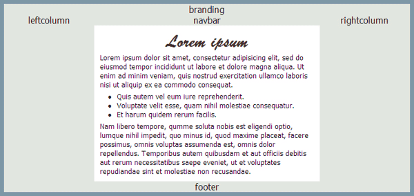
 Right now, we only have one h1 element in the content division. But
rest assured that any additional h1 elements you add to the content
division would have the same style.
Right now, we only have one h1 element in the content division. But
rest assured that any additional h1 elements you add to the content
division would have the same style.