
Butterfly picture
Chapter 1:
Sizing and Positioning Elements
Welcome back. Today we're going to talk about sizing and positioning elements on a page. The topic is becoming increasingly important, because the days when you could assume that the user was viewing a page at 800 x 600 or 1024 x 768 are over.
Current estimates still put 1024 x 768 as the most common resolution (about 50% of people who view your page). But the other half might be using 800 x 600, 1280 x 1024, 1440 x 990, 1680 x 1050, 1920 x 1200, 2560 x 1600, or something else.
An elastic layout, like our working example, gives the user more flexibility in sizing things on the screen. An elastic layout holds together well regardless of whether the user presses CTRL++, CTRL+-, or chooses View > Text Size from Internet Explorer's menu bar to change the text size. This is good, as it allows the user some control over how they experience your site. It's also in keeping with the modern idea of making your pages accessible to people with handicaps, including folks with poor vision who may need to magnify the page to a very large size.
In this lesson, we'll explore various ways of putting elements on a page in ways that support the elastic layout. But first, in this chapter, we need to talk about something you need to be aware of in images that can grow and shrink in the Web browser.
Image Pixelation
In the ideal elastic layout, everything on the page, including graphic images, will grow when the user chooses browser options to increase the text size. As the magnification of an image increases, so does its pixelation. To illustrate what I mean, take a look at the nice, clean butterfly image below. There's no pixelation in that one. It looks just fine.
Here's a pixelated version of the same image.

The pixelated image looks blurry and blotchy. To create the pixelated image, I shrunk the original to a smaller size. Then, I zoomed in to magnify it. The higher the magnification means the more pixelated the image.
When creating your own graphic images, you might want to think in terms of making your images a little larger than their initial size in the page. That way, they're less likely to be pixelated if the user magnifies the page. We'll work through some examples shortly. But first, here's another thing to think about.
Aspect Ratio
All images have an aspect ratio. The aspect ratio is the ratio of the image's height to its width. Changing an image's aspect ratio distorts the image. It's like a funhouse mirror. Here's an example of where I've changed the aspect ratio in a way that makes the image wider:

Here's the same butterfly image distorted by changing its aspect ratio so it's taller.

When specifying the size of images in your Web pages and style sheets, you always want to do so in a way that prevents such distortions. You can easily accomplish this by specifying the size of one dimension only—either width or height, but not both. Let's head over to Chapter 2 now and explore the possibilities.
We'll use the branding bar in our sample page layout as a working example.
Chapter 2:
Creating a Branding Bar
Most Web sites display a header across the top of each page to give pages in the site a consistent identity. That top bar is often referred to as the branding bar, because it's like the brand name of any product you buy in a store. It clearly identifies the creators of the Web site.
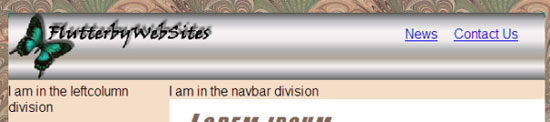
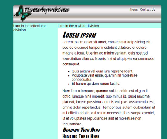
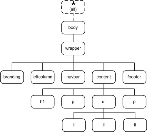
In our layout.htm page, the branding division provides that space at the top of the page. Currently, its tags look like this in the layout.htm page.
<div id="branding">

  I am in the branding division

</div><!-- End branding -->
It doesn't look like much in the browser, but because it's a division, it's as wide as its containing element (the wrapper). It has a transparent background; so, the wrapper background color shows through. And it's just tall enough to show its content—one line of text.

You can put anything you want in the branding division, such as text, pictures, or whatever you'd like. Some Web sites use a single graphic image for the branding bar. To create such an image, you need a good graphics program like PhotoShop, Illustrator, or Paint Shop Pro. And you need the skills to use that program. I realize that not everyone in this course has those products or skills. That's okay. We'll look at other ways to fill the branding division in later chapters. For now, I'd like to use a hypothetical single image as a working example only.
We know that the branding division is 40em wide because it's as wide as the wrapper. And we know that the wrapper is 40em wide because we made it that wide in the #wrapper style rule in the layoutstyles.css style sheet:
#wrapper{

  width: 40em;

  .

}
|
A measure of 40em is equivalent to 640 pixels because 1em equals 16px. So, let's say you're about to create a single graphic image for the branding bar. You could make that image 640 pixels wide. But in an elastic layout, the image could grow to almost any width. At extremely high magnifications, it would start to look pixelated.
So, you might be wise to start with a wider image. The question is, how wide? You don't want to make the image enormous. Then the file will be huge and take more time to download. So, where‘s the happy medium?
Well, when you consider that 1024 is still a common width, it's a number worth considering. And even if the user expands that to 2560 pixels wide, it's still only 2.5 times the original width. The pixelation shouldn't be too bad at that magnification. So, 1024 might just be a good choice.
So, for the sake of example, let's suppose you or a graphics artist creates an image that's 1024 pixels wide to use as a branding bar. That image, which I'll refer to as bbImage.jpg in this working example, looks like this. (Well, not quite that ugly or generic, but I think you get the idea):

|
Now let's assume you put that image in a folder named images in your Web site folder. How do you show the image in the branding bar? And how do you size it so that it grows and shrinks with the rest of the layout? And how do you specify the size of the image in a way that will prevent it from losing its aspect ratio and becoming distorted?
Here are a couple of important facts to help with the last question:
So, when specifying the size of an image in CSS, the trick is to specify a width only or a height only. That way, the image will never lose its aspect ratio and get all distorted looking.
What unit of measure should we use to specify the size of the image so it'll grow and shrink with the rest of the layout? Here's another little CSS fact that might help with that:
The next question is, how do we put the image in the branding division? If you're familiar with CSS, you might say, "As a background image." Unfortunately, that only works in fixed layouts. You can specify a size for a background image in CSS 2.1. So, if you use a background image, it won't shrink and grow with the rest of the layout.
|
This leaves us with only one way to put the graphic image in the branding division: the <img and /> tag. This means you have to open up the page (layout.htm, in this example) and put in the <img /> tag there.
So, let's assume the image bbImage.jpg is in a subfolder named images. You want the image to act as your full-width branding bar. Put the tag between the tags that define that division. You can use an inline style to set the image width to 100% as below.
<div id="branding">

  <img src="images/bbImage.jpg" alt="logo" style="width:100%" />

</div><!-- End branding -->
In the Web
browser, the image should fill the branding bar, as below. And no
matter how much you mess with View > Text Size in Internet Explorer
or the CTRL++ and CTRL+- keys in other browsers, it should grow and
shrink right along with everything else on the page. You don't even need
to do anything in the style sheet because width:100% is all you need in terms of styling.
The basis of the entire preceding hypothetical example is on the notion of using a single graphic image that spans the full width of the layout. What if you don't want to do things that way? What if you want images and text in the branding bar or page footer and you don't want any to be as wide as the whole layout? Well, you could set the image heights to 100% rather than their widths to get the same effect.
Follow me to Chapter 3, and I'll show you.
Chapter 3:
Using Floats to Fill a Division
Using a single graphic image as a branding bar isn't the only way to go. The branding division is a division just like any other, and you can fill it with whatever you fancy. The same is true for the footer.
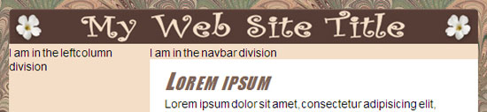
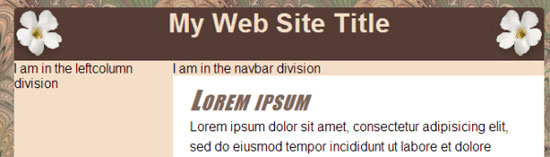
As an example, let's try a completely different method of filling the branding division. We can start with a simple title. Right now, you may have an image tag in there, or placeholder text. It doesn't matter. Open the layout.htm in your editor. Then, put a simple level-1 heading in the branding division, like this. (The tags for the branding division are already in the page.)
<div id="branding">

  <h1>My Web Site Title</h1>

</div><!-- End branding -->
Save the page, and refresh the browser. The new heading appears in the branding bar, as below.
Now you can start styling the branding division. Since you're not using a single graphic image in this case, it would be in your best interest to do the styling in the layoutstyles.css style sheet,. That way, if you ever decide to change something later, when there are many pages with the branding bar, you can do so from the style sheet.
So, go ahead and open up layoutstyles.css. Add a new style rule for the branding division. Can you envision what that style rule looks like? In the page, the tag that starts that division is <div id="branding">. So in the style sheet, the style rule to style that division needs to look like this:
#branding{}
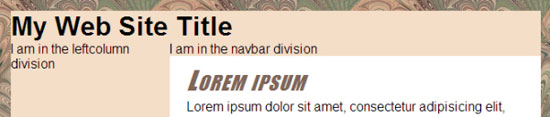
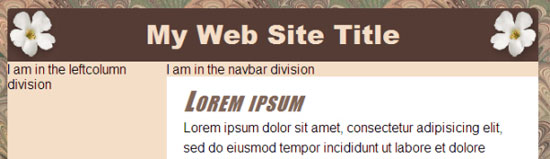
Of course, you can style the branding division any way you like using any CSS properties you desire. As a working example, give it a height of 4em, a brown (#553c35) background color, a tan (#f4dec8) foreground color for text, and centered text alignment, like this:
#branding{

  height:4em;

  background-color:#553c35;

  color:#f4dec8;

  text-align:center;

}
Save the style sheet, and refresh the layout.htm page in the browser. Here's how the new style rule plays out.
You could do more with the text, but let's talk about putting in a couple of graphic images that will grow and shrink with the page layout.
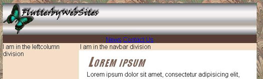
You'll need a couple of sample graphic images to illustrate. So, for the sake of example, let's say you want to put in the bbImgLeft.jpg and bbImgRight.jpg images, as shown below.
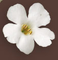

I made both images a little larger than they need to be to fit within that 4em height. As before, I did that to avoid pixelation if the user magnifies the layout, causing the images to grow.
Once again, you can't use the CSS background-image property here, because that won't allow the images to shrink and grow with the rest of the layout. You need a couple of <img /> tags right in the page.
Let's suppose you want to put bbImgLeft.jpg at the left side of the branding division and put bbImgRight.jpg on the right side. You could use a table in the division to get everything right where you want it. But now that you know more about floats, there's really no need to use a table. You can just float the images into position.
You want to put these images in the branding division. So, you need to put the <img> tags inside the branding division of the page. Remember the rule about floated elements floating next to subsequent elements (tags) in the page? That means both <img> tags will have to go above the title that's already in the branding division.
Finally, you want these images to be as tall as the branding division but also to grow and shrink with the branding division. So, each image will need a height of 100%.
Once again, you can use inline styles for styling. These styles aren't ones you're likely to change after everything's in place. So, a style rule in the external style sheet probably isn't all that important for this particular situation.
So, here's how the two image tags will look in layout.htm, assuming bbImgLeft.jpg and bbImgRight.jpg are both in a subfolder named images.
<div id="branding">

 <img src="images/bbImgLeft.jpg" alt="flower"

 style="height:100%; float:left;" />


 <img src="images/bbImgRight.jpg" alt="flower"

 style="height:100%; float:right" />
<h1>My Web Site Title</h1>
</div><!-- End branding -->
Save the page, and refresh the browser. The images are at the left and right sides of the branding division, as planned.
The size of each image is 100% the height of the branding division. So, if you press CTRL + + or CTRL + - or choose View > Text Size in the browser, both images will grow and shrink along with everything else on the page.
I'm sure some of you are wondering how to get that My Web Site Title centered vertically in the division. Intuitively, you might think vertical-align:middle or the old valign= attribute would do the trick. But surprisingly, it won't. Vertical alignment applies to table cells, but not divs.
About the best you could do is add a style rule for that h1 element to layoutstyles.css, like this:
#branding h1{}
Use that to set the font, size, and other characteristics of the title. Add a little padding to the top to push it down a bit. You may have to play around with different settings to get it just right. Here's an example:
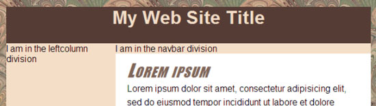
#branding h1{

  font-family:'Arial Black', Charcoal, Impact, Sans-serif;

  font-size:2em;

  padding-top:0.25em;

}
Here's how that plays out in the Web browser.
Let's mosey over to Chapter 4 and look at yet another way to position elements in a division.
Chapter 4:
Putting Links on a Picture
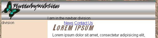
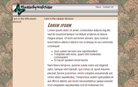
In this chapter, let's talk about another method of positioning elements with CSS. We'll need some kind of working example to illustrate the problem and solution. So, let's go back to the idea of using a single graphic image as a branding bar. This time, you'll use a slightly different branding bar that contains a picture, title, but also a lot of empty space, like this.

Let's suppose that the image is bbImg2.jpg and is in the images folder. You want to use it for your branding bar. You also want it to grow and shrink with other elements in an elastic layout. So, you can't use it as a background image. You have to use an <img /> tag in the layout.htm page. And you have to put that tag inside the tags that define the branding division, like this:
<div id="branding">

  <img src="images/bbImg2.jpg" alt="logo" style="width:100%" />

</div><!-- End branding -->
Now, here's an interesting challenge to ponder. Suppose you want to put some links inside the branding division, and you want them to be on the graphic image. We'll use Help and Contact Us as working examples. Even if those pages don't exist yet in your site, you can go ahead and create the links, just to get them into the page for styling. Here's a couple of sample links added to the branding division.
<div id="branding">

<img src="images/bbImg2.jpg" alt="logo" style="width:100%" />

<a href="news.htm">News</a>

<a href="contact.htm">Contact Us</a>

</div><!-- End branding -->
In the Web browser, the News and Contacts links are under, not on, the image, as shown below. (Your results might look a little different. Don't worry about that. We haven't styled anything yet.)
So, how do you get the links up and to the right so they're actually on that branding bar?
The answer is absolute positioning. Most of you probably know that absolutely positioned elements are outside the normal text flow. Therefore, graphic images and other text don't push them around.
You might also recall that absolutely positioned elements are placed relative to the viewport or a positioned containing block. That's a mouthful of jargon. So, let's take it one step at a time.
Let's start with the assumption that we want to absolutely position all hyperlinks we put in the branding division, because that's the only way we're going to be able to get them to appear on the large graphic image that's currently in that division.
Switch over to layoutstyles.css and add a style rule that applies only to hyperlinks (<a> tags) in the branding division. Add to that style rule the position:absolute to apply absolute positioning to all <a> tags in that division.
/* Absolutely position links in the branding division */

#branding a{

  position:absolute;

}
To specify the exact position of an absolutely positioned element, you use one vertical coordinate, top or bottom, plus one horizontal coordinate, left or right. Here are their meanings:
You have two separate hyperlinks in your branding bar. They won't have
exactly the same position in the page. So, you can't use a style rule to
position them both. The easiest thing to do might be to use inline
styles to position each one. Inline styles go right inside the tab. So,
it's back to layout.htm where you can see those tags.
It's not easy to know exactly where to place each item. So, you can start with a guess, check it, and then adjust and check again. Just keep doing trial and error until you find the position you want. For starters, I'll try the top and right coordinates shown in the inline styles below.
<div id="branding">

<img src="images/bbImg2.jpg" alt="logo"   style="width:100%" />

   <a style="top:1em;   right:8em;"   href="news.htm">News</a>

  <a style="top:1em;   right:2em;" href="contact.htm">Contact   Us</a>

</div>
<!-- End branding -->
I didn't need to include position:absolute in the inline styles, because that's already defined in the #branding a{} style rule in the style sheet.
Save and refresh your browser. Oops, that isn't quite right. The elements are being positioned relative to the viewport (Web browser window). They're not inside the branding division at all.

Actually, the links are behaving exactly as they should. They're positioning relative to the viewport, because the tags that define those elements aren't inside a positioned element. They're in the branding division, which is just an element with no particular positioning applied.
So, if you want to position the links relative to the branding division, you need to make the branding division a positioned element itself. The challenge is the branding division is right where you want it to be. You don't want to change its position. So, how can you make it a positioned element without actually changing its position?
The solution is to make the branding division a relatively positioned element, but not to change its location. To make that happen, you need to go back to layoutstyles.css and put position:relative in the #branding style rule, as shown below. While you're at it, take out the other descriptors that are currently in the #branding div. They no longer apply when you're filling the branding div with a single large image that's already sized to fill the width of the branding div. So, you end up with two #branding style rules—one that applies to the division as a whole, and the other applies to <a> tags contained within the division.
/* Make branding a positioned element, but don't move it */

#branding{

  position:relative;

}
/* Absolutely position links in the branding division */
#branding a{

  position:absolute;

}
Now the top and right coordinates in the <a> tags are relative to the top and right side of the branding division, but not the viewport. This puts the hyperlinks right inside the division.
The beauty of absolute positioning is that you can put an element anywhere you want. But you really need to understand how it works. The key issue is that whole business of elements positioning to the viewport versus a positioned element.
If the tags that define the absolutely positioned element are not contained within a positioned element, then the top, bottom, left, or right coordinates are calculated relative to the viewport—the entire browser window. This is fine when that's your intent. But that's not our intent in this particular example. Here we want to position the elements within the branding div.
When you want to position elements relative to a div (containing block), then that div itself has to be a positioned element. The problem is that you may already be happy with the position of that div and not want to move it. In that case, just add position:relative to the div's style rule. That will make it a positioned element without altering its current position on the page. But any absolutely positioned elements inside that div will position relative to that div rather than to the viewport.
|
Let's head over to Lesson 5 now and talk about styling those hyperlinks.
Chapter 5:
Styling Links
In the previous chapter, we used absolute positioning to get a couple of hyperlinks inside the branding division. What if you want to style those links some more so that they don't look like your standard blue, underlined hyperlinks?
You wouldn't necessarily want to create style rules that apply to all links in all divisions. So, you could create style rules with descendant selectors that apply only to links in the branding division. For example, this style rule, which we already added to layoutstyles.css, applies to all <a> tags in the branding division:
#branding a{
position:absolute;
}You could use that same style rule to set a font, size, color, text decoration, and so forth for those elements, like this:
#branding a{

  position:absolute;

  text-decoration:none;

  color:#000;

  font-size:0.8em;

}
You can also use the CSS pseudo-classes to define link, visited, hover, and active styles. But again, to prevent those styles from affecting other divisions, you need to use descendant selectors that limit the style to links in the branding division, like this:
/* Unvisited and visited links in branding bar */

#branding a:link, #branding a:visited {

  color:#000;

}/* Hover links in branding bar */

#branding a:hover{

  color:#0f0;

}
/* Active link in branding bar */

#branding a:active{

  color:#1bb498;

}
When using pseudo-classes, it's important to put them in the order shown above, lvha (link, visited, hover, active). Otherwise, they might not work as expected. In the above example, I want both unvisited and visited links to be black (#000). So, I used a single style rule to define the color of both types of links, but I maintained the required lvha order while doing so.
When testing hyperlinks and styles, the ones that take you to a non-existent page will show an error message when you attempt to open the non-existent page. But the link, visited, hover, and active styles will still apply, as though you actually did visit a page within your site.
Changing the Color Scheme
Before we close this lesson, I'd like to remind you that nothing is set in stone with CSS. You can make substantial changes to the general layout by changing just a few lines of code in your style sheet. For example, the image below shows how layout.htm looks with that alternate bbImg2.jpg image in the branding bar.
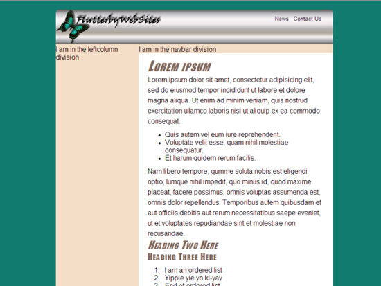
The metal image doesn't really go well with the background and other colors. The background image comes from the body style rule in layoutstyles.css, as shown below.
body {
background: #856E5E url(images/fabric01.jpg);
font-family: Arial, Helvetica, sans-serif;
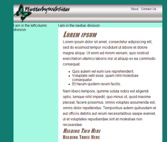
}You could easily replace the current background color and image with a simple background color, like this:
body {

  background-color: #117b6f;

  font-family: Arial, Helvetica, sans-serif;

}
Save and refresh to see the new background.
That beige background color doesn't look so good anymore. The background color is defined in the #wrapper style rule, shown below.
#wrapper{

  width: 40em;

  background-color: #F4DEC8;

  /* Put 20px margin above the wrapper */

  /* Set right and left to auto for centering */

  margin: 20px auto;

}
Change that background color to #B0FFF0 like this:
#wrapper{

  width: 40em;

  background-color: #B0FFF0;

  /* Put 20px margin above the wrapper */

  /* Set right and left to auto for centering */

  margin: 20px auto;

}
Save and refresh to see the new wrapper background color.
The heading colors don't look quite right anymore. Those get their color from this style rule in layoutstyles.css:
/* Styles h1, h2, and h3 style rules in the content division */

#content h1, #content h2, #content h3{

  font-family: Charcoal, Impact, sans-serif;

  color:#806659;

  font-weight:normal;

  font-style:italic;

  font-variant:small-caps;

  letter-spacing:0.08em;

}
Change the brown #806659 color to black (#000):
/* Styles h1, h2, and h3 style rules in the content division */

#content h1, #content h2, #content h3{

  font-family: Charcoal, Impact, sans-serif;

  color:#000;

  font-weight:normal;

  font-style:italic;

  font-variant:small-caps;

  letter-spacing:0.08em;

}
Save and refresh to see the results.
The layout has a whole new color scheme just by changing three lines of code in the style sheet. It would work even in a site that has dozens or even hundreds of pages based on that style sheet. It wouldn't be quite so easy in traditional HTML or a layout built on tables.
Conclusion
CSS offers a wealth of tools and techniques for sizing and positioning elements on Web pages.
When you put a graphic image inside a division, a width or height of 100% sizes the image to the division without changing its aspect ratio. In an elastic page layout, the image will grow and shrink with the text size without distorting.
You can float images to the left and right sides of a division. Setting their heights to 100% in an elastic layout allows them to grow and shrink with the rest of the layout.
You can place links and other elements over a graphic image using absolute positioning.
In the next lesson, we'll get to work on a navigation bar, which will make it easy for users to go from page to page within the site. See you there
.Supplementary Material
|
Pixel http://en.wikipedia.org/wiki/Pixel |
| Click this link for Wikipedia's encyclopedic description of pixels. |
|
Mountaintop Corners http://www.alistapart.com/articles/mountaintop/ |
| This page describes a simple method of rounding the corners of graphic images by coloring a few pixels at the corners. |
|
Visual Formatting Model http://www.w3.org/TR/CSS21/visuren.html |
| Here's the full scoop on CSS positioning and floats as defined in the official (and woefully technical) W3C specifications. |
|
CSS Positioning http://www.brainjar.com/css/positioning/ |
|
This page offers a tutorial on the various ways to position elements with CSS. |
|
Learn CSS Positioning in Ten Steps http://www.barelyfitz.com/screencast/html-training/css/positioning/ |
| Here you'll find a quick tutorial on CSS positioning. |
|
CSS Positioning http://www.w3schools.com/css/css_positioning.asp |
| Try this site for more useful information on CSS positioning, including techniques for handling overflow content. |
FAQs
p{

  background-color:yellow;

}


p{

  background-color:orange;

}/* Applies to h1 through h4 headings */
h1, h2, h3, h4{
font-family: Broadway, Playbill, Fantasy;
color: #009;
text-align:center;
}
/* Applies to h4 only */
h4{
text-align:left;
}/* Applies to h4 only */
h4{
text-align:left;
}
/* Applies to h1 through h4 headings */
h1, h2, h3, h4{
font-family: Broadway, Playbill, Fantasy;
color: #009;
text-align:center;
}
/* layoutstyles.css */


/* Universal style rule */

*{

  margin: 0;

  padding: 0;

  /* Temporary borders */

  /* border: dashed 1px #f00; */

}


body {

  background-color: #117b6f;

  font-family: Arial, Helvetica, sans-serif;

}


#wrapper{

  width: 40em;

  background-color: #B0FFF0;

  /* Put 20px margin above and below the wrapper */

  /* Set right and left to auto for centering */

  margin: 20px auto;

}


/********** Major layout divisions **********/

#branding{

  /* For absolutely-positioned hyperlinks */

  position:relative;

}


/** branding division hyperlinks **/

#branding a{

  /* Postions are set in tags in layout.htm */

  position:absolute;

  text-decoration:none;

  color:#000;

  font-size:0.8em;

}


#branding a:link, #branding a:visited{

  color:#000;

}


#branding a:hover{

  color:#0f0;

}

#branding a:active{

  color:#1bb498;

}


#leftcolumn{

  /* Remember, content and navbar left margin must match this width */

  width:12em;

  float:left;

}


#navbar{

  /* To be determined */

}


#content{

  /* Left margin must match leftcolumn width */

  margin-left:12em;

  background-color:#fff;

  color:#000;

  padding:10px 20px;

}


/* Applies to paragraphs in the content division */

#content p{

  line-height:1.5em;

}


/* Applies to all lists in the content division */

#content ul, #content ol{

  padding:10px 0 0 40px;

}


/* Applies to all list items in the content division */

#content li{

  margin-bottom:10px;

}


/* Styles h1, h2, and h3 style rules in the content division */

#content h1, #content h2, #content h3{

  font-family: Charcoal, Impact, sans-serif;

  color:#000;

  font-weight:normal;

  font-style:italic;

  font-variant:small-caps;

  letter-spacing:0.08em;

}


/* Size h1 headings in the content division */

#content h1{

  font-size:2em;

}


/* Size h2 headings in the content division */

#content h2{

  font-size:1.5em;

}

/* Size h3 headings in the content division */

#content h3{

  font-size:1.25em;

  font-style:normal;

}


#footer{

  /* To be determined */

}<!DOCTYPE html PUBLIC "-//W3C//DTD XHTML 1.1//EN"
"http://www.w3.org/TR/xhtml11/DTD/xhtml11.dtd">
<html xmlns="http://www.w3.org/1999/xhtml">
<head>
<title>layout.htm</title>
<link href="layoutstyles.css" rel="stylesheet" type="text/css" />
</head>
<body>
<!-- Wrapper sets the layout width -->
<div id="wrapper">
<div id="branding">
<img src="images/bbImg2.jpg" alt="logo" style="width:100%" />
<!-- Absolutely positioned in style sheet -->
<a style="top:1em;right:8em;" href="news.htm">News</a>
<a style="top:1em;right:2em;" href="contact.htm">Contact Us</a>
<!-- Pages in links above are purely hypothetical -->
</div><!-- End branding -->
<div id="leftcolumn">
I am in the leftcolumn division
</div><!-- End leftcolumn -->
<div id="navbar">
I am in the navbar division
</div><!-- End navbar -->
<div id="content">
<h1>Lorem ipsum</h1>
<p>Lorem ipsum dolor sit amet, consectetur adipisicing elit, sed
do eiusmod tempor incididunt ut labore et dolore magna aliqua. Ut enim
ad minim veniam, quis nostrud exercitation ullamco laboris nisi ut
aliquip ex ea commodo consequat.</p>
<ul>
<li>Quis autem vel eum iure reprehenderit.</li>
<li>Voluptate velit esse, quam nihil molestiae consequatur.</li>
<li>Et harum quidem rerum facilis.</li>
</ul>
<p>Nam libero tempore, qumme soluta nobis est eligendi optio,
lumque nihil impedit, quo minus id, quod maxime placeat, facere
possimus, omnis voluptas assumenda est, omnis dolor repellendus.
Temporibus autem quibusdam et aut officiis debitis aut rerum
necessitatibus saepe eveniet, ut et voluptates repudiandae sint et
molestiae non recusandae.</p>
<h2>Heading Two Here</h2>
<h3>Heading Three Here</h3>
<ol>
<li>I am an ordered list</li>
<li>Yippie yie yo ki-yay</li>
<li>End of ordered list</li>
</ol>
<p>This is a paragraph</p>
</div><!-- End content -->
<div id="footer">
I am in the footer
</div><!-- End footer -->
</div><!-- End wrapper -->
</body>
</html>Assignment
The ClientLayout page could probably use a branding bar about now. There
are probably as many different branding bars, and ways to fill a
branding bar, as there are sites on the Web—tens of millions. I
encourage you to try to fill the branding bar in ClientLayout.htm using
techniques described in this lesson. The idea is to ensure that when you
increase or decrease the text size in the Web browser, the branding bar
content grows and shrinks along with everything else.
Keep in
mind that the branding bar is just a division defined by a pair of
<div> and </div> tags. What applies to it applies to the
footer and other divisions as well. So, while you're at it, you might
want to experiment with some ways to fill the footer in the
ClientLayout.htm.
If you come up with something you like and
want to share, feel free to publish the page somewhere and provide the
URL in a Discussion Area post. And as always, if you run into any
problems, your fellow students and I will be happy to help.
 Note:
The … in the image above is a placeholder for other property:value
pairs in the #wrapper style rule. Those have nothing to do with its
width and aren't relevant to the topic at hand.
Note:
The … in the image above is a placeholder for other property:value
pairs in the #wrapper style rule. Those have nothing to do with its
width and aren't relevant to the topic at hand.  Tip: All the images described in this lesson are in the AdvCSSCourse/images folder you downloaded in the Lesson 1 assignment.