Sample navigation bars
Chapter 1:
Creating Navigation Bars
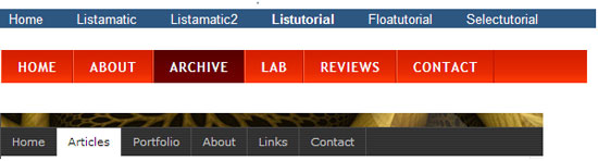
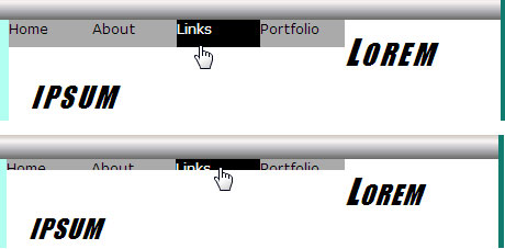
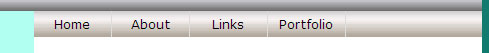
Hello again, and welcome back. In this lesson, we're going to explore navigation bars. Navigation bars provide a consistent way for users to get to major sections of your Web site. You've probably seen dozens of them in your day-to-day Web browsing. The image below shows some examples.
In this lesson, we'll develop an elastic navbar that works in all modern Web browsers. We'll also use an unordered list (<ul> and </ul> tags) to format the navbar. Unordered lists are the preferred method today, because research has shown that lists work best with non-visual user agents, such as screen readers.
A Navbar for Our Layout
A navigation bar is a list of hyperlinks. Your layout.htm page already has a division named navbar that you can use for your navigation bar. If you open layout.htm for editing, you'll see that division looks like this:
<div id="navbar">

  I am in the navbar division

</div><!-- End navbar -->
You need to replace that placeholder text with a list of links. You need to place the entire list within the navbar division. You should have some idea of what you want to appear in your navbar. The first link is usually Home to return to the home page. That's customary in most Web sites, and you should follow suit. Other links vary depending on the number of pages in your site.
If your site contains many pages, there may not be enough room for a link to every page. In that case, you might want to think about creating links to categories of pages within your site.
|
It isn't necessary to create the pages first that your navigation bar links will open. In your <a> tags, you can use href="#"
as a placeholder for any page you haven't yet created. This allows you
to build and tweak the navbar without ever navigating away from the
page. Later, after you've created the actual pages, you can replace the #
placeholders with the actual page references.
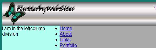
We need a general example to work with here. So, let's suppose you want navbar links titled Home, About, Links, and Portfolio. To create an unordered list of hyperlinks, enclose the entire list in the usual <ul> and </ul> tags. Make each link a list item by placing it between <li> and </li> tags, like this:
<div id="navbar">

  <ul>

  <li><a href="#">Home</a></li>

  <li><a href="#">About</a></li>

  <li><a href="#">Links</a></li>

  <li><a href="#">Portfolio</a></li>

  </ul>

</div><!-- End navbar -->
Remember, the layout.htm page already contains the div tags for the navbar. So, don't add those again. Instead, just remove the I am in the navbar division text and put in the tags as shown above, using whatever items you wish in place of About, Links, and Portfolio.
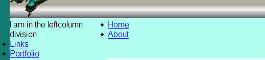
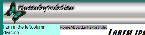
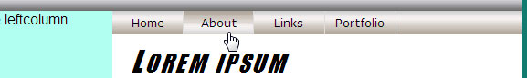
After you've added the tags to layout.htm, save the page and view it in a browser. At first glance, you'll think I'm off my rocker. The unordered list looks like, well, an unordered list. It doesn't look anything like a navigation bar.
Your list might look a little different, depending on the browser used to view the page. Not to worry. It'll look very different by the end of this lesson.
You can leave the layout.htm page in the browser open if you like. But you can close the copy of layout.htm that's showing the code you just added. We'll do all the styling in layoutstyles.css. So, open that up for editing now.
Let's start by giving our navbar the same background color. In the interest of keeping your style sheet somewhat organized, I suggest you put this new style rule under, or above, the #leftcolumn style rule that's already in the style sheet. Technically, it doesn't matter which. So, use whatever seems best to you. Let's give the navbar a gray (#aaa) background color, unless you prefer some other color. So, the #navbar style rule in your layoutstyles.css should look like this once you've typed it in:
/* Navbar division */
#navbar{
background-color:#aaa;
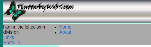
}The navbar takes on the new background color. Unfortunately, so does that portion of the leftcolumn division.
We saw the challenge of the background color stretching across the sidebar earlier when we set the content division's background color to white. The solution here is the same as it was there. Set the left margin of the navbar equal to the width of the leftcolumn division.
In the working example, the sidebar is 12em wide (as you can see in the #leftcolumn style rule in the style sheet). So, you need to set its left margin to 12em, as below. As always, it's good to put in comments to remind yourself of these things.
/* Navbar division */
#navbar{
background-color:#aaa;
/* Left margin must match leftcolumn width */
margin-left:12em;
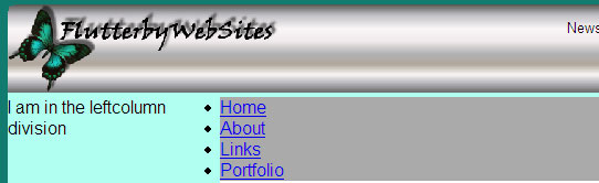
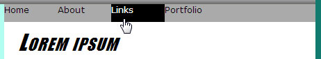
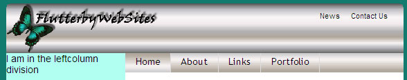
}Save and refresh. The navbar background color no longer crosses the leftcolumn division.
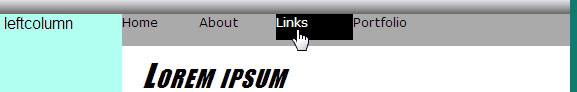
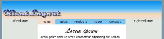
The Mysterious Image Gap
If you look closely at the picture above, you'll notice a little gap between the branding bar image and the navbar. It usually shows up only when you use a single graphic image for your branding bar. The gap is a mysterious little problem that has puzzled many a Web developer for hours. No amount of messing with margins and padding will make it go away!
As it turns out, graphic images are inline elements that always have a little extra space underneath to prevent subsequent text from touching the picture. The only way to get rid of the gap is to convert the image in the branding bar to a block element. You can do that by adding this style rule to layoutstyles.css. In the interest of keeping your style sheet organized, you might want to put this one up with the other #branding style rules that are already in the style sheet:
/* Fixes the mysterious image gap */

#branding img{

  display:block;

}
After adding the new style rule, save and refresh. The gap under the branding bar image disappears.
Your navbar still doesn't look like a navbar. Let's head over to Chapter 2 now and start whipping that into shape.
Chapter 2:
Styling the Navbar
So far, you've created an unordered list of links for your navbar. In this chapter, you'll get rid of the bullets, make the list horizontal, and make the whole thing look more like a navbar.
Remove the Bullets
You don't need bullets in your navbar. So, let's get rid of those by adding a style rule to remove them. A list-style-type:none descriptor will do the trick. Applying that to the ul element will remove the bullet from every item in an unordered list.
You don't want to remove the bullets from all lists in your site. So, we need a style rule that applies to unordered lists in the navbar division only. A style rule with a descendant selector will work. Of course, the style rule goes in layoutstyles.css. You should put it right under the #navbar style rule, just to stay organized. Here's how that looks with a descriptive comment up top:
/* Remove bullets from ul in the navbar */
#navbar ul{
list-style-type:none;
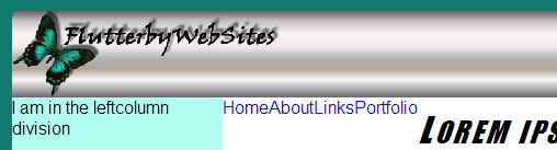
}Save, then refresh, and the bullets disappear.
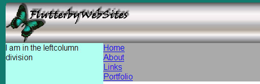
Make a Horizontal List
Next, you need to make the list horizontal. By default, list items are block elements. That's what causes them to stack one atop the other. You can float them to line up horizontally. To do this, you need a style rule that applies to list items (<li> tags) in the navbar. So, add this style rule to your style sheet:
/* List items in the navbar */
#navbar li{
float:left;
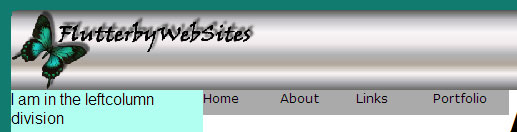
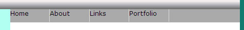
}Save and refresh. In the browser, the links line up right next to each other. But something else happens, too. The background color disappears!
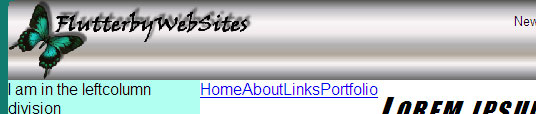
The disappearing background color is caused by the fact that floated elements aren't in the normal text flow and don't have any real height. So, the whole division currently has a height of zero, which makes its background color disappear. Weird, I know. Not to worry. We're not done yet.
Styling the Links
Each
option in the navbar is a standard hyperlink defined with <a> and
</a> tags. The selector for a style rule that applies to links in
the navbar would be #navbar a.
Typically in a navbar, you want visited and unvisited links to look the same. So, whatever style you apply to <a> tags in general, you also want to apply to links in the :link (unvisited) and :visited state. So, what you really need is a style rule with three selectors separated by commas, like this:
/* Applies to navbar links, visited and unvisited */

#navbar a,

#navbar a:link,

#navbar a:visited{
}
The underline that normally appears under hyperlinks in most Web browsers isn't necessarily appropriate for a navigation bar. Add text-decoration:none to the style rule, as below, to remove the underline:
/* Applies to navbar links, unvisited and visited */

#navbar a,

#navbar a:link,

#navbar a:visited{

   text-decoration:none;

}
Now you can start thinking about fonts, colors, and sizes. While you're at it, here's a little trick many Web developers use. When you choose View > Text Size in Internet Explorer, the text can grow to be quite large—so large, in fact, that a navbar like this might wrap to two lines in the browser. That doesn't look so good.
If you specify a smaller font size using a percent (%) rather than em unit of measure, the differences in text size aren't quite so dramatic. The text still grows and shrinks, just not quite as much. Nobody really knows why. It just works that way. For this reason, you'll often see developers use a font size of 80% or so for navbars. You'll do the same here.
While you're thinking about fonts and sizes, you can also choose a font, color, and background for the links. So, go ahead and add a font-family, font-size, and color descriptors to the style rule now, as below. Feel free to use whatever font or color you want. But I suggest you stick with the 80% font size for now.
/* Applies to navbar links, unvisited and visited */

#navbar a,

#navbar a:link,

#navbar a:visited{

   text-decoration:none;

   font-family:Verdana, Geneva, Arial, Sans-Serif;

   font-size:80%;

   color:#000;

   background-color:#aaa;

}
Save and refresh. The new font and styling are applied to the links. It's not very pretty, but it's closer to our goal:
Now you can start thinking about widths and heights. First, you need to be aware that hyperlinks are inline elements. That's so you can put links in the middle of a sentence or paragraph without disrupting the flow of text. Here's an important fact about inline elements:
The CSS width: and height: properties apply only to block elements, not to inline elements.
To take control of the heights and widths of the links, you need to convert them to block elements using display:block. Then, you can apply some height and width. So, add the display, height, and width properties shown below to the style rules for the links:
/* Applies to navbar links, unvisited and visited */
#navbar a,
#navbar a:link,
#navbar a:visited{
text-decoration:none;
font-family:Verdana, Geneva, Arial, Sans-Serif;
font-size:80%;
color:#000;
background-color:#aaa;
display:block;
height:2em;
width:6em;
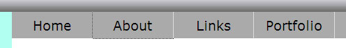
}Save and refresh. The results depend on what browser you're using. If it's Firefox, Safari, or most others, it'll look something like this:
If it's Internet Explorer 7, it'll look something like this:
Clearly,
we still have a little more work to do. Follow me to Chapter 3 to fix
this Internet Explorer challenge and add some finishing touches.
Chapter 3:
Finishing the Navbar
Your navbar is slowly starting to look the way a navbar should. But you still have some issues to deal with.
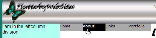
Let's start by giving the navbar some interactivity by styling the :hover and :active states of the navbar links. You can use a single style rule to set both. Within that style rule, I'll set the background color to black (#000) and the foreground color to white (#fff). You can use any colors you like. Here's the style rule to add to layoutstyles.css.
/* Navbar hover and active links */
#navbar a:hover,
#navbar a:active{
background-color:#000;
color:#fff;
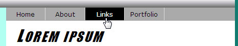
}Save, refresh, and then point to a link. The link shows the new colors, as below (in Firefox). In Internet Explorer 7, the portion of the link that's visible will show the new colors.
Sizing the Navbar
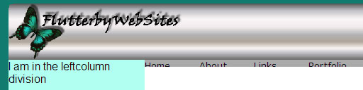
We still have a couple of challenges to deal with. The floats in the style rules are causing the navbar not to reach the right side of the page. In Internet Explorer, the floats are also causing the links to lose some height. So, depending on which browser you're using to view your page, your navbar now looks like one of the examples below.
The
solution to this problem is to give the entire navbar division a
specific height. You want the navbar to be elastic so it grows and
shrinks with the text size. Let's try a height of 2em. Add height:2em; to the #navbar style rule, as below (make sure you put it in that right style rule, or it won't work):
/* Navbar division */

#navbar{

   background-color:#aaa;

   /* Left margin must match leftcolumn width */

   margin-left:12em;

   height:2em;

}
Save and refresh. The division grows to that height, as in the example below. The height applies to the entire division. So now, the navbar is 2em in height all the way across to the right side of the layout.
Pointing to a link still activates the hover style. But there's something weird going on. The link isn't as tall as the div! This is strange, because you just made the height of the navbar 2em. And earlier, you made the height of each link 2em as you can see below (I used . . . to represent descriptors that aren't relevant to the situation at hand):
/* Applies to navbar links, unvisited and visited */

#navbar a,

#navbar a:link,

#navbar a:visited{

   . . .

   font-size:80%;

   . . .

  height:2em;

   . . .

}
The discrepancy in heights is caused by the fact that 2em at 80% font size is less than 2em at the default font size! In fact, the hover link in the image above is 80% the height of the navbar, which accounts for the little bit of extra gray under the hover link. This deserves a major "Hmm." What can you do about this discrepancy?
What if instead of making the navbar 2em tall, you make it 80% of 2em tall? Popping open your trusty calculator, type in .8*2= to calculate 80% of 2. You should get 1.6
as the result. So, let's go back up to the #navbar style rule and
change its height from 2em to 1.6em, as below. (Again, make sure you
make this change in the #navbar style rule, not the style rule for the
links):
/* Navbar division */

#navbar{

   background-color:#aaa;

   /* Left margin must match leftcolumn width */

   margin-left:12em;

   height:1.6em;

}
Save, refresh, and then point to a link. Hey, it works!
This might seem like a lot of trouble to go through just to create a navbar. But this isn't just any navbar. Unlike most, when you zoom using options on your browser's View menu, or CTRL + + and CTRL + -, the navbar grows and shrinks along with everything else. Also, as you'll see in the next lesson, adding drop-down menus to the link items is relatively easy.
Add a Right Border
Your navbar might look a little better if you put a line between each option. Once again, you need to go back to the style rule for the navbar links. Let's use border-right to put a right border on each link. I'll use a light gray color, #ddd. You can use another color if you like. I suggest you use a solid thin line. For example, below I've added a solid 1-pixel light gray line to each link by adding a border-right: property to the navbar style for the links:
/* Applies to navbar links, unvisited and visited */

#navbar a,

#navbar a:link,

#navbar a:visited{

   text-decoration:none;

   font-family:Verdana, Geneva, Arial, Sans-Serif;

   font-size:80%;

   color:#000;

   background-color:#aaa;

   display:block;

   height:2em;

   width:6em;

   border-right:solid 1px #ddd;

}
Save, refresh, and now you should see a border at the right side of each link.
Don't you think it would look better if you centered the text in each item? You can use text-align:center in the style rule for the links to center the text horizontally. Intuitively, it might seem as though you could use vertical-align:middle to center things vertically. But that won't work because vertical-align:middle only applies to table cells (in most browsers).
However, if you set the line-height of the links equal to the height of the links, it'll move the text down enough to get it in the ballpark. So, add two more descriptors to the style rule for the links:
/* Applies to navbar links, unvisited and visited */

#navbar a,

#navbar a:link,

#navbar a:visited{

 text-decoration:none;

 font-family:Verdana, Geneva, Arial, Sans-Serif;

 font-size:80%;

 color:#000;

 background-color:#aaa;

 display:block;

 height:2em;

 width:6em;

 border-right:solid 1px #ddd;

 text-align:center;

 line-height:2em;

}
Save and refresh. The text in each link is more centered now.
So, there you have it. I know it seems like an awful lot of work for a navbar. But it's important to keep in mind that this isn't just any navbar. It's an elastic navbar that grows and shrinks properly with the text size in all modern Web browsers.
The navbar is fully functional. Just don't forget that eventually you have to change the href="#" attributes in the <a> tags to actual pages in your Web site.
If you're feeling ambitious and want something fancier, there's more you can do. Let's start with something you might notice in Firefox and some other browsers.
The Dotted Border
If you test your page in Firefox or Netscape, you might notice something odd. After you click a link, it shows a little dotted border. It's subtle; so, you have to look closely.
The dotted box is harmless. But if you really would rather not see it, there's a way to prevent it. Add outline-style:none to the style rule for the links. Here's that whole style rule with the new outline style property added to it:
/* Applies to navbar links, unvisited and visited */

#navbar a,

#navbar a:link,

#navbar a:visited{

   text-decoration:none;

   font-family:Verdana, Geneva, Arial, Sans-Serif;

   font-size:80%;

   color:#000;

   background-color:#aaa;

   display:block;

   height:2em;

   width:6em;

   border-right:solid 1px #ddd;

   text-align:center;

   line-height:2em;

   outline-style:none;

}
That's all it takes. Clicking a navbar link won't show the dotted border around that link anymore.
If you really want to get fancy with your navbar, you can add a background image to give it some texture or shape.
Come on over to Chapter 4, and I'll show you how.
Chapter 4:
Adding a Background Image
In this chapter, we'll add a background image to our navbar. This is completely optional. If you're happy with solid colors, then there's no reason to add a background image.
You probably wouldn't want to use a photo as the background for a navbar. It might make the navbar too "busy" looking. More likely, you'd use a simple texture or pattern.
You're probably familiar with the background-image property for applying a background image. In this chapter, you'll learn a new technique: the background: shorthand property. This allows you to specify a background color, image, and some image properties in a single line. The syntax is:
background:color url(image) repeat attachment horizontalposition verticalposition
You
can omit any properties you don't need. But for properties you do need,
you must replace the italicized word with a valid value. For instance,
replace color with a color hex code. Replace image with the path to a background image. Replace repeat with none, repeat, repeat-x, or repeat-y.
You should always specify a background color, even if your background image totally hides that color. You use the background color just in case the browser can't display the background image. Also, sometimes with an elastic navbar, subtle differences among browsers will cause an extra pixel or two of the navbar background color to show under the actual links. Using a background color that resembles the background image color can help to mask that.
It's important to keep in mind that background images don't grow and shrink with the text size. So, you have to use a background image that's taller than the initial height of the navbar. If the image is a two-toned or gradient, you need to center the image vertically within the navbar. Let me show you an example of what I mean.
Here's a two-toned image I'll refer to as navtest.jpg. It's 4em (64 pixels) tall, which is more than twice the height we really need for our 1.6em tall navbar at its default size.

If you were to apply it without vertical centering, only the top 1.6em of the background image would show. The portion that would actually be visible would show inside the red dashed borders.
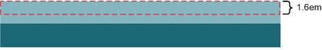
When only the top 1.6em of the image is visible, there's no two-tone effect.
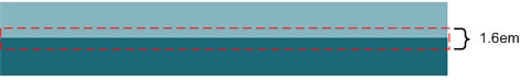
However, if you vertically position the background image, then both colors will be visible. This is because the middle 1.6em of the image appears within the navbar, as illustrated by the red dashed box below.
The two-toned background image is just for illustration. In real life, you'd likely use a background image that has more of a smooth gradient effect. But the same basic principal applies.
Here's an example, which I'll refer to as navbak.jpg. It's 64 pixels (4em) tall. The lightest portion of the image is a little off center. I'll explain why in a moment.

To use the navbak.jpg as the background image for the navbar, it needs to repeat horizontally (using repeat-x). You also want to center it vertically so the lightest portion of the image is near the center of the navbar. Assuming the navbak.jpg image is in a subfolder named images, change the current background-color descriptor to the background: descriptor shown below.
/* Navbar division */

#navbar{

    /* Left margin must match leftcolumn width */

    margin-left:12em;

    background:#aaa url(images/navbak.jpg) repeat-x center;

    height:1.6em;

}
The first value, #aaa, is the background color that appears only if the image isn't available. The next three values specify the image to use, the repeat-x value to make the image repeat horizontally only, and center to center the background image inside the div.
We also need to apply the same style to links. Since it's a light-colored image, you'll want to use a dark color for the text. Below, I've changed the text color of links to black (#000). And I've replaced the background-color descriptor with the same background: descriptor specified for the navbar as a whole.
/* Applies to navbar links, unvisited and visited */

#navbar a,

#navbar a:link,

#navbar a:visited{

   text-decoration:none;

   font-family:Verdana, Geneva, Arial, Sans-Serif;

   font-size:80%;

   color:#000;

   background:#aaa url(images/navbak.jpg) repeat-x center;

   display:block;

   height:2em;

   width:6em;

   border-right:solid 1px #ddd;

   line-height:2em;

   text-align:center;

   outline-style:none;

}
Here's how the navbar looks with the new background image applied.
You can use a second image for hover and active links. Here's one I'll refer to as navhover.jpg. To create it, I just made an upside-down version of the original navbak.jpg file. That's why I made the lightest part of the navbak slightly off center toward the top—so that same area would be slightly off center toward the bottom in this upside-down version of the image.

Once again, let's assume the image is in a folder named images. To use navhover.jpg as the background for hover and active links, replace the background-color descriptor in that style rule with a background: descriptor that uses navhover.jpg as the image. Again, you'll want to repeat it horizontally (repeat-x) and center it vertically. Make sure your text color contrasts well with the light background image. Here's how the modified style rule looks using navhover.jpg and a black text color:
/* Navbar hover and active links */

#navbar a:hover,

#navbar a:active{

    background:#ddd url(images/navhover.jpg) repeat-x center;

    color:#000;

}
Save, refresh, and then point to any item in the navbar of your browser to see the effect. The hover link shows the navhover background texture.
Admittedly, it's not flawless. Subtle differences among browsers might cause a pixel or two of the navbar color to show under the button. And this difference might vary with the zoom level. But it's as close as you're likely to get to perfect until the Web browsers all handle CSS and XHTML exactly the same.
In the next chapter, we'll add one more finishing touch to our navbar. You'll use the navhover image to show the user which page they're currently viewing.
This is a good way of letting users know where they are in your site each moment.
Chapter 5:
Highlighting the Current Page Link
One last issue that we haven't dealt with yet concerns background images that don't appear until a user hovers over or clicks on a link. Those don't automatically download when the user first opens the page. So, once you post the page to a Web server, the hover background image won't work as well as it did on your own computer.
One way to deal with this is to use JavaScript to preload those graphic images. Those of you who have used graphic rollovers in Dreamweaver may have noticed that Dreamweaver automatically adds some JavaScript to the page to handle the image pre-loading.
A second method is to make sure the image shows one of the links as soon as the page loads. This is actually the preferred method, because it also provides another useful feature. It lets the user know what page they're on at that moment.
A simple
way to do this is to use just a slightly different navbar for each page.
That's something you'll have to do in each page, not in the style
sheet. For example, in the site's home page add class="selected"
to the <li> tag for the Home link. You can use any word in place
of "selected" because it's just a class name. And maybe add a comment as
a reminder to the purpose of the selected class, as below.
<div id="navbar">

  <ul>

  <!-- The selected class identifies current page or category -->

  <li class="selected"><a href="#">Home</a></li>

  <li><a href="#">About</a></li>

  <li><a href="#">Links</a></li>

  <li><a href="#">Portfolio</a></li>

  </ul>

</div><!-- End navbar -->
After you create an About page, add class="selected" to the <li> tag for the About link, as below.
<div id="navbar">

  <ul>

  <!-- The selected class identifies current page or category -->

  <li><a href="#">Home</a></li>

  <li class="selected"><a href="#">About</a></li>

  <li><a href="#">Links</a></li>

  <li><a href="#">Portfolio</a></li>

  </ul>

</div><!-- End navbar -->
Do the same for the Links and Portfolio pages, when you create them.
Then, in your style sheet, add two more selectors to the style rule for hover and active links. Make sure each selector except the last one ends with a comma, as below. Note that I've also changed the comment above the style rule to describe its purpose better.
/* Navbar hover, active, and current page links */

#navbar a:hover,

#navbar a:active,

#navbar li.selected a:link,

#navbar li.selected a:visited{

  background:#ddd url(images/navhover.jpg) repeat-x center;

  color:#000;

}
Save and refresh. In the browser, the link that has class="selected"
in the <li> tag will have the hover and active style. For
example, with class="selected" in the home page, the link in the navbar
stands out from the other buttons, even without pointing to it or
clicking.
The beauty of it is twofold. For one, the navbar provides a visual indication of which page the user is currently viewing. For another, there's no need to use any JavaScript code to pre-load the hover background image. This is because the background image downloads automatically as soon as the user opens a page!
Conclusion
Whew, who thought something as simple as a navbar could be so complicated! But remember, it's an elastic one. It shows the user where they are in the Web site, and it's designed in a way that will make it relatively easy to add drop-down menus to any or all of the options. You'll see how that works in Lesson 8!
Supplementary Material
|
Listutorial http://css.maxdesign.com.au/listutorial/index.htm |
| Click this link for many tutorials on working with lists. The navigation bar at the top is the first one shown in Chapter 1 of this lesson. |
|
Turning a List Into a Navigation Bar http://www.456bereastreet.com/archive/200501/turning_a_list_into_a_navigation_bar/ |
| This link takes you to a site that shows the second navbar example in Chapter 1. The article also describes how the author created his navbar. |
|
Wildly Useful Free Web Development Programs http://c82.net/article.php?ID=19 |
| I've included this link so you could try out the third navbar example from Chapter 1. However, the site doesn't contain any description of how the author created the navigation bar. |
|
Standards and Accessibility - Navigation Lists http://www.brucelawson.co.uk/index.php/2005/navigation-lists/ |
| This page is the reason why most sites use unordered lists for navigation bars these days. |
|
CSS Design: Taming Lists http://alistapart.com/articles/taminglists/ |
| Here you'll find a great tutorial on styling lists with CSS. |
|
Links, Menus, Navigation, and Rollovers http://websitetips.com/css/tutorials/menus/#csslists |
| There are links to many tutorials dealing with lists, menus, navigation, and rollovers on this site. |
|
Setting the Current Menu State With CSS http://www.456bereastreet.com/archive/200503/setting_the_current_menu_state_with_css/ |
| Here's an alternative way to identify the current page in a navbar, using the <body> tag rather than a class inside the navbar. |
|
Elastic Design http://www.alistapart.com/articles/elastic/ |
| You'll find a few tips and tricks for creating elastic layouts here. |
|
Dynamic Drive CSS Library http://www.dynamicdrive.com/style/ |
| Here's where you'll find many sample navbars. Unfortunately, most aren't elastic. Many do nothing when you change the text size in your browser. |
|
Professional Horizontal Series http://www.cssplay.co.uk/menus/pro_horizontal.html#nogo |
| Use this link to discover some advanced horizontal navbars. The code is woefully complex and would be difficult to elasticize. You can really see the problems by pressing CTRL + + and CTRL + - while viewing the page in Firefox or a similar browser. |
FAQs
/* layoutstyles.css */

/* Universal style rule */
*{
  margin: 0;
  padding: 0;
  /* Temporary borders */
  /* border: dashed 1px #f00; */
}

body {
  background-color: #117b6f;
  font-family: Arial, Helvetica, sans-serif;
}

#wrapper{
  width: 40em;
  background-color: #b0fff0;
  /* Put 20px margin above the wrapper */
  /* Set right and left to auto for centering */
  margin: 20px auto;
}

/********** Major layout divisions **********/
#branding{
  /* For absolutely-positioned hyperlinks */
  position:relative;
}

/** branding division hyperlinks **/
#branding a{
  /* Postions are set in tags in layout.htm */
  position:absolute;
  text-decoration:none;
  color:#000;
  font-size:0.8em;
}

#branding a:link, #branding a:visited{
  color:#000;
}

#branding a:hover{
  color:#0f0;
}
#branding a:active{
  color:#1bb498;
}

/* Fixes the mysterious image gap */
#branding img{
  display:block;
}

#leftcolumn{
  /* Remember, content and navbar left margin must match this width */
  width:12em;
  float:left;
}

/* Navbar division */
#navbar{
  background:#aaa url(images/navbak.jpg) repeat-x center;
  /* Left margin must match leftcolumn width */
  margin-left:12em;
  height:1.6em;
}

/* Remove bullets from ul in the navbar */
#navbar ul{
  list-style-type:none;
}

/* List items in the navbar */
#navbar li{
  float:left;
}

/* Applies to navbar links, unvisited and visited */
#navbar a,
#navbar a:link,
#navbar a:visited{
  text-decoration:none;
  font-family:Verdana, Geneva, Arial, Sans-Serif;
  font-size:80%;
  color:#000;
  background:#aaa url(images/navbak.jpg) repeat-x center;
  display:block;
  height:2em;
  width:6em;
  border-right: solid 1px #ddd;
  line-height:2em;
  text-align:center;
  outline-style:none;
}

/* Navbar hover, active, and current page links */
#navbar a:hover,
#navbar a:active,
#navbar li.selected a:link,
#navbar li.selected a:visited{
  background:#ddd url(images/navhover.jpg) repeat-x center;
  color:#000;
}

#content{
  /* Left margin must match leftcolumn width */
  margin-left:12em;
  background-color:#fff;
  color:#000;
  padding:10px 20px;
}

/* Applies to paragraphs in the content division */
#content p{
  line-height:1.5em;
}

/* Applies to all lists in the content division */
#content ul, #content ol{
  padding:10px 0 10px 40px;
}

/* Styles h1, h2, and h3 style rules in the content division */
#content h1, #content h2, #content h3{
  font-family: Charcoal, Impact, sans-serif;
  color:#000;
  font-weight:normal;
  font-style:italic;
  font-variant:small-caps;
  letter-spacing:0.08em;
}

/* Size h1 headings in the content division */
#content h1{
  font-size:2em;
}

/* Size h2 headings in the content division */
#content h2{
  font-size:1.5em;
}
/* Size h3 headings in the content division */
#content h3{
  font-size:1.25em;
  font-style:normal;
}

#footer{
  /* To be determined */
}<!DOCTYPE html PUBLIC "-//W3C//DTD XHTML 1.1//EN"
"http://www.w3.org/TR/xhtml11/DTD/xhtml11.dtd">
<html xmlns="http://www.w3.org/1999/xhtml">
<head>
<title>layout.htm</title>
<link href="layoutstyles.css" rel="stylesheet" type="text/css" />
</head>
<body>
<!-- Wrapper sets the layout width -->
<div id="wrapper">
<div id="branding">
<img src="images/bbImg2.jpg" alt="logo" style="width:100%" />
<!-- Absolutely positioned in style sheet -->
<a style="top:1em;right:8em;" href="#">News</a>
<a style="top:1em;right:2em;" href="#">Contact Us</a>
</div><!-- End branding -->
<div id="leftcolumn">
I am in the leftcolumn division
</div><!-- End leftcolumn -->
<div id="navbar">
<ul>
<li class="selected"><a href="#">Home</a></li>
<li><a href="#">About</a></li>
<li><a href="#">Links</a></li>
<li><a href="#">Portfolio</a></li>
</ul>
</div><!-- End navbar -->
<div id="content">
<h1>Lorem ipsum</h1>
<p>Lorem
ipsum dolor sit amet, consectetur adipisicing elit, sed do eiusmod
tempor incididunt ut labore et dolore magna aliqua. Ut enim ad minim
veniam, quis nostrud exercitation ullamco laboris nisi ut aliquip ex ea
commodo consequat.</p>
<ul>
<li>Quis autem vel eum iure reprehenderit.</li>
<li>Voluptate velit esse, quam nihil molestiae consequatur.</li>
<li>Et harum quidem rerum facilis.</li>
</ul>
<p>Nam
libero tempore, qumme soluta nobis est eligendi optio, lumque nihil
impedit, quo minus id, quod maxime placeat, facere possimus, omnis
voluptas assumenda est, omnis dolor repellendus. Temporibus autem
quibusdam et aut officiis debitis aut rerum necessitatibus saepe
eveniet, ut et voluptates repudiandae sint et molestiae non
recusandae.</p>
<h2>Heading Two Here</h2>
<h3>Heading Three Here</h3>
<ol>
<li>I am an ordered list</li>
<li>Yippie yie yo ki-yay</li>
<li>End of ordered list</li>
</ol>
<p>This is a paragraph</p>
</div><!-- End content -->
<div id="footer">
I am in the footer
</div><!-- End footer -->
</div><!-- End wrapper -->
</body>
</html><div id="leftcolumn">
<div id="navbar">
<ul>
<li class="selected"><a href="#">Home</a></li>
<li><a href="#">About</a></li>
<li><a href="#">Links</a></li>
<li><a href="#">Portfolio</a></li>
</ul>
</div><!-- End navbar -->
</div><!-- End leftcolumn -->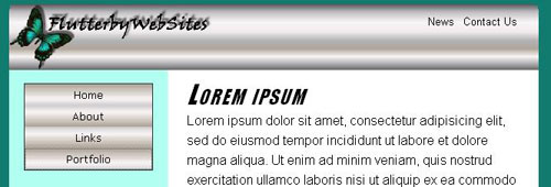
/* Navbar division (Vertical navbar) */
#navbar{
  width:80%;
  /* Center horizontally */
  margin:1em auto;
  text-align:center;
  border:solid 1px #333;
}

/* Remove bullets from ul in the navbar */
#navbar ul{
  list-style-type:none;
}

/* List items in the navbar */
#navbar li{
  background:#aaa url(images/navbak.jpg) repeat-x center;
}

/* Applies to navbar links, unvisited and visited */
#navbar a,
#navbar a:link,
#navbar a:visited{
  text-decoration:none;
  font-family:Verdana, Geneva, Arial, Sans-Serif;
  font-size:80%;
  color:#000;
  background:#aaa url(images/navbak.jpg) repeat-x center;
  display:block;
  height:2em;
  width:auto;
  line-height:2em;
  text-align:center;
  outline-style:none;
}

/* Navbar hover, active, and current page links */
#navbar a:hover,
#navbar a:active,
#navbar li.selected a:link,
#navbar li.selected a:visited{
  background:#ddd url(images/navhover.jpg) repeat-x center;
  color:#000;
}/* Navbar division */
#navbar{
background:#aaa url(images/navbak.jpg) repeat-x center;
/* Left margin must match leftcolumn width */
margin-left:12em;
height:2em;
}/* Applies to navbar links, unvisited and visited */
#navbar a,
#navbar a:link,
#navbar a:visited{
text-decoration:none;
font-family:Verdana, Geneva, Arial, Sans-Serif;
color:#000;
background:#aaa url(images/navbak.jpg) repeat-x center;
display:block;
height:2em;
width:6em;
border-right: solid 1px #ddd;
line-height:2em;
text-align:center;
outline-style:none;
}Assignment
 Note:
In Lesson 8, you'll learn to create drop-down menus. These provide
another means of providing links to pages within some category of
content within your site.
Note:
In Lesson 8, you'll learn to create drop-down menus. These provide
another means of providing links to pages within some category of
content within your site.