 Note:
For the first few chapters in this lesson, the exact results you get
will vary from one browser to the next. Try not to worry about that.
We'll pull everything together by the end of the lesson.
Note:
For the first few chapters in this lesson, the exact results you get
will vary from one browser to the next. Try not to worry about that.
We'll pull everything together by the end of the lesson.
Chapter 1:
Introducing Drop-Down Menus
In this lesson, you'll learn about drop-down menus. Drop-down menus allow you to add more links to your navigation bar. At first, the drop-down menus are invisible. As soon as the user touches the mouse pointer to a link in the navigation bar, the drop-down menu appears to provide links to specific pages. This is similar to how drop-down menus work in program menu bars—only you don't have to click an option in the navbar to see the menu. You just point to the navbar option.
Before we go on, I should point out that there's nothing built into CSS or XHTML to create menus. You have to use the available XHTML tags and CSS properties to build them from scratch. And it isn't particularly easy, especially if you want those menus to be elastic and work in all modern Web browsers.
Not all sites need menu bars, either. For many sites, a simple navbar like the one we created in Lesson 7 is sufficient. But if you do need drop-down menus, the techniques you learn in this lesson should serve you well.
The XHTML Tags
Like most things in modern Web development, you need XHTML tags in your page, and CSS style rules in your style sheet, to make drop-down menus. Let's start with the tags. Open your layout.htm page for editing. If you've been following along, your page currently has tags for a navbar, as below.
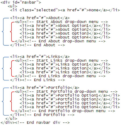
<div id="navbar">

<ul>

   <li class="selected"><a href="#">Home</a></li>

    <li><a href="#">About</a></li>

    <li><a href="#">Links</a></li>

    <li><a href="#">Portfolio</a></li>

</ul>

</div><!-- End navbar -->
To add a drop-down menu to an item, you need to get the cursor so it's right after the closing </a> tag for that item. Press ENTER to start a new line and put in a pair of <ul> and </ul> tags to start a new unordered list. You can add a pair of comments to help you later identify the tags. Here's an example where I'm about to add a drop-down menu to the About option on our sample working navbar.
<li><a href="#">About</a>

 <ul><!-- Start About drop-down menu -->

 </ul><!-- End About drop-down menu -->

</li><!-- End About -->
Notice how the <ul> and </ul> tags are contained within the <li> and </li> tags for the item. That's required for the drop-down menus to work properly.
Between the new <ul> and </ul> tags, you need a list item and link for each option on the drop-down menu. In other words, each option on the drop-down menu will require the following:
<li><a href=" page">Text on menu</a></li>
Replace page with the URL or name of the page to which the item links. If you haven't created that page yet, you can use # as a temporary placeholder. The Text on menu is the actual text on the menu. Keep it brief—one or two words, if necessary. Here's an example where I've added four generic drop-down menu options to the About link in the navbar.
<li><a href="#">About</a>

    <ul><!-- Start About drop-down menu -->

    <li><a href="#">About Option1</a></li>

    <li><a href="#">About Option2</a></li>

    <li><a href="#">About Option3</a></li>

    <li><a href="#">About Option4</a></li>

    </ul><!-- End About drop-down menu -->

</li><!-- End About -->
You can add a similar drop-down menu to as many, or as few, navbar items as you wish. For example, in the code below, I've added a generic drop-down menu to all navbar items except the Home link. For this example, I'll assume we don't need a drop-down menu on the Home link.
 <div id="navbar">

    <ul>

    <li class="selected"><a href="#">Home</a></li>    <li><a href="#">About</a>

    <ul><!-- Start About drop-down menu -->

    <li><a href="#">About Option1</a></li>

    <li><a href="#">About Option2</a></li>

    <li><a href="#">About Option3</a></li>

    <li><a href="#">About Option4</a></li>

    </ul><!-- End About drop-down menu -->

    </li><!-- End About -->    <li><a href="#">Links</a>

    <ul><!-- Start Links drop-down menu -->

    <li><a href="#">Links Option1</a></li>

    <li><a href="#">Links Option2</a></li>

    <li><a href="#">Links Option3</a></li>

    </ul><!-- End Links drop-down menu -->

    </li><!-- End Links -->
    <li><a href="#">Portfolio</a>

    <ul><!-- Start Portfolio drop-down menu -->

    <li><a href="#">Portfolio Option1</a></li>

    <li><a href="#">Portfolio Option2</a></li>

    <li><a href="#">Portfolio Option3</a></li>

    <li><a href="#">Portfolio Option4</a></li>

    </ul><!-- End Portfolio drop-down menu -->

    </li><!-- End Portfolio -->

    </ul>

</div><!-- End navbar div -->
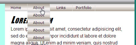
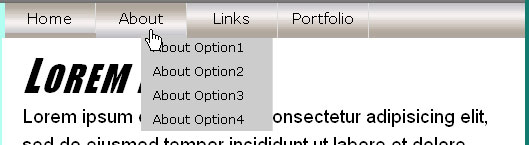
You can add the same code to your layout.htm page as a working example. It's very dense and complex code. It's easy to make mistakes when typing it. So, I suggest you copy and paste as much as possible to minimize typographical errors.
|
After adding code to the page, here's how the page looks in a modern browser.
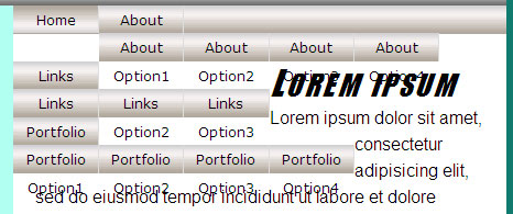
It's a far cry from drop-down menus. That's because we haven't styled anything with CSS yet. But that's all the XHTML we need. The rest takes place in the style sheet, layoutstyles.css. So, you can close layout.htm now.
Styling the navbar List Items
Now open layoutstyles.css for editing. Your first task is to locate the #navbar li style rule that's already in the style sheet. Right now, it looks like this:
/* List items in the navbar */

#navbar li{

    float:left;

}
You need to make each navbar list item a relatively positioned element, because later, you'll use absolute positioning to get each drop-down menu to line up under each navbar item. So, add a comment and position:relative to that style rule, as below.
/* List items in the navbar */

#navbar li{

    float:left;

 /* Required for drop-down menus */

 position:relative;

}
This change will have no immediate effect in your Web browser. So, don't expect to see anything different there.
In Chapter 2, we'll build on what we've created so far by adding some new style rules to the style sheet.
Chapter 2:
Styling the Drop-Down Menus
In this chapter, you'll get to work on making your drop-down menus look like drop-down menus. You'll need to create a whole new set of style rules, just for the drop-down menus. In the interest of keeping your style sheet organized, I suggest you put a comment, as shown below, right under all of the #navbar style rules that are currently in your layoutstyles.css style sheet.
/* Drop-down menu styles */Put the new style rules that you'll create in this chapter under that comment.
First, you need a style rule that applies only to the drop-down menus in the navbar. The selector for that style rule looks like this:
#navbar li ul
The image below shows why the selector applies only to drop-down menus in the navbar. The only time you have a ul tag pair inside a li tag pair is where you define a drop-down menu. The red braces below illustrate:
Each drop-down menu is actually a nested list. It's nested because it's contained within a single list item from a larger, outer list. That larger outer list is defined by the <ul> tag near the top of the navbar and its closing tag down near the bottom of the navbar.
Your new style rule applies only to those nested lists—the drop-down menus. Within that new style rule, you need to make each nested unordered list an absolutely positioned element. It seems kind of strange, I know. You don't normally think about absolute positioning with lists. But the way it all plays out is to your advantage.
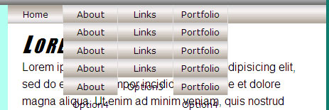
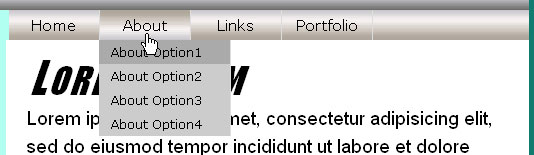
To ensure that nothing else on the page covers the drop-down menu, you can give them a very high z-index value. So, go ahead and add the comment and style rule to layoutstyles.css now, right under the new Drop-down menu styles you just added to your style sheet:
/* Applies to drop-down menus in navbar */
#navbar li ul{
position:absolute;
z-index:100;
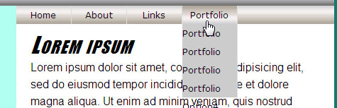
}This new style rule causes each item in the drop-down menus to line up right under its relatively positioned parent element. That parent element is one item on the horizontal navbar. The menus aren't perfect yet. But if you look at the page after adding this style rule to your style sheet, you'll see it's starting to look a bit more like a navbar with drop-down menus. Yours might look different from the image below, depending on your browser. We'll iron out the browser differences as we go along.
We still have quite a bit of styling to do. Let's start with the fact that drop-down menus aren't supposed to be visible all the time. They should become visible only when requested.
Controlling Visibility
You want your drop-down menus to be invisible and out of the way most of the time. To make an element invisible (or visible again), you'll use the CSS visibility property. As its name implies, this property controls whether or not an element is visible on the page. It supports two values:
Like most CSS properties, you can apply the visibility property to any element in any page. To make your drop-down menus invisible, add visibility:hidden to the #navbar li ul style rule, as below.
/* Applies to drop-down menus in navbar */
#navbar li ul{
position:absolute;
z-index:100;
visibility:hidden;
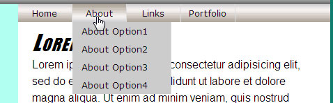
}Save the style sheet, and refresh the page in the browser. The drop-down menus have disappeared! You didn't do anything wrong. The drop-down menus are still there. You just can't see them because they're hiding at the moment. And that's exactly what we want.
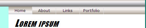
Of course, you don't want the drop-down menus to be invisible all the time. You want a drop-down menu to appear when the user points to an item in the navbar. You can use visibility:visible to make an invisible element visible. And here, you need to make that happen when the user hovers the mouse pointer over a list item in the navbar.
Now you need to add another style rule to our style sheet. This one applies whenever the mouse pointer is hovering over a list item in the outer unordered list. And it applies to the inner unordered list (the drop-down menu). Here's that style rule, which you can add to your style sheet now.
/* Make drop-down visible on navbar hover */

#navbar li:hover ul{

  visibility:visible;

}
Save the style sheet, and refresh your browser. At first, you won't see any change. However, when you point to About, Links, or Portfolio in the navbar, its drop-down menu becomes visible.
Things aren't perfect yet. But at least we've taken care of the trickiest part. The drop-down menu is visible only while you're pointing at a link on the navbar.
It doesn't work at all in Internet Explorer 6 or some other Web browsers. We'll fix that a little later. Let's take care of making the drop-down menu look a little better first.
Styling the Drop-Down Menu Links
Right now, your drop-down menu links have the same style as the links in the navbar. To make the drop-down menus look different, you need another new style rule. This one should apply only to links (<a> tags) in the drop-down menu when the hover state is on for a link. The selector for this style rule is a long one:
#navbar li:hover ul li aThe style applies only to <a> tags inside the drop-down menu and only when the mouse pointer is touching an item in the navbar. Within the new style rule, you can control the appearance of those links and, hence, the general appearance of items on the drop-down menu.
The background image I used in my navbar doesn't look so great on the drop-down menu. To remove a background image, use a background property that specifies a color but no image. I'll use #ccc as my background color, and #000 (black) as my foreground color. Use any colors you like.
|
Also, drop-down menus generally don't show centered text. So, I suggest you left-align the text in your drop-down menus. Here's the new style rule you need to add to layoutstyles.css to make that all happen:
/* Applies to links on the drop-down menu */

#navbar li:hover ul li a{

  background:#ccc; /* Removes background image */

  color:#000;

  text-align:left;

}
Save, refresh, and point to a navbar item that has a drop-down menu. The new styles are applied to all links on all drop-down menus.
The drop-down menu still isn't wide enough to show all the text of each item. If you apply display:block to the items, you can then give them a width, padding, and height as you see fit. You can play around with those settings. For your working example, you'll use a width of 10em, a little left padding (only), and let the Web browser calculate a height using height:auto. Add the four descriptors, shown below, to the style rule you just created for the drop-down menu links:
/* Applies to links on the drop-down menu */
#navbar li:hover ul li a{
background:#ccc; /* Removes background image */
color:#000;
text-align:left;
display:block;
width:10em;
padding:0 0 0 1em;
height:auto;
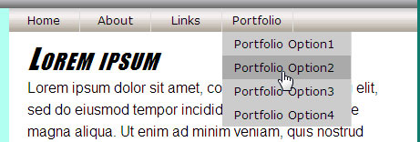
}Save, refresh, and then point to a navbar item that has a drop-down menu. Now it looks more the way a drop-down menu should.
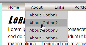
A little interactivity on the drop-down menus would be a nice touch so links change colors as the user moves the mouse pointer down the menu. For this, you need a style rule that applies only when the mouse pointer is touching an item on the drop-down menu. The selector for this new style rule is similar to the selector for the previous style rule. But it ends with a:hover so that it only applies when the mouse pointer is actually touching a link on the drop-down menu.
Within this new style rule, you can define a background color and text color as you see fit. I'll use a different shade of gray and stick with my black text color for this example. Put this new style rule under the one you just added to layoutstyles.css.
/* Hover on drop-down menu links */

#navbar li:hover ul li a:hover{

  background: #aaa;

  color:#000;

}
Save and refresh. Now as you point to items on the submenu, they take on the new background and foreground colors.
So now, your drop-down menus look and act like drop-down menus. They work in current versions of all browsers (Firefox, Safari, Opera, Netscape, and Internet Explorer 7). They're elastic in the sense that they hold together regardless of how the user zooms or changes the text size. This is all good.
Clicking a link on a drop-down menu doesn't take you anywhere yet. That's because we're using the href="#" placeholder in all of the links. You'll need to replace each # sign with an actual Web page reference when you have pages in your site.
If you try out the page in Internet Explorer 6, you'll find that it doesn't work at all. That's unfortunate, because there are still many people out there using Internet Explorer 6.
In the next chapter, we'll get started on making this menu work with Internet Explorer 6, as well as some earlier versions of that product.
Chapter 3:
Internet Explorer
Conditional Comments
Microsoft Internet Explorer (IE) has been the thorn in every Web developer's side for many years. Usually it's the oddball Web browser that shows a page differently than the way it looks in other Web browsers. Case in point: Your drop-down menus don't work at all in Internet Explorer version 6 (IE6).
The situation has improved in Internet Explorer 7 (IE7). For example, your drop-down menus work fine in IE7. If all Internet Explorer users were up-to-date with that version, there would be no need for you to continue. But unfortunately, that's not the case. There are still many millions of IE6 users out there on the Web. So, it behooves us to try to ensure that our drop-down menus work in IE6, as well.
Getting the menus to work in IE6 is no small feat. Many developers use JavaScript, a programming language for Web pages, to get their menus to work in older IE versions. That's okay, but it does have some disadvantages. For one, JavaScript is an entirely separate programming language with a long, steep learning curve. For another, as many as 10% of users have JavaScript disabled in their browsers. This is often due to corporate policies over which the user has no control. So, they can't simply enable JavaScript on their own.
Fortunately, there's a way to make the drop-down menus work in IE6 (and some other older browsers) without using JavaScript. As you'll discover in this chapter, you can use conditional comments to work up a solution. Such solutions are sometimes referred as hacks, because you have to hack up your otherwise perfectly good code to get it to work in an ornery Web browser like Internet Explorer 6.
Internet Explorer Conditional Comments
Internet Explorer has a unique feature known as conditional comments. Like regular comments, these don't show up in the Web browser. Most browsers completely ignore comments. Internet Explorer is the exception. Internet Explorer actually looks at the comments and, if the comment is formatted just right, Internet Explorer will treat the comment like code.
The basic syntax of a conditional comment looks like this:
<!--[expression]>

  tag(s)

<![endif]-->
The expression is an if statement that can detect if Internet Explorer (IE) is in use. The simplest expression is if IE:
<!--[if IE]>

  <p>You are using Internet Explorer</p>

<![endif]-->
When you view a page that contains those tags in any modern version of Internet Explorer, the page shows, You are using Internet Explorer. View that page in any other browser, and you don't see that paragraph at all!
These days, the issue isn't so much about whether or not the browser is Internet Explorer. The issue is whether the Web browser is Internet Explorer 6 (or earlier) versus Internet Explorer 7 (or later, when later versions become available). For such issues, we can use any of the following comparison operators in expressions:
| Operator | Meaning | Example |
| lt | Less than | [if lt IE 7] |
| lte | Less than or equal to | [if lte IE 6] |
| gt | Greater than | [if gt IE 7] |
| gte | Greater than or equal to | [if gte IE 7] |
| ! | Not | [if ! IE] |
|
Intuitively, you might think that you could use a conditional comment like this to target all Web browsers except Internet Explorer 6:
<!-- [if ! IE6]>
In English, it means, if not Internet Explorer 6. However, only Internet Explorer sees conditional comments. To all other browsers, they're just comments that they can ignore. So, other browsers can't decide if they are or aren't Internet Explorer 6. This makes things very tricky indeed.
What you really need is an elaborate set of conditional comments and regular comments that can distinguish between all modern browsers, and Internet Explorer 6 and its predecessors. Here's what that elaborate set of conditional and regular comments looks like:
<p>

<!--[if gte IE 7]><!-->You are NOT using IE6 or earlier<!--<![endif]-->

<!--[if lte IE 6]>You are using IE6 or earlier<![endif]-->

</p>
If you put that code in a page and view it in a Web browser, only Internet Explorer 6 (and some of its predecessors) show, You are using IE6 or earlier. All other Web browsers (Safari, Firefox, Netscape, Opera, IE7) show, You are NOT using IE6 or earlier.
I realize few people have the ability to test these things in Internet Explorer 6 and 7. Most people have one version or the other, or no version at all. That's okay, but you'll have to trust me that it works.
These conditional comments work only if every character is in exactly the right place. I doubt anybody has memorized the exact sequence of characters. So, I strongly suggest that you never try to type some comments from scratch. Put them in a file somewhere that's easy to find. Copy and paste the comments into your code as needed. Replace the text inside the tags with the tags, text, or both that apply only to IE6 or all other Web browsers.
You'll see an example of how to do that in the next chapter.
Chapter 4:
The Internet Explorer 6 Hacks
In this chapter, you'll hack up our drop-down menu code so the menu works in Internet Explorer 6. I really hate to do this, and I'm sure many of you will feel the same way. Like all developers, I yearn for the day when I can just write valid code and have it look and act the same in all Web browsers. But that day isn't here yet. And there are just too many Internet Explorer 6 users to ignore.
The main reason our drop-down menus don't work in IE6 is that IE6 doesn't understand this relatively simple pseudo-class, which is triggered when the user touches the mouse pointer to a list item:
li:hoverInternet Explorer 6 and some other older Web browsers can only detect when the mouse pointer is touching a hyperlink. In other words, they can only detect an a:hover pseudo-class.
Right now, each drop-down menu in your page follows a main navbar link. Right after the </a> tag for a main navbar link, you have a <ul> tag that starts the drop-down menu, like this one for the About menu:
<li><a href="#">About</a> <ul><!-- Start About drop-down menu -->
We need to remove that closing </a> tag and replace it with the following nasty bit of conditional comment code:
<!--[if gte IE 7]><!--></a><!--<![endif]-->

<!--[if lte IE 6]><table><tr><td><![endif]-->
In modern browsers, the first conditional comment leaves the </a> tag right where it is. That's good, because you don't want to mess up what's already working in modern browsers. The second conditional comment doesn't put in that closing </a> tag for IE6. Instead, it puts in <table><tr><td> tags, which simply start a one-row, one-column table. (Sounds crazy, I know. But IE6 is a crazy browser, and we have to play by its rules.)
To get this to work, you need to replace the </a> tag at the end of each navbar link with that crazy set of conditional comments—in other words, the </a> tag right after About, the one right after Links, and the one right after Portfolio.
Then, at the bottom of each drop-down menu, you need a conditional comment to close the table tags for IE 6, then close the initial <a> tag. That conditional comment looks like this:
<!--[if lte IE 6]></td></tr></table></a><![endif]-->That has to go right under the </ul> tag that ends each drop-down menu. It's a nasty bit of code to have to write. Even if you copy and paste it, everything has to be in just the right place. If you want to make it easy, I suggest a simple copy-and-paste, where you take out the entire navbar in layout.htm and replace it with this version. It already has those complex conditional comments in place.
<div id="navbar">
<ul>
<li class="selected"><a href="#">Home</a></li><li><a href="#">About<!--[if gte IE 7]><!--></a><!--<![endif]-->
<!--[if lte IE 6]><table><tr><td><![endif]-->
<ul><!-- Start About drop-down menu -->
<li><a href="#">About Option1</a></li>
<li><a href="#">About Option2</a></li>
<li><a href="#">About Option3</a></li>
<li><a href="#">About Option4</a></li>
</ul><!-- End About drop-down menu -->
<!--[if lte IE 6]></td></tr></table></a><![endif]-->
</li><!-- End About -->
<li><a href="#">Links<!--[if gte IE 7]><!--></a><!--<![endif]-->
<!--[if lte IE 6]><table><tr><td><![endif]-->
<ul><!-- Start Links drop-down menu -->
<li><a href="#">Links Option1</a></li>
<li><a href="#">Links Option2</a></li>
<li><a href="#">Links Option3</a></li>
</ul><!-- End Links drop-down menu -->
<!--[if lte IE 6]></td></tr></table></a><![endif]-->
</li><!-- End Links -->
<li><a href="#">Portfolio<!--[if gte IE 7]><!--></a><!--<![endif]-->

<!--[if lte IE 6]><table><tr><td><![endif]-->

   <ul><!-- Start Portfolio drop-down menu -->

   <li><a href="#">Portfolio Option1</a></li>

   <li><a href="#">Portfolio Option2</a></li>

   <li><a href="#">Portfolio Option3</a></li>

   <li><a href="#">Portfolio Option4</a></li>

   </ul><!-- End Portfolio drop-down menu -->

   <!--[if lte IE 6]></td></tr></table></a><![endif]-->

</li><!-- End Portfolio -->

</ul>

</div><!-- End navbar div -->
The net result is that, to IE6, drop-down menus look a little different than they do to other browsers. IE6 sees the following tags rather than your original tags:
<li><a href="#">About

<table><tr><td>

<ul><!-- Start About drop-down menu -->

<li><a href="#">About Option1</a></li>

<li><a href="#">About Option2</a></li>

<li><a href="#">About Option3</a></li>

<li><a href="#">About Option4</a></li>

</ul><!-- End About drop-down menu -->

</td></tr></table></a>

</li>
All other Web browsers still see the original tags. So, the navbar and drop-down menus still look and act exactly the way they did before hacking up our code. You can close layout.htm now. You don't need to make any more changes to that page. But you do need to make more changes to your style sheet for IE6.
We'll do that in the next chapter.
Chapter 5:
IE6 Drop-Down Menu Styles
Getting your drop-down menus to work properly in IE6 requires making some changes to your style sheet, layoutstyles.css. So, go ahead and open that now if you've closed it.
The first thing we need to do is add a selector to every style rule that relies on li:hover, because IE6 doesn't get that. We'll start with the last style rule we added to the page, which starts with this comment and selector:
/* Hover on drop-down menu links */

#navbar li:hover ul li a:hover{
Add a comma to the end of the selector, and put in a second selector for IE6, as below. (I'll also add a little comment to each new selector that's strictly an IE6 hack):
/* Hover on drop-down menu links */

#navbar li:hover ul li a:hover,

#navbar li a:hover ul li a:hover{ /* IE6 hack */
Move up to the style rule that starts with this comment and selector:
/* Applies to links on the drop-down menu */

#navbar li:hover ul li a{
Add a comma, second selector, and comment, as shown below:
/* Applies to links on the drop-down menu */

#navbar li:hover ul li a,

#navbar li a:hover ul li a{ /* IE6 hack */
Next, move on up to this style rule in the style sheet:
/* Make drop-down visible on navbar hover */

#navbar li:hover ul{

   visibility:visible;

}
Add a comma, second selector, and comment to that one:
/* Make drop-down visible on navbar hover */

#navbar li:hover ul,

#navbar li a:hover ul{ /* IE6 hack */

   visibility:visible;

}
If you have IE6, try it out. You'll see that it gets us in the ballpark. The drop-down menu isn't exactly where we want it. But at least it shows up when you point to a navbar item that has a drop-down menu.
The drop-down menu isn't in the right place in IE6. To get it placed correctly, you have to alter the style rule you already have for making drop-down menus visible on hover. Right now, that style rule looks like this in layoutstyles.css:
/* Make drop-down visible on navbar hover */

#navbar li:hover ul,

#navbar li a:hover ul{ /* IE6 hack */

   visibility:visible;

}
To make IE6 happy, you need to add top and left properties to get the drop-down menu where we need it. Go ahead and add the top and left properties to your own style rule.
/* Make drop-down visible on navbar hover */

#navbar li:hover ul,

#navbar li a:hover ul{ /* IE6 hack */

   visibility:visible;

   top:1.6em;

   left:0;

}
If you're testing in IE6, save and refresh, then point to a navbar link that has a drop-down menu. The position of the menu is a little better now.

It's still not perfect. The drop-down menu in IE6 is actually a table. You can create a style rule for that type to clean things up a bit. Only IE6 even sees the table. So, this new style rule applies only to IE6. Now, I suggest you add it to your layoutstyles.css page under all the other #navbar style rules currently in your style sheet.
/* IE6 hack applies to its table drop-down */

#navbar table {

   margin:-1px;

   border-collapse:collapse;

   position:absolute;

   top:0.5em;

   left:0;

   z-index:100;

}
The drop-down menus look more like they do in browsers that are more modern. And that's about the best you can do.
Go ahead, save, and close everything. If you ever need to use such menus in your own pages, I suggest you copy and paste all the style rules and code from this lesson as your starting point. Change only the text that appears on menu items (not the tags or the styles). And replace the # placeholders with actual pages in your site. If you try to re-write all those complex codes from scratch, you'll likely spend more time looking for and correcting typos than anything else!
Conclusion
In this lesson, you've explored a method for creating drop-down menus using only CSS and XHTML. The approach required no JavaScript programming, and the menus hold together well when the user zooms or resizes text in their browser.
This task would've been a lot easier if it weren't for Internet Explorer 6. We had to jump through quite a few flaming hoops to get the drop-down menus to work correctly in that older Web browser. Hopefully, IE6 will soon fade into the history books like other older browsers. This way, we developers will never have to hack up our code with conditional comments and specialized style rules.
In the next lesson, we'll focus on techniques for sizing and positioning elements in narrow columns, like the leftcolumn div in our sample page. See you there!
Supplementary Material
|
Browser Version Market Share http://marketshare.hitslink.com/report.aspx?qprid=2 |
| Click this link to see how many people are using different brands and versions of browsers. You may want to bookmark this one or add it to your favorites to keep up with trends. |
|
Browser Version Trend http://marketshare.hitslink.com/report.aspx?qprid=3 |
| Speaking of trends, this page shows market share of browser brands and trends over time. This is another good candidate for your bookmarks or favorites. |
|
CSSPlay List of Menus http://www.cssplay.co.uk/menus/ |
| Here you'll find a huge collection of pure CSS horizontal and vertical menus by Stu Nichols. |
|
The Ultimate CSS Only Drop-down Menu http://www.cssplay.co.uk/menus/final_drop.html |
| Click this link for Stu Nichols' ultimate horizontal drop-down menu example. |
|
A Flyout Menu With Four Sublevels http://www.cssplay.co.uk/menus/flyout_4level.html |
| Here's another complex example from the king of CSS menus, Stu Nichols. |
|
CSS Drop-Down Menu Tutorial Code http://www.tanfa.co.uk/css/examples/menu/ |
| Check out these tutorials on creating vertical and horizontal menus. |
|
How to Create a Drop-Down Menu in Dreamweaver http://webdesign.about.com/od/dreamweaverhowtos/ig/Dreamweaver-Drop-Down-Menus/index.htm |
| This link offers an alternative approach to creating drop-down menus for Dreamweaver users. |
|
Drop-Down, Flyout, Pop-Up Navigation Menus With CSS http://websitetips.com/css/tutorials/menus/#popupnav |
| Click this link for a large collection of links to different methods of creating pure CSS menus and pop-ups. |
|
Son of Suckerfish Dropdowns http://www.htmldog.com/articles/suckerfish/dropdowns/ |
| Still more drop-down menus from the folks at HTML Dog |
FAQs
<!DOCTYPE html PUBLIC "-//W3C//DTD XHTML 1.1//EN"
"http://www.w3.org/TR/xhtml11/DTD/xhtml11.dtd">
<html xmlns="http://www.w3.org/1999/xhtml">
<head>
   <title>layout.htm</title>
   <link href="layoutstyles.css" rel="stylesheet" type="text/css" />
</head>
<body>
<!-- Wrapper sets the layout width -->
<div id="wrapper">

<div id="branding">
<img src="images/bbImg2.jpg" alt="logo" style="width:100%" />
<!-- Absolutely positioned in style sheet -->
<a style="top:1em;right:8em;" href="#">News</a>
<a style="top:1em;right:2em;" href="#">Contact Us</a>
</div><!-- End branding -->

<div id="leftcolumn">
I am in the leftcolumn division
</div><!-- End leftcolumn -->

<div id="navbar">
<ul>
<li class="selected"><a href="#">Home</a></li>

<li><a href="#">About<!--[if gte IE 7]><!--></a><!--<![endif]-->
<!--[if lte IE 6]><table><tr><td><![endif]-->
   <ul><!-- Start About drop-down menu -->
   <li><a href="#">About Option1</a></li>
   <li><a href="#">About Option2</a></li>
   <li><a href="#">About Option3</a></li>
   <li><a href="#">About Option4</a></li>
   </ul><!-- End About drop-down menu -->
   <!--[if lte IE 6]></td></tr></table></a><![endif]-->
</li><!-- End About -->

<li><a href="#">Links<!--[if gte IE 7]><!--></a><!--<![endif]-->
<!--[if lte IE 6]><table><tr><td><![endif]-->
   <ul><!-- Start Links drop-down menu -->
   <li><a href="#">Links Option1</a></li>
   <li><a href="#">Links Option2</a></li>
   <li><a href="#">Links Option3</a></li>
   </ul><!-- End Links drop-down menu -->
   <!--[if lte IE 6]></td></tr></table></a><![endif]-->
</li><!-- End Links -->


<li><a href="#">Portfolio<!--[if gte IE 7]><!--></a><!--<![endif]-->
<!--[if lte IE 6]><table><tr><td><![endif]-->
   <ul><!-- Start Portfolio drop-down menu -->
   <li><a href="#">Portfolio Option1</a></li>
   <li><a href="#">Portfolio Option2</a></li>
   <li><a href="#">Portfolio Option3</a></li>
   <li><a href="#">Portfolio Option4</a></li>
   </ul><!-- End Portfolio drop-down menu -->
   <!--[if lte IE 6]></td></tr></table></a><![endif]-->
</li><!-- End Portfolio -->
</ul>
</div><!-- End navbar div -->

<div id="content">
<h1>Lorem ipsum</h1>

<p>Lorem
 ipsum dolor sit amet, consectetur adipisicing elit, sed do eiusmod
tempor incididunt ut labore et dolore magna aliqua. Ut enim ad minim
veniam, quis nostrud exercitation ullamco laboris nisi ut aliquip ex ea
commodo consequat.</p>

<ul>
<li>Quis autem vel eum iure reprehenderit.</li>
<li>Voluptate velit esse, quam nihil molestiae consequatur.</li>
<li>Et harum quidem rerum facilis.</li>
</ul>

<p>Nam
 libero tempore, qumme soluta nobis est eligendi optio, lumque nihil
impedit, quo minus id, quod maxime placeat, facere possimus, omnis
voluptas assumenda est, omnis dolor repellendus. Temporibus autem
quibusdam et aut officiis debitis aut rerum necessitatibus saepe
eveniet, ut et voluptates repudiandae sint et molestiae non
recusandae.</p>

<h2>Heading Two Here</h2>
<h3>Heading Three Here</h3>

<ol>
<li>I am an ordered list</li>
<li>Yippie yie yo ki-yay</li>
<li>End of ordered list</li>
</ol>
<p>This is a paragraph</p>
</div><!-- End content -->

<div id="footer">
I am in the footer
</div><!-- End footer -->
</div><!-- End wrapper -->
</body>
</html>/* layoutstyles.css */
/* Universal style rule */
*{
margin: 0;
padding: 0;
}
body {
background-color: #117b6f;
font-family: Arial, Helvetica, sans-serif;
}
#wrapper{
width: 40em;
background-color: #b0fff0;
/* Put 20px margin above the wrapper */
/* Set right and left to auto for centering */
margin: 20px auto;
}
/********** Major layout divisions **********/
#branding{
/* For absolutely-positioned hyperlinks */
position:relative;
}
/** branding division hyperlinks **/
#branding a{
/* Postions are set in tags in layout.htm */
position:absolute;
text-decoration:none;
color:#000;
font-size:0.8em;
}
#branding a:link, #branding a:visited{
color:#000;
}
#branding a:hover{
color:#0f0;
}
#branding a:active{
color:#1bb498;
}
/* Fixes the mysterious image gap */
#branding img{
display:block;
}
#leftcolumn{
/* Remember, content and navbar left margin must match this width */
width:12em;
float:left;
}
/* Navbar division */
#navbar{
background:#aaa url(images/navbak.jpg) repeat-x center;
/* Left margin must match leftcolumn width */
margin-left:12em;
height:1.6em;
}
/* Remove bullets from ul in the navbar */
#navbar ul{
list-style-type:none;
}
/* List items in the navbar */
#navbar li{
float:left;
/* Required for drop-down menus */
position:relative;
}
/* Applies to navbar links, unvisited and visited */
#navbar a,
#navbar a:link,
#navbar a:visited{
text-decoration:none;
font-family:Verdana, Geneva, Arial, Sans-Serif;
font-size:80%;
color:#000;
background:#aaa url(images/navbak.jpg) repeat-x center;
display:block;
height:2em;
width:6em;
border-right: solid 1px #ddd;
line-height:2em;
text-align:center;
outline-style:none;
}
/* Navbar hover, active, and current page links */
#navbar a:hover,
#navbar a:active,
#navbar li.selected a:link,
#navbar li.selected a:visited{
background:#ddd url(images/navhover.jpg) repeat-x center;
color:#000;
}
/* Drop-down menu styles */
/* Applies to drop-down menus in navbar */
#navbar li ul{
   position:absolute;
   z-index:100;
   visibility:hidden;
 }
/* Make drop-down visible on navbar hover */
#navbar li:hover ul,
#navbar li a:hover ul{ /* IE6 hack */
visibility:visible;
top:1.6em;
left:0;
}
/* Applies to links on the drop-down menu */
#navbar li:hover ul li a,
#navbar li a:hover ul li a{ /* IE6 hack */
background:#ccc; /* Removes background image */
color:#000;
text-align:left;
display:block;
width:10em;
padding:0 0 0 1em;
height:auto;
}
/* Hover on drop-down menu links */
#navbar li:hover ul li a:hover,
#navbar li a:hover ul li a:hover{ /* IE6 hack */
background: #aaa;
color:#000;
}
/* IE6 hack applies to its table drop-down */
#navbar table {
margin:-1px;
border-collapse:collapse;
position:absolute;
top:0.5em;
left:0;
z-index:100;
}
#content{
/* Left margin must match leftcolumn width */
margin-left:12em;
background-color:#fff;
color:#000;
padding:10px 20px;
}
/* Applies to paragraphs in the content division */
#content p{
line-height:1.5em;
}
/* Applies to all lists in the content division */
#content ul, #content ol{
padding:10px 0 10px 40px;
}
/* Styles h1, h2, and h3 style rules in the content division */
#content h1, #content h2, #content h3{
font-family: Charcoal, Impact, sans-serif;
color:#000;
font-weight:normal;
font-style:italic;
font-variant:small-caps;
letter-spacing:0.08em;
}
/* Size h1 headings in the content division */
#content h1{
font-size:2em;
}
/* Size h2 headings in the content division */
#content h2{
font-size:1.5em;
}
/* Size h3 headings in the content division */
#content h3{
font-size:1.25em;
font-style:normal;
}
#footer{
/* To be determined */
}/* Drop-down menu styles */
/* Applies to drop-down menus in navbar */
#navbar li ul{
position:absolute;
z-index:100;
visibility:hidden;
}/* Drop-down menu styles */
/* Applies to drop-down menus in navbar */
#navbar li ul{
position:absolute;
z-index:100;
visibility:hidden;
border:solid 1px #000;
}/* Drop-down menu styles */
/* Applies to drop-down menus in navbar */
#navbar li ul{
position:absolute;
z-index:100;
visibility:hidden;
border:solid 1px #aaa;
border-right: solid 2px #999;
border-bottom: solid 2px #999;
}
<div id="leftcolumn">
<div id="navbar">
<ul>
<li class="selected"><a href="#">Home</a></li>

<li><a href="#">About<!--[if gte IE 7]><!--></a><!--<![endif]-->
<!--[if lte IE 6]><table><tr><td><![endif]-->
   <ul><!-- Start About flyout menu -->
   <li><a href="#">About Option1</a></li>
   <li><a href="#">About Option2</a></li>
   <li><a href="#">About Option3</a></li>
   <li><a href="#">About Option4</a></li>
   </ul><!-- End About flyout menu -->
   <!--[if lte IE 6]></td></tr></table></a><![endif]-->
</li><!-- End About -->

<li><a href="#">Links<!--[if gte IE 7]><!--></a><!--<![endif]-->
<!--[if lte IE 6]><table><tr><td><![endif]-->
   <ul><!-- Start Links flyout menu -->
   <li><a href="#">Links Option1</a></li>
   <li><a href="#">Links Option2</a></li>
   <li><a href="#">Links Option3</a></li>
   </ul><!-- End Links flyout menu -->
   <!--[if lte IE 6]></td></tr></table></a><![endif]-->
</li><!-- End Links -->


<li><a href="#">Portfolio<!--[if gte IE 7]><!--></a><!--<![endif]-->
<!--[if lte IE 6]><table><tr><td><![endif]-->
   <ul><!-- Start Portfolio flyout menu -->
   <li><a href="#">Portfolio Option1</a></li>
   <li><a href="#">Portfolio Option2</a></li>
   <li><a href="#">Portfolio Option3</a></li>
   <li><a href="#">Portfolio Option4</a></li>
   </ul><!-- End Portfolio flyout menu -->
   <!--[if lte IE 6]></td></tr></table></a><![endif]-->
</li><!-- End Portfolio -->
</ul>
</div><!-- End navbar div -->
</div><!-- End leftcolumn -->/* Navbar division */
#navbar{
background:#aaa url(images/navbak.jpg) repeat-x center;
/* Left margin must match leftcolumn width */
margin-left:12em;
height:1.6em;
} /* Navbar division (for vertical navbar only) */
#navbar{
width:80%;
/* Center horizontally */
margin:1em auto;
text-align:center;
border:solid 1px #333;
}/* List items in the navbar */
#navbar li{
background:#aaa url(images/navbak.jpg) repeat-x
float:left;
/* Required for Drop-Down Menus */
position:relative;
}/* List items in the navbar */
#navbar li{
background:#aaa url(images/navbak.jpg) repeat-x center;
/* For flyout menus */
position:relative;
}/* Applies to navbar links, unvisited and visited */
#navbar a,
#navbar a:link,
#navbar a:visited{
.
width:6em;
.
}/* Applies to navbar links, unvisited and visited */
#navbar a,
#navbar a:link,
#navbar a:visited{
.
width:auto;
.
}/* Applies to drop-down menus in navbar */
#navbar li ul{
position:absolute;
z-index:100;
visibility:hidden;
}/* Applies to flyout menus in navbar */
#navbar li ul{
position:absolute;
top:0;
left:99%;
z-index:105;
visibility:hidden;
}/* Make drop-down visible on navbar hover */
#navbar li:hover ul,
#navbar li a:hover ul{ /* IE6 hack */
visibility:visible;
top:1.6em;
left:0;
}/* Make flyout menu visible on navbar hover */
#navbar li:hover ul,
#navbar li a:hover ul{ /* IE6 hack */
visibility:visible;
}/* IE6 hack applies to its table drop-down */
#navbar table {
margin:-1px;
border-collapse:collapse;
position:absolute;
top:0.5em;
left:0;
z-index:100;
}/* IE6 hack applies to table flyout menus */
#navbar table {
margin:-1px;
border-collapse:collapse;
position:absolute;
top:0em;
left:99%;
z-index:105;
}
/**************************** Navbar division (For vertical navbar) */
#navbar{
width:80%;
/* Center horizontally */
margin:1em auto;
text-align:center;
border:solid 1px #333;
}
/* Remove bullets from ul in the navbar */
#navbar ul{
list-style-type:none;
}
/* List items in the navbar */
#navbar li{
 background:#aaa url(images/navbak.jpg) repeat-x center;
 /* For flyout menus */
 position:relative;
}
/* Applies to navbar links, unvisited and visited */
#navbar a,
#navbar a:link,
#navbar a:visited{
text-decoration:none;
font-family:Verdana, Geneva, Arial, Sans-Serif;
font-size:80%;
color:#000;
background:#aaa url(images/navbak.jpg) repeat-x center;
display:block;
height:2em;
width:auto;
border-right: solid 1px #ddd;
line-height:2em;
text-align:center;
outline-style:none;
}
/* Navbar hover, active, and current page links */
#navbar a:hover,
#navbar a:active,
#navbar li.selected a:link,
#navbar li.selected a:visited{
background:#ddd url(images/navhover.jpg) repeat-x center;
color:#000;
}
/****************************************************** Flyout menu styles */
/* Applies to flyout menus in navbar */
#navbar li ul{
 position:absolute;
 top:0;
 left:99%;
 z-index:105;
 visibility:hidden;
}
/* Make flyout menu visible on navbar hover */
#navbar li:hover ul,
#navbar li a:hover ul{ /* IE6 hack */
 visibility:visible;
}
/* Applies to links on the drop-down menu */
#navbar li:hover ul li a,
#navbar li a:hover ul li a{ /* IE6 hack */
background:#ccc; /* Removes background image */
color:#000;
text-align:left;
display:block;
width:10em;
padding:0 0 0 1em;
height:auto;
}
/* Hover on drop-down menu links */
#navbar li:hover ul li a:hover,
#navbar li a:hover ul li a:hover{ /* IE6 hack */
background: #aaa;
color:#000;
}
/* IE6 hack applies to table flyout manus */
#navbar table {
margin:-1px;
border-collapse:collapse;
position:absolute;
top:0em;
left:99%;
z-index:105;
}
Assignment
<li><a href="#">Portfolio<!--[if gte IE 7]><!--></a><!--<![endif]-->
<!--[if lte IE 6]><table><tr><td><![endif]-->
   <ul><!-- Start Portfolio drop-down menu -->
<li><a href="#">Portfolio Option1</a></li><li><a href="portfolio.htm">Portfolio<!--[if gte IE 7]><!--></a><!--<![endif]-->
<!--[if lte IE 6]><table><tr><td><![endif]--><li><a href="ColorPhotos.htm">Photography</a></li>