Placeholder text in leftcolumn div
Chapter 1: Using the Left Column
Hello, and welcome back. Today, we're going to spend more time on techniques for sizing and positioning elements on a page. After all, much of what you do in Web development is about sizing and positioning everything exactly how you want it.
In traditional HTML, you were often forced to use tricks like long sequences in non-breaking spaces ( characters), line breaks, empty paragraphs, tables, and spacer GIFs to get things where you wanted them. These techniques were messy, added a lot of unnecessary code to the page, and didn't always play out the same in all Web browsers. You may have noticed that we haven't resorted to any of those methods in this course.
In modern Web development, sizing and positioning are more a matter of using CSS to define widths, margins, padding, and such.
Modern Web development also involves giving the user some control over how they experience your page using the browser's magnification and text size tools. For this reason, you use em and percent (%) units of measure for most elements because they give the user that freedom of choice.
You've seen many techniques for sizing and positioning elements throughout this course. In this chapter and the next, you'll apply those same techniques to elements in the leftcolumn div. The techniques are basically the same. And the leftcolumn div is just a div like any other. So, you can use any CSS properties and XHTML tags you want to put content in that div. The only thing that's unique about the left column is that it's narrow. In fact, it's exactly 12em wide in our layout.htm page. You know that because we made it that wide in its style rule in layoutstyles.css, shown below.
#leftcolumn{

   /* Remember, content and navbar left

   margins must match this width */

   width:12em;

   float:left;

}
In your layout.htm page, the left column starts with a <div> tag and ends with a </div> tag, just like any other div. Right now, you have some placeholder text inside that div.
<div id="leftcolumn">
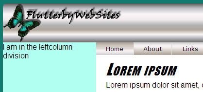
I am in the leftcolumn division
</div><!-- End leftcolumn -->In the page, we see that placeholder text in the leftcolumn div.
The light blue color of the left column isn't coming from that div or its style rule. Neither the tags nor style rules contain descriptors for a background color. That gives the div a transparent background color. The color you see in the left column is actually the background color of the wrapper div that's "behind" all the other elements. That light blue color is #b0fff0, as defined in the style rule for the wrapper div, shown below.
#wrapper{

    width: 40em;

    background-color: #b0fff0;
/* Put 20px margin above the wrapper */
/* Set right and left to auto for centering */
margin: 20px auto;
}
If you want to change the color of that leftcolumn div, change the background-color defined in the #wrapper style rule.
Adding a Temporary Border
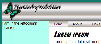
It always helps to know what's really going on behind the scenes when you're designing a page. As we've seen before, putting a temporary border around an element is a good way to see what's really happening. So, let's start by putting a temporary border around our leftcolumn div. Open up layoutstyles.css, and add the comment and border descriptor shown below to the #leftcolumn style rule now. If you haven't already done so, you might also want to add a large comment above that style rule, as below.
/************* Leftcolumn division styles ****************/#leftcolumn{
/* Remember, content and navbar left
margins must match this width */
width:12em;
float:left;
/* Temporary border */
border:dashed 1px #f00;
}
Save the change, and open layout.htm in a browser. Now, you can see the whole leftcolumn div, as indicated by its dashed red border. It's 12em wide, as per its style rule. And like all divs, it's automatically just tall enough to contain its content.
Normally, text from the content division to the right of the leftcolumn division would wrap underneath that short leftcolumn div. But you took care of that earlier by setting the left margin of the content div equal to the width of the leftcolumn div in this style rule.
#content{
/* Left margin must match leftcolumn width */
margin-left:12em;
background-color:#fff;
color:#000;
padding:10px 20px;
}As you add content to the leftcolumn div, it'll grow in height into that empty space.
Let's head over to Chapter 2 and start adding some content to that division.
Chapter 2:
Putting Content in the Column
The leftcolumn div is just a div like any other in our page. So, you can put anything you want in that div. In this chapter, you'll use some techniques for putting pictures and text in the column.
Adding a Picture to the Leftcolumn Div
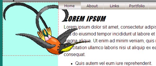
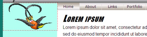
To add a graphic image to the leftcolumn division, use a standard <img /> tag. By default, a graphic image displays at its actual size. So, if the image is wider than the column, part of it'll stick out to the right.
For example, here's a graphic image I'll refer to as bird.gif. Its dimensions are 300 x 183 (300 pixels wide and 183 pixels tall).

Let's assume that the bird.gif file is in a subfolder named images in your Web site. To display that image in the left column, you'd add the <img /> tag shown below to the page, inside the leftcolumn div, as shown below. (I took out the sample placeholder text here since we don't really need it anymore.)
<div id="leftcolumn">
<img src="images/bird.gif" alt="bird" /></div><!-- End leftcolumn -->
In the Web browser, you can see that the image is much too wide for the leftcolumn div. It extends beyond the right edge of the leftcolumn div and into the content and navbar divisions to the right.
In an elastic layout like this, it's a good idea to make the image a little larger than it appears at normal magnification. That way, the picture won't become pixelated at higher magnifications.
But you want the image to fit inside the left column; so, you need to specify a width in CSS. To maintain elasticity, you need to specify that width using the em or percent (%) unit of measure. When sizing an image, it really doesn't matter which you use. The image will flex properly either way.
As always, you have a choice about where you specify the size. If you want to specify the width of only this image, you can use an inline style. If you want to create a more general style rule that applies to all images in the leftcolumn division, use a style rule. Let's try the latter approach. Open layoutstyles.css, and add the following comment and style rule just under the #leftcolumn style rule that's already in the style sheet, just to keep things organized.
/* Applies to images in the leftcolumn div */
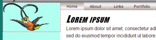
#leftcolumn img{
width:80%;
}Save and refresh. Now the image is 80% the width of the leftcolumn division, as shown below. As you can see from the dashed red border, the leftcolumn div has also grown in height to accommodate the image.
In the browser, you can zoom in and out using View > Text Size on the menu, or the CTRL++ and CTRL+- keys. The image will flex with everything else. That's because its width will always be 80% of whatever width the left column happens to be.
Centering the Image
Centering is always tricky in XHTML. The old align=
attribute from traditional HTML is deprecated. So, we want to avoid
that. The only other way to accomplish centering is by putting the image
inside a div that has a text-align:center descriptor.
Here,
you don't need to add a new div to the page, though. The leftcolumn
division is already a div. And it already has a style rule, #leftcolumn.
So, you can just add text-align:center; to the #leftcolumn style rule in your layoutstyles.css style sheet. You might want to add a comment, too.
/************* Leftcolumn division styles ****************/
#leftcolumn{
/* Remember, content and navbar left
margins must match this width */
width:12em;
float:left;
/* Temporary border */
border: dashed 1px #f00;
/* Center images and text inside this div */
text-align:center;
}Save and refresh. The image is centered inside the leftcolumn division.
You can add as many images as you want to your leftcolumn division. They'll all share the style defined by the #leftcolumn img style rule. That saves you from having to style every graphic image individually.
Adding Text to the Left Column
You can also add text to the left column. Typically, you put small boxes of text in narrow columns, not long passes of paragraphs. Let's create a simple style rule for using stylized paragraphs to create such boxes.
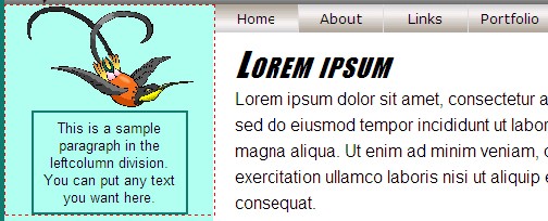
In layout.htm, go ahead and add the paragraph below to your leftcolumn div. Note that the other tags are already in your page. You need only add the paragraph.
<div id="leftcolumn">
<img src="images/bird.gif" alt="bird" /><p>
This is a sample paragraph in the leftcolumn division. You can put any text you want here.
</p>
</div><!-- End leftcolumn -->
Save and refresh to see the result in the browser.
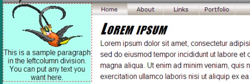
Notice how the leftcolumn div, surrounded by the red dashed border, has grown in height to accommodate the paragraph. It hasn't gotten any wider, though. That's because, unlike pictures, paragraphs and other block elements that contain text can wrap (break between words) to fit within their containing block.
Now,
you can style the paragraph to taste. As always, you can create a
single style rule that applies to all paragraphs in the left column. In
the layoutstyles.css, scroll down to where the other two #leftcolumn
style rules are in the sheet. Add the following style rule under the #leftcolumn img style rule:
/* Applies to paragraphs in the leftcolumn division */
#leftcolumn p{}
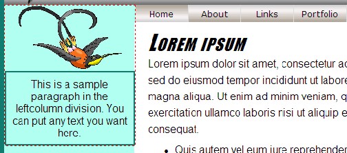
Let's start by putting a border around the paragraph. You can also add a little padding to keep text inside the paragraph from touching the paragraph border.
/* Applies to paragraphs in the leftcolumn division */
#leftcolumn p{
border:solid 2px #117b6f;
padding:0.5em;
} Save and refresh to see the result.
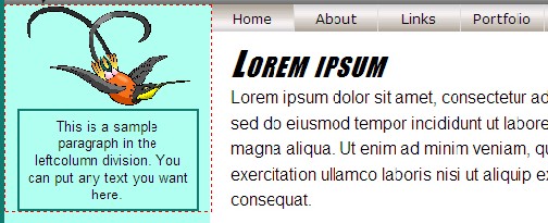
Right now, the paragraph has a transparent background color because we didn't specify a background color in our style rule. You can keep it that way if you like. Or you can specify a background color and color (for the text) of your own choosing.
The paragraph is as wide as the column. To make it narrower, you can give it a specific width. There's a slight difference between using em units or percent (%) when specifying the width of an element that contains text.
If you specify the width using em units, the width is relative to the size of text inside the paragraph. For example, let's just suppose you specify the width as 10em:
/* Applies to paragraphs in the leftcolumn division */
#leftcolumn p{
border:solid 2px #117b6f;
padding:0.5em;
width:10em;
}The box shrinks to a width of 11em. That sounds weird, I know, but padding always gets added to the width that you specify in the width: property. The descriptor padding:0.5em;
puts half an em of padding at the top, right, bottom, and left sides of
the paragraph. The left and right padding will be added to the width
specified in the width:10em; descriptor. So, the actual
width is 0.5em of left padding, plus 10em of specified width, plus 0.5em
of right padding, which adds up to 11em. In the browser, it looks like
this:
|
As I mentioned, when you specify a width using em units of measure, that width is sensitive to the size of text inside the element. For example, let's see what happens if we reduce the size of text inside the paragraph to 0.8em:
/* Applies to paragraphs in the leftcolumn division */
#leftcolumn p{
border:solid 2px #117b6f;
padding:0.5em;
width:10em;
font-size:0.8em;
}Save and refresh. In the Web browser, the text shrinks, but so does the box as a whole! This is because a width of 10em at a font size of 0.8em isn't the same as a width of 10em at the default font size.
If you specify the width of the paragraph using percent (%) rather than em units, the size of text inside the paragraph has no effect. The percent unit of measure is always relative to the containing element and never the text size. For example, suppose you change the width of the paragraph to 80%:
/* Applies to paragraphs in the leftcolumn division */
#leftcolumn p{
border:solid 2px #117b6f;
padding:0.5em;
width:80%;
font-size:0.8em;
}Save and refresh. The paragraph is 80% the width of the left column (plus a little extra because of the padding). In other words, the 80% width is 80% the width of the column, regardless of the size of text inside the paragraph.
Depending on the browser you use to view your page, the paragraph in the left column might not be centered.
Let's head over to Chapter 3 to explore what that's about and what you can do about it.
Chapter 3:
Centering Elements
in the Left Column
Earlier in this lesson, you added text-align:center to the #leftcolumn style rule in our style sheet. We did that mainly to center the graphic image that we put into the left column.
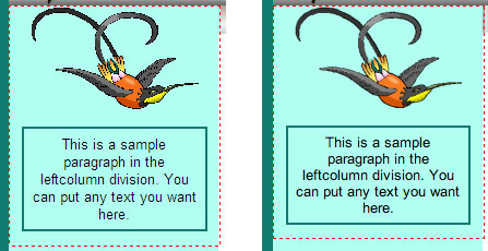
The text-align property is an inherited property. So, it also applies to the paragraph. But exactly how it applies depends on the browser you use to view the page.
In Internet Explorer, text-align:center causes the
entire paragraph to center, as a whole, within the left column, as shown
at left below. But in Firefox, Safari, and most other browsers, only
the text inside the paragraph is centered. The paragraph as a whole
remains left-aligned in the column, as shown at right below.
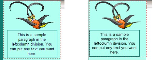
The cause of this difference in browsers is how they interpret the meaning of text-align:center. Internet Explorer tends to center everything inside a div that has its text-align property set to center. Firefox and other browsers apply that to graphic images and text flows, but not to entire block elements like paragraphs and tables. That's why the text inside the paragraph is centered, but the paragraph as a whole is not.
To center a block element, like a paragraph, table, or div, in Firefox and most other browsers, you apply margin:auto
directly to that element—like the way you used to apply directly to an
element in traditional HTML. Only you don't have to put margin:auto in
the tag as an attribute. You can put it in the element's style rule.
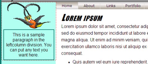
To see for yourself, go ahead and add margin:auto; to the #leftcolumn p style rule in layoutstyles.css now.
/* Applies to paragraphs in the leftcolumn division */
#leftcolumn p{
border:solid 2px #117b6f;
padding:0.5em;
width:80%;
font-size:0.8em;
margin:auto;
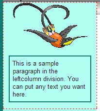
}The paragraph, as a whole, is centered inside the left column in all browsers.
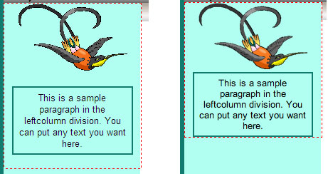
But a new browser difference has reared its head. Internet Explorer (on the left) has added some extra space above and below the paragraph!
To center the paragraph horizontally, only the left and right margins
need to be set to auto. The top and bottom margins can be anything you
want. For example, below I've changed margin:auto; to margin: 1em auto;.
/* Applies to paragraphs in the leftcolumn division */
#leftcolumn p{
border:solid 2px #117b6f;
padding:0.5em;
width:80%;
font-size:0.8em;
margin:1em auto;
}That sets the top and bottom margins each to 1em (in all browsers) and leaves the right and left margins set to auto. And now the paragraph looks the same (or as close as you can hope to get) in all browsers. The image below shows the paragraph in IE at left and Safari at right.
Aligning Text Inside the Paragraph
Now, let's suppose you want the text inside the paragraph (not the
paragraph as a whole) to be left-aligned rather than centered. As it
turns out, this is easy to do. Just add text-align:left; to the #leftcolumn p style rule.
/* Applies to paragraphs in the leftcolumn division */
#leftcolumn p{
border:solid 2px #117b6f;
padding:0.5em;
width:80%;
font-size:0.8em;
margin:1em auto;
text-align:left;
}The whole paragraph remains centered within the div. Only text inside the paragraph aligns left. And it works the same in all Web browsers.
Of course, you can set the top and bottom margins to anything you want. It all depends on how much vertical space you want between elements in the division. Ideally, you want to get the top and bottom margins just right in your style rule. That way, you don't have to resort to using empty paragraphs or a bunch of line breaks in the page to try to control that vertical spacing.
Wordwrap and Hyphenation
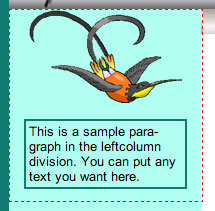
Whenever you've long words in a narrow column, you're bound to get a lot of empty space inside the element. For instance, there's not enough room for the words paragraph and leftcolumn in the sample paragraph above to fit in their original lines. So, they wrap to the next line, causing noticeable empty space in the lines above them.
You can use soft hyphens to break long words. These aren't
the same hyphens you type directly from your keyboard. These are special
characters denoted by ­ or ­ in your code. For example, here's a soft hyphen in the word paragraph:
<p>
This is a sample para­graph in the leftcolumn division. You can put any text you want here.
</p>In most browsers, the text wraps at the soft hyphen so there's not such a large gap at the end of the first line.
It's important to understand that a soft hyphen indicates where a word can break, if necessary. If the word can fit on a line without wrapping, then the soft hyphen doesn't show up at all in the browser.
So, there are some good general tools and techniques for sizing and positioning elements in the left column. We don't really need that dashed red border anymore. That was just temporary; so, you can see what the leftcolumn div really looks like. You can get rid of that temporary red border at any time. Just remove the following lines from the #leftcolumn style rule in layoutstyles.css.
/* Temporary border */
border: dashed 1px #f00; For the rest of this lesson, let's take a break from working directly on layout.htm and talk about some general issues related to vertically centering elements in CSS and XHTML.
We'll get started on that in Chapter 4.
Chapter 4
Understanding Vertical Alignment
Vertical alignment is one of the most perplexing aspects of Web development. CSS offers a vertical-align:
property that offers some relief. However, it only applies to table
cells and inline elements. For example, you can't use vertical-align to
vertically center an element on the page or vertically center content
inside a div or paragraph.
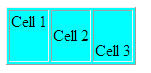
Let's start by looking at situations where vertical-align actually works. Below, you see the tags for a table with one row and three columns. The table row has a height of 3em (three lines of text). The first cell aligns its content to the top. The second cell aligns its content to the middle. The third aligns its content to the bottom.
<table border="1" style="background-color:#0ff;"> <tr style="height:3em"> <td style="vertical-align:top">Cell 1</td> <td style="vertical-align:middle">Cell 2</td> <td style="vertical-align:bottom">Cell 3</td> </tr> </table>
Here's how that table looks in a Web browser. The content in each cell is vertically aligned, as expected.
Vertical alignment can also be applied to inline elements, such as words in a paragraph or a small graphic image embedded within those words. For inline vertical alignment, you can use any of the following values with the vertical-align property:
The image below shows the difference between baseline, text-bottom, and text-top relative to some text. The baseline is the bottom of text excluding descenders. Lowercase letters like g, j, p, q, and y have descenders (tails) that extend below the baseline.
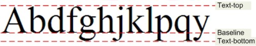
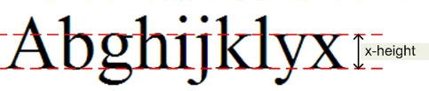
The x-height of the text is the height of lowercase x. Lowercase letters like b, f, h, j, k, i, and l have ascenders that extend above the x-height.
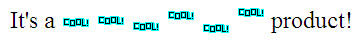
You can use these values to align small graphic images within a line of text vertically. For example, here's a graphic image to which I'll refer as tiny.gif:

Here's a paragraph of text that shows that image six times, each with a different vertical-align value:
<p style="font-size:1.5em; padding:1em">It's a <img src="images/tiny.gif" style="vertical-align:baseline" alt="" /> <img src="images/tiny.gif" style="vertical-align:middle" alt="" /> <img src="images/tiny.gif" style="vertical-align:sub" alt="" /> <img src="images/tiny.gif" style="vertical-align:super" alt="" /> <img src="images/tiny.gif" style="vertical-align:text-bottom" alt="" /> <img src="images/tiny.gif" style="vertical-align:text-top" alt="" /> product!</p>
This is how that paragraph looks in a browser. You can see how the different vertical- align: values affect where the image is in relation to the text in that same line.
In addition to using word values with vertical-align, you can specify numeric values using any unit of measure.
Let's head over to Chapter 5
and look at some practical examples of those.
Chapter 5:
Vertical Centering
As you saw in the previous chapter, you can use vertical-align to align table cell contents and inline elements vertically. You can also use it to align an element relative to the Web browser window or a containing block vertically. However, word values like middle and bottom don't work for this kind of element. You have to take more extreme measures.
The trick to vertically centering an entire block element requires that two conditions be met:
So, right off the bat, you know the elements style must include height and position absolute descriptors. Let's work through an example. Let's use an otherwise empty page and an internal style sheet, just to try to keep the example as simple as possible.
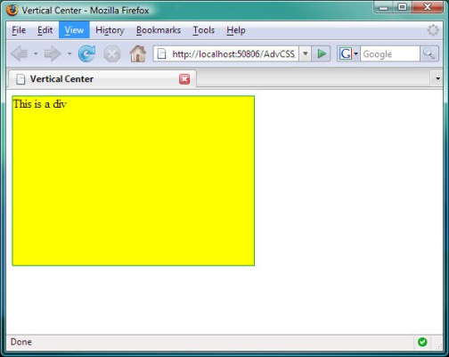
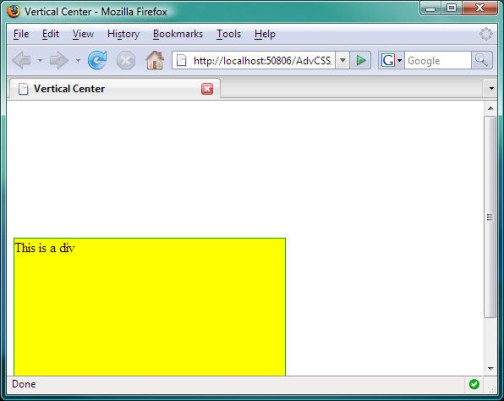
For starters, this page contains a style class named div.vertcenter that defines a div that has a yellow background, a height of 14em, and a width of 20em. The element is positioned absolutely on the page. The body of the page contains a div to which that style class is applied. Here's the page:
<!DOCTYPE html PUBLIC "-//W3C//DTD XHTML 1.0 Transitional//EN" "http://www.w3.org/TR/xhtml1/DTD/xhtml1-transitional.dtd">
<html xmlns="http://www.w3.org/1999/xhtml">
<head>
<title>Vertical Center</title>
<style type="text/css">
div.vertcenter{
background-color:#ff0; /* yellow */
border:solid 1px #0a0; /* green */
height:14em;
width:20em;
position:absolute;
}
</style>
</head>
<body>
<div class="vertcenter">
This is a div
</div>
</body>
</html>This is how the page looks in a Web browser.
You've met the conditions of giving the element a specific height and absolute positioning. To vertically center the element in the browser, you must now do the following:
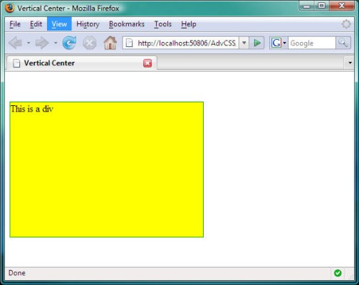
First, set the top of the element to 50% by adding top:50%; to the style rule:
div.vertcenter{
background-color:#ff0; /* yellow */
border:solid 1px #0a0; /* green */
height:14em;
width:10em;
position:absolute;
top:50%;
}Save and refresh. The top of the element centers vertically down the browser window.
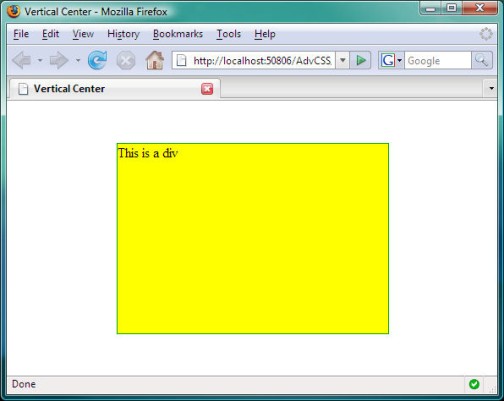
You're not finished. You don't want the top of the element centered vertically. You want the middle of the element centered vertically. So, you have to move it up by half its height. You can do this by giving it a negative top margin that's half the height of the element. Since the height of this element is 14em, you need a top margin of -7em (minus 7em).
div.vertcenter{
background-color:#ff0; /* yellow */
border:solid 1px #0a0; /* green */
height:14em;
width:20em;
position:absolute;
top:50%;
margin-top:-7em; /* Half the height */
}Save and refresh to see that the element centers vertically in the browser window. And it stays vertically centered as you increase or decrease the height of the browser window.
Now, here's the rub: Absolutely positioned elements are outside the text flow. Other text and tags in the page don't push absolutely positioned elements around. Furthermore, margin:auto and other techniques for horizontally centering normal elements don't apply to absolutely positioned elements.
So, what if you want to center this horizontally as well? You have to use a technique similar to that for the vertical centering:
To center our sample div horizontally, you need to add left:50%; to the style rule. And you need to add margin-left:-10em; because the element is 20em wide. Here's the style rule with those two descriptors added:
div.vertcenter{
background-color:#ff0; /* yellow */
border:solid 1px #0a0; /* green */
height:14em;
width:20em;
position:absolute;
top:50%;
left:50%;
margin-top:-7em; /* Half the height */
margin-left:-10em /* Half the width */
}Save and refresh. The element is smack dab in the middle of the browser window. And it stays there no matter how you size the browser window.
So, if for whatever reason, you need to center both vertically and horizontally within the Web browser window, you now know the trick.
Vertically Centering a Single Line of Text
If your goal is simply to vertically center a single line of text inside a division, you don't need to go to such extreme measures. Instead, you can set the line height of the div equal to the height of the div. For example, the div below uses inline styles to set both the height and the line height of the div to 4em.
<div style="height:4em;
line-height:4em;
background-color:#ccc;
text-align:center">
<h1>Centered Title</h1>
</div>Here's how that div and text look in a Web browser.

Nudge It With Relative Positioning
Keep in mind that if you need to reposition an element only slightly, relative positioning is your best friend. If you need to move the element down slightly, set the top measurement to a positive value. If you need to move the element up slightly, set the top value to a negative number.
For example, here are the tags for a div that has a two-line title. The div is 6em tall. We can't use line-height to center the text because the text is two lines tall rather than one line (because the title contains a <br /> tag.
<div style="height:6em;background-color:#ccc;text-align:center">
<h1>Centered Title<br />
Across Two Lines</h1>
</div>Here's that div in a Web browser.
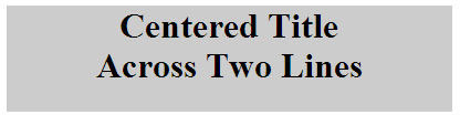
It's not always easy to know exactly how far you need to move an element up or down. But you can take a guess and then make refinements from there. For example, a style rule was added to the <h1> tag to position it relatively and move it down 0.3em.
<div style="height:6em;background-color:#ccc;text-align:center">
<h1 style="position:relative;top:0.3em">Centered Title<br />
Across Two Lines</h1>
</div>This is how it looks in the Web browser. The slight downward nudge of 0.3em makes the title look more vertically centered within the gray div.

Conclusion
In today's lesson, you discovered many techniques for sizing and positioning elements. You used the left column of our layout as an example, because a narrow column like that poses some unique challenges. But the techniques are universal and work inside any div, as well as in a page body without divs.
Graphic images that you don't size explicitly will appear at their natural dimensions. Block elements that contain text tend to fit within their containing block.
When sizing elements in elastic layouts, you want to stick with the percent (%) and em units of measure, as these allow the sized elements to flex with the user's preferred magnification and text size.
Sometimes, an element will naturally fall close to where you want it, but not exactly. In those cases, you can use relative positioning to nudge the element up, down, left, or right slightly to a better position.
In the next chapter, we'll go over some tips, tricks, and techniques for using scroll bars, images, and for making layouts more search engine-friendly. See you there!
Supplementary Material
|
Visual Formatting Model http://www.w3.org/TR/CSS21/visuren.html |
| This is the W3C's official documentation on the many ways you can position elements using CSS. |
|
Values http://www.w3.org/TR/CSS21/syndata.html#values |
| Here's where you'll find the official W3C page on all the different units of measure you can use with CSS properties. |
|
Baseline http://en.wikipedia.org/wiki/Baseline_%28typography%29 |
| Click this link for Wikipedia's definition of baseline, as well as other typographical terms like x-height, ascender, and descender. |
|
Hyphenation http://www.w3.org/TR/html4/struct/text.html#h-9.3.3 |
| This official W3C specs section describes hyphenation. |
|
Vertical-Align http://www.w3.org/TR/CSS21/visudet.html#propdef-vertical-align |
| This page provides the W3C's full documentation on the CSS vertical-align property. |
|
Understanding Vertical-Align http://phrogz.net/CSS/vertical-align/index.html |
| This page describes how to vertically align content. |
|
CSS Vertical Centering Using Float and Clear http://d-graff.de/fricca/center.html |
| This page illustrates a div that's centered vertically and horizontally in the browser window. It uses a technique similar to that in Chapter 5. You have to look at the source code of the page to see the CSS styles used. |
FAQs
/* Applies to paragraphs and lists in the leftcolumn division */
#leftcolumn p,
#leftcolumn .leftcollist{
border:solid 2px #117b6f;
padding:8px;
width:80%;
font-size:0.8em;
margin:1em auto;
text-align:left;
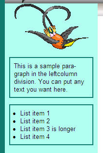
} <div id="leftcolumn">
<img src="images/bird.gif" alt="bird" />
<p>
This is a sample paraÂgraph in the leftÂcolumn division. You can put any text you want here.
</p>
<div class="leftcollist">
<ul>
<li>List item 1</li>
<li>List item 2</li>
<li>List item 3 is longer</li>
<li>List item 4</li>
</ul>
</div><!-- End leftcollist div -->
</div><!-- End leftcolumn -->/* Applies to unordered lists in the left column */
#leftcolumn ul{
margin-left:1em;
}
<p>E=mc<sup>2</sup> is Einstein's famous equation</p>
<p>U<sub>92</sub> is Uranium with 92 protons</p>.superscript{
font-size:50%;
vertical-align:super;
}.subscript{
font-size:50%;
vertical-align:sub;
}<p>E=mc<span class="superscript">2</span> is Einstein's famous equation</p>
<p>U<span class="subscript">92</span> is Uranium with 92 protons</p>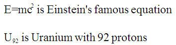
/* layoutstyles.css */
/* Universal style rule */
*{
margin: 0;
padding: 0;
/* Temporary borders */
/* border: dashed 1px #f00; */
}
body {
background-color: #117b6f;
font-family: Arial, Helvetica, sans-serif;
}
#wrapper{
width: 40em;
background-color: #b0fff0;
    /* Put 20px margin above the wrapper */

    /* Set right and left to auto for centering */

    margin: 20px auto;

}
/********** Major layout divisions **********/
#branding{
/* For absolutely-positioned hyperlinks */
position:relative;
}
/********** Branding division styles **********/
#branding a{
/* Postions are set in tags in layout.htm */
position:absolute;
text-decoration:none;
color:#000;
font-size:0.8em;
}
#branding a:link, #branding a:visited{
color:#000;
}
#branding a:hover{
color:#0f0;
}
#branding a:active{
color:#1bb498;
}
/* Fixes the mysterious image gap */
#branding img{
display:block;
}
/********** Leftcolumn division styles **********/
#leftcolumn{
/* Remember, content and navbar left
margins must match this width */
width:12em;
float:left;
/* Center images and text inside this div */
text-align:center;
}
/* Applies to images in the leftcolumn div */
#leftcolumn img{
width:80%;
}
/* Applies to paragraphs and lists in the leftcolumn division */
#leftcolumn p,
#leftcolumn .leftcollist{
border:solid 2px #117b6f;
padding:8px;
width:80%;
font-size:0.8em;
margin:1em auto;
text-align:left;
}
/* Unordered lists in left column */
#leftcolumn ul{
margin-left:1em;
}
/********** Navbar division styles **********/
#navbar{
background:#aaa url(images/navbak.jpg) repeat-x center;
/* Left margin must match leftcolumn width */
margin-left:12em;
height:1.6em;
}
/* Remove bullets from ul in the navbar */
#navbar ul{
list-style-type:none;
}
/* List items in the navbar */
#navbar li{
float:left;
/* Required for drop-down menus */
position:relative;
}
/* Applies to navbar links, unvisited and visited */
#navbar a,
#navbar a:link,
#navbar a:visited{
text-decoration:none;
font-family:Verdana, Geneva, Arial, Sans-Serif;
font-size:80%;
color:#000;
background:#aaa url(images/navbak.jpg) repeat-x center;
display:block;
height:2em;
width:6em;
border-right: solid 1px #ddd;
line-height:2em;
text-align:center;
outline-style:none;
}
/* Navbar hover, active, and current page links */
#navbar a:hover,
#navbar a:active,
#navbar li.selected a:link,
#navbar li.selected a:visited{
background:#ddd url(images/navhover.jpg) repeat-x center;
color:#000;
}
/* Drop-down menu styles */
/* Applies to drop-down menus in navbar */
#navbar li ul{
position:absolute;
z-index:100;
visibility:hidden;
border:solid 1px #aaa;
border-right: solid 2px #999;
border-bottom: solid 2px #999;
}
/* Make drop-down visible on navbar hover */
#navbar li:hover ul,
#navbar li a:hover ul{ /* IE6 hack */
visibility:visible;
top:1.6em;
left:0;
}
/* Applies to links on the drop-down menu */
#navbar li:hover ul li a,
#navbar li a:hover ul li a{ /* IE6 hack */
background:#ccc; /* Removes background image */
color:#000;
text-align:left;
display:block;
width:10em;
padding:0 0 0 1em;
height:auto;
}
/* Hover on drop-down menu links */
#navbar li:hover ul li a:hover,
#navbar li a:hover ul li a:hover{ /* IE6 hack */
background: #aaa;
color:#000;
}
/* IE6 hack applies to its table drop-down */
#navbar table {
margin:-1px;
border-collapse:collapse;
position:absolute;
top:0.5em;
left:0;
z-index:100;
}
/********** Content division styles **********/
#content{

    /* Left margin must match leftcolumn width */

    margin-left:12em;

    background-color:#fff;

    color:#000;

    padding:10px 20px;

}
/* Applies to paragraphs in the content division */
#content p{
line-height:1.5em;
}
/* Applies to all lists in the content division */
#content ul, #content ol{
padding:10px 0 10px 40px;
}
/* Styles h1, h2, and h3 style rules in the content division */
#content h1, #content h2, #content h3{
font-family: Charcoal, Impact, sans-serif;
color:#000;
font-weight:normal;
font-style:italic;
font-variant:small-caps;
letter-spacing:0.08em;
}
/* Size h1 headings in the content division */
#content h1{
font-size:2em;
}
/* Size h2 headings in the content division */
#content h2{
font-size:1.5em;
}
/* Size h3 headings in the content division */
#content h3{
font-size:1.25em;
font-style:normal;
}
/********** Footer division styles **********/
#footer{
/* To be determined */
}<!DOCTYPE html PUBLIC "-//W3C//DTD XHTML 1.1//EN"
"http://www.w3.org/TR/xhtml11/DTD/xhtml11.dtd">
<html xmlns="http://www.w3.org/1999/xhtml">
<head>
<title>layout.htm</title>
<link href="layoutstyles.css" rel="stylesheet" type="text/css" />
</head>
<body>
<!-- Wrapper sets the layout width -->
<div id="wrapper">
<div id="branding">
<img src="images/bbImg2.jpg" alt="logo" style="width:100%" />
<!-- Absolutely positioned in style sheet -->
<a style="top:1em;right:8em;" href="#">News</a>
<a style="top:1em;right:2em;" href="#">Contact Us</a>
</div><!-- End branding -->
<div id="leftcolumn">

   <img src="images/bird.gif" alt="bird" />
<p>
This is a sample paraÂgraph in the leftÂcolumn division. You can put any text you want here.
</p>
<div class="leftcollist">
<ul>
<li>List item 1</li>
<li>List item 2</li>
<li>List item 3 is longer</li>
<li>List item 4</li>
</ul>
</div><!-- End leftcollist div -->
</div><!-- End leftcolumn -->
<div id="navbar">
<ul>
<li class="selected"><a href="#">Home</a></li>
<li><a href="#">About<!--[if gte IE 7]><!--></a><!--<![endif]-->
<!--[if lte IE 6]><table><tr><td><![endif]-->
<ul><!-- Start About drop-down menu -->
<li><a href="#">About Option1</a></li>
<li><a href="#">About Option2</a></li>
<li><a href="#">About Option3</a></li>
<li><a href="#">About Option4</a></li>
</ul><!-- End About drop-down menu -->
<!--[if lte IE 6]></td></tr></table></a><![endif]-->
</li><!-- End About -->
<li><a href="#">Links<!--[if gte IE 7]><!--></a><!--<![endif]-->
<!--[if lte IE 6]><table><tr><td><![endif]-->
<ul><!-- Start Links drop-down menu -->
<li><a href="#">Links Option1</a></li>
<li><a href="#">Links Option2</a></li>
<li><a href="#">Links Option3</a></li>
</ul><!-- End Links drop-down menu -->
<!--[if lte IE 6]></td></tr></table></a><![endif]-->
</li><!-- End Links -->
<li><a href="#">Portfolio<!--[if gte IE 7]><!--></a><!--<![endif]-->
<!--[if lte IE 6]><table><tr><td><![endif]-->
<ul><!-- Start Portfolio drop-down menu -->
<li><a href="#">Portfolio Option1</a></li>
<li><a href="#">Portfolio Option2</a></li>
<li><a href="#">Portfolio Option3</a></li>
<li><a href="#">Portfolio Option4</a></li>
</ul><!-- End Portfolio drop-down menu -->
<!--[if lte IE 6]></td></tr></table></a><![endif]-->
</li><!-- End Portfolio -->
</ul>
</div><!-- End navbar div -->
<div id="content">
<h1>Lorem ipsum</h1>
<p>Lorem ipsum dolor sit amet, consectetur adipisicing elit, sed
do eiusmod tempor incididunt ut labore et dolore magna aliqua. Ut enim
ad minim veniam, quis nostrud exercitation ullamco laboris nisi ut
aliquip ex ea commodo consequat.</p>
<ul>
<li>Quis autem vel eum iure reprehenderit.</li>
<li>Voluptate velit esse, quam nihil molestiae consequatur.</li>
<li>Et harum quidem rerum facilis.</li>
</ul>
<p>Nam libero tempore, qumme soluta nobis est eligendi optio,
lumque nihil impedit, quo minus id, quod maxime placeat, facere
possimus, omnis voluptas assumenda est, omnis dolor repellendus.
Temporibus autem quibusdam et aut officiis debitis aut rerum
necessitatibus saepe eveniet, ut et voluptates repudiandae sint et
molestiae non recusandae.</p>
<h2>Heading Two Here</h2>
<h3>Heading Three Here</h3>
<ol>
<li>I am an ordered list</li>
<li>Yippie yie yo ki-yay</li>
<li>End of ordered list</li>
</ol>
<p>This is a paragraph</p>
</div><!-- End content -->
<div id="footer">
I am in the footer
</div><!-- End footer -->
</div><!-- End wrapper -->
</body>
</html>Assignment
 Note: The paragraph won't be centered in all browsers. We'll take care of that in a moment.