Overflow text is visible
Chapter 1:
Overflows and Scroll Bars
Hello again, and welcome back. In today's lesson, we'll take a break from some of the mind-bending techniques we've covered in the previous lessons. We'll start with a couple of fun and relatively easy techniques you might want to use to add some pizzazz to your pages. Then, we'll get back into some professional-level matter concerning search engine optimization. Let's start with the fun stuff.
Throughout this course, we've seen how block elements like divs and paragraphs tend to grow in height to contain whatever you put in them. But it doesn't have to be that way. As you'll learn in this chapter, you can make them any height you want. Then, you can add a scroll bar to allow users to see any content that's currently hiding.
The trick lies in understanding the CSS overflow: property. The overflow property can take any one of four possible values:
The auto value is by far the most common. Let's take it from the top and work through an example. Here's a page that contains a scrollbar style class. Inside the page is a div that uses that style class, and it contains some text, as follows:
<!DOCTYPE html PUBLIC "-//W3C//DTD XHTML 1.1//EN"

"http://www.w3.org/TR/xhtml11/DTD/xhtml11.dtd">

<html xmlns="http://www.w3.org/1999/xhtml">

<head>

   <title>Overflow</title>

   <style type="text/css">

   .scrollbar{

   width:10em;

   height:5em;

   padding:0.25em;

   border:solid thin #000;

   background-color:#ddd;

   }

   </style>

</head>

<body>

<div class="scrollbar">This is a div with some text
inside. It could be a paragraph or any other block element. What's
important is that it has a specified height that isn't tall enough to
show all of this text.
</div>

</body>

</html>
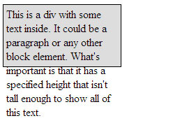
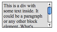
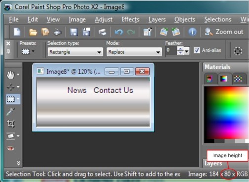
Here's how the page looks in a Web browser. I haven't used an overflow property yet. So, text that doesn't fit in the box is visible. Text that doesn't fit in the box spills right out past the bottom of that box. The extra text beyond the bottom of the box is called overflow text. Needless to say, it doesn't look too good.
Adding overflow:visible to the scrollbar style class would have no effect because that's the default. It's what you get if you don't apply an overflow property at all.
Now, let's see what happens if you add overflow:hidden; to the style rule, as below:
.scrollbar{
width:10em;
height:5em;
padding:0.25em;
border:solid thin #000;
background-color:#ddd;
overflow:hidden;
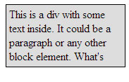
}Save the page, and refresh the browser window. The overflow text is hidden.
Now, we can't see the overflow text. But there's no way to get to it either. That's where the scroll and auto values come into play.
Let's try the scroll value in the style rule like this:
.scrollbar{

 width:10em;

 height:5em;

 padding:0.25em;

 border:solid thin #000;

 background-color:#ddd;

 overflow:scroll;

}
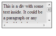
Save and refresh. Now the box shows two scroll bars, as shown below. The user can scroll up and down using the vertical scroll bar to see the overflow text. But the bottom horizontal scroll bar is disabled (dimmed) because there's no need to scroll left and right to see content.
|
Now, let's try the auto value. This value only applies scroll bars if and where appropriate to the situation. Here's the scrollbar style class with the overflow property set to auto.
.scrollbar{
width:10em;
height:5em;
padding:0.25em;
border:solid thin #000;
background-color:#ddd;
overflow:auto;
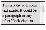
}Here's how that plays out in the Web browser. The user can scroll up and down using the vertical scroll bar. There's no horizontal scroll bar because there's no need in this box.
The exact appearance of the scroll bar varies from one browser to the next. For example, here's how it looks in Safari 3.
Unfortunately, there's nothing in CSS or XHTML that will let you style the scroll bar. What you see in each browser is what you get. The one exception is Internet Explorer, which offers a scroll bar property. However, this isn't an official W3C CSS property, and most Web browsers ignore it.
So, that wraps it up for our work with the CSS overflow property. As you've seen, it lets you choose how you want to handle overflow content that doesn't fit inside a box that has a specific height and width.
Let's head over to Chapter 2 and discover another relatively easy technique that might come in handy—images with captions.
Chapter 2:
Using Captioned Images
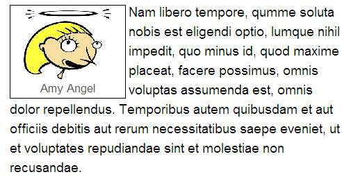
In this chapter, you'll learn a relatively easy technique for adding captioned images to your pages. Here's an example where we have a cartoon image of a person captioned "Amy Angel."
The easiest way to create something like this is via two style rules, like these:
/* Captioned images */
div.captionpic{
   width:9em;
   padding:0.25em;
   margin:0.25em 0.25em 0 0;
   float:left;
   border:solid 1px #000;
   font-family: Arial, Helvetica, Sans-Serif;
   font-size:0.8em;
   color:#555;
   text-align:center;
}

/* Applies to the image inside a captionpic div */
div.captionpic img{
   width:80%;
   border:none;
}
Of course, you can style things whatever way you want. All those descriptors are just examples of how you might want to style things.
We don't have any captioned figures in our current layout to work with. Should you ever want to use them in your own sites, here's what you'll need to do. (I'm assuming you've already added the above style rules to the site's style sheet.) First, put in the following tags:
<div class="captionpic"></div><!-- End captionpic -->
Between those tags, put in a normal <img /> tag for the picture you want to show. Follow that with a line break (<br /> tag) and the caption text, as in this example:
<div class="captionpic">
   <img src="images/amy.jpg" alt="Amy" />
   <br />
   Amy Angel
</div><!-- End caption pic -->
The style rule for the div includes float:left. Remember, floated elements appear next to subsequent elements in the page. You'll want to put those div tags above any content to which the captioned image floats left.
Now, you know a technique to place captioned images in your pages.
Let's switch gears and talk about search engine optimization and how it relates to page layouts.
Chapter 3:
SEO and Page Layouts
You've probably heard of search engine optimization, often abbreviated SEO. This has to do with techniques that maximize your page's chances of getting good placement in Google and other search engines.
SEO is a big topic, but in this chapter, I'd like to focus on one aspect of SEO concerning page layouts.
Search engines use programs—sometimes called bots, spiders, crawlers, and even Web-crawling infobots—to locate and index Web pages. Every search engine company designs its own programs to try to produce the best search engine possible. They also constantly refine those programs to improve their service and try to keep out spamdexers.
|
Because of the variety and ever-changing nature of search engine indexing, there's no magic bullet for ensuring top search result placement in any search engine. But there's one general principle that seems always to hold true: The first words on the page (under the <body> tag in the source code) get the most weight.
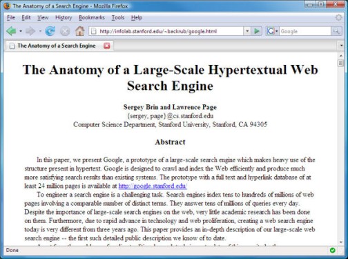
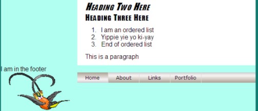
In the early days when people used traditional HTML and no page layout, the most important words automatically appeared near the top of the page, like this sample page we originally discussed in an earlier lesson and shown below.
Few of us write and publish such heady content or create pages with so little visual pizzazz. Most sites today use branding bars, navbars, columns, and other page layout features. Most use divs and floats for their layout. Some older sites still use tables. Both methods create a situation that works against search engine optimization. Let me explain.
A search engine crawler is a non-visual user agent. It doesn't see your page, visually, the way a human sees it in a Web browser. The crawler doesn't know, or care, about your page layout. The crawler simply starts indexing words in the page, starting right under the opening <body> tag.
In page layouts based on floats or tables, the first words the search indexer sees are words that are in the branding, leftcolumn, and navbar divisions (represented by … in the code below).
<body>

<div id="branding">

.

</div>

<div id="leftcolumn">

.

</div>

<div id="navbar">

.

</div>

<div id="content">

<h1>Page title</h1>

<p>The real meat of the page starts here.</p>

</div>

<div id="footer">

.

</div>

</body>
By the time the search engine crawler gets to "the real meat of the page," it has already indexed words in the previous divisions. Because those words are up near the opening <body> tag, the crawler has given them a lot of weight. This isn't good.
Usually, you want the crawler to index the words in the content division first, because those represent what the page is really concerning. Those are the words that should get the most weight when indexing your page.
Truthfully, the branding division usually doesn't pose much of a problem. Typically, it contains a few words at most. There may be no words at all if it's a graphic image. The leftcolumn and navbar divs may contain quite a few words, especially if the navbar contains drop-down menus.
The only way to prevent the words in the navbar and leftcolumn divisions from affecting a search engine indexing is to move the tags and content of those divisions lower in the source code. They should be closer to the closing </body> tag:
<body>

<div id="branding">

.

</div>

<div id="content">

<h1>Page title</h1>

<p>The real meat of the page starts here</p>

</div>

<div id="footer">

.

</div>

<div id="leftcolumn">

.

</div>

<div id="navbar">

.

</div>

</body>
This new tag arrangement gets the words that are most important for indexing up closer to the opening <body> tag. Less important words in the navbar and leftcolumn divs get less weight because they're down near the bottom of the source code and closing </body> tag. This is good for search engine optimization.
Unfortunately, you can't just open up the page and cut and paste those tags into their new position. Well, you can, but doing so will have a profound effect on how the page looks in the Web browser. That's because the order of tags in the source code affects where the content inside those tags appears on the page in the Web browser. Absolute positioning offers a way to position elements wherever you want, regardless of where the tags that define an element are located in the source code.
Absolutely positioned elements are always outside the text flow, which means other elements on the page don't affect their placement. Other elements on the page don't push absolutely positioned elements around. They don't wrap around or next to absolutely positioned elements.
Now that the tags and text of the navbar and leftcolumn divisions are lower in the source code, you'll need to use absolute positioning to make those elements appear, visually, on the Web page where you want them. It's not too difficult. The main trick is knowing where to position those elements.
Come on over to Chapter 4, and I'll show you how to figure that out.
Chapter 4:
Planning an SEO Layout
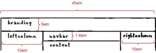
If you want to maximize your search engine placement and still use a fancy layout, you'll need to switch from a layout based on floats (or tables) to a layout based on absolute positioning. As a first step, you need to know the heights and widths of your major layout divisions. Most are things you define yourself in your style sheet. If you've forgotten what they are, just look at the style rules in your style sheet.
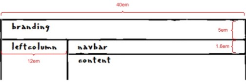
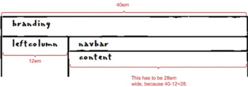
For starters, you need to know the width of your wrapper div (assuming you're using a wrapper div). This is defined in the #wrapper style rule in your style sheet. For example, in layoutstyles.css, we can see that the wrapper width is 40em.
#wrapper{
  width: 40em;
  . . .
}
Similarly, we can see that the left column div is 12em wide, and the navbar is 1.6em tall.
#leftcolumn{
  . . .
  width:12em;
}
#navbar{
  . . .
  height:1.6em;
}
The branding division is a little trickier. In layoutstyles.css, it doesn't have a specific height. Its style rule looks like this:
#branding{
  /* For absolutely-positioned hyperlinks */
  position:relative;
}
We intentionally avoided giving the branding division a specific height because we used a single graphic image, sized to 100% the width of the wrapper, as our branding division content. The height of that division needs to flex with the browser magnification and text size. As we discussed in an earlier lesson, sizing only the width of the image allows that height to flex. But it leaves us not knowing the exact height of that division on the screen.
Though you don't know its exact height, there are a couple of ways you can estimate it. And an estimate is good place to start. One handy way is to measure it with an on-screen ruler. As its name implies, an on-screen ruler is a tool for measuring things on your screen. There are a couple of links for free on-screen rulers that you can download in the Supplementary Material section.
The image below shows where I've used a screen ruler to get a sense of the height of the branding division in layout.htm using a screen ruler. There, I can see that it's about 80 pixels tall.
If you've a good graphics program and some basic skills for using it, you can use an alternative method. Open the page in a Web browser and take a screen shot. Paste the screen shot into your graphics program. Crop out everything except the branding bar (or a portion of the branding bar). Then, look at the height of the branding bar in that program, as in the example below.
It isn't necessary to get an exact pixel height on the division. It's important, however, to keep in mind that, in elastic layouts, you need to use em units of measure, not pixels. So, if you do come up with a pixel height, you need to divide that by 16 to convert to em units. For instance, my 80px tall branding division is 5em tall, because 80 divided by 16 is 5.
Once you have a sense of those heights and widths, jot them down on a sketch like the one we made back in Lesson 3:
When you have some numbers to work with, you're ready to take the plunge and change your float-based layout to one that uses absolute positioning.
Follow me to Chapter 5 to see the next steps.
Chapter 5:
Repositioning Layout Elements
In this chapter, you'll go through the actual steps required to change a float-based layout to an absolutely positioned layout. Search engine optimization is your motivation for doing so. You want to physically move the tags that define the navbar and leftcolumn divs down close to the closing </body> tag so their words get little weight when visited by a search engine crawler. But you want those divisions to appear near the top of the page, visually, in the Web browser.
In other words, a human sees the navbar and leftcolumn divisions up near the top of the page, while a search engine crawler sees them near the bottom of the course code.
This part is scary. There's no margin for error. You have to be very aware of what you're doing at each step in the process. And hopefully, your cut-and-paste skills are up to the task. If not, keep in mind that this isn't a course requirement or anything. If you're not looking to get to the top of the professional leagues right now, you can file this under a potentially good thing to know for future Web development. Or, if you want to try it out, consider working with copies of your layout.htm and layoutstyles.css files for starters.
The first step is to open your layout page (layout.htm) and select everything starting with (and including) the <div id="leftcolumn"> tag, down to and including the </div><!-- End navbar div --> tags. You have to select both tags and everything in between. Then, you need to cut and paste them so they're between the </div><!-- End footer --> and </div><!-- End wrapper -->
tags. And I don't mean in that general vicinity. I mean in exactly that
spot. The tags in your page should look like what's shown below. Each …
stands for all the text and tags currently inside each division.
<!-- Wrapper sets the layout width -->
<div id="wrapper">
<div id="branding">
.
</div><!-- End branding --><div id="content">
.
</div><!-- End content -->
<div id="footer">
.
</div><!-- End footer -->
<div id="leftcolumn">
.
</div><!-- End leftcolumn -->
<div id="navbar">
.
</div><!-- End navbar div -->
</div><!-- End wrapper -->

</body>
I didn't move the branding division down because doing so can pose some tricky new challenges. But, since that division contains few (if any) words, we don't have to worry about it compromising our search index positioning.
Of course, moving the tags has a disastrous effect on the visual appearance of the page in the Web browser. When viewed through the browser, those elements are now at the bottom of the page.
You have the tags and content where they need to be for search engine optimization, but you need to make them appear, visually, near the top of the page in the Web browser. For that, you need to position each one absolutely. You'll do that in the layoutstyles.css style sheet.
With absolute positioning, you always have to decide whether you want to position elements within the viewport (Web browser window) or within a containing block. If you want to position within a containing block, then that containing block itself must have absolute or relative positioning.
In this case, you want to position the leftcolumn and navbar within the wrapper division. The wrapper division is the containing block that defines the width of the entire layout. So, you need to convert the wrapper to a positioned element. You can do that by adding position:relative to the #wrapper style rule, as shown below. (I also added a comment above that new descriptor):
#wrapper{

   width: 40em;

   background-color: #b0fff0;

   /* Put 20px margin above the wrapper */

   /* Set right and left to auto for centering */

   margin: 20px auto;

   /* Required for absolutely-positioned layout only */

   position:relative;

}
Save and refresh. Visually, this change has no effect on the page, but it does allow you to position the leftcolumn and navbar divs, absolutely, within the wrapper division.
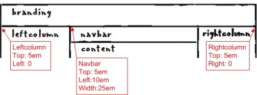
Absolutely Position the Leftcolumn
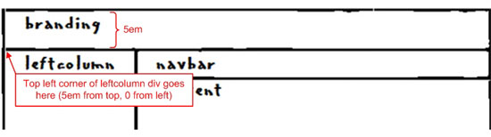
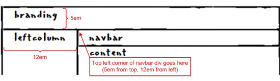
You now need to use absolute positioning to get the leftcolumn div back where it was visually before you moved its tags in the source code. Looking back at the sketch of your page, you want to put the upper-left corner of the leftcolumn div 5em from the top of the wrapper and right at the left side of the wrapper, as illustrated below.
You don't need to create a new style rule to do this. Instead, you just need to modify the #leftcolumn style rule that's already in layoutstyles.css. Currently, the #leftcolumn style rule in layoutstyles.css looks like this:
#leftcolumn{

   /* Remember, content left

   margin must match this width */

   width:12em;

   float:left;

   /* Center images and text inside this div */

   text-align:center;

}
To get it back to where it was, visually, you need to position it absolutely with a top setting of 5em and a left setting of 0 (zero) by adding the descriptors to its style rule. You can also remove the float:left descriptor, since a positioned element doesn't need to float:
#leftcolumn{

 /* Remember, content left

   margin must match this width */

   width:12em;

   /* Center images and text inside this div */

   text-align:center;

   /* For absolutely-positioned leftcolumn */

   position:absolute;

   top:5em; /* Same as branding div height */

   left:0;

}
That gets the leftcolumn division back, visually, to where it was in the Web browser. To verify it, you can save the style sheet, then view or refresh the page in the Web browser.
Now, you have to do something similar with the navbar. You have to absolutely position it back under the branding bar. Specifically, you need to put the upper-left corner of the navbar 5em from the top of the wrapper and 12em from the left side of the wrapper, as shown below:
Once again, you don't need to add a new style rule. You just have to tweak the #navbar style rule that's already in layoutstyles.css. That style rule looks like this:
/********** Navbar division styles **********/

#navbar{

   background:#aaa url(images/navbak.jpg) repeat-x center;

   /* Left margin must match leftcolumn width */

   margin-left:12em;

   height:1.6em;

}
You need to position the navbar so its top edge is just under the branding bar (5em from the top of the wrapper). In this design, the navbar is next to the leftcolumn. So, you need to set the left edge of the navbar equal to the width of the leftcolumn div, 12em. You don't need the margin-left descriptor anymore. So, go ahead and take that out. Here's the #navbar style rule after making the necessary changes:
#navbar{

   background:#aaa url(images/navbak.jpg) repeat-x center;

   height:1.6em;

   /* For absolutely-positioned navbar */

   position:absolute;

   top:5em; /* Same as branding div height */

   left:12em; /* Same as leftcolumn width */

}
After making and saving those changes, the leftcolumn and navbar are right back where they were in the Web browser before moving the source code.
A couple of small problems remain. The navbar has lost some of its background color. That's because it doesn't have a specific width. And, unlike a non-positioned div, an absolutely positioned div won't naturally stretch to the width of its containing element. So, you have to give the navbar a specific width.
You never gave your content division a specific width, but it really doesn't need one. It's easy enough to figure out how wide it is, because you know the wrapper is 40em wide and the leftcolumn div is 12em wide. How wide is the content div? You're right—28em wide, as illustrated below.
Now that you know the navbar has to be 28em wide, you can specify that in its style rule using the width property:
#navbar{

   background:#aaa url(images/navbak.jpg) repeat-x center;

   height:1.6em;

   /* For absolutely-positioned navbar */

   position:absolute;

   top:5em; /* Same as branding div height */

   left:12em; /* Same as leftcolumn width */

   width:28em; /* Layout width minus leftcolumn width */

}
That takes care of the missing background in the navbar. If you want to see for yourself, save and refresh.
The second issue concerns the first heading in the content division. Part of it's tucked under the navbar because now the navbar is positioned absolutely and is, therefore, outside the normal text flow. This means it no longer pushes down on the content division. You have to add some padding to the top of the content division to take care of that.
Right now, the content division has 10px of top and bottom padding, 20px of left and right padding. You can see that in the #content style rule that's in layoutstyles.css.
#content{

   /* Left margin must match leftcolumn width */

   margin-left:12em;

   background-color:#fff;

   color:#000;

   padding:10px 20px;

}
You don't want to use pixels as a unit of measure to set our top padding. That was okay when the navbar was a non-positioned element in the normal text flow because when the user changed the text size or screen magnification and the navbar grew in height, it would automatically push down the content div accordingly.
Absolutely positioned elements don't work that way. They're outside the normal text flow and don't push other elements around. You need to specify that extra padding at the top of the content division in em units so it'll grow and shrink with the text size and browser magnification.
You don't need an exact measure here. A couple of ems should do the trick. Here's a suggested change:
/********** Content division styles **********/

#content{

   /* Left margin must match leftcolumn width */

   margin-left:12em;

   background-color:#fff;

   color:#000;

   padding:2em 10px 10px 20px;

}
Save and refresh to see the results. If 2em was too little or too much, try different values until you find what looks good. Here's how the page looks now with the numbers I've used.

The page looks like it did before we started this whole rigmarole. It may seem odd to go to all that trouble just to end up right where you started, but Web development isn't only about the visual. Non-visual user agents matter, too.
Conclusion
SEO (search engine optimization) is a big topic that encompasses many aspects of Web development. From the standpoint of page layouts, the main trick is getting the source code for the main content division up near the <body> tag in the source code. That way, the real content of the page gets the most weight when indexing the page.
It's better to place tags and content that define columns and navbars lower in the source code, near the closing </body> tag. Normally, this would make those elements appear near the bottom of the page in the Web browser as well. You can get around that by using absolute positioning. With absolute positioning, you can put an element anywhere you want on a page, regardless of where the element's tags are located in the source code.
In the next lesson, we'll look at another big topic that affects many aspects of Web page design—accessibility. This is all about making your page more accessible to people with sensory impairments that make it difficult or impossible for them to see the page the same way as people who don't have such impairments.
Supplementary Material
|
The Overflow Property http://www.w3.org/TR/CSS21/visufx.html#x0 |
| This link takes you to the official CSS documentation on the overflow property. |
|
CSS Overflow Property http://www.w3schools.com/css/pr_pos_overflow.asp |
| Here's a page on the overflow property with a Try-It-Yourself Demo from W3Schools.com. |
|
Figure and Captions http://www.w3.org/Style/Examples/007/figures.html |
| Here you'll find more techniques for adding captioned images to your pages. |
|
CSS Library Image CSS http://www.dynamicdrive.com/style/csslibrary/category/C4/ |
| This page has CSS techniques for displaying captioned images from a thumbnail gallery. I've included a page called CSSThumbs.htm in the samples you downloaded for this course that simplifies the technique a little by using descendant selectors rather than style classes. |
|
Free On-screen Ruler for Windows http://www.download.com/On-screen-Ruler/3000-2192_4-10520257.html |
| This site contains a free on-screen ruler for Windows. |
|
Free On-screen Ruler for Mac http://www.pascal.com/software/freeruler/ |
| Here's another free on-screen ruler, but it's for the Mac. |
|
SEO Benefits of CSS http://www.searchenginejournal.com/seo-benefits-of-css/2211/ |
| This link takes you to a page on using absolute positioning in a layout in SEO-friendly ways. |
|
Cascading Style Sheets and Absolute Positioning http://www.searchengineworkshops.com/articles/css.html |
| This page, from the Search Engine Workshops site, is a little dated. But the section on using absolute positioning still holds true. |
|
Death of a Meta Tag http://searchenginewatch.com/2165061 |
| Click this link for an article about the end of the keywords meta tag, once used to provide search terms to search engines. |
FAQs
<div id="navbar"> and </div><!-- End navbar -->
tags near the bottom of the page in your source code. Then, use
absolute positioning to make the navbar appear, visually, near the top
of the page.<!DOCTYPE html PUBLIC "-//W3C//DTD XHTML 1.1//EN"
"http://www.w3.org/TR/xhtml11/DTD/xhtml11.dtd">
<html xmlns="http://www.w3.org/1999/xhtml">
<head>
<title>layout.htm</title>
<link href="layoutstyles.css" rel="stylesheet" type="text/css" />
</head>
<body>
<!-- Wrapper sets the layout width -->
<div id="wrapper">
<div id="branding">
<img src="images/bbImg2.jpg" alt="logo" style="width:100%" />
<!-- Absolutely positioned in style sheet -->
<a style="top:1em;right:8em;" href="#">News</a>
<a style="top:1em;right:2em;" href="#">Contact Us</a>
</div><!-- End branding -->
<div id="content">
<h1>Lorem ipsum</h1>
<p>Lorem
ipsum dolor sit amet, consectetur adipisicing elit, sed do eiusmod
tempor incididunt ut labore et dolore magna aliqua. Ut enim ad minim
veniam, quis nostrud exercitation ullamco laboris nisi ut aliquip ex ea
commodo consequat.</p>
<ul>
<li>Quis autem vel eum iure reprehenderit.</li>
<li>Voluptate velit esse, quam nihil molestiae consequatur.</li>
<li>Et harum quidem rerum facilis.</li>
</ul>
<p>Nam
libero tempore, qumme soluta nobis est eligendi optio, lumque nihil
impedit, quo minus id, quod maxime placeat, facere possimus, omnis
voluptas assumenda est, omnis dolor repellendus. Temporibus autem
quibusdam et aut officiis debitis aut rerum necessitatibus saepe
eveniet, ut et voluptates repudiandae sint et molestiae non
recusandae.</p>
<h2>Heading Two Here</h2>
<h3>Heading Three Here</h3>
<ol>
<li>I am an ordered list</li>
<li>Yippie yie yo ki-yay</li>
<li>End of ordered list</li>
</ol>
<p>This is a paragraph</p>
</div><!-- End content -->
<div id="footer">
I am in the footer
</div><!-- End footer -->
<div id="leftcolumn">
<img src="images/bird.gif" alt="bird" />
<p>
This is a sample paraÂgraph in the leftÂcolumn division. You can put any text you want here.
</p>
<div class="leftcollist">
<ul>
<li>List item 1</li>
<li>List item 2</li>
<li>List item 3 is longer</li>
<li>List item 4</li>
</ul>
</div><!-- End leftcollist div -->
</div><!-- End leftcolumn -->
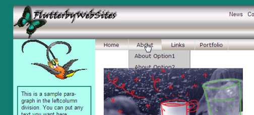
<div id="navbar">
<ul>
<li class="selected"><a href="#">Home</a></li>
<li><a href="#">About<!--[if gte IE 7]><!--></a><!--<![endif]-->
<!--[if lte IE 6]><table><tr><td><![endif]-->
<ul><!-- Start About drop-down menu -->
<li><a href="#">About Option1</a></li>
<li><a href="#">About Option2</a></li>
<li><a href="#">About Option3</a></li>
<li><a href="#">About Option4</a></li>
</ul><!-- End About drop-down menu -->
<!--[if lte IE 6]></td></tr></table></a><![endif]-->
</li><!-- End About -->
<li><a href="#">Links<!--[if gte IE 7]><!--></a><!--<![endif]-->
<!--[if lte IE 6]><table><tr><td><![endif]-->
<ul><!-- Start Links drop-down menu -->
<li><a href="#">Links Option1</a></li>
<li><a href="#">Links Option2</a></li>
<li><a href="#">Links Option3</a></li>
</ul><!-- End Links drop-down menu -->
<!--[if lte IE 6]></td></tr></table></a><![endif]-->
</li><!-- End Links -->
<li><a href="#">Portfolio<!--[if gte IE 7]><!--></a><!--<![endif]-->
<!--[if lte IE 6]><table><tr><td><![endif]-->
<ul><!-- Start Portfolio drop-down menu -->
<li><a href="#">Portfolio Option1</a></li>
<li><a href="#">Portfolio Option2</a></li>
<li><a href="#">Portfolio Option3</a></li>
<li><a href="#">Portfolio Option4</a></li>
</ul><!-- End Portfolio drop-down menu -->
<!--[if lte IE 6]></td></tr></table></a><![endif]-->
</li><!-- End Portfolio -->
</ul>
</div><!-- End navbar div -->
</div><!-- End wrapper -->
</body>
</html>/* layoutstyles.css */
/* Universal style rule */
*{
margin: 0;
padding: 0;
/* Temporary borders */
/* border: dashed 1px #f00; */
}
body {
background-color: #117b6f;
font-family: Arial, Helvetica, sans-serif;
}
#wrapper{
width: 40em;
background-color: #b0fff0;
/* Put 20px margin above the wrapper */
/* Set right and left to auto for centering */
margin: 20px auto;
position:relative;
}
/********** Major layout divisions **********/
#branding{
/* For absolutely-positioned hyperlinks */
position:relative;
}
/********** Branding division styles **********/
#branding a{
/* Postions are set in tags in layout.htm */
position:absolute;
text-decoration:none;
color:#000;
font-size:0.8em;
}
#branding a:link, #branding a:visited{
color:#000;
}
#branding a:hover{
color:#0f0;
}
#branding a:active{
color:#1bb498;
}
/* Fixes the mysterious image gap */
#branding img{
display:block;
}
/********** Leftcolumn division styles **********/
#leftcolumn{
/* Remember, content and navbar left
margins must match this width */
width:12em;
/* Center images and text inside this div */
text-align:center;
/* For absolutely-positioned leftcolumn */
position:absolute;
top:5em; /* Same as branding div height */
left:0;
}
/* Applies to images in the leftcolumn div */
#leftcolumn img{
width:80%;
}
/* Applies to paragraphs and lists in the leftcolumn division */
#leftcolumn p,
#leftcolumn .leftcollist{
border:solid 2px #117b6f;
padding:8px;
width:80%;
font-size:0.8em;
margin:1em auto;
text-align:left;
}
/* Unordered lists in left column */
#leftcolumn ul{
margin-left:1em;
}
/********** Navbar division styles **********/
#navbar{
background:#aaa url(images/navbak.jpg) repeat-x center;
height:1.6em;
/* For absolutely-positioned navbar */
position:absolute;
top:5em; /* Same as branding div height */
left:12em; /* Same as leftcolumn width */
width:28em; /* Layout width minus leftcolumn width */
}
/* Remove bullets from ul in the navbar */
#navbar ul{
list-style-type:none;
}
/* List items in the navbar */
#navbar li{
float:left;
/* Required for drop-down menus */
position:relative;
}
/* Applies to navbar links, unvisited and visited */
#navbar a,
#navbar a:link,
#navbar a:visited{
text-decoration:none;
font-family:Verdana, Geneva, Arial, Sans-Serif;
font-size:80%;
color:#000;
background:#aaa url(images/navbak.jpg) repeat-x center;
display:block;
height:2em;
width:6em;
border-right: solid 1px #ddd;
line-height:2em;
text-align:center;
outline-style:none;
}
/* Navbar hover, active, and current page links */
#navbar a:hover,
#navbar a:active,
#navbar li.selected a:link,
#navbar li.selected a:visited{
background:#ddd url(images/navhover.jpg) repeat-x center;
color:#000;
}
/* Drop-down menu styles */
/* Applies to drop-down menus in navbar */
#navbar li ul{
position:absolute;
z-index:100;
visibility:hidden;
border:solid 1px #aaa;
border-right: solid 2px #999;
border-bottom: solid 2px #999;
}
/* Make drop-down visible on navbar hover */
#navbar li:hover ul,
#navbar li a:hover ul{ /* IE6 hack */
visibility:visible;
top:1.55em;
left:0;
}
/* Applies to links on the drop-down menu */
#navbar li:hover ul li a,
#navbar li a:hover ul li a{ /* IE6 hack */
background:#ccc; /* Removes background image */
color:#000;
text-align:left;
display:block;
width:10em;
padding:0 0 0 1em;
height:auto;
}
/* Hover on drop-down menu links */
#navbar li:hover ul li a:hover,
#navbar li a:hover ul li a:hover{ /* IE6 hack */
background: #aaa;
color:#000;
}
/* IE6 hack applies to its table drop-down */
#navbar table {
margin:-1px;
border-collapse:collapse;
position:absolute;
top:0.5em;
left:0;
z-index:100;
}
/********** Content division styles **********/
#content{
/* Left margin must match leftcolumn width */
margin-left:12em;
background-color:#fff;
color:#000;
padding:2em 10px 10px 20px;
}
/* Applies to paragraphs in the content division */
#content p{
line-height:1.5em;
}
/* Applies to all lists in the content division */
#content ul, #content ol{
padding:10px 0 10px 40px;
}
/* Styles h1, h2, and h3 style rules in the content division */
#content h1, #content h2, #content h3{
font-family: Charcoal, Impact, sans-serif;
color:#000;
font-weight:normal;
font-style:italic;
font-variant:small-caps;
letter-spacing:0.08em;
}
/* Size h1 headings in the content division */
#content h1{
font-size:2em;
}
/* Size h2 headings in the content division */
#content h2{
font-size:1.5em;
}
/* Size h3 headings in the content division */
#content h3{
font-size:1.25em;
font-style:normal;
}
/********** Footer division styles **********/
#footer{
/* To be determined */
}Assignment
 Note:
The images of boxes are just images. The scroll bars don't do anything
in these images. You'll have to view the actual code in a Web page to
use the scroll bars.
Note:
The images of boxes are just images. The scroll bars don't do anything
in these images. You'll have to view the actual code in a Web page to
use the scroll bars.