 Note: See the ISO 639 Language Codes link in the Supplementary Material section for more language codes.
Chapter 1:
Introducing Accessibility
Accessibility is about making your Web site accessible to people with disabilities. Contrary to popular belief, it's not just about making the site accessible to the blind. Accessibility covers all types of sensory and motor impairments.
There are many assistive technologies designed to make computers more accessible to people with various disabilities. There are screen readers and Braille machines for the blind, magnifiers and enlargers for people with other visual impairments, alternative input devices for people who can't operate a mouse or keyboard, and others. But these devices alone aren't the full story. There are things you can do in your Web site to make the site work better with these assistive technologies.
Not all impairments are serious enough to warrant special assistive technologies. Many people with disabilities can use a standard PC. But it's not easy for them. For example, they may need to enlarge things on the screen or have difficulty operating a mouse but no problem pressing keys on a keyboard.
In this lesson, you'll discover techniques you can use within your own Web site to better support all kinds of disabilities and assistive technologies.
In this chapter, we'll focus on techniques for making your Web site more accessible to the blind and people with other visual impairments.
Specify the Root Language
Some screen readers and other nonvisual user agents can adapt to different written and spoken languages. All they need to know is what language you used to write the page.
To specify the root (main) language of your page in transitional XHTML, use xml:lang= and lang= in the <html> tag. Follow that with the ISO 639 abbreviation for your site's main language. For English, use en as the two-letter abbreviation. Enclose the two-letter abbreviation in quotation marks, like this:
<!DOCTYPE html PUBLIC "-//W3C//DTD XHTML 1.0 Transitional//EN" "http://www.w3.org/TR/xhtml1/DTD/xhtml1-transitional.dtd">

<html xmlns="http://www.w3.org/1999/xhtml" xml:lang="en" lang="en" >
XHTML 1.1, a newer and more strict version of XHTML, doesn't support, or require, the lang= attribute. Use the DOCTYPE tag below for XHTML 1.1, and use only the xml:lang= attribute in the <html> tag:
<!DOCTYPE html PUBLIC "-//W3C//DTD XHTML 1.1//EN"

"http://www.w3.org/TR/xhtml11/DTD/xhtml11.dtd">

<html xmlns="http://www.w3.org/1999/xhtml" xml:lang="en">
|
|
Use Good Color Contrast
For readability, a good contrast between text and background color is a must. For this reason, the vast majority of print and online materials use black text against a white background for text. If you want to use more color than that, make sure your colors contrast well.
Monitors aren't equal in color contrast and brightness. Furthermore, many forms of color blindness make it impossible for some people to see certain colors.
The W3C has formulas for determining whether the brightness and contrast differences between two colors are sufficient for text to be readable. Fortunately, you don't need to use the formula to determine if your chosen colors are adequate. Just use an online color contrast checker, like the Do It Yourself Colour Check in the Supplementary Material section for this lesson.
Use Proper Tags to Define Elements
Using proper tags allows nonvisual user agents to better understand the purpose of every element in your page and better process that information. When creating your pages, always define what an element is by using tags. Don't use tags based solely on appearance. For example, don't use <h3> or <h4> to mark up a main title just because you want the smaller text size. Use <h1> tags for the main title. Then, use CSS to define how you want that title to look.
Remember, the goal is always to use XHTML tags to define what an element is. Use CSS to define how those elements look.
Use Relative Units of Measure Consistently
One of the most common problems with Web sites today is that they do nothing or fall apart when the user attempts to increase or decrease the size of text on the screen. This isn't good, because not everyone has large monitors or perfect eyesight.
When creating your Web site, use elastic layouts. Avoid using pixels (px) and points (pt) as units of measure for elements that need to grow and shrink with the user's preferred text size or screen magnification. Use relative units of measure, em and %, instead.
Identify Acronyms and Abbreviations
Most of us use acronyms and abbreviations in a way that assumes our reader knows what they mean. That's not always the case. If you use acronyms or abbreviations in text, use tags to identify and define them.
Furthermore, many screen readers will attempt to pronounce acronyms and abbreviations as words. For example, using amt as an abbreviation for amount will cause a screen reader to say amt (like ant with an m), because the screen reader doesn't know you mean amount.
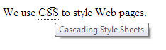
An acronym generally consists of two or more uppercase letters, each representing a single word. For example, XHTML is an acronym for extensible hypertext markup language. CSS is an acronym for cascading style sheets.
To identify and define acronyms, use the <acronym title=""> and </acronym> tags. Place the definition between the quotation marks. Place the acronym between the tags. For example:
<p>We use <acronym title="cascading style sheets">CSS</acronym> to style Web pages.</p>Abbreviations are generally shortened words that don't use all uppercase letters. For example, assn. is a common abbreviation for association. Use <abbr title=""> and </abbr> tags for abbreviations, as in the example below.
<abbr title="association">assn.</abbr>Screen readers won't attempt to pronounce acronyms or abbreviations as words. Furthermore, they'll provide the reader with access to the title text.
Acronyms and abbreviations also play a role in regular Web browsers. A user can point to the acronym or abbreviation to see the title definition in a ToolTip (also called a ScreenTip). This text appears near the mouse pointer when the user touches the mouse pointer to the element, as below.
Firefox, Netscape, and Opera show a dotted underline beneath acronyms and abbreviations, as above. Internet Explorer and Safari don't show the underline or any other distinguishing characteristic. But you can change that by creating your own style rule for both. For example, if you want all Web browsers to show a dotted underline, create a style rule like this:
acronym, abbr{

  border-bottom: dotted 1px #ddd;

}
Pointing to an acronym or abbreviation usually turns the mouse
pointer to an I-beam. That looks a little strange. You can change that
using the CSS cursor: property. That property lets you define how the mouse pointer looks when the user points to an element.
For example, you can use cursor:arrow; to make the mouse pointer look like a regular arrow when the user points to an acronym or abbreviation. Or use cursor:help; to make the pointer look like an arrow with a little question mark, as shown below.
acronym, abbr{

  border-bottom:dotted 1px #333;

  cursor:help;

}
Provide Text Alternatives for Visual Elements
All images should provide alternate text in the form of an alt= attribute. This is required in XHTML. Screen readers for the blind always read the alternate text. In situations where the image is purely decorative and doesn't provide useful information, you can use null text for the alt attribute. Null text is a pair of quotation marks with nothing in between, like this:
<img src="bullet.gif" alt="" />In rare instances where the graphic image is a complex diagram with content critical to the meaning and content of the page, you can use the longdesc attribute. The longdesc attribute provides a link to a separate page that describes the diagram in detail to non-sighted users, as in this example:
<img src="diagram.jpg" alt="diagram" longdesc="http://www.mysite.com/diagram.htm" />Web browsers will ignore the longdesc address, as though it doesn't even exist. Screen readers for the blind load the page at the address and read it aloud for non-sighted users.
So, those are some good general tips for making your Web site accessible to more people. Let's delve a bit deeper and look at making tables a bit more accessible.
Tables require some extra special handling, and we'll talk about that in Chapter 2.
Chapter 2:
Marking Up Tables
Tables are a good way to organize content into rows and columns. It's easy for sighted people to read tables. It's not so easy for nonvisual user agents or non-sighted readers.
Non-linear tables are especially challenging. Each cell in a nonlinear table contains a significant amount of content. Nested tables (tables within tables) are even more problematic. Using tables rather than divs to define page layouts always requires nested and nonlinear tables. Therefore, it's best to try to avoid using tables for page layout.
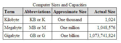
Linearized tables (also called data tables) are perfectly acceptable. These are tables where each cell contains a small amount of information. It's usually a word or two, or perhaps a single graphic image. Here's an example of a data table.
You can use
<caption> and </caption> tags under the <table> tag to
provide a brief title for sighted users. For non-sighted users, add a summary=
attribute to the <table> tag. Use it to provide a more detailed
explanation of what the table contains. Here's an example:
<table
 summary="Table showing terms, abbreviations, approximate, and actual
sizes for computer terms used to describe file sizes and disk
capacities.">

<caption>Computer Sizes and Capacities</caption>
The summary description isn't visible in any Web browser. Only screen readers for the blind read it. So, feel free to be wordy in your description.
Table header cells are generally the cells across the first row. They describe what's contained in each column. You should use <th> and </th> tags to define those header cells, as they allow screen readers to better read the table's contents to non-sighted readers. In the Web browser, text in <th> and </th> cells is boldface unless you use CSS to style the element differently.
While not strictly an accessibility issue, using CSS style rules to style table elements can decrease the amount of code it takes to define the table and reduce download times in large tables.
You can use <col /> tags within the table to define stylistic characteristics of individual columns. The first <col /> tag under the <table> tag defines the style of the first column. The second <col /> tag defines the second column, and so forth.
If several adjacent columns share the same style, you can use a span= element within the <col /> tag to indicate the number of adjacent columns to which the style applies. Here's an example using an internal style sheet and some <col /> tags to style a table.
<!DOCTYPE html PUBLIC "-//W3C//DTD XHTML 1.1//EN"

"http://www.w3.org/TR/xhtml11/DTD/xhtml11.dtd">

<html xmlns="http://www.w3.org/1999/xhtml" xml:lang="en">

<head>

   <title>Sample Data Table</title>

   <style type="text/css">

   /* Style for table borders

 */table {

   border-collapse: collapse;

   border: solid 1px #000;

 }

 /* General style for header and data cells */

 td, th {

   border: solid 1px #000;

   padding: 0.25em;

 }

 /* Additional style for table header cells */

 th {

   background-color: #ddd;

 }

 </style>

</head>

<body>

   <table summary="Table showing terms, abbreviations,
approximate, and actual sizes for computer terms used to describe file
sizes and disk capacities.">

   <caption>Computer Sizes and Capacities</caption>

   <!-- Style for first column (below) -->

   <col style="text-align: left;" />

   <!-- Style for second and third column (below) -->

   <col span="2" style="text-align: center;" />

   <!-- Style for fourth column (below) -->

   <col style="text-align: right" />

   <tr>

    <!-- Table header cells (first table row) -->

    <th>Term</th>

    <th>Abbreviations</th>

    <th>Approximate Size</th>

    <th>Actual Size</th>

    </tr>

    <!-- Remaining cells are regular data cells -->

    <tr>

    <td>Kilobyte</td>

    <td>KB or K</td>

    <td>One thousand</td>

    <td>1,024</td>

    </tr>

    <tr>

    <td>Megabyte</td>

    <td>MB or M</td>

    <td>One million</td>

    <td>1,048,576</td>

    </tr>

    <tr>

    <td>Gigabyte</td>

    <td>GB or G</td>

    <td>One billion</td>

    <td>1,073,741,824</td>

    </tr>

    </table>

</body>

</html>
The tags above display the sample data table shown at the start of this chapter. From an accessibility standpoint, the summary= attribute and <th> tags for header cells are the most important issues.
Navigation is another key issue in Web sites.
In the next chapter, we'll look at techniques for making your site's navigational structure more accessible.
Chapter 3:
Navigation Considerations
Navigation within a site is important. It should be easy for users to get from one page to the next in your site. A navigation bar across the top of every page is usually your best bet. Drop-down menus are useful in larger sites with many pages.
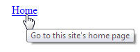
If your navigation scheme relies on images rather than text, it's important to provide text alternatives for non-visual user agents. For example, let's say you use a button like this to represent your home page.

A sighted user can easily see the word Home on the button. Most sighted users can easily figure out that clicking the button will probably take them to your site's home page.
Non-visual user agents see neither the button nor the word Home. You can do two things to help with this issue. As always, use an alt= attribute in the <img /> tag to describe the button.
<img src="home.jpg" alt="Home" />Screen readers read the alternate text aloud. In text-only Web browsers, the alternate text displays in place of the image.
For the image to be a link, it must be contained in a pair of <a> and </a> tags. As an additional aid to users, you can add a title= attribute to the <img /> tag. The title should be more descriptive than the alternative text. It serves as a ToolTip when the user points to the button. Here's an example:
<a href="index.html">

<img src="home.jpg" alt="Home" title="Go to this site's home page" />

</a>
If you use text rather than images for your links, a title= attribute in the <a> tag is still useful for non-visual user agents and sighted users, as well. Use it to provide a more detailed description of where the link takes the user. For example, consider the following text link:
<a href="index.html" title="Go to this site's home page">

Home

</a>
In a Web browser, the word Home appears as a link. When the user points to the link, a ToolTip shows with the title text:
You've seen the title= attribute used in acronyms, abbreviations, links, and images. The truth is, you can put a title= in virtually any XHTML tag to create a ToolTip for that element. Doing so isn't required. But it's a good way to provide more information to sighted and non-sighted users alike.
Providing Alternative Links
If you use an alternative technology such as Flash or JavaScript to create a navigation bar or menus, you must provide an alternative means of navigation. That's because not all Web browsers process Flash and JavaScript.
It's a good idea to provide some alternative means of navigation even in a site like the one we developed in this course, where we use CSS and XHTML for drop-down menus, This is because those menus required a mouse, and there are physical disabilities that make working a mouse difficult for some people.
To help with accessibility, many sites place alternative links at the bottom of every page. Those alternative links should use simple text and XHTML tags. They should have nothing fancy in terms of images, styling, or alternative technologies.
If your site contains many pages, you may not want to put links to all your pages at the bottom of every page. Instead, you can provide a separate site map page that provides links to every page in your site.
Let's use our current drop-down menu as an example. To get to a drop-down menu, the user must place the mouse pointer on an option in the navbar.
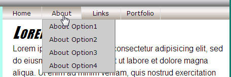
This makes it easy for able-bodied users to jump to any page in the site quickly. But it does nothing for users who are unable to use a mouse.
When you consider how many links there might be in all the drop-down menus combined, it may be too many to put into a list of links at the bottom of the page. Rather than clutter the footer with links to every page in the site, give each section its own home page of sorts, and provide links to just those pages. You can also provide a link to an alternative site map page, as shown below.
As shown below, you can put the links in the footer division at the bottom of layout.htm. The <div id="footer"> and </div><!-- End footer --> tags are already in layout.htm. So, put the new tags between those existing tags:
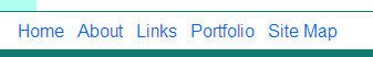
<div id="footer">
<a href="#">Home</a>
<a href="#">About</a>
<a href="#">Links</a>
<a href="#">Portfolio</a>
<a href="SiteMap.htm">Site Map</a>
</div><!-- End footer -->
|
In the example above, I intentionally used relatively simple markup for the links—a pair of <a> and </a> tags per link and a couple of non-breaking spaces ( ) to separate them. Those all date back to the very earliest versions of HTML. So, every Web browser ever created will be able to display them.
You can still use CSS to style the general look and feel of the footer. In the example below, the footer has a white background color, top border, and little extra padding to make it taller. The text-align:center descriptor centers the links in the footer.
#footer{

   background-color:#fff;

   border-top: solid 1px #117b6f;

   padding:0.5em;

   text-align:center;

}
This simple footer includes a link to a page named SiteMap.htm. This page doesn't create itself. You need to create it for your site. And you want to keep it simple enough that even non-mouse users can operate it.
Here's a very generic example. It contains all the same links that the drop-down menus do. But it uses simple markup and CSS. I used an internal style sheet to define styles that apply only to this sitemap page.
<!DOCTYPE html PUBLIC "-//W3C//DTD XHTML 1.1//EN"
"http://www.w3.org/TR/xhtml11/DTD/xhtml11.dtd">
<html xmlns="http://www.w3.org/1999/xhtml" xml:lang="en">
<head>
<title>Site Map</title>
<style type="text/css">
/* Style rules for this page only */
body{
margin:1em 0 0 5em;
background-color:#fff;
color:#000;
}
h2{
margin:0.25em 0;
}
ul{
margin:0em 2em;
padding:0;
}
a:link{
color:#00f;
text-decoration:underline;
}
</style>
</head>
<body>
<h1>Your Site Name Site Map</h1>
<h2><a href="#" title="descriptive text">Home</a></h2><h2><a href="#" title="descriptive text">About</a></h2>
<ul>
<li><a href="#">About Option1</a></li>
<li><a href="#">About Option2</a></li>
<li><a href="#">About Option3</a></li>
<li><a href="#">About Option4</a></li>
</ul>
<h2><a href="#">Links</a></h2>
<ul>
<li><a href="#">Links Option1</a></li>
<li><a href="#">Links Option2</a></li>
<li><a href="#">Links Option3</a></li>
</ul>
<h2><a href="#">Portfolio</a></h2>

   <ul>

   <li><a href="#">Portfolio Option1</a></li>

   <li><a href="#">Portfolio Option2</a></li>

   <li><a href="#">Portfolio Option3</a></li>

   <li><a href="#">Portfolio Option4</a></li>

   </ul>

</body>

</html>
As always, I used # as a placeholder in href= attributes for pages I haven't created yet. You would need to replace them with relative references to actual pages within the site. Here's how that sample site map page looks in a Web browser.
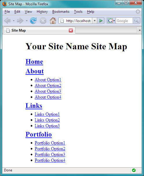
Screen readers can easily read the site map. It also offers keyboard-only users a way to get around within the site. We'll talk about how that works in the next chapter.
Chapter 4:
Keyboard Alternatives for Links
For some people, using a keyboard is easier than using a mouse. In most Web browsers, you can get around in virtually any Web site without using a mouse. The first few TAB presses will likely take you through tools in the Web browser's menu and toolbars. After you've cycled through them, the TAB key takes you from one link to the next on the page. Pressing SHIFT + TAB will move you backward through the links.
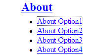
In most browsers, the link that currently has the focus has a dotted frame around it, like in the example below with About Option1. Pressing ENTER at that point is the same as clicking the link with a mouse.
The order in which the TAB key moves through links on the page is determined by the order of their <a> tags in the Web page. But you can override that default order using the tabindex attribute in <a> tags.
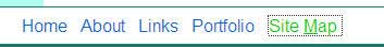
For example, let's suppose you've added text-only links to the page footer, as described in the previous chapter. You want to make it easy for users to get to those links, particularly the Site Map link. You could give the Site Map link a tabindex value of 1, as shown below.
<a href="SiteMap.htm" tabindex="1">

Site Map

</a>
Because it has a tabindex order of 1, it'll be the first link on the page that gets the focus when the user has pressed TAB enough times to get past the first few options at the top of the Web browser's program window. You could assign other tabindex values to other items in the footer navbar.
<div id="footer">

<a href="#" tabindex="2">Home</a>

<a href="#" tabindex="3">About</a>

<a href="#" tabindex="4">Links</a>

<a href="#" tabindex="5">Portfolio</a>

<a href="SiteMap.htm" tabindex="1">Site Map</a>

</div><!-- End footer -->
In the example above, pressing TAB when the Site Map link has the focus takes the user to the Home link. The next press takes the user to the About link, and so forth to Portfolio with a tabindex of 5.
Any links that don't have a tabindex will still be accessible in the usual order after the last link that has a tabindex.
Creating Shortcut Keys
You can also create shortcut keys for links. Use the accesskey attribute in <a> tags. Follow accesskey= with a single letter enclosed in quotation marks. In the example below, the letter m is the shortcut for reaching the Site Map link.
<a href="SiteMap.htm" tabindex="1" accesskey="m">

Site Map

</a>
In most Web browsers, users need to press SHIFT + ALT, then the shortcut key letter to jump to or activate the link. For example, pressing SHIFT + ALT + M will take the user straight to the Site Map link in most browsers.
There are a few caveats to consider here. For one, the accesskey attribute doesn't change how the tag looks. So, the appropriate shortcut key won't be intuitively obvious to the user.
You can get around that by styling the shortcut keys differently. You can color them or make them bold or italic. If you don't normally underline links, you can create a style class that underlines only the hot key.
To illustrate, here are some style rules for the footer. The first one prevents underlining the links. The second one makes hover and active links in green with a dotted border. (This can make it easier to tell which link currently has the focus.) The last style rule is a generic style rule that you can apply to any text using <span> tags.
#footer a:link,

#footer a:visited{

/* No underline on links */

  text-decoration:none;

}

#footer a:hover,

#footer a:active{

  color:#0c0;

  border: dotted 1px #333;

}
.hotkey{

  text-decoration:underline;

}
In the page footer, use <span class="hotkey">...<span>
to style whatever key you've specified as the hot key for that link.
For instance, the code below makes SHIFT + ALT + M the shortcut key for
accessing the Site Map link. The span tags use the hotkey style class to
underline the letter M in the link text.
<a href="SiteMap.htm" accesskey="m">

Site <span class="hotkey">M</span>ap

</a>
In the Web browser, only the hot key for that link is underlined.
The underlining provides a visual cue that the letter M is the hot key. Of course, you can add a hot key to every link, if you prefer. Just make sure no two links share the same hot key.
You should be aware of a few other limitations about keyboard accessibility. In most Web browsers, pressing SHIFT + ALT plus the shortcut key navigates to the page immediately. In Internet Explorer, the hot key moves the focus to the link and applies the a:active style, as shown in the example below. But it doesn't follow the link. The user has to press ENTER to follow the link from there.
Both Safari and Internet Explorer allow users to press ALT plus your hot key (no SHIFT key) to access your link. It only works if your hot key doesn't conflict with a hot key that's built into the browser.
Many users won't realize that they have to press SHIFT + ALT plus the hot key to use the link. Most will try using ALT or some other modifier key. And when it doesn't work, they'll blame you and maybe send irate e-mails. If you're considering adding shortcut keys to your links, you might also consider adding a brief instruction on how to use them.
One last thing, links that are in drop-down menus aren't accessible from the keyboard at all. This is because the drop-down menu isn't even visible until the user touches the navbar with a mouse. So, don't bother adding tabindex or accesskey attributes to items in drop-down menus. Create a separate set of links or site map with keyboard access to those links.
Let's move on to Chapter 5 and talk about printer-friendly versions of Web pages.
Chapter 5:
Printer-Friendly Pages
Printed copies of Web pages are usually very similar to the screen version. The only difference is the removal of background colors and background images from the printed copy. Having background colors and images print can make things look ugly on paper.
To see how a page will look on paper, you don't really need to print it. You can use Print Preview (choose File > Print Preview from the Web browser's menu bar). Here's how layout.htm looks in Print Preview.
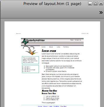
The printed version of the page is almost like a snapshot of how the page looks in the browser, but without background images or colors. The page even contains the navbar and links, which serve no purpose at all on the printed page!
Many sites will create an entirely separate printer-friendly version of every page in their site. But that's a lot of work. As an alternative, you can create a set of style rules that apply only to the printed page. That way you don't need multiple copies of your pages.
To create a set of styles that apply only to print, you need to add the following to your style sheet. If you want to try it out, you can add those to the bottom of layoutstyles.css right now. As always, the comments are optional but certainly useful.
@media print{

/* Start printer-friendly styles */
/*End printer-friendly styles */
}
The opening curly brace marks the start of the @media print block within the style sheet. The closing curly brace at the end marks the end of that block.
Now, here's the deal: Style rules inside the @media print{} block have no effect whatsoever on how the page looks on the screen in the Web browser. Any style rule that you put inside the block will apply only to the printed page.
Style rules outside the curly braces still apply, even to the printed page, except in cases where a style rule inside the block conflicts with a style rule outside the block. When there's a conflict, the style rule inside the block takes precedence, but only for the printed page.
You can style your printer-friendly pages any way you like. There really are no restrictions, except to generally ignore background colors and images. So, don't bother defining those elements inside the @media print{} block.
There are some quick and easy things you can do right off the bat to design a printer-friendly version of your pages. For starters, you might consider changing your wrapper style so its width is 100%. On the printed page, that makes the layout as wide as the page, minus the printer's left and right margins.
You can use display:none;
to hide any elements that don't belong on the printed page. In most
sites, this will include the navbar. It could also include any sidebar
columns and the footer. You could also hide the branding bar, but since
that's your site's title, you may want to consider keeping that in the
printed page. It's up to you.
Here's an example where the width of the wrapper is 100%, and I've opted to hide the navbar, leftcolumn, and footer divs on the printed page.
@media print{
/* Start printer-friendly styles *//* Set wrapper to fill page width */
#wrapper{
width:100%;
}
/* Hide leftcolumn, navbar,and footer */
#leftcolumn,
#navbar,
#footer{
display:none;
}
/*End printer-friendly styles */

}
Notice how both style rules are completely contained within the @media:print{} block. That's important, because it means they'll have no effect on how the page looks in the Web browser. The style rules apply only to the printed page (and Print Preview).
To check your progress with this kind of styling, you first have to save the style sheet as usual. If Print Preview is already open, you have to close it. Then, you have to refresh the browser as usual and open Print Preview again. Here's how layout.htm looks in Print Preview with the new style rules applied:
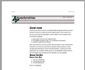
The navbar, left column, and footer are gone, but there's still a large left margin next to where the left column used to be. That's because in the main area of your style sheet, you put a large left margin in the content div to prevent it from overlapping the left column.
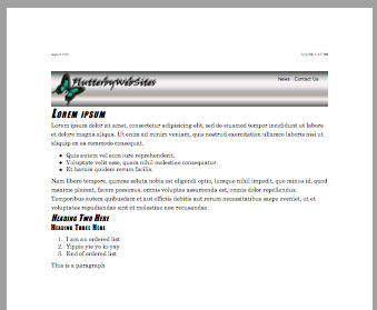
To get rid of the extra space, you can add another style rule to the @media print{} section. This one sets the margins and padding of the content division to 0 to eliminate any extra white space. If you like, you can change the font of the printed page, as well. Here's the entire @media print{} section with a third new style rule for the content division.
@media print{
/* Start printer-friendly styles *//* Make wrapper the full page width */
#wrapper{
width:100%;
}
/* Hide leftcolumn, navbar,and footer */
#leftcolumn,
#navbar,
#footer{
display:none;
}
/* Get rid of content div margins and
padding. Use a different font for print */
#content{
margin:0;
padding:0;
font-family:'Century Schoolbook', Times, Serif;
font-size:1em;
}
/*End printer-friendly styles */

}
Here's how the page looks in Print Preview (and on paper) with all three styles rules in the @media print{} block.
There you have it—an instant printer-friendly version of the page. There's no need to create separate pages or add printer-friendly links to pages. The style rules in the @media print{} section of the style sheet apply automatically when the user chooses File > Print or File > Print Preview from their Web browser's menu bar. They'll apply to every page within the site that links to the style sheet. It doesn't get much easier than that. A little knowledge, a little careful typing, and you're done!
Conclusion
In this lesson, we've explored things you can do to make your Web site more accessible to people with disabilities. Remember, it's not just about helping the blind. You also need to take into account poor vision, color blindness, and motor disabilities.
In the next lesson, we'll turn our attention to a topic that puzzles many an aspiring Web developer. How do you get content, such as headers, sidebars, and footers, to appear on every page in your site?
Supplementary Material
|
Assistive Technology Products http://www.microsoft.com/enable/at/default.aspx |
| This page provides links to pages about assistive technologies designed to make computers in general (not just Web sites) more accessible. |
|
ISO 639 Language Codes http://igraham.org/books/xhtml1/appc/iso639.html |
| This site offers language codes used in conjunction with the xml:lang and lang attributes to identify a page's primary language. |
|
Do It Yourself Colour Check http://www.etre.com/tools/colourcheck/ |
| Go here to see if the brightness and contrast of your text and background colors are sufficient to meet WAI guidelines. |
|
What Is Web Accessibility? http://www.alistapart.com/articles/wiwa/ |
| Here you'll find a good summary article on the world of Web accessibility. |
|
The Accessibility Hat Trick: Getting Abbreviations Right http://www.alistapart.com/articles/hattrick/ |
| Click this link for the full story on abbreviations and related topics. |
|
The Alt and Title Attributes http://www.456bereastreet.com/archive/200412/the_alt_and_title_attributes/ |
| This is a good tutorial on property use of alt, title, and longdesc attributes. |
|
Accessibility: The Politics of Design http://www.alistapart.com/articles/politics/ |
| Visit this page to read an overview of what's happening in the world of Web accessibility. |
|
Accessibility Myths and Misconceptions http://www.456bereastreet.com/archive/200505/accessibility_myths_and_misconceptions/ |
| This link takes you to a general article on accessibility. It ends with links to other sites about accessibility. |
|
Secret Benefits of Accessibility http://www.sitepoint.com/article/accessible-search-friendly-site |
| What does Web site accessibility have to do with search engine optimization? More than you might presume. Click this link to learn more. |
|
Media Types http://www.w3.org/TR/REC-CSS2/media.html |
| Here's the official documentation on using @media in style sheets to define different styles for different media. |
FAQs
/* Remove border from link images */
a img{
border:none;
}<!DOCTYPE html PUBLIC "-//W3C//DTD XHTML 1.1//EN"
"http://www.w3.org/TR/xhtml11/DTD/xhtml11.dtd">
<html xmlns="http://www.w3.org/1999/xhtml" xml:lang="en>
<head>
<title>Sample Mouse Pointers</title>
</head>
<body>
<div>
<a href="#" style="cursor:crosshair">crosshair</a><br />
<a href="#" style="cursor:default">default</a><br />
<a href="#" style="cursor:e-resize">e-resize</a><br />
<a href="#" style="cursor:help">help</a><br />
<a href="#" style="cursor:move">move</a><br />
<a href="#" style="cursor:n-resize">n-resize</a><br />
<a href="#" style="cursor:ne-resize">ne-resize</a><br />
<a href="#" style="cursor:not-allowed">not-allowed</a><br />
<a href="#" style="cursor:nw-resize">nw-resize</a><br />
<a href="#" style="cursor:pointer">pointer</a><br />
<a href="#" style="cursor:progress">progress</a><br />
<a href="#" style="cursor:s-resize">s-resize</a><br />
<a href="#" style="cursor:se-resize">se-resize</a><br />
<a href="#" style="cursor:sw-resize">sw-resize</a><br />
<a href="#" style="cursor:text">text</a><br />
<a href="#" style="cursor: w-resize">w-resize</a><br />
<a href="#" style="cursor:wait">wait</a><br />
</div>
</body>
</html>cursor:url(relativePath)/* layoutstyles.css */
/* Universal style rule */
*{
margin: 0;
padding: 0;
/* Temporary borders */
/* border: dashed 1px #f00; */
}
body {
background-color: #117b6f;
font-family: Arial, Helvetica, sans-serif;
}
#wrapper{
width: 40em;
background-color: #b0fff0;
/* Put 20px margin above the wrapper */
/* Set right and left to auto for centering */
margin: 20px auto;
position:relative;
}
/********** Major layout divisions **********/
#branding{
/* For absolutely-positioned hyperlinks */
position:relative;
}
/********** Branding division styles **********/
#branding a{
/* Postions are set in tags in layout.htm */
position:absolute;
text-decoration:none;
color:#000;
font-size:0.8em;
}
#branding a:link, #branding a:visited{
color:#000;
}
#branding a:hover{
color:#0f0;
}
#branding a:active{
color:#1bb498;
}
/* Fixes the mysterious image gap */
#branding img{
display:block;
}
/********** Leftcolumn division styles **********/
#leftcolumn{
/* Remember, content and navbar left
margins must match this width */
width:12em;
/* Center images and text inside this div */
text-align:center;
/* For absolutely-positioned leftcolumn */
position:absolute;
top:5em; /* Same as branding div height */
left:0;
}
/* Applies to images in the leftcolumn div */
#leftcolumn img{
width:80%;
}
/* Applies to paragraphs and lists in the leftcolumn division */
#leftcolumn p,
#leftcolumn .leftcollist{
border:solid 2px #117b6f;
padding:8px;
width:80%;
font-size:0.8em;
margin:1em auto;
text-align:left;
}
/* Unordered lists in left column */
#leftcolumn ul{
margin-left:1em;
}
/********** Navbar division styles **********/
#navbar{
background:#aaa url(images/navbak.jpg) repeat-x center;
height:1.6em;
/* For absolutely-positioned navbar */
position:absolute;
top:5em; /* Same as branding div height */
left:12em; /* Same as leftcolumn width */
width:28em; /* Layout width minus leftcolumn width */
}
/* Remove bullets from ul in the navbar */
#navbar ul{
list-style-type:none;
}
/* List items in the navbar */
#navbar li{
float:left;
/* Required for drop-down menus */
position:relative;
}
/* Applies to navbar links, unvisited and visited */
#navbar a,
#navbar a:link,
#navbar a:visited{
text-decoration:none;
font-family:Verdana, Geneva, Arial, Sans-Serif;
font-size:80%;
color:#000;
background:#aaa url(images/navbak.jpg) repeat-x center;
display:block;
height:2em;
width:6em;
border-right: solid 1px #ddd;
line-height:2em;
text-align:center;
outline-style:none;
}
/* Navbar hover, active, and current page links */
#navbar a:hover,
#navbar a:active,
#navbar li.selected a:link,
#navbar li.selected a:visited{
background:#ddd url(images/navhover.jpg) repeat-x center;
color:#000;
}
/* Drop-down menu styles */
/* Applies to drop-down menus in navbar */
#navbar li ul{
position:absolute;
z-index:100;
visibility:hidden;
border:solid 1px #aaa;
border-bottom: solid 2px #999;
border-right: solid 2px #999;
}
/* Make drop-down visible on navbar hover */
#navbar li:hover ul,
#navbar li a:hover ul{ /* IE6 hack */
visibility:visible;
top:1.55em;
left:0;
}
/* Applies to links on the drop-down menu */
#navbar li:hover ul li a,
#navbar li a:hover ul li a{ /* IE6 hack */
background:#ccc; /* Removes background image */
color:#000;
text-align:left;
display:block;
width:10em;
padding:0 0 0 1em;
height:auto;
}
/* Hover on drop-down menu links */
#navbar li:hover ul li a:hover,
#navbar li a:hover ul li a:hover{ /* IE6 hack */
background: #aaa;
color:#000;
}
/* IE6 hack applies to its table drop-down */
#navbar table {
margin:-1px;
border-collapse:collapse;
position:absolute;
top:0.5em;
left:0;
z-index:100;
}
/********** Content division styles **********/
#content{
/* Left margin must match leftcolumn width */
margin-left:12em;
background-color:#fff;
color:#000;
padding:2em 10px 10px 20px;
}
/* Applies to paragraphs in the content division */
#content p{
line-height:1.5em;
}
/* Applies to all lists in the content division */
#content ul, #content ol{
padding:10px 0 10px 40px;
}
/* Styles h1, h2, and h3 style rules in the content division */
#content h1, #content h2, #content h3{
font-family: Charcoal, Impact, sans-serif;
color:#000;
font-weight:normal;
font-style:italic;
font-variant:small-caps;
letter-spacing:0.08em;
}
/* Size h1 headings in the content division */
#content h1{
font-size:2em;
}
/* Size h2 headings in the content division */
#content h2{
font-size:1.5em;
}
/* Size h3 headings in the content division */
#content h3{
font-size:1.25em;
font-style:normal;
}
/********** Footer division styles **********/
#footer{
background-color:#fff;
border-top: solid 1px #117b6f;
padding:0.5em;
text-align:center;
}
#footer a:link,
#footer a:visited{
/* No underline on links */
text-decoration:none;
}
#footer a:hover,
#footer a:active{
color:#0c0;
border:dotted 1px #333;
}
/*************** General styles ************/
.hotkey{
text-decoration:underline;
}
/* Acronyms and abbreviations */
acronym,abbr{
border-bottom:dotted 1px #333;
cursor:help;
}
/*********** Printer-Friendly Styles **********/
@media print{
/* Start printer-friendly styles */
/* Make wrapper the full page width */
#wrapper{
width:100%;
}
/* Hide leftcolumn, navbar,and footer */
#leftcolumn,
#navbar,
#footer{
display:none;
}
/* Get rid of content div margins and

 padding. Use a different font for print */

#content{

 margin:0;

 padding:0;

 font-family:'Century Schoolbook', Times, Serif;

 font-size:1em;

}

/*End printer-friendly styles */

}<!DOCTYPE html PUBLIC "-//W3C//DTD XHTML 1.1//EN"
"http://www.w3.org/TR/xhtml11/DTD/xhtml11.dtd">
<html xmlns="http://www.w3.org/1999/xhtml" xml:lang="en">
<head>
<title>layout.htm</title>
<link href="layoutstyles.css" rel="stylesheet" type="text/css" />
</head>
<body>
<!-- Wrapper sets the layout width -->
<div id="wrapper">
<div id="branding">
<img src="images/bbImg2.jpg" alt="logo" style="width:100%" />
<!-- Absolutely positioned in style sheet -->
<a style="top:1em;right:8em;" href="#">News</a>
<a style="top:1em;right:2em;" href="#">Contact Us</a>
</div><!-- End branding -->
<div id="content">
<h1>Lorem ipsum</h1>
<p>This
site created with <acronym title="Cascasing Style
Sheets">CSS</acronym> and <acronym title="eXtensible
Hypertext Markup Language">XHTML</acronym>. Lorem ipsum dolor
sit amet, consectetur adipisicing elit, sed do eiusmod tempor incididunt
ut labore et dolore magna aliqua. Ut enim ad minim veniam, quis nostrud
exercitation ullamco laboris nisi ut aliquip ex ea commodo
consequat.</p>
<ul>
<li>Quis autem vel eum iure reprehenderit.</li>
<li>Voluptate velit esse, quam nihil molestiae consequatur.</li>
<li>Et harum quidem rerum facilis.</li>
</ul>
<p>Nam
libero tempore, qumme soluta nobis est eligendi optio, lumque nihil
impedit, quo minus id, quod maxime placeat, facere possimus, omnis
voluptas assumenda est, omnis dolor repellendus. Temporibus autem
quibusdam et aut officiis debitis aut rerum necessitatibus saepe
eveniet, ut et voluptates repudiandae sint et molestiae non
recusandae.</p>
<h2>Heading Two Here</h2>
<h3>Heading Three Here</h3>
<ol>
<li>I am an ordered list</li>
<li>Yippie yie yo ki-yay</li>
<li>End of ordered list</li>
</ol>
<p>This is a paragraph</p>
</div><!-- End content -->
<div id="footer">
<a href="#">Home</a>
<a href="#">About</a>
<a href="#">Links</a>
<a href="#">Portfolio</a>
<a href="SiteMap.htm" accesskey="m">Site <span class="hotkey">M</span>ap
</a>
</div><!-- End footer -->
<div id="leftcolumn">
<img src="images/bird.gif" alt="bird" />
<p>
This is a sample paraÂgraph in the leftÂcolumn division. You can put any text you want here.
</p>
<div class="leftcollist">
<ul>
<li>List item 1</li>
<li>List item 2</li>
<li>List item 3 is longer</li>
<li>List item 4</li>
</ul>
</div><!-- End leftcollist div -->
</div><!-- End leftcolumn -->
<div id="navbar">
<ul>
<li class="selected"><a href="#">Home</a></li>
<li><a href="#">About<!--[if gte IE 7]><!--></a><!--<![endif]-->
<!--[if lte IE 6]><table><tr><td><![endif]-->
<ul><!-- Start About drop-down menu -->
<li><a href="#">About Option1</a></li>
<li><a href="#">About Option2</a></li>
<li><a href="#">About Option3</a></li>
<li><a href="#">About Option4</a></li>
</ul><!-- End About drop-down menu -->
<!--[if lte IE 6]></td></tr></table></a><![endif]-->
</li><!-- End About -->
<li><a href="#">Links<!--[if gte IE 7]><!--></a><!--<![endif]-->
<!--[if lte IE 6]><table><tr><td><![endif]-->
<ul><!-- Start Links drop-down menu -->
<li><a href="#">Links Option1</a></li>
<li><a href="#">Links Option2</a></li>
<li><a href="#">Links Option3</a></li>
</ul><!-- End Links drop-down menu -->
<!--[if lte IE 6]></td></tr></table></a><![endif]-->
</li><!-- End Links -->
<li><a href="#">Portfolio<!--[if gte IE 7]><!--></a><!--<![endif]-->
<!--[if lte IE 6]><table><tr><td><![endif]-->
<ul><!-- Start Portfolio drop-down menu -->
<li><a href="#">Portfolio Option1</a></li>
<li><a href="#">Portfolio Option2</a></li>
<li><a href="#">Portfolio Option3</a></li>
<li><a href="#">Portfolio Option4</a></li>
</ul><!-- End Portfolio drop-down menu -->
<!--[if lte IE 6]></td></tr></table></a><![endif]-->
</li><!-- End Portfolio -->
</ul>
</div><!-- End navbar div -->
</div><!-- End wrapper -->
</body>
</html>Assignment