Lesson 4: Formatting HTML5 With CSS3

Lesson 4: Formatting HTML5 With CSS3

Introduction

How does a mobile device know what a certain Web app is supposed to look like? The device gets its instructions from Cascading Style Sheets. CSS is the language for telling Web browsers how to format HTML documents.

You can use CSS to set all kinds of webpage characteristics, such as . . .

  • font styles and sizes for the different types of text.
  • the alignment of different elements in the document.
  • the page's background color.

How can our friends at WatzThis use CSS to make their app more attractive, easier to use, and workable on all kinds of devices? And what does "cascading" have to do with anything? We'll discuss all of this in this lesson.

If you're already familiar with CSS, don't worry. I'll cover CSS3, the latest version of CSS, and we'll discuss about how and why it differs from previous versions.

Now that you have an idea of what CSS is for, let's move on to Chapter 2, where I'll explain more about how it works.

CSS Basics and Styles

CSS works by pointing to (or selecting) HTML elements and modifying their presentation. For example, here's a simple semantic HTML document. (Remember this term from Lesson 3? Semantic HTML uses tags that explain what the different parts of the document mean rather than how they should look.)

<!DOCTYPE html>
<html>
<head>
<meta charset="utf-8">
<title>Chris Minnick's To-Do List</title>
</head>
<body>
<header>
<h1>My To-Do List</h1>
</header>
<ol>
<li>Write a lesson</li>
<li>Write quiz questions</li>
<li>Eat strawberry ice cream</li>
</ol>
</body>
</html>

If you save this document in a file with the extension .html and then open it in a Web browser, you'll see something like this:

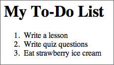
Simple HTML document with no CSS applied

This webpage is rather plain. It's got some style, however. The header text is larger than the body text, there's space between the header and the body, the list has a numbered format, and the whole thing is in the Times New Roman font.

If you have an HTML document that doesn't contain any CSS, you'll see the browser default styles. Examples of browser default styles include the size of Heading 1 elements, the amount of line spacing between paragraphs, and the default text color and link color. All browsers use pretty much the same default style. These styles are never very attractive or exciting, however.

You don't want anyone to look at your app and think, "That looks boring." So here's an example of some CSS code that we could apply to this HTML to make it a bit more exciting.

body {
  font-family: Verdana, Arial, sans-serif;
}
header {
  background: #000000;
  width: 75%;
  padding: 8px;
  color: #ffffff;
  text-align:center;
}
li {
    width: 300px;
    background: #00eebb;
    padding: 6px;
}

And here's the result of applying these styles to the HTML document:

Styling applied; black header background and a turquoise list background. 
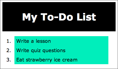
Document with CSS styles

I know, I know . . . it's still ugly. But at least it's a little more interesting!

Now that you've seen what I refer to as Chris' Simple Sample of CSS, let's discuss about how you can use CSS to beautify your own webpages.

Adding CSS to HTML Documents

You have three choices for how to add CSS to HTML documents:

  • With inline styling, you add CSS to individual elements within a style attribute.
  • Using page-level styles lets you add CSS to an entire page using the <style> element.
  • An external style sheet uses the <link> element to connect to a separate CSS document.

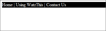
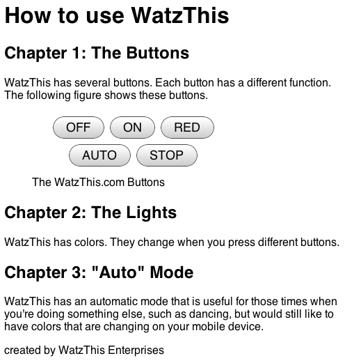
To find out how to use each of these methods, and to start understanding the power of style sheets, let's take a quick look at the WatzThis.com documentation we created in Lesson 3.

<!DOCTYPE html>
<html>
<head><meta charset="utf-8"> <title> WatzThis.com Documentation</title>
</head>
<body>
  <header>
    <h1>How to use WatzThis</h1>
  </header>
    <section>
      <h2>Chapter 1: The Buttons</h2>
      <p>WatzThis has several buttons. Each button has a different function. The following figure shows these buttons.</p>
      <figure>
      <img src="http://www.watzthis.com/images/buttons.png" alt="Here are the buttons">
      <figcaption>The WatzThis.com Buttons</figcaption>
      </figure>
    </section>
    <section>
      <h2>Chapter 2: The Lights</h2>
      <p>WatzThis has colors. They change when you press different buttons.</p>
    </section>
    <section>
      <h2>Chapter 3: "Auto" Mode</h2>
      <p>WatzThis has an automatic mode that is useful for those times when you're doing something else, such as dancing, but would still like to have colors that are changing on your mobile device.</p>
    </section>
  <footer>
  <p>created by WatzThis Enterprises</p>
  </footer>
</body>
</html>

Let's say you wanted to change the typeface of all the text in this document from the default serif font to a sans-serif font.

Sans What?

When I say serif, I'm talking about the little lines or rounded edges on the ends of letters. Some typefaces have these little lines and edges; typefaces that don't are sans-serif. ("Sans" is French for "without.")

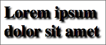
Serif typeface Sans-serif typeface

Designers and typographers love to argue about which type of font is better. Some people say a sans-serif typeface gives text a cleaner look. Others point to studies indicating that serif typefaces are easier to read.

As you build your own apps, experiment with different typefaces. Which ones work best to get your message across?

Using inline styling, you'd simply add a style attribute to every element in the body that contains text. Here's how that would look (I've highlighted the changes):

<!DOCTYPE html>
<html>
<head><meta charset="utf-8"> <title> WatzThis.com Documentation</title>
</head>
<body>
  <header>
    <h1 style="font-family:sans-serif;">How to use WatzThis</h1>
  </header>
    <section>
      <h2 style="font-family:sans-serif;">Chapter 1: The Buttons</h2>
      <p style="font-family:sans-serif;"> WatzThis has several buttons. Each button has a different function. The following figure shows these buttons.</p>
      <figure>
      <img src="http://www.watzthis.com/images/buttons.png" alt="Here are the buttons">
      <figcaption style="font-family:sans-serif;">The WatzThis.com Buttons</figcaption>
      </figure>
    </section>
    <section>
      <h2 style="font-family:sans-serif;">Chapter 2: The Lights</h2>
      <p style="font-family:sans-serif;">WatzThis has colors. They change when you press different buttons.</p>
    </section>
    <section>
      <h2 style="font-family:sans-serif;">Chapter 3: "Auto" Mode</h2>
      <p style="font-family:sans-serif;">WatzThis has an automatic mode that is useful for those times when you're doing something else, such as dancing, but would still like to have colors that are changing on your mobile device.</p>
    </section>
  <footer>
  <p style="font-family:sans-serif;">created by WatzThis Enterprises</p>
  </footer>
 </body>
</html>


And here's what the document looks like when you view it in a browser:

Using CSS rules to change the type to a sans-serif font

Like most structured documents, the WatzThis documentation contains repeated elements. For example, this document contains three <section> elements, three <h2> elements, and three <p> elements. The marketing department has mentioned that they don't consider this the final document yet (I never would have guessed!), so there may be many more of each of these elements in the future.

It sure looks better with that sans-serif font . . . but you've added a considerable amount of text to the HTML file, which has made the file more difficult to edit and increased the file size (and therefore has made it take longer to download).

When you need to style just one element in just one document, inline styling is an acceptable technique. More often, however, you'll need to apply a style to multiple elements within a document. This is where page-level styling comes in.

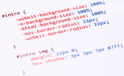
Here's how you can add a new font family to the text in this document using page-level styling. Again, I've highlighted the new code.

<!DOCTYPE html>
<html>
<head><meta charset="utf-8">
  <title> WatzThis.com Documentation</title>
  <style>
    body {
      font-family: sans-serif;
    }
  </style>
</head>
<body>
  <header>
    <h1>How to use WatzThis</h1>
  </header>
    <section>
      <h2>Chapter 1: The Buttons</h2>
      <p> WatzThis has several buttons. Each button has a different function. The following figure shows these buttons.</p>
      <figure>
      <img src="http://www.watzthis.com/images/buttons.png" alt="Here are the buttons">
      <figcaption>The WatzThis.com Buttons</figcaption>
      </figure>
    </section>
    <section>
      <h2>Chapter 2: The Lights</h2>
      <p>WatzThis has colors. They change when you press different buttons.</p>
    </section>
    <section>
      <h2>Chapter 3: "Auto" Mode</h2>
      <p>WatzThis has an automatic mode that is useful for those times when you're doing something else, such as dancing, but would still like to have colors that are changing on your mobile device.</p>
    </section>
  <footer>
  <p>created by WatzThis Enterprises</p>
  </footer>
</body>
</html>

As you can see, this document looks the same in a Web browser.

Documentation with our new, optimized CSS

Page-level styling lets you use one style rule to change everything that matches that rule in the document.

As far as the result is concerned, the only difference between the document with inline styles and the one with page-level styles is that one of them is 1,086 characters long and the other is 851. This means the second document will take about 20% less time to download.

Page-level CSS styles are also much easier to maintain than inline styles. Imagine that the marketing manager comes back to you the next day and asks you to change the font back to serif or to put it all in Comic Sans. With inline styles, you'll need to carefully go through the document and change the font-family property's value in each place it occurs. With page-level CSS, you need to make only one change to affect the whole document.

But what if the marketing manager comes back again? This time she says to split each section of documentation into a separate page, and, oh yeah, management has requested that the biographical information and photos of the company management also appear on a separate page. They'd also like to have a "contact us" page that lists a technical support phone number and email address (yours, of course) that people can use if they need help.

Now you've got at least five HTML pages to style. If you use page-level CSS rules, you're suddenly faced with five things you need to change when the corporate font changes. When you have multiple pages, you should use an external style sheet.

External style sheets are files with a .css extension that contain style rules that you want to apply to multiple files. Here's an external style sheet with the style rule that we've created for the WatzThis documentation:

body {
      font-family: sans-serif;
    }

Copy this code. Now create a new blank document in Komodo Edit and paste it in there. This should be the only text in the file.

Save the file into the same directory as the HTML file that you want to style. Make sure to save the file with a .css extension. Then, to use it in as many HTML documents as you want, just link to it with this code inside the <head> element:

<link rel="stylesheet" type="text/css" href="watzthis.css">

Naturally, you'd use the name of the CSS file you created rather than watzthis.css.

I asked you to save the CSS file into the same directory as your HTML file for simplicity's sake. It's actually more common to save CSS files in their own directory, separate from HTML files. If you were to save this CSS file in a directory called 'css', your <link> element would look like this:

<link rel="stylesheet" type="text/css" href="css/watzthis.css">

Once you've included the external style sheet in every page of your site, all you need to do to change the font sitewide is to modify the style in this one file. Pretty cool, huh?

About User Agents

Ease of maintenance is just one benefit of using style sheets. Another is flexibility in where and how a browser presents your document.

A program that uses HTML content in any way is a user agent. Web browsers are one type of user agent; mobile browsers are another. Email programs commonly read HTML content and can be user agents too. Other types of user agents include search engine spiders, Braille browsers, and screen readers.

CSS lets you have one HTML document that you can style in multiple ways to fit multiple types of user agents. Later in this lesson, I'll show you one way to style documents differently for different users.

By using CSS, you can create different style rules for how different user agents should use a single HTML document. One of the main objectives of this course is to show you how to style the same content for desktop browsers and mobile devices. This wouldn't be possible without CSS.

Now that you understand the importance of CSS, let's dig deeper into the language and find out how it works.

The Rules of CSS

CSS is created using rules. A CSS rule consists of selectors and declarations—I'll explain both of those terms in just a moment.

Here's an example of a CSS rule:

h1 {
font-style: bold;
font-size: 100px;
color: red;
border: 10px;
}
Selector with four different declarations

The part of a rule that's outside of the { and } is the selector. Its purpose is to specify what elements the rule applies to. In this case, it applies to <h1> elements.

The declarations are the part of the rule that say how it should change the formatting of elements that the selector selects. Declarations take the format of property:value. For example, in the previous CSS rule, font-style, font-size, color, and border are properties.

CSS has a long list of possible properties that you can adjust. Some frequently used properties are:

  • font-family
  • font-style
  • color
  • border
  • padding
  • margin

In the Supplementary Material for this lesson, you can find a link to a guide to all the CSS properties.

Using Selectors

Selectors are patterns that match different characteristics of elements. The two most basic types of selectors are element type selectors and the universal selector.

Element type selectors simply match the element that you want to apply the CSS rule to. For example, here's a CSS rule that will make the contents of every <p> element be red:

p {
color: red;
}

The universal selector is a way to apply the same style to every element in a document. Let's say that you wanted to make sure that every element in your document would be black. Here's how you'd do that:

* {
color: black;
}

There aren't that many instances where you need to apply a style to every element in a document. More often, you'll find that you need to be more precise and apply a style to one particular element or to a group of elements. That's where ID selectors and class selectors come in.

The ID selector applies a style to one particular element in a document, using a unique ID value. If you remember, in the last lesson, we talked about HTML's ID attribute, which uniquely identifies an element. Here's an element with a unique ID attribute:

<nav id="topnav">
    Home | Using WatzThis | Contact Us
</nav>

Using the CSS ID selector, you can apply a style to the element with this unique ID.

ID selectors have a # symbol in front of them. The # symbol tells browser tool to look for an ID attribute with the value of whatever comes after the #. For example, the following CSS rule applies a font color, a background, and a border to the element with the ID "topnav."

#topnav {
background: black;
color: white;
border: 2px;
}

Here's how our topnav element looks when you apply this style to it:

The WatzThis app with top level navigation applied. Using the ID selector to format a navigation element

When you want to apply a style to a group of elements, you can use the class selector. This selects elements with the specified value of an attribute called "class." To use a class selector in your style sheet, put a period (.) before the name of the class.

For instance, you might create a class called "error-text" that changes the color of an element to red and prints its contents in larger, bolder type. In your HTML document, you might have something like the following markup:

<p class="error-text">You entered the wrong number.</p>

And in your style sheet, you might style this element (and every other element in the document with this same class) using this rule:

.error-text {
  font-size: large;
  color: red;
  font-style: bold;
}

Understanding Pseudo-Class Selectors

Pseudo-classes are similar to classes in that they apply to multiple elements, but they apply to elements when they are in a certain state or condition rather than when they have a certain value in their class attribute.

An example is the "hover" pseudo-class. It activates when the user hovers the mouse over an element. This pseudo-class is useful for creating rollover effects, which Web developers often use in website navigation.

You can refer to pseudo-classes in style sheets using a colon (:) after any other selector (such as a class selector, an element selector, or an ID selector), like this:

a:hover {
  background: orange;
  }

In this case, you're combining an element selector (a) and a pseudo-class (hover) into one selector. The new selector applies the orange background color to the <a> elements in the document whenever a user hovers the mouse over any of them.

Pseudo-Classes and Web Design

Many Web browsers support pseudo-classes, but versions of Internet Explorer prior to version 9 don't. For this reason, it's not usually a good practice (just yet) to use pseudo-classes for vital parts of your site design. In mobile Web apps targeted to WebKit browsers, however, you can be sure that pseudo-classes are supported.

What Do They Mean By "Cascading"?

The C in CSS stands for cascading, as I mentioned earlier. Cascading describes how CSS determines which style to apply to an element when multiple rules apply to it. For example, take a look at the following CSS rules. (The abbreviation px stands for pixels. In computer terminology, a pixel—short for "picture element"—is about as small a measurement as you can get.)

body {
  font-size: 48px;
}
p {
  font-size: 12px;
}

Notice that the first rule applies a font size to <body>, but then a different font size applies to <p> elements. Since <p> elements are always inside of the <body>, which of these font sizes will a browser use for the content of <p> elements? Care to take a guess?

If you guessed that the contents of <p> elements will be in 12-pixel type, you guessed right! In this case, the reason is that <p> is closer to the content. Proximity is one of the weighing factors that determine which styles a browser uses when there's a conflict.

Now for something a bit trickier. Consider the following style sheet:

body {
  font-size: 48px;
  font-weight: bold;
}
p {
  font-size: 12px;
}

What properties do you think will apply to the contents of the HTML <p> elements here?

Did you guess that they'll be bold and 12 pixels? That's right! Cascading happens on a property level, not a rule level. In other words, just because the new font size was applied to <p> elements, that doesn't overrule the font-weight property that was set for all the contents of the <body> element.

Next, let's explore recent developments to CSS.


What Is CSS3?

Like HTML, CSS is a specification written by groups of eggheads and industry types. The specification defines, in great detail, how CSS rules are written and what effect they have on different HTML elements. Web browser makers must implement the standard in order for it to take effect.

Previous versions of CSS were extremely long documents. CSS3 is a set of smaller modules (more than 40 at this point), each of which deals with a specific aspect of styling HTML documents. By "modularizing" the specification, CSS3's authors hope to make it final in stages, so they don't have to perfect it before it becomes a standard.

At this point, the major browsers have implemented much of CSS3. However, there are inconsistencies and differences in the way each browser implements certain features. This has led to the strange creatures that we call browser prefixes.

Browser prefixes identify a CSS property as being a certain browser's implementation of that property rather than a strictly standard implementation.

Browser prefixes start with the name of the browser engine, followed by the CSS3 property. For example, the CSS3 animation property is not yet fully supported by every browser. To use it in a WebKit-based browser (such as Safari), you currently need to use the webkit-animation property, rather than just the animation property. To use it in a Mozilla-based browser (such as Firefox), you need to use the moz-animation property.

To make sure that certain new CSS3 properties work on as many browsers as possible, it's often necessary to write several lines of CSS3 code for each rule—each with a different browser prefix. But such is life on the cutting edge. The good news is that the list of properties that require you to use browser prefixes is getting shorter as the CSS properties become standardized and browsers are updated.

New CSS3 Properties

CSS3 contains some really fantastic (and fun!) new capabilities. All the new stuff that I cover in the rest of this chapter works right now in Chrome and in most modern browsers.

Media queries give you a way to evaluate a logical statement and then apply different style rules based on the result of that statement.

For example, it's common to test for whether the device is currently in landscape mode (width larger than height) or portrait mode (height larger than width). On mobile devices, you may sometimes want to display the page, or components of the page, differently for landscape mode and portrait mode. Here's a media query to check for landscape mode. Inside the media query's brackets, you can put the code that should only apply if the statement is true.

The following media query is "true" when the page is in landscape mode and is going to be displayed on a screen (rather than read via text-to-speech, projected, or printed). You'd replace the three dots with whatever specifics you wanted for your query.

@media screen and (orientation:landscape) { … }

Here are a few more examples of media queries:

@media all and (min-width:300px) { … } 

This query will be true if the device is a screen and the viewing area is at least 300 pixels wide.

@media all and (color) { … } 

This query will be true if the device supports color. A black-and-white printer, for example, would cause this media query to evaluate to false, and the rules contained in it would not be applied to the page.

@media all and (max-width:600px) { … } 

This query will be true for any device when the viewing area is 600 pixels or less.

These examples all assume that you're using the media query inside a style sheet. You can also use media queries to determine which style sheet will load, as in this example:

<link rel="stylesheet" media="screen and (color)" href="color.css">

This example loads a style sheet called color.css if the user is viewing the page on a color screen.

Multicolumn Layout and Borders

Multicolumn layout gives designers the ability to flow text between multiple columns in an HTML document. To create columns, you have two choices:

  • Define the width of the columns, and the browser will figure out how many columns to create based on the width of the container.
  • Specify the number of columns, and the browser will figure out how wide to make them so that they fit.

To use the column-width method, use the column-width rule:

-webkit-column-width: 150px;
-webkit-column-gap: 8px;

To create a multicolumn layout by defining the number of columns, use column-count, like this:

-webkit-column-count: 3;
-webkit-column-gap: 8px;

Borders are like a picture frame around an element. In previous versions of CSS, you could specify the width, color, and a few different styles of border—such as solid line, dotted, or dashed. CSS3 has some cool new things you can do with borders.

  • border-color allows you to create multicolored borders for elements.

    #bigbox {
        width: 250px;
        height: 250px;
        border: 10px;
        border-style: solid;
        border-color: purple;    
    }
    

    A thick, purple square border. Border-color property

  • border-image allows you to use an image for a border. For example:

    .starbox {
    border:30px;
       
    -webkit-border-image: url(star.jpg) 30 30 30 30 round round; 
    }
    

    A square border made of yellow stars. Using an image as a border

  • border-radius creates rounded corners. Here's an example:

    border-radius: 4px

    A square, purple border with rounded outer edges. Creating round corners

  • box-shadow allows you to create drop shadows on boxes. You can specify the color, size, blur, and offset of the drop shadow. For example:

    box-shadow: 5px 5px gray;

A square purple border with rounded outer edges and a drop shadow. Adding a drop shadow with box-shadow

Text Effects

CSS3 text lets you do some fancy things with text, which were previously only available by using image-editing software. Here are a couple of my favorite new text effects:

  • The text-shadow property creates a shadow behind text. It takes four parameters, in this order: x-axis, y-axis, cast-length, and color.

    The x-axis and y-axis properties refer to the positioning of the shadow relative to the text. The cast length is how wide the shadow should be. The color, of course, is the color of the shadow. To create a three-pixel wide black shadow that appears three pixels to the right and below the text, you'd use the following:

    text-shadow: 3px 3px 3px black;

    Sample text with a drop shadow. Creating a text shadow

  • If you've ever tried to format an html document written in German, you understand the value of the word-wrap property. All those long words in a column of text can really throw off your design. The word-wrap property breaks long words and wraps them to the next line.

    word-wrap: break-word;

first box has line of text overflowing, second box has same text wrapping inside of box Text with and without word-wrap:break-word

Please take a moment to stand up and stretch. Then head over to Chapter 5 for a summary.

Summary

CSS is an important building block of any Web app. In this lesson, you took your first steps toward understanding what CSS is, how it works, and how to use it.

You learned how CSS makes your app more maintainable, flexible, colorful, and visually appealing. We covered how CSS uses selectors to identify HTML elements. You also found out about using properties to modify elements' default appearance in the browser, plus we explored CSS3 and some of the new capabilities it's bringing to Web apps.

As you can tell, understanding CSS can save you a lot of time and effort as you make your Web apps functional and attractive. How will you use the CSS and CSS3 expertise you've developed during this lesson?

I think you'll enjoy this lesson's assignment, which reunites us with our friends at WatzThis. And be sure to check out the quiz, FAQs, and Supplementary Material.

Remember, you can always contact me in the Discussion Area if anything about this lesson is confusing you. We've covered a lot in this lesson, and sometimes it's tough to keep it all straight!

Supplementary Material

CSS Properties

CSS Reference

10 Interesting CSS3 Experiments and Demos

Can I use Support tables for HTML5, CSS3, etc

Lesson 4 FAQs

Q: If it's possible to create text effects with image editing software, such as Photoshop, why should you use CSS instead?

A: Images almost always result in larger file sizes than textual content does, so using images to display text is an inefficient use of bandwidth. Also, search engines can't read and index images . . . and that means using images in place of text decreases the usability and search engine visibility of your site.

Q: You mentioned that some browsers don't support certain CSS3 styles. What happens when you try to view a webpage that uses one of these styles in a browser that doesn't support it?

A: Nothing. If a browser doesn't understand a CSS property, it'll simply ignore it. So, for example, if you use the border-radius property to give a

rounded corners on the border, and someone tries to view it in an older browser that doesn't support border-radius, the user will simply see the border without rounded corners.

Q: How can I tell if the browser that I'm using doesn't support certain CSS styles?

A: Several websites publish browser support or browser tests for different CSS styles. See the Supplementary Material for this lesson for a link to one of them. In general, if you stick to the latest version of almost any of the major desktop browsers, you should have fairly good CSS support at this point. If you're using a recent WebKit browser on a mobile device, you'll also have good CSS support.

Lesson 4 Assignment

Just as I predicted, the marketing manager for WatzThis has requested some changes to the documentation. The problem is, her feedback wasn't very specific, and she ran off to a social networking conference in Hawaii right after dashing off her email. So it's up to you to interpret her email. Here's what she said: The documentation looks very plain. Please add more style and make it really pop. You think about the request for a while . . . maybe while you get a cup of coffee or talk with your co-workers at the water cooler. She could be looking for unicorns and rainbows, larger text, more colors, or all of the above. Download the watzthis.zip from the Supplementary Material. Once it's downloaded (which should take only a second or two), find it on your computer. It'll most likely be in the Downloads folder.

Once you locate the file, follow these steps:

Double-click watzthis.zip. On Mac or Windows, the file should then expand into a folder named watzthis.
Double-click the folder to open it. You'll see two html files, a css file, and an image.
Start up Komodo Edit, and use File > Open to locate and open the file named docs.html.
Click the Preview in Browser button on the toolbar in Komodo Edit. You may get a pop-up window asking you whether you want to preview with this file or with another file.

The Preview in Browser Options pop-up message

Make sure that Preview with this file is selected. Then click Preview. The file will open in your default preview browser.

WatzThis.com documentation

This is the latest version of the documentation, with some basic styling done using an external style sheet (watzthis.css). Your assignment is to adjust the styles and add new ones to "make it pop." Open watzthis.css in Komodo Edit, and experiment with it. Start by changing the values of some of the properties. Remember to save your work; then reload docs.html in your browser to see the changes.