Lesson 6: Jump-Start Your App With jQuery Mobile

Lesson 6: Jump-Start Your App With jQuery Mobile

Introduction

In the last three lessons, you learned about the basic building materials of mobile Web apps: HTML5, CSS3, and JavaScript. Your colleagues at WatzThis Enterprises are starting to refer to you as "The Mobile Wonder," and you deserve it! You've learned quite a bit about three different languages and how they can help you build mobile apps. Congratulations!

As will happen in such situations, expectations for what you can do with your new skills are far outpacing your available time and your level of experience.

The marketing manager—fresh from her Hawaiian vacation, er, conference—mentioned that the WatzThis.com documentation "pops" now, thank you very much, but it doesn't "look like an app." Also, she asks, is it optimized for the iPhone? How about iPad? Android? What about BlackBerry?

You start to panic, thinking about everything you're going to need to learn in order to make this app look and feel "like an app" on all these devices and operating systems.

Then she sends a follow-up email:

Subject: RE: the app docs

Message: One more thing: If you could do those little things we discussed in the lesson, that would be great! Thanks!

You're just one person! How can you possibly accomplish what she's asking, not to mention test it on all of those different devices, in such a short time? You need help!

If only you had a team of experts in mobile Web app development who could take on this job for you . . . and who would work for free, since WatzThis is strapped for cash at the moment!

Fortunately, you have the next best thing to a team of experts who will work for free! You have results from a team of experts who have made their work on mobile Web apps available as a free tool. The marketing manager's wild request may be possible after all.

Continue on to Chapter 2 to find out more about this tool—JavaScript's treasure trove of libraries and frameworks.

JavaScript Libraries and Frameworks

In this lesson, we're going to get practice and have some fun with real-life tools that app developers use to reduce the amount of work involved in app development while improving the results. The tools are libraries and frameworks.

Your local public library is a collection of books, magazines, CDs, DVDs, and other pre-written works that anyone can use.

Similarly, a software library is a collection of resources such as subroutines, values, and other pre-built pieces of code that programmers can use. Frameworks are collections of libraries that programmers can access (or interface with) from within other software or applications using a standard method.

The term for a standard method for accessing and communicating with software components through a program is application programming interface, or API. The API lists things that the software can do (also known as services) and tells how to make it do them.

For example, a time-telling app might include a function called "getCurrentTime" that gives the current time (obviously) when it's requested. The API for this time-telling app would include an interface and instructions for other programs to request the current time from this app.

Thanks to frameworks and libraries, you can focus your attention on writing the code that makes your app unique rather than on writing code to handle the little things such as database access, displaying a calendar, or making a Web app mobile-friendly. In short, you gain functionality while writing less code.

The Google Maps framework is popular and widely used, and it's an important part of many Web and mobile apps. On the inside, it does a lot of work to create maps, determine locations and distances, and much more. To use the framework, however, programmers simply need to write a small amount of code that passes values to the framework using the API. The framework takes care of the rest.

Want to see the Google Maps Framework in action? Just copy the following code document into Komodo Edit.

  1. In Komodo Edit, click File > New > New File to create a blank file.

  2. Copy the following code, and then paste it into your new blank file.

    <!DOCTYPE html>
    <html>
      <head>
        <title>Google Maps JavaScript API v3 Example: Map Simple</title>
        <meta name="viewport"
            content="width=device-width, initial-scale=1.0, user-scalable=no">
        <meta charset="UTF-8">
        <style type="text/css">
          html, body, #map_canvas {
            margin: 0;
            padding: 0;
            height: 100%;
          }
        </style>
        <script type="text/javascript"
            src="http://maps.googleapis.com/maps/api/js?sensor=false"></script>
        <script type="text/javascript">
          var map;
          function initialize() {
            var myOptions = {
              zoom: 8,
              center: new google.maps.LatLng(-34.397, 150.644),
              mapTypeId: google.maps.MapTypeId.ROADMAP
            };
            map = new google.maps.Map(document.getElementById('map_canvas'),
                myOptions);
          }
    
          google.maps.event.addDomListener(window, 'load', initialize);
        </script>
      </head>
      <body>
        <div id="map_canvas"></div>
      </body>
    </html>
    

Save the document as google.html, and then preview it in a browser. You should see something like the following map. Can you imagine how much work it would take to program this same functionality by yourself? I can't!

The Google Maps framework in action

Every app has common tasks that it performs—examples include retrieving data from a database, displaying data in certain familiar formats (such as a grid or a drop-down menu), or creating a chart or a pop-up dialog box. Frameworks and libraries use a process called abstraction to create standardized components that you can use whenever you need one of these tasks. Abstraction hides the complexity of a program from the end user.

We're going to discuss about jQuery Mobile, but it isn't the only mobile Web app framework out there. Others you might want to check out include Sencha Touch and jQT (formerly known as jqTouch). See the Supplementary Material area to find out more about other mobile frameworks.

jQuery and AJAX Help You Do More

Before we discuss about what jQuery Mobile is, let's backtrack a bit and mention jQuery, since it's at the center of jQuery Mobile.

jQuery's creator calls it "The Write Less, Do More, JavaScript Library." Because it lives up to this tagline, it's fantastically popular—almost indispensable—among Web app developers.

jQuery simplifies the processes of accessing objects in HTML, doing animation, handling events, and accessing data with JavaScript. Many so-called "Web 2.0" websites (including Twitter and Google) use jQuery to animate the appearance and disappearance of windows and objects, to communicate between HTML windows, and to create AJAX applications.

AJAX stands for Asynchronous JavaScript and XML. AJAX makes it possible for Web browsers to send and retrieve data and update the contents of a webpage without reloading the whole page.

In addition to its built-in functionality, jQuery provides all the tools that developers need to extend its capabilities. Developers do this by building and using jQuery plug-ins, and jQuery Mobile is one such plug-in. I'll introduce you to it in the next chapter.

Introducing jQuery Mobile

jQuery Mobile (JQM) bills itself as a "touch-optimized Web framework for smartphones and tablets." It reads special HTML attributes that you put into your webpages and adds code to reformat the page. You end up with a sophisticated mobile Web app that has the cross-platform benefits of HTML5 and that closely mimics the polished look and feel of native mobile apps.

Visit the Supplementary Material section for a list of apps that use jQuery Mobile.

JQM currently works on almost every popular smartphone, tablet device browser, and operating system in use today, including:

  • iOS devices (iPhone, iPod touch, iPad)
  • Android
  • Windows Phone
  • BlackBerry
  • Kindle 3 and Kindle Fire
  • Firefox

The great thing about jQuery Mobile is that just by using it, your app becomes optimized for all these platforms!

Let's see and try out a simple jQuery Mobile example app.

First, follow these steps to create a basic JQM template that you can reuse for your future JQM projects.

  1. Open Komodo Edit, and select File > New > New File.

  2. Copy the following code, and paste it into your blank file.

    <!DOCTYPE html> 
    <html> 
    	<head> 
    	<title>My Page</title> 
    	<meta name="viewport" content="width=device-width, initial-scale=1"> 
    	<link rel="stylesheet" href="http://code.jquery.com/mobile/1.3.2/jquery.mobile-1.3.2.min.css" />
    	<script src="http://code.jquery.com/jquery-1.9.1.min.js"></script>
      // allow local previewing of JQM app
      <script>
        $(document).bind('mobileinit',function(){
          $.mobile.pushStateEnabled = false;
        });
      </script>
    	<script src="http://code.jquery.com/mobile/1.3.2/jquery.mobile-1.3.2.min.js"></script>
    </head> 
    <body> 
    
    <div data-role="page">
    
    	<div data-role="header">
    		<h1>My Title</h1>
    	</div><!-- /header -->
    
    	<div data-role="content">	
    		<p>Hello world</p>		
    	</div><!-- /content -->
    
    	<div data-role="footer">
    		<p>Footer text</p>
    	</div><!-- /footer -->
    </div><!-- /page -->
    
    </body>
    </html>
    
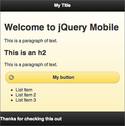
  3. Save this document as jqmtemplate.html, and then preview it in your browser. You should see something like this:

screenshot of jquery mobile template 
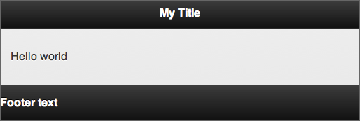
Your basic JQM template

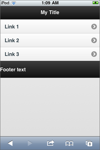
If you have access to a mobile device and a space on the Web where you can upload and access this file, check it out on your mobile device. For instructions on how to get a free Web hosting account, see the FAQs in Lesson 2. Here's what it looks like on my phone:

screenshot of jquery mobile template on an android device 
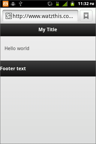
JQM template on an Android smartphone

I hope that you can already see the potential power and time savings that a framework such as jQuery Mobile can bring you. Just wait until you see what comes next!

Before I show you the real power of jQuery Mobile, let's examine the structure of this template.

Check out the code that makes up this page. Look first at the <link> element and the two <script> elements in the <head> of the document. In order for JQM to function, every HTML document in your Web app has to have these three elements, which import, or "include," three files into the document. These are (in order):

  • The jQuery Mobile style sheet: This contains all the code to make JQM apps look good.
  • The jQuery library: JQM uses this basic system to interact with the page.
  • The jQuery Mobile framework: This is what enables the unique features of JQM to style your mobile app and create native app-like buttons and toolbars.

Inside the body of the document, you use the data-role attribute to tell JQM the role of different sections of markup within your app. The first data-role, "page," is a container that you use to create a single page of your mobile app. It's actually possible to have multiple JQM pages in one HTML document, as you'll see later.

Inside the div with the data-role value of "page," you divide your content into three categories: header, content, and footer.

If you use only three standard JQM-included files and these four data-role values, you've already made your app far more cross-platform capable than any native app could ever be. And it took you only a few lines of code!

Creating and Linking Pages

JQM lets you create multiple pages within a single HTML document by stacking <div> elements with the data-role attributes set to "page." As long as you give each of these pages a unique ID attribute, you can link between them by using a standard HTML link and a hash tag (#) followed by the ID value.

For example, here's a JQM app with two linked pages:

<!DOCTYPE html> 
<html> 
	<head> 
	<title>My Page</title> 
	<meta name="viewport" content="width=device-width, initial-scale=1"> 
	<link rel="stylesheet" href="http://code.jquery.com/mobile/1.3.2/jquery.mobile-1.3.2.min.css" />
	<script src="http://code.jquery.com/jquery-1.9.1.min.js"></script>
  // allow local previewing of JQM app
  <script>
    $(document).bind('mobileinit',function(){
      $.mobile.pushStateEnabled = false;
    });
  </script>
	<script src="http://code.jquery.com/mobile/1.3.2/jquery.mobile-1.3.2.min.js"></script>
</head> 
<body> 

<div data-role="page" id="mypage">

	<div data-role="header">
		<h1>My Title</h1>
	</div><!-- /header -->

	<div data-role="content">	
		<p>Hello world. <a href="#yourpage">Click here!</a></p>		
	</div><!-- /content -->

	<div data-role="footer">
		<p>Footer text</p>
	</div>

</div><!-- /page -->

<div data-role="page" id="yourpage">

	<div data-role="header">
		<h1>My Title</h1>
	</div><!-- /header -->

	<div data-role="content">	
		<p>OH hi! Check out <a href="#mypage">My page!</a></p>
	</div><!-- /content -->

	<div data-role="footer">
		<p>Footer text</p>
	</div>

</div><!-- /page -->

</body>
</html>

If you save and preview this app in a browser, you'll get a nice surprise: JQM automatically creates a native-like transition effect when you click between the two pages. You should see one page slide out of view while the one you're linking to slides into view. Very slick!

Enabling the Toolbars

jQuery Mobile has two toolbars: header and footer. You can enable them by using the data-role values of "header" and "footer" (ingeniously enough).

The header should be the first element within a page, and the footer should be the last. The header can contain up to two buttons, and it usually also contains a page title. On native iOS apps, the header typically contains the "Back" and "Home" buttons as well as the title.

Here's some sample code for putting two buttons in the header of the sample JQM app you just built:

<div data-role="header" data-position="fixed">
	<a href="javascript:history.go(-1)">Back</a>
	<h1>My Title</h1>
	<a href="#mypage">Home</a>
</div>

Go back to the basic JQM template you set up earlier in this chapter. Replace the header elements in both pages of the previous sample JQM app to see the header in action and to try it out. (If you have trouble with this, give me a holler in the Discussion Area.)

When I test it on iOS, it looks like this. The header can contain two links and a title.
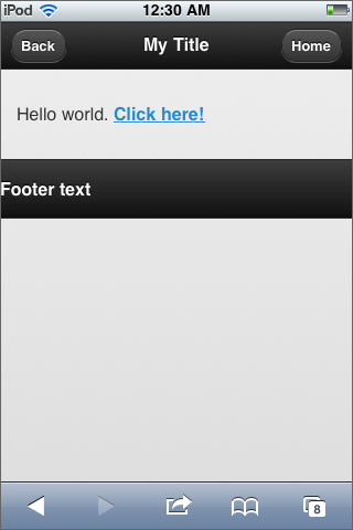
The JQM App on an iOS device iOS version

Looking good!

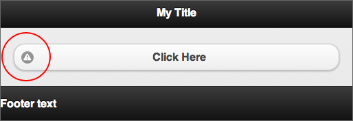
There's one thing that bothers me about this app so far, though. I want the footer to be at the bottom of the screen. So please insert data-position="fixed" into the beginning tag of the footer div, like this:

<div data-role="footer" data-position="fixed">

When you refresh the page in your browser, you'll see the footer toolbar fixed at the bottom of the window:

screenshot of jquery mobile template with a fixed footer at the bottom of the screen 
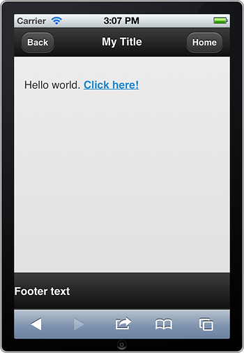
App with a fixed footer

Now you know the basics of creating JQM pages, linking between them, and creating toolbars. Please continue on to Chapter 4, where we'll discuss about some more capabilities of this mobile framework.

More jQuery Mobile Tools and Techniques

If you've used a website on a smartphone, you know that it can be challenging to click small text links. To solve this problem, JQM has a simple way to convert any link into a finger-friendly button. To format a link as a button, use the "button" data-role.

<a href="link.html" data-role="button">Click Here</a>

Here's how the above code looks when you preview it in a browser. You've turned a link into a touch-friendly button.

Link is now a button

JQM includes a library of button icons that you can add by using the data-icon attribute.

<a href="link.html" data-role="button" data-icon="alert">Click Here</a>

Adding an icon to a button

Here's a page that demonstrates each of the JQM data-icon values. Follow these steps to see all of the available button icons.

  1. In Komodo Edit, create a new document by clicking File > New > New File.

  2. Copy the following code, and paste it into the new file.

    <!DOCTYPE html>
    <html>
    <head>
        <title>JQM data icons</title>
        <meta name="viewport" content="width=device-width, initial-scale=1"> 
        <link rel="stylesheet" href="http://code.jquery.com/mobile/1.3.2/jquery.mobile-1.3.2.min.css" />
        <script src="http://code.jquery.com/jquery-1.9.1.min.js"></script>
    // allow local previewing of JQM app
      <script>
        $(document).bind('mobileinit',function(){
          $.mobile.pushStateEnabled = false;
        });
      </script>
        <script src="http://code.jquery.com/mobile/1.3.2/jquery.mobile-1.3.2.min.js"></script>
    </head>
    
    <body>
    <div data-role="header">
        <h1>jQuery Mobile Icons</h1>
    </div>
    <div data-role="content">
    <p><strong>Left arrow</strong> - data-icon="arrow-l"</p>
    <a href="index.html" data-role="button" data-icon="arrow-l">My button</a>
    <p><strong>Right arrow</strong> - data-icon="arrow-r"</p>
    <a href="index.html" data-role="button" data-icon="arrow-r">My button</a>
    <p><strong>Up arrow</strong> - data-icon="arrow-u"</p>
    <a href="index.html" data-role="button" data-icon="arrow-u">My button</a>
    <p><strong>Down arrow</strong> - data-icon="arrow-d"</p>
    <a href="index.html" data-role="button" data-icon="arrow-d">My button</a>
    <p><strong>Delete</strong> - data-icon="delete"</p>
    <a href="index.html" data-role="button" data-icon="delete">My button</a>
    <p><strong>Plus</strong> - data-icon="plus"</p>
    <a href="index.html" data-role="button" data-icon="plus">My button</a>
    <p><strong>Minus</strong> - data-icon="minus"</p>
    <a href="index.html" data-role="button" data-icon="minus">My button</a>
    <p><strong>Check</strong> - data-icon="check"</p>
    <a href="index.html" data-role="button" data-icon="check">My button</a>
    <p><strong>Gear</strong> - data-icon="gear"</p>
    <a href="index.html" data-role="button" data-icon="gear">My button</a>
    <p><strong>Refresh</strong> - data-icon="refresh"</p>
    <a href="index.html" data-role="button" data-icon="refresh">My button</a>
    <p><strong>Forward</strong> - data-icon="forward"</p>
    <a href="index.html" data-role="button" data-icon="forward">My button</a>
    <p><strong>Back</strong> - data-icon="back"</p>
    <a href="index.html" data-role="button" data-icon="back">My button</a>
    <p><strong>Grid</strong> - data-icon="grid"</p>
    <a href="index.html" data-role="button" data-icon="grid">My button</a>
    <p><strong>Star</strong> - data-icon="star"</p>
    <a href="index.html" data-role="button" data-icon="star">My button</a>
    <p><strong>Alert</strong> - data-icon="alert"</p>
    <a href="index.html" data-role="button" data-icon="alert">My button</a>
    <p><strong>Info</strong> - data-icon="info"</p>
    <a href="index.html" data-role="button" data-icon="info">My button</a>
    <p><strong>Home</strong> - data-icon="home"</p>
    <a href="index.html" data-role="button" data-icon="home">My button</a>
    <p><strong>Search</strong> - data-icon="search"</p>
    <a href="index.html" data-role="button" data-icon="search">My button</a>
    </div>
    </body>
    </html>
    
  3. Save the file as data-icons.html.

  4. Click the Preview in Browser button in Komodo Edit to preview it in your browser.

Formatting Content

Making content look attractive in jQuery Mobile apps can be as simple as writing error-free HTML5 code. The built-in JQM style sheet will automatically take care of some adjustments to the page margins, fonts, and padding in order to make basic HTML elements (such as headings, paragraphs, and tables) look better on mobile devices.

If you want to customize the default look of anything in jQuery Mobile, you certainly can. Just use your own style sheet in addition to the standard jQuery Mobile style sheet.

As you may recall from Lesson 4, the cascading nature of CSS makes it possible for you to override or add on to any of JQM's default styles. So, for example, if you want h2 elements in your app to have a yellow background, you could create the following rule in a CSS file:

h2 {
  background-color: yellow;
}

As long as you link to this new file after the JQM style sheet, it will add your new background color onto the style settings created by JQM.

If you don't want to go through the trouble of designing your own color scheme and basic look for your app, jQuery Mobile provides themes, which are sets of styles and colors you can use. The default theme is the one you've been viewing in this lesson. The theme determines the shapes of buttons, the font family, and the colors of toolbars and buttons.

Changing App Colors

JQM's data-theme attribute lets you select one of five color schemes for your app.

<div data-role="page" data-theme="a">

You can add the data-theme attribute to any element. The allowed values of data-theme are the letters a through e. Each theme uses different color combinations for background, text, buttons, and icons.

As a quick exercise, follow these steps to experiment with the different data-themes:

  1. In Komodo Edit, click File > New > New File to create a blank file.

  2. Copy the following code, and then paste it into your new blank file.

    <!DOCTYPE html> 
    <html> 
    	<head> 
    	<title>My Page</title> 
    	<meta name="viewport" content="width=device-width, initial-scale=1"> 
    	<link rel="stylesheet" href="http://code.jquery.com/mobile/1.3.2/jquery.mobile-1.3.2.min.css" />
    	<script src="http://code.jquery.com/jquery-1.9.1.min.js"></script>
    // allow local previewing of JQM app
      <script>
        $(document).bind('mobileinit',function(){
          $.mobile.pushStateEnabled = false;
        });
      </script>
    	<script src="http://code.jquery.com/mobile/1.3.2/jquery.mobile-1.3.2.min.js"></script>
    </head> 
    <body> 
    
    <div data-role="page" data-theme="e">
    
    	<div data-role="header">
    		<h1>My Title</h1>
    	</div><!-- /header -->
    
    	<div data-role="content">
                <h1>Welcome to jQuery Mobile</h1>
                    <p>This is a paragraph of text.</p>
                <h2>This is an h2</h2>
                    <p>This is a paragraph of text.</p>
                    <a href="index.html" data-role="button" data-icon="search">My button</a>
                <ul>
                    <li>List Item</li>
                    <li>List Item 2</li>
                    <li>List Item 3</li>
                </ul>
    	</div><!-- /content -->
            
            <div data-role="footer">
                <p>Thanks for checking this out</p>
            </div>
    </div><!-- /page -->
    
    </body>
    </html>
    
  3. Save your new file as jqm-datathemes.html, and then use the Preview in Browser feature in Komodo Edit to preview the page. You should see something like this:

    Using the data-theme attribute

  4. Now try changing the value of the data theme attribute to one of the other letters (a-e). For example, here's the same file, but with the data-theme set to "c":

    Data theme "c"

Organizing With List Views

Lists are an essential tool for organizing content and links. Many mobile apps contain hierarchical data (that is, data organized like an outline). HTML lists are a great way to display data in outline form. JQM provides many tools for formatting and working with lists.

You can create a basic touch-friendly list of links in jQuery Mobile by using data-role="listview". For example, here's a standard HTML list of linked items:

<ul>
  <li><a href="#">Link 1</a></li>
  <li><a href="#">Link 2</a></li>
  <li><a href="#">Link 3</a></li>
</ul>

Normally, this list would render like the following figure on iOS. The list items are small and would be difficult to press (unless you happen to have very small fingers).

The standard HTML links are small and hard to press. A standard HTML list of links

Let's say you apply JQM's listview data-role to the <ul> element, like this:

<ul data-role="listview">

The list transforms into the following interface, which is much more attractive and easy to navigate:

Using JQM’s list view makes links easier to press. Touch-friendly linked buttons

We've covered so much in this lesson! Let's move on to Chapter 5.

Summary

In this lesson, you learned how jQuery Mobile, frameworks, and libraries can make your life easier.

You discovered what libraries and frameworks can do for you. We also discussed about some key concepts, such as abstraction (using standardized components to make a program seem less complex).

Also, you found out how to structure a jQuery Mobile page and add toolbars. And to wrap up this lesson, you learned to use jQuery Mobile's buttons, lists, content formatting, and themes.

Your App Ideas

We're halfway through the course! What do you think of what you've learned so far? We discussed app ideas back in Lesson 1. How have your ideas changed since then?

Feel free to make comments and ask questions in the Lesson 6 Discussion Area. And don't forget the four principles of mobile app design:

  • Design for mobility.
  • Design for simplicity.
  • Design for people.
  • Design for different devices.

In the next lesson, we'll look at how to use some of the great capabilities of mobile devices from within your HTML5 apps. We'll explore two techniques that can dramatically improve your apps: geolocation and offline storage.

Supplementary Material

Mobile Frameworks Comparison Chart

jQuery Mobile Gallery

jQuery Mobile

jQuery Mobile Framework Themes

ThemeRoller for jQuery Mobile

php - How to display HTML tags as plain text - Stack Overflow

Lesson 6 FAQs

Q: Why did you choose to write about jQuery Mobile and not one of the other mobile Web app frameworks?

A: jQuery Mobile is currently the most cross-platform capable of the available HTML5 mobile frameworks, and it's the one I've worked with the most. It's also easy to get started with.

Q: Can anyone use jQuery and jQuery Mobile for free?

A: Yes! jQuery and jQuery Mobile are both open source and free to use. If you're grateful for the many benefits that these projects have given to the Internet, you're free to donate to them using the Donate links on their websites—but there's no requirement that you do so.

Lesson 6 Assignment

In Lesson 3, you saw the beginnings of the WatzThis.com document, which I wrote using HTML5. In Lesson 4, you improved that documentation by adding some style to it. In this assignment, we're going to make it touch-enabled and mobile-friendly by using jQuery Mobile.

Here's the HTML5 code from Lesson 4 with jQueryMobile added:

<!DOCTYPE html>
<html>
<head>
<meta charset="utf-8">
 <title> WatzThis.com Documentation</title>
<link rel="stylesheet" href="http://code.jquery.com/mobile/1.3.2/jquery.mobile-1.3.2.min.css" />
 <script src="http://code.jquery.com/jquery-1.9.1.min.js"></script>

  <script>
  // allow local previewing of JQM app
    $(document).bind('mobileinit',function(){
      $.mobile.pushStateEnabled = false;
    });
  </script>
 <script src="http://code.jquery.com/mobile/1.3.2/jquery.mobile-1.3.2.min.js"></script>

</head>
<body>
  <header>
    <h1>How to use WatzThis</h1>
  </header>
    <section>
      <h2>Chapter 1: The Buttons</h2>
      <p>WatzThis has several buttons. Each button has a different function. The following figure shows these buttons.</p>
      <figure>
      <img src="http://www.watzthis.com/images/buttons.png" alt="Here are the buttons">
      <figcaption>The WatzThis.com Buttons</figcaption>
      </figure>
    </section>
    <section>
      <h2>Chapter 2: The Lights</h2>
      <p>WatzThis has colors. They change when you press different buttons.</p>
    </section>
    <section>
      <h2>Chapter 3: "Auto" Mode</h2>
      <p>WatzThis has an automatic mode that is useful for those times when you're doing something else, such as dancing, but would still like to have colors that are changing on your mobile device.</p>
    </section>
  <footer>
  <p>created by WatzThis Enterprises</p>
  </footer>
</body>
</html>

We need to add a new div to the page that will contain the other divs so that we can assign the page data-role to an element. So, before the <header> element, insert the following:

<div data-role="page">
After the </footer> tag, insert a closing div tag (</div>).
Add data-role="header" to the header element.
Add data-role="footer" data-position="fixed" to the footer element.
Add data-role="content" to each of the section elements.
Preview the page in a browser.
It should look something like this:

WatzThis documentation with basic JQM styling When you add details and options to the application, the documentation could get long. To minimize the amount of scrolling, let's break this app into three pages—one for each section of the documentation. To do this, we'll need to rethink the organization of the document.
Here's what I came up with:

<!DOCTYPE html>
<html>
<head>
<meta charset="utf-8">
 <title> WatzThis.com Documentation</title>
<meta name="viewport" content="width=device-width, initial-scale=1"> 
  <link rel="stylesheet" href="http://code.jquery.com/mobile/1.3.2/jquery.mobile-1.3.2.min.css" />
  <script src="http://code.jquery.com/jquery-1.9.1.min.js"></script>
  <script>
  $(document).bind('mobileinit',function(){
    $.mobile.pushStateEnabled = false;
  });
  </script>
  <script src="http://code.jquery.com/mobile/1.3.2/jquery.mobile-1.3.2.min.js"></script>
  <link rel="stylesheet" type="text/css" href="watzthis.css">
</head>
<body>
<div data-role="page" id="chapter1">
  <header data-role="header">
    <h1>How to use WatzThis</h1>
 </header>
 <section data-role="content">
      <h2>Chapter 1: The Buttons</h2>
      <p>WatzThis has several buttons. Each has a different function. The following figure shows the buttons.</p>
      <figure>
      <img src="http://www.watzthis.com/images/buttons.png" alt="Here are the buttons">
      <figcaption>You can see the buttons here.</figcaption>
      </figure>
</section>
      <footer data-role="footer" data-position="fixed">
  <p>created by WatzThis Enterprises</p>
  </footer>
</div>
<div data-role="page" id="chapter2">
  <header data-role="header">
    <h1>How to use WatzThis</h1>>
  </header>
<section data-role="content>
      <h2>Chapter 2: The Lights</h2>
      <p>WatzThis has colors. They change when you press different buttons.</p>
</section>
  <footer data-role="footer" data-position="fixed">
  <p>created by WatzThis Enterprises</p>
  </footer>
</div>
    <div data-role="page" id="chapter3">
  <header data-role="header">
    <h1>How to use WatzThis</h1>
  </header>
<section data-role="content">
      <h2>Chapter 3: "Auto" Mode</h2>
      <p>WatzThis has an automatic mode that's useful for those times when you're doing something else, such as dancing, but would still like to have changing colors on your mobile device.</p>
</section>
  <footer data-role="footer" data-position="fixed">
  <p>created by WatzThis Enterprises</p>
  </footer>
</div>
</body>
</html>

This seems like a good start, but there's one big problem. If you preview this document in a browser right now, you'll see what I mean. There's no way to get from one page to another. To remedy this problem, we'll add navigation to the footer of each page. JQM provides a great feature for doing just that: data-role="navbar". Add the following code underneath the "created by" paragraph in each of the three footers in the document:

<div data-role="navbar" data-id="watzthisnav">
<ul>
  <li><a href="#chapter1">Chapter 1</a></li>
  <li><a href="#chapter2">Chapter 2</a></li>
  <li><a href="#chapter3">Chapter 3</a></li>
</ul>
</div>

When you preview the document in a browser now, you should see three buttons in the footer. Click each of them to see them in action! Your app should look like the following:

The WatzThis app with navigation