Some mobile devices—especially the iPhone and iPod touch—support additional meta tags beyond viewport for making Web apps look good.
One of the most obvious differences between an app that you download from an app store and a Web app is that Web apps usually appear within a browser window.
Apple's iOS provides a way to make Web apps launch in full-screen mode . . . that is, without the browser address bar and controls that take up part of your screen when you're browsing webpages with mobile Safari.
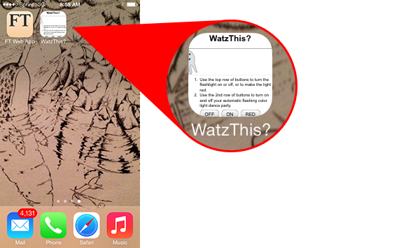
If you have an iOS device (iPhone, iPad, or iPod touch), you see what full-screen mode looks like by visiting the Financial Times at app.ft.com. You'll see a pop-up on the screen that tells you to add a link to the home screen.
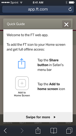
App.FT.com encouraging you to add the app to your home screen
If you follow the instructions, iOS will add a link to app.ft.com to your home screen. This link looks very much like a link to a native app.

A home screen link to the Financial Times Web app
Now here's where the magic happens. When you click this home screen link, the Financial Times Web app opens in full-screen mode.
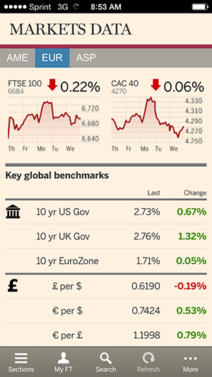
Financial Times Web app in full-screen mode
Notice that the address bar (at the top) and the navigation bar (at the bottom)—which are both normally visible while you browse Web apps—are gone! As a result, the app has significantly more breathing room, and it "feels" more like a native app.
Making a webpage load in full-screen mode (which Apple calls "Web App Mode") when launched from the home screen is surprisingly simple. Are you ready? Here's all it takes:
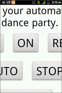
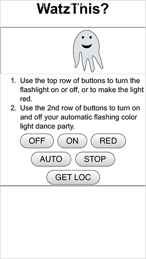
I added this meta tag to WatzThis.com, and here's the result when I load it from the home screen with the iPhone simulator:
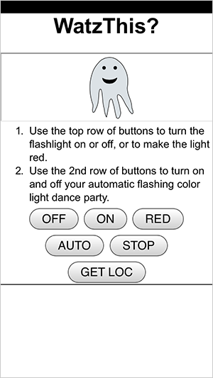
WatzThis app rendered on a smartphone in full-screen mode
Full-screen mode looks great, but you should be aware of a couple of things (besides that it only works on the iPhone and iPod Touch).
First, there's no way to force the Web app to open in full-screen mode. The only way it will happen is if the user adds the app to his or her home screen and then launches it from the home screen. In practical terms, this means you can't really count on having that extra space. You still need to design your app as if the browser controls will be there.
This brings us to the next point: In full-screen mode, none of the standard browser features are there (such as the Back and Forward buttons and the address bar). This means your app has to have its own navigation buttons so that the user doesn't get stuck somewhere with no way to escape.
When you add an app to your home screen, iOS creates an icon from the page that you were browsing when you clicked the Add to Homescreen link. Here's what my iOS button looked like for WatzThis:
My WatzThis icon
Android supports adding Web bookmarks to the home screen, but it doesn't create an icon for you. Instead, it will display the Android bookmark icon.

The Android bookmark icon
Both iOS and Android let you customize what the home screen icon looks like. To control what shows up for the home screen icon, you can specify "apple-touch-icon" in a link tag. Note that this link tag uses the name "apple" for both Android and Apple products. This is just a result of Apple having invented it.
Here's how you specify the home icon for the iPhone 4 and newer (with iOS7):
Here's how you specify the home icon for iPad2 and iPad mini:
And here's how you specify it for newer iPads:
You can include all of these in your app at the same time, and the device will choose the most appropriate graphic.
These same link tags will also work on Android.
A splash screen is an image that displays while your app is loading. You can create a splash screen by using an apple-touch-startup-image link:
The image you specify here must be 320 x 460 pixels (in portrait orientation) for the iPhone and iPod touch, and 1004 x 768 pixels for the iPad.
Even when you're using a Web app in full-screen mode, the iOS status bar still displays at the top of the screen. The status bar is the gray bar with the time and battery status in it. While there's no way to hide this bar, you can change its color and cancel out its effect on your page layout by using the following meta tag:
By setting the value of this meta tag to black-translucent, you give your app access to the whole screen and make the status bar overlap it.
Changing the status bar
You can also use values of default, black, and gray with this meta property. Setting it to just black or gray (the default) will change the color of the status bar but won't cause it to overlap your content.
In Chapter 4, we'll discuss about touch screens. See you there!