Sample navbar
Intermediate Dreamweaver CS3: Lesson 03
Chapter 1:
Introduction
Now that you've gotten your feet wet playing in Dreamweaver's CSS Styles panel, it's time to dig a little deeper. In today's lesson, we'll experiment with our first CSS layout element—navigation bars—and learn why lists are tailor-made for them.
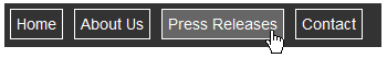
We'll learn how to make both horizontal and vertical navbars by combining list markup with CSS. We'll also tackle tabbed navigation elements. What's more, we'll include mouse-over effects without JavaScript or multiple sets of images. Here's an example of what we'll be creating together:
Sample navbar
So, without further ado, let's get started!
Chapter 2:
Why Lists?
If you think about it, what's a navigation bar, really? It's simply a list of your site links. And unordered lists are HTML's way of structuring lists. Don't worry that a vertical, bulleted list of links will cramp your artistic style (no pun intended). CSS allows us to present our lists any way we want.
They can be horizontal or vertical, with bullets or without. They can also include mouse-over effects. Nothing beats learning by doing, so let's build a few simple examples together to get a feel for what's possible.
Horizontal Navigation
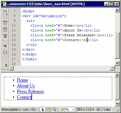
Open Dreamweaver and go to your Files panel. Then, right-click or CONTROL-click your misc folder and choose New File from the context menu. Name your new file horz_nav.html, as shown here:
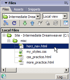
horz_nav.html
Go ahead and double-click the horz_nav.html file in your Files panel to open it in a Document window. Enter a document title in the Title field of the Document window. Title the document Horizontal Navbar Example.
When using a list to build a horizontal navigation bar, we essentially have to do the following:
But, before we can do anything, we need to place a list in our page. Click in the document to place your cursor, and enter the following list:
Since this is a navbar, we'll need some links. Let's create some simple null links (links that point nowhere). To do this, simply select a list item and type a pound sign (#) into the Link field on the Property Inspector, as shown here:
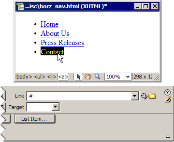
List of null links
Creating the Container
In CSS layout, we specify regions of our document we want to treat in different ways. These regions (or divisions) are structured with the <div> tag. We typically call these structured elements containers, since they act to contain different zones of content. We need to wrap a set of <div> tags around our unordered list. To do this, we must first select the unordered list.
Believe it or not, simply dragging our cursor down the list doesn't actually select the list. It selects the list items inside the list, which is slightly different. To select the entire list, click anywhere in the list to place your cursor, and then look down at the Tag Selector running along the bottom of the Document window. Here, you'll see the following line of HTML code:
<body> <ul> <li> <a>
This simply means that your cursor is currently sitting within an anchor tag (<a>), which is inside a list item tag (<li>), which is part of an unordered list (<ul>), within the body of this document (<body>).
Follow these steps to select the entire list:
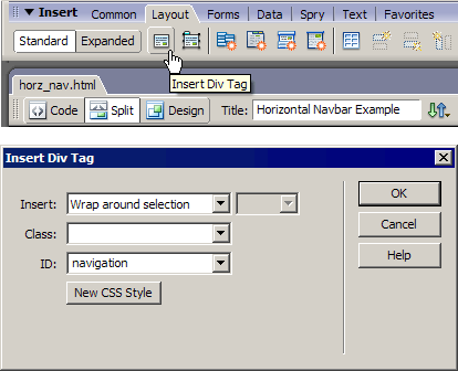
Insert div tag
If you switch to Split view, shown below, you can see that Dreamweaver has inserted our <div> tag, has given it an ID of "navigation", and placed a dashed line around our list in Design view as a visual aid to let us know the container is in place. Now we're ready to create styles.
In CSS, it's best to work from the outside in, moving from the general to the specific. In our example, our tags work inward in this order:
<body><div id="navigation"><ul> <li> <a>
Split view
Styling the Body Tag
Since this document is only going to contain a simple navbar and nothing else, let's set the font-family and font-size of our list at the <body> tag level.
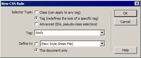
New CSS Rule dialog box
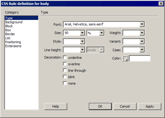
CSS Rule definition dialog box
Styling the Div Tag
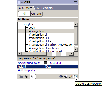
If you look at your Document window, you'll see that the list items have been updated (see below). The next level in is our container—the <div> tag we set up to hold the navigation bar. Let's set a background color and height for this container.
Selecting the container is very easy. You can see the dashed line that represents it right there in the Document window. All we have to do is move our cursor over it until it turns red and then click, as shown here.
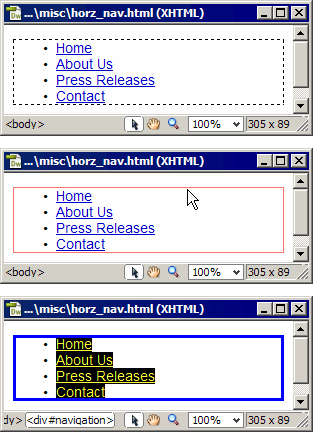
Select the navigation <div>
Now, it's time to start styling:
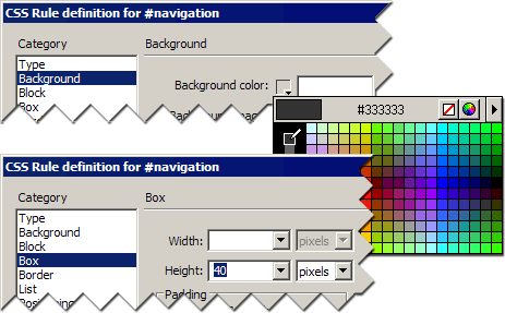
Background color and height properties
The container and the document body are done. Let's move on to Chapter 3 and get started on the list itself.
Chapter 3:
Styling the Unordered List
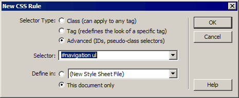
At the moment, our list looks pretty bad. It's still indented from the left margin, and it extends vertically beyond the container, not to mention the bullets that are still there. Time to change the presentation of the unordered list. First, we're going to define three properties to remove the indenting and kill off the bullets:
New CSS Rule dialog box
 Note Note Notice that the Selector is not simply referencing the <ul> tag. Instead, it's something called a contextual selector. In a nutshell, this selector sets up a search pattern for the browser. It says that this style rule should only affect unordered lists found inside our navigation container. This way, if you need to use a regular bulleted list someplace else in your document or site, this set of styles won't prevent you from doing so. |
Padding and margins to 0px, list type to none
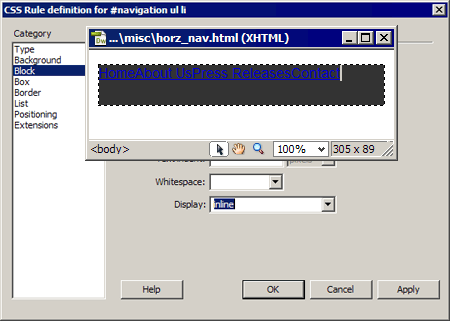
Styling the List Items
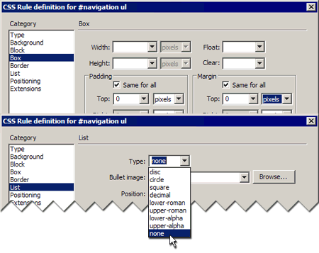
Well, the bullets are gone, and the list is now flush with the left margin, but we're still over-hanging the container, and the list items are still displayed as block-level elements. Now we'll go in and set the list items to display in line. That will put them in a horizontal orientation:
We want to create a rule only for unordered list items found in the navigation container. So, click in the selector field, between #navigation and li, and type in the missing ul. The next image shows a before and after.
Before and after
CSS Rule Definition dialog box and Document window
Styling the Links
We're down to the last tag. I realize this navigation bar still doesn't look that great, but don't give up yet. We're almost there! In the previous set of steps, we took the list items out of their original block-level position and forced them inline. Now, we're going to set some styles at the link level that give them more of a button-like look and feel.
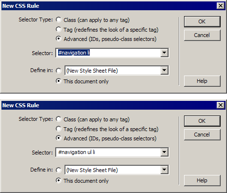
We want to create a rule only for links within unordered list items found in the navigation container. So, click in the selector field, between #navigation and a, and type in the missing ul and li. Your selector should read: #navigation ul li a.
Your document should now look like this:
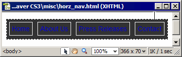
The result
Modifying Link Colors
Let's style our links further using pseudo-classes. CSS normally sets properties based on what an element is—for example, a paragraph, a heading, a list, or a link.
Pseudo-classes allow you to set properties for the state of a given element. For example, browsers give links states based on the browser's memory—previously visited or not yet visited—and display these unvisited links differently from previously visited ones, typically using different colors. CSS provides the pseudo-classes ':link' and ':visited' so you can style these two states.
What I want you to do is set the link color so that it appears white for both visited and unvisited links. The great thing about CSS is that if you want to set identical styles for two elements, you can simply separate their selectors with a comma and follow it with the style declaration. Or, in Dreamweaver-speak, simply enter your comma-separated list of selectors into the selector field of the New CSS Rule dialog box, click OK, and Dreamweaver does the rest.
Now, we're still dealing with contextual selectors. In this case, they are #navigation ul li a:link and #navigation ul li a:visited. Follow these steps to set our link colors:
#navigation ul li a:link, #navigation ul li a:visited
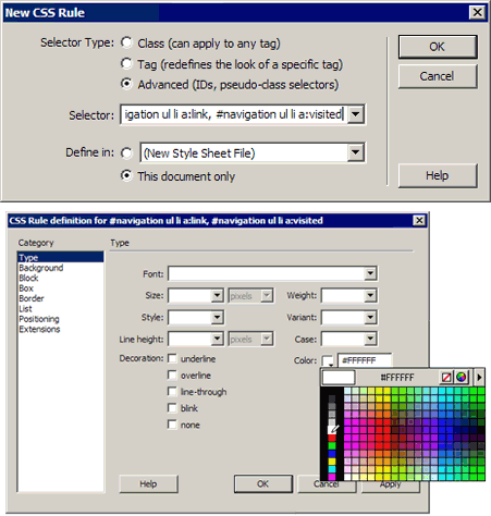
Set the pseudo-classes to white
Creating the Mouse-over Effect
Let's look at two more items, create a mouse-over effect, and create some sort of indication for users so that they know which page they're on, on our site. The mouse-over is accomplished using another pseudo-class: ':hover'. Its name is fairly self-explanatory. When the mouse hovers over an anchor link, whatever style properties we've set will go into effect. For our example, we're going to change the background color.
#navigation ul li a:hover
Now, save your file and preview it in a browser. Run your mouse over the links. It should look something like this:
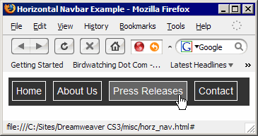
The mouse-over
 Caution Caution If
you preview your file in Internet Explorer 7, you can expect the menu
to behave a bit weird at first. Link colors may not appear right away,
background colors may not respond to mouse-overs, and other odd
behavior. Understand that Internet Explorer 7 is loaded with bugs and
is not standards-compliant (no Microsoft browser ever has been). So,
stick with standards-complaint coding. This forces users to stick with
standards-compliant browsers, which ultimately forces software
manufacturers to fix their software if they want to stay relevant. |
Now, we'll create a class that highlights a particular link to show the user which page they're on. Class names are always preceded by a period. We're going to create a class called .present, but at the same time, we'll keep it as part of a contextual selector so that it can't be used outside of the specific situation we're creating it for.
#navigation ul li a.present
Now that we have this class, how would we apply it? The scenario might go something like this:
You've created the four pages indicated by the navbar entries for this site and inserted this navbar in each of them. You'd then open each page in turn in Dreamweaver and go up to the corresponding link on that navbar. For example, let's imagine this page we're working on was actually the Press Releases page. Let's apply the style class to that link:
Now, that link's background is permanently shaded to tell the user that's where they are. Nice job. That's it for our horizontal navbar. Now, let's take a look at vertical navbars.
Vertical Navigation
Making a vertical navbar is pretty much the same procedure we just followed, only this time we set a width and some padding for our container div, leave the display properties of our list items alone, and set the display of the anchor links to block levels.
Try this:
Properties pane
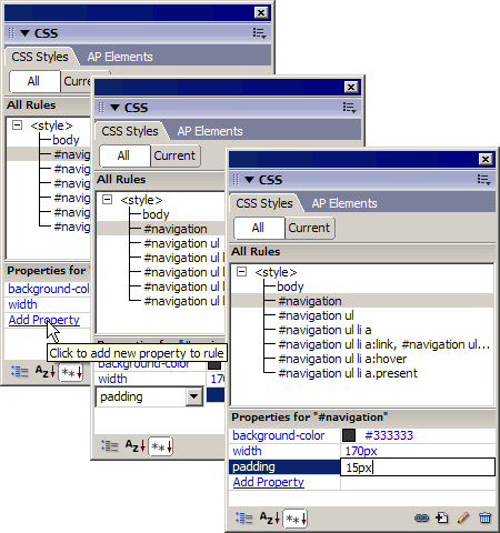
Add new property to rule
Your menu is probably breaking up at this point, but don't panic. A few more edits to your style sheet and all will be right with the world. In a vertical navbar, we won't need to modify the display properties of the list item tags, so let's remove that style from our style sheet:
Now, on to the anchor links. In our horizontal navbar, we needed to float the anchor tags in order to get the links to stay properly aligned. Since we're now sticking with the vertical alignment, this property can go.
Now, we need to restyle the display properties of our anchor tags. By default, they are inline. We want them to be block-level elements.
Now, I want you to save your file and preview it in two browsers. Windows users could notice that the vertical spacing is all out of whack when viewed in some versions of Internet Explorer. This is because Internet Explorer has a bug. Not to worry. By setting a width from our anchor tags, everything will be pulled into line.
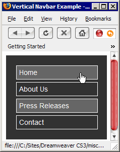
Vertical navbar
That covers the basics of both horizontal and vertical navigation bars. In
the next chapter, we'll use this basic structure to create tabbed
navigation bars. Ready to move on?
Let's go!
Chapter 4:
Tabbed Navigation
As you've probably already surmised, turning our original horizontal navbar into something tab-like isn't much of a stretch. It's a matter of aligning our button area with the bottom of the navigation div and then modifying borders and background colors. Let's give it a shot:
All we need to do to morph the buttons into tabs is modify the #navigation ul li a style rule. Because it's so simple (and I want to give the code-fearing among you a little practice), we're simply going to edit the style rule manually.
Right now, this style rule looks like this:
#navigation ul li a {
border: 1px solid #FFFFFF;
padding: 5px;
float: left;
margin: 5px;
text-decoration: none;
}
The first defined property is for our borders. Because we had the Same for All check boxes selected by default when we added this style, it is written in CSS shorthand. It simply says, "Make all the borders 1 pixel thick, using a solid line, in the color white." I want to remove the bottom border, but if we went through the CSS Rule Definition dialog box and deselected the Same for All check boxes, we'd have to set the border properties for three sides. That would remove this shorthand approach and make this style rule ridiculously long.
By simply adding one short property/value pair to this rule, we can use the cascade to remove the bottom border. Just do this:
border-bottom: none;
Okay, that gives us something a little more tab-like. Now I want to modify the margins to get the tabs down along the bottom of the #navigation container.
margin-left: 5px;
margin-top: 13px;
When you're done, your style rule should look like this:
#navigation ul li a {
border: 1px solid #FFFFFF;
border-bottom: none;
padding: 5px;
float: left;
margin-left: 5px;
margin-top: 13px;
text-decoration: none;
}
We have one last thing to do. We're going to set the background color for the document to the same color as the selected tabs. This way, the tabs will appear to flow into the background. Simply follow these final three steps:
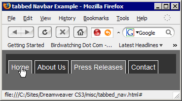
Tabbed navigation bar
Rounded Tabs
Round tab edges aren't too hard. Specificity and CSS's background properties are the key to making them work. We simply need two images first:

Left side of tab

Right side of tab
Follow these steps to copy these two images into your local root folder.
We're going to use these two background images—one covering the left side (at the anchor tag level), which will overlap the other covering the right side (at the list item level)—to create our tabbed effect. The left image is very narrow, while the right image is significantly wider. This allows the tab to expand if text sizes are increased. You'll find an article that discusses this effect in detail in the Supplemental Material section for this lesson.
Our tabbed_nav.html file is a perfect starting point for this example:
Great job! Now let's style the container div.
Styling the Container
In order to make our tabs function properly, we have to float just about everything in this layout. Let's continue with the same outside-in approach we've been using and start by restyling the #navigation div.
Style the Unordered List
Currently, we've got margin and padding values of 0px, but we'll need to increase the padding to keep the tabs aligned. Here's what you do:
Styling the List Items
The only property set for our <li> tags at the moment is display: inline. We need to float this element to maintain each list item in a horizontal row. Ultimately, by nesting several floated elements within our container (which we just floated, also) we're able to take advantage of specificity, adding background images in overlapping succession. This is first done at the list item level, and then at the anchor link level.
Select the #navigation ul li rule on the CSS Styles panel. Then, click the Edit button. In the resulting dialog box, modify the following properties:
Styling the Anchor Links
We won't be needing any borders around our links, so let's get rid of those first. Simply select the #navigation ul li a rule in the CSS Styles panel. Move down to the Properties pane, and delete both the border and border-bottom properties (right-click or CONTROL-click them and choose Delete, or select them and click the Delete CSS Rule button). While we're at it, delete the margin-top property too (it'll just mess with the background images). And change the margin-left value to 0px.
Once that's done, it's time to set the background image for the link. This will take care of the left side of the tab. With the #navigation ul li a rule selected in the CSS Styles panel, click the Edit button. In the resulting dialog box, modify the following properties:
Cleaning Up the Pseudo-classes
So far, we've been using pseudo-classes to create mouse-over effects by changing the background colors. Since we're using images for these tabs, we can clear these background colors and change our effects to something at the type level. To do this, do the following:
Changing the .present Class
The last item on our list is the .present class. We want to remove that background-color property as well. Then, we'll change the text to bold.
You've done it! Save your file and preview it in your browsers. Your file should look something like this:
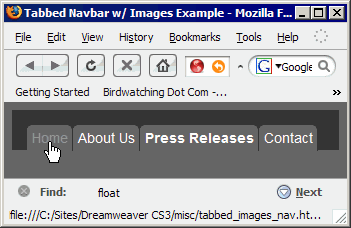
Tabbed image navigation bar
Chapter 5:
Summary
Today's lesson focused on navigation bars. You learned how lists create an excellent structure for navigation elements and looked at four methods for creating navbars. They included simple horizontal and vertical navbars and two slants on tabbed navigation. We even discussed how to use the :hover pseudo-class to create mouse-over effects.
Coming up in Lesson 4, we'll take a look at controlling larger regions of our documents with CSS to create full CSS-based layouts. Don't forget to visit the Discussion Area. See you there!
Supplementary Material
|
The Cascade, Inheritance, and Specificity http://www.westciv.com/style_master/academy/css_tutorial/advanced/cascade_inheritance.html |
| This article will give you a little insight into just why we work from the outside in. |
|
Sliding Doors of CSS http://alistapart.com/articles/slidingdoors/ |
| A rarely discussed advantage of CSS is the ability to layer background images, allowing them to slide over each other to create certain effects. |
FAQs
Q: If I resize the browser window on some of our examples, the navbars break. Is there a way around this?
A:
Yes. You see, these examples were built as isolated components and not
plugged into a full layout. Once part of a complete page, where other
layout elements would be in place to govern the navbars, they wouldn't
break as easily. Of course, even the best layout will come a little
undone if you collapse a browser window down to something like 200
pixels across.
Assignment
In this assignment, I want you to build an image-based tabbed navigation
bar on your own, using the skills covered in this lesson as your
starting point. First, I want you to read the article in the
Supplementary Material section titled Sliding Doors of CSS.
There, you'll learn how to create the necessary images. If you don't
own a solid image editor like Fireworks or Photoshop, you can always
re-use the images from the lesson. It's more important for this class
that you master the CSS concepts.
Then, take the concepts
covered in the article and combine them with what we covered in class.
The article is a little code-centric, so it's okay if some of it is
Greek to you. Just focus on what we did in the lesson.
Simply
make a new file in your misc folder, and name it my_navbar.html. You
can embed your style sheet in this file if you like, or you can create
a new external style sheet. It's up to you. If you run into any
trouble, just holler in the Discussion Area.