Scrolling left to right is a no-no
Intermediate Dreamweaver CS3: Lesson 04
Chapter 1:
Introduction
Well, here we are—Chapter 4! We're a third of our way in, and we're ready to take on page layout. In today's lesson, we'll discuss some basic Web design principles. Then, I'll unveil the design for our class project. We'll then discuss our layout strategy and begin building the first of our site pages. This page will ultimately become the template for subsequent pages.
So, follow me to Chapter 2,
and let's talk about a few basic principles of Web design.
Chapter 2:
Design Principles 101
If only Web design was as straightforward as print design. In print, there is a level of consistency the Web just doesn't have. For example, every person who buys a copy of a book, a magazine, or a brochure you design will have a virtually identical experience using it. This is because every copy of your book, magazine, or brochure is virtually identical.
But, on the Web, we don't have the same luxury. People view our sites through different browsers, with different operating systems, and at different screen resolutions. Our job as designers is to try and create as much of a uniform user experience as possible given these rather wide parameters. It isn't always easy, but there are steps we can take to make it more so.
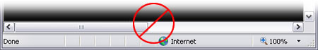
When a user comes to your site, assuming they have their browser window fully expanded, they should be able to see the following:
They may not be able to see everything on the page in one shot, but they'll know where they are, how to get around, and what you're trying to say. They may have to scroll down to read all of your text, but they should never have to scroll left or right to view anything—ever.
Scrolling left to right is a no-no
The question then becomes what dimensions should you use as a standard for layouts since we can never be certain of a user's screen resolution? The traditional approach is to decide upon a worst-case scenario. Ask yourself, "What's the lowest screen resolution a visitor could be using?"
Modern graphics cards and monitors improve by leaps and bounds every couple of years. When I first began creating Web content, a screen resolution of 640 x 480 was not uncommon. The machine I'm writing this on today can't even be set that low.
A good way to determine what your worst-case resolution should be is to take a look at the big commercial sites, like Amazon.com or Yahoo!. Then, set your screen resolution as low as it will go. Next, call up one of these sites in your favorite browser and expand the window to full-screen.
If there's a horizontal scroll bar running along the bottom of your browser window, knock the resolution up a notch. Still got a scroll bar down there? Knock it up again. When that scroll bar finally disappears, you'll know what resolution they feel safe designing for.
I actually tried that little experiment (granted, I already knew the answer), and the resolution happens to be 1024 x 768. About five years ago (yes, I've checked this before), you would have found it to be 800 x 600. So, we can glean that the cost of larger monitors and more powerful graphics cards has gone down over the years and will probably continue to do so.
With this knowledge in hand, we then want to be sure all those things I mentioned before are visible in a fully expanded browser window when the user has their resolution set to 1024 x 768. They may have to scroll down to see the rest of the page, but they'll never have to scroll side-to-side to see anything.
Is there one method for making sure everything fits in that space? No. Amazon.com's design is expandable. It hugs the left and right margins at all resolutions. If you come to it at 1024 x 768, you can see all those items I mentioned (logo, navigation, the big item they're selling that day) and scroll down to get to the rest. If you have a higher resolution, things are a little less crowded. Additionally, the spacing is a bit better, but you still need to scroll—just not as much.
If we look at Yahoo!, we see a different approach. They confine there content inside a fixed region. This fixed region is in turn floated to the center of the page. So, at 1024 x 768, any empty space on the left and right sides of the screen is almost nothing. But, as resolutions increase, the content stays centered inside a bounding rectangle, and the empty space on either side increases proportionally.
These methods—variable width and fixed width—aren't the only two possibilities, although they are the most common. Some folks just peg everything to the left margin. They make sure the content isn't hidden at their chosen worst-case resolution, and then, when the resolution is higher, the user experiences a huge right-hand margin. Personally, I don't like this approach. I think the other two allow for better overall site design and use of space.
Okay, we have a site to build together. So I've created a layout for us, keeping 1024 x 768 in mind.
If you hop over to Chapter 3, we can take a look at it.
Chapter 3:
Our Layout Strategy
For our class project, I've opted for a fixed-width design for two reasons: (1) the variable-width approach is best for sites with a lot of content (which is why Amazon.com uses it), and (2) the fixed-width approach is a little more complex (so you'll be learning more). And once you can build a fixed-width layout, creating a variable-width design is child's play.
Time to unveil what we're building. Being a big fan of history, I thought we'd redesign a small section of an existing site devoted to computer history. Since the site is rather big and our time together is rather short, I figured it would be best to focus on the one part that intersects with what we're doing here—Web history.
Here's a rough mock-up of what we're going to build:
Our layout
It's a fairly straightforward design. It contains a header with logo and navigation, and beneath it is an area for body text and a sidebar. Though you can't see it in this figure (you'd have to scroll down), there's also a footer tucked inside the DIV for the text.
How Many DIVs?
To create this layout, we'll need these eight DIVs:
To get a feel for how these DIVs will be interconnected, look at this diagram:
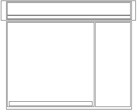
Diagram of our DIVs
Each outline represents a different DIV, and we're still following the container principle we first discussed in Lesson 3. We'll essentially carve out a region, and then, we'll cut that region into parcels of content. When we begin applying styles to our DIVs, we'll work from the outside in, just as we have before.
Prepping the Local Root Folder
Our first order of business is prepping our local root folder. We need a new file for a home page. So, go to your Files panel and create a new file in your local root folder. Since this is going to be our home page, name the file index.html, as shown here:
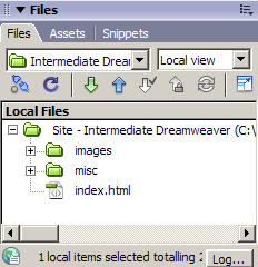
Files panel
Styling the <body> Tag
Go ahead and open the file in a Document window. Go up to the Title field at the top of the Document window, and enter *History of the Web. Now, let's start by styling our <body> tag. Our background color is off-white (#F3F1E9), and we don't want margins:
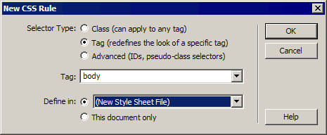
New CSS Rule dialog box
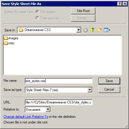
Save Style Sheet As dialog box
 Note Note The
filename you choose (other than the .css file extension) is not all
that important. We're using this filename because we want something
logical that we can easily identify down the road when we're digging
through a list of files. Just remember to stick with lowercase letters
and don't use spaces (use hyphens or underscores if you must) or
punctuation marks. |
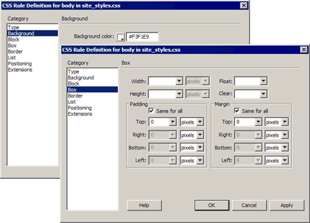
CSS Rule Definition dialog box
Building the Header
Now, we're ready to start building the header. It contains our simple, but effective, logo, which is just a Heading 1. This is very search engine-friendly, because no graphics software is needed. It also includes our navigation bar.
Let's begin by inserting the DIVs we'll need. Remember, we've got four DIVs in this section: one on the outside that will run to the edges of the screen with our dark gray background color, one inside that is set to a fixed width and aligned to the center, and two inside (one to hold the logo at the top and another for the navigation bar at the bottom). The code looks like this:
<div>
   <div>
      <div></div>
      <div></div>
   </div>
</div>
Because Dreamweaver is a visual program, let's insert these tags with Dreamweaver's WYSIWYG tools. If you go up to the Insert Bar and choose the Layout category, the first button you'll see inserts DIVs, as shown here:
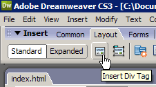
Insert Div Tag
Go ahead and place your cursor in the Document window, and then give that Insert Div Tag button a click. The resulting dialog box looks like this:
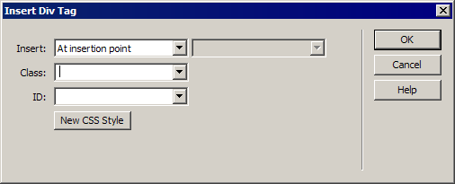
Insert Div Tag dialog box
The first drop-down menu allows you to select where you want the tag inserted. We'll use some of the other options you see in just a moment. Since we want our first DIV at the start of the page, where our cursor currently is, stick with the At insertion point option. Now, we need to give this DIV an ID so we can create styles for it. Click in the ID field, and name this DIV header_container. Then click OK.
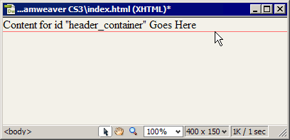
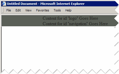
Your Document window should now have a DIV in it, indicated by a dashed outline, with the words "Content for id "header_container" Goes Here" inside it. If you mouse over the dashed line, it will turn red, as shown below. This means you can click it to select the DIV. But don't do that just yet.
A highlighted DIV
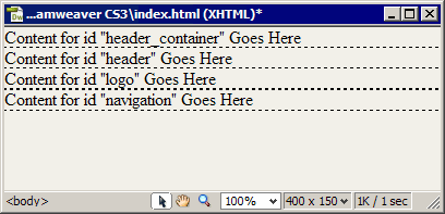
Let's get the rest of the DIVs in there. Click at the end of that sentence inside the DIV, and click the Insert Div Tag button again. Stick with the At insertion point option, and name this DIV header. Then click OK. Now we have two DIVs. Two more to go.
These last two DIVs are going inside the header DIV, so place your cursor at the end of the sentence that reads, "Content for id "header" Goes Here". Next, click the Insert Div Tag button again, but this time, name it logo.
Now, we want to take advantage of that first drop-down menu in the Insert Div Tag dialog box. We want this next DIV placed inside the header DIV, right after the logo DIV. So, click the Insert Div Tag button one last time, and choose After Tag from that drop-down menu. This enables the drop-down menu to the right of it, where you choose which tag you want this new DIV to follow. Choose <div id=" logo">, and name this last DIV navigation.
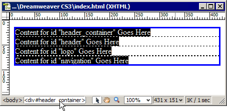
Your Document window should now look something like this:
Document window
Let's examine the code we've created by clicking the Code view button. Our DIVs should be arranged as follows:
<div id="header_container">Content for id "header_container" Goes Here
   <div id="header">Content for id "header" Goes Here
      <div id="logo">Content for id "logo" Goes Here</div>
      <div id="navigation">Content for id "navigation" Goes Here</div>
   </div>
</div>
Ultimately, we'll remove all those examples of "Content for id [DIV Name] Goes here" and replace it with real content. In some cases, the DIV's only content will be other DIVs.
Styling the Header
Just as we did when creating our navigation bars in the last lesson, we'll work from the outside in. That means we'll start by setting properties for the #header_container DIV first.
Tag Selector
If your dialog box is not behaving, simply enter those values manually, and then continue with these steps:
The container for the header is now done. Now, we've got to place the logo and navigation.
Aligning the Logo and Navigation
In our layout, the logo and navigation occupy a region that is 685 pixels wide and aligned to the center of the page. This is accomplished by placing them in their own container and defining width and margin properties for that container. That container, as you've guessed, is the one we named #header. Let's continue working with it:
| Note How did I instinctively know to set this DIV to a width of 685 pixels? I didn't. When I was originally building this example, I set an estimated width. After creating a mock-up in Photoshop, I was able to take measurements. But I changed my mind about some things while I was doing the actual Dreamweaver work. So, the original estimate was just that—an estimate. I finished the logo DIV and then went to work on the navigation. I started building that, and of course, the whole thing broke up because the navigation bar was wider than my estimated #header DIV width. So, I had to go back and mess with the width until everything aligned properly. The point I'm trying to make is this: Real work (as opposed to following a series of steps someone else lays out for you) will be a more organic experience. You'll tweak things here and there, and that's to be expected. |
You can now remove some of the text inside the header by following these steps:
The header
Now, we're ready to fill in our logo and begin building our navigation list. Onward to Chapter 4!
Chapter 4:
Filling in the Logo
This part is simple—our logo is just a Heading 1. Go ahead and select the sentence that reads, Content for id "logo" Goes Here, and type *History of the Web in its place. Now, we'll style that heading:
Creating the Navigation List
This part is going to be easy too, because we can reuse a chunk of one of the style sheets we built in the last lesson. First, we need to get an unordered list into the Navigation DIV.
Well, we could start building our navigation styles from scratch, but if you look at the list structure, you'll see it's identical to the navbars we built in the previous lesson. I hate to do work twice, so let's see what we can recycle.
Reusing Some of Our Work
In the last lesson, we created navigation bars from lists, and we just happened to use the same DIV name. Consequently, the style rule names for this style sheet are going to be identical. No reason not to take advantage of this opportunity to reuse some content, so we're going to cut and paste from one of our previous embedded style sheets into our current external style sheet file. Then, we'll simply swap out the properties for new ones:
<style type="text/css">
<!--body {
font-family: Arial, Helvetica, sans-serif;
font-size: 90%;
}
#navigation {
background-color: #333333;
height: 40px;
}
#navigation ul {
margin: 0px;
padding: 0px;
list-style-type: none;
}
#navigation ul li {
display: inline;
}
#navigation ul li a {
border: 1px solid #FFFFFF;
padding: 5px;
float: left;
margin: 5px;
text-decoration: none;
}
#navigation ul li a:link, #navigation ul li a:visited {
color: #FFFFFF;
}
#navigation ul li a:hover {
background-color: #666666;
}
#navigation ul li a.present {
background-color: #666666;
}
-->
</style>
We only need a portion of this style sheet. Obviously we don't need the <style> tags. We also don't need the body style since we already have a similar style rule in place. We do need the #navigation through #navigation ul li a.present styles. So let's copy and paste these styles into our site _styles.css file.
@charset "utf-8";
body {
margin: 0px;
padding: 0px;
}
#header_container {
background-color: #31363E;
width: 100%;
}#header {
margin: auto;
width: 685px;
}
#logo h1 {
font-family: "Times New Roman", Times, serif;
font-size: 425%;
color: #F3F1E9;
margin: 0px;
padding: 0px;
}#navigation {
background-color: #333333;
height: 40px;
}
#navigation ul {
margin: 0px;
padding: 0px;
list-style-type: none;
}
#navigation ul li {
display: inline;
}
#navigation ul li a {
border: 1px solid #FFFFFF;
padding: 5px;
float: left;
margin: 5px;
text-decoration: none;
}
#navigation ul li a:link, #navigation ul li a:visited {
color: #FFFFFF;
}
#navigation ul li a:hover {
background-color: #666666;
}
#navigation ul li a.present {
background-color: #666666;
}
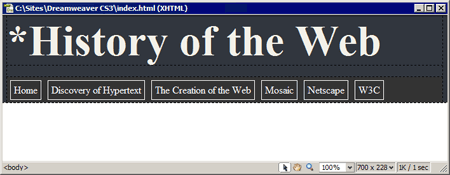
Of course, now there's one problem. Our navbar looks like the one in horz_nav.html (shown below), not like the example from the start of the lesson. No big deal. We've just got to make some edits to the existing styles.
Our page so far . . .
Modifying the Navigation Element Styles
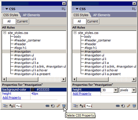
Up to this point, we've been adding styles using the CSS Rule Definition dialog box. And we could simply select the styles we just pasted in the CSS Styles panel and then click the Edit button to go into that dialog box and make edits. But, I want to take this opportunity to familiarize you with the true CSS property names by doing this round of editing directly in the Properties pane of the CSS Styles panel.
So, let's begin with the first style we pasted—the #navigation style:
CSS Styles panel
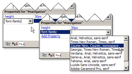
Next, we want to set the font-family, font-size, and border properties for the #navigation DIV.
Add font-family
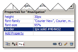
Properties for the #navigation DIV
| Note This last property/value pair is an example of CSS shorthand. Any element can have a border, and there are four specific types: border-bottom, border-left, border-right, and border-top. These in turn have properties for width, color, and style. So, that's 12 properties to define if you do each one individually. In our example, we want a solid border all the way around the #navigation DIV that's 1 pixel wide and a funky shade of gray. So, instead of entering 12 properties, we simply enter the word border as our property and follow it with three values (first width, then style, then color). Viola! All four sides are covered in one property/value pair. |
The properties we set for the #navigation ul and #navigation ul li elements back in horz_nav.html are perfect just as they are. So, we can move on to the #navigation ul li a style. The previous style wrapped a border around the entire #navigation DIV, but the borders between buttons will be added to the right side of the anchors.
This will cause a minor problem for the very last anchor link in the navbar. But, we can fix that with a unique style class, just as we created the .present class to indicate which page the user was on. We'll also modify the padding and kill off the margin values. The float is perfect just as it is. Let's get started by following these steps:
Almost done. We just have a few more styles to modify and some new ones to add, and then, we'll be able to move on to our final chapter.
Now we're going to add two new style classes so our last list item link's borders won't conflict with the border we set for the #navigation DIV.
Our last style class mimics our .present class, formulated for the last link in the navbar:
Setting Our Classes
In the last lesson on navbars, we created the .present class so we could set the background color of the link to the current page to indicate where the user was. We copied that style over to this navbar and changed the color to suit this layout's color scheme. Now, all we have to do is set the class for the link.
Last, we need to set the class for the W3C link. Yours may appear to have vanished, but the text is really there. It's just sitting under the Home link. Try dragging your cursor there, and see if the Tag Selector displays the anchor (<a>) tag.
If it does, just follow the same procedure and set its class to end. If you can't select it, simply switch to Code view and select the W3C text. The Tag Selector will then give you access to the anchor tag, and you can set the class, as shown here:
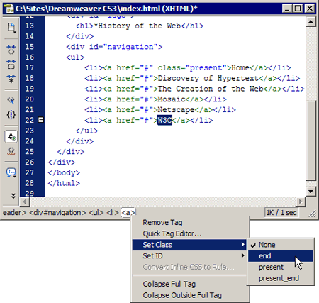
Tag Selector
Go ahead and choose File > Save All to save your work, and then, preview it in your browsers. Your file should look something like this:
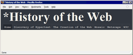
Browser preview
That's our header! That still leaves the content section, which has
four DIVs not all that different from what we've just built. We'll
tackle that in this lesson's assignment.
Right now, let's wrap up what we've learned so far.
Chapter 5:
Summary
In today's lesson, we talked about using a worst-case scenario approach when deciding how to determine the width of a layout. We then began work on our class Web site project. We examined the layout we're going to use and discussed the number of DIVs we need to create it. We then built the upper half of the layout together, building on the skills we began developing in the previous lesson.
Of course, we still have the rest of the layout to complete. We'll tackle that in this lesson's assignment, at which point we'll have a finished layout for our site pages. That'll bring us to Lesson 5, where we'll learn how to turn this layout into a template for building the remainder of our site.
Supplementary Material
|
The One True Layout http://www.positioniseverything.net/articles/onetruelayout/ |
| Pure CSS-based layouts have come a long way, but they still have shortcomings that fail to address certain design goals without compromising the true separation of content and presentation. This article shows how to overcome many of them. |
|
CSS Articles at "A List Apart" http://www.alistapart.com/topics/code/css/ |
| Here are 83 excellent articles concerning CSS. |
|
CSS Edge http://meyerweb.com/eric/css/edge/ |
| Check out this site for cutting-edge CSS techniques. |
FAQs
Q: Whenever I click the New CSS Rule button, the dialog box doesn't open prefilled as you describe.
A:
The New CSS Rule dialog box will properly prefill if the style you're
currently trying to create is the same as the style you made before it.
One way to bypass this issue is to always set the Selector type to
Advanced and just enter your selectors manually.
Assignment
Building the Content Section
Building the content section of the page is much the same procedure as building the header. Of course, since we don't have a navbar to worry about, there will be fewer styles to create.
Inserting Our DIVs
Our DIVs will follow the #header_container DIV and have this structure:
<div id="content">Content for id "content" Goes Here
   <div id="text">Content for id "text" Goes Here
      <div id="footer">Content for id "footer" Goes Here</div>
   </div>
   <div id="sidebar">Content for id "sidebar" Goes Here</div>
</div>
Check your code against the sample I showed you above.
The #content DIV will serve the same function as our #header DIV. In fact,
it will have the exact same property/value pairs as the #header style
we created previously, setting the width of the content area and
centering it. Go ahead and select that DIV, and create a new style for
it. Set its width to 685 pixels and the margins to auto.
Styling the DIVs
In creating the header, we walked through each step together. For this
section, I'll give you the styles. See if you can build them on your
own.
Here's a little CSS Rule Definition dialog box cheat sheet:
Your document may be looking a little ill at the moment, since the only
content in the content area of the page is a bunch of sentences like,
"Content for id "text" Goes Here." And one of those sentences is in a
spot where there shouldn't be any text! Don't worry. You'll be cleaning
that up in Lesson 5.
If all else fails, you can copy and paste
these styles into your site_styles.css file. Don't hesitate to post
questions or problems in the Discussion Area.