Braille tactile device
Intermediate Dreamweaver CS3: Lesson 06
Chapter 1:
Introduction
Do you own a printer? I bet you do or at least have access to one. Ever print a Web page? I'm sure you have. Now, do you own a cell phone too? How about a PDA, like a Palm Pilot? Maybe a Blackberry device? Guess what? All of these devices are Web-enabled. In other words, people use them to access the Internet, read their e-mail, and browse Web pages.
What does this mean to us? It means that, at some point, we're going to have to create Web pages that can be viewed (and look professional) on all of these devices. This is just further proof that we definitely need to be able to separate content from presentation.
In fact, by the end of this lesson, you'll be painfully aware that what looks good on your PC screen doesn't necessarily look that good once it's printed or when it's viewed on a tiny cell phone screen. Today, we're going to learn all about styling for devices. We'll look at the different types of devices we can style for (with a concentration on printers, for simplicity's sake), and we'll examine some of the tools Dreamweaver provides to make styling for devices easier.
Let's move on to Chapter 2. There, we'll discuss devices and the different ways CSS allows us to handle them.
Chapter 2:
Devices and Style Sheets
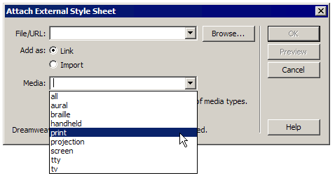
In simple terms, a device is just the piece of equipment that displays a Web page. We have computers, printers, cell phones, PDAs, and others that we can create specific style sheets for. In HTML and CSS, we use the media attribute of the <link> tag (<link href=" [path to style sheet] " rel="style sheet" type="text/css" media="print" />) to specify which style sheet we want used for each kind of device.
Basically, you create a unique style sheet containing styles for your page elements that allow these elements to look good when viewed on a specific type of device. Then, you attach the style sheet to the Web page using one of the following 10 values for the media attribute:
all: This is the default value. In other words, if you don't specify a media type, then all devices will use this style sheet. So, use this value if you want all devices to use one style sheet, or simply don't bother with the media attribute at all.
braille: If you need to create a style sheet for Braille tactile feedback devices, this is the value you use.
Braille tactile device
embossed: Use this value for style sheets intended for Braille printers.
Braille printer
handheld: style sheets for cell phones and PDAs use this value.
Blackberry
print: This value is for printers, as well as documents viewed on screen in print preview mode.
Printer
projection: If you have specific display needs for projecting your page, use this value.
Projector
screen: This value represents computer monitors.
PC monitor
speech: Use this value when creating a style sheet specifically for text-to-speech synthesizers.
Text-to-speech synthesizer
tty: TTY stands for teletype and is used if your content is going to be sent to a teletype machine, dot-matrix printer, or terminal screen for viewing.
Terminal window
tv: This value is for televisions—for example, WebTV or game consoles that are Web-enabled.
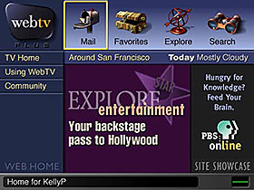
WebTV
 Note Note Braille
tactile devices, Braille printers, and text-to-speech synthesizers
(also called screen readers) are sometimes referred to as assistive technologies—they
assist users with visual impairments so they can experience Web-based
content through non-visual means. We'll build on what we learn in this
lesson later when we examine issues of Web page accessibility in Lesson
7. |
Previewing Issues
When you're creating content specifically designed for PC viewing, previewing your work is pretty simple. Build the page, save the files, preview the page in a browser—no problem. But how do you go about previewing your content when you've created a style sheet for one of the other devices I mentioned?
Typically, you'd have to build your Web pages, upload the files to the server, and then have the specific device handy so you can view the finished product in it. Fortunately, Dreamweaver has some very helpful features to make this a little easier: the Style Rendering Toolbar and Device Central.
Using the Style Rendering Toolbar
The Style Rendering Toolbar (shown below) is normally hidden. To display it, choose View > Toolbars > Style Rendering from the menu. This toolbar contains buttons that allow you to toggle between different style sheets for various media types. It also has a button that lets you toggle all CSS styles on or off so you can see your page rendered only with the structuring HTML.
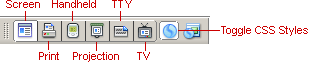
Style Rendering Toolbar
From left to right, this is what each button does:
Of course, the toolbar does nothing if you haven't specified any media-dependent style sheets. Don't worry about that for now. Later on in the lesson, we'll create a printer-specific style sheet and attach it to our template file (and by association, all of our HTML files).
The point to remember with the Style Rendering Toolbar is that these buttons simply toggle your various style sheets on and off. You're still viewing the document in the Document window, which is essentially like a browser window. Therefore, selecting the Render Handheld Media Type option, for example, doesn't let you see how it really looks on a handheld device. It simply gives you a general idea of what styles are in place in that particular style sheet.
This is where Device Central comes in.
Opening Device Central
Device Central is part of Adobe's Creative Suite. It uses Opera's Small Screen Rendering technology within a stand-alone interface that mimics various handheld devices. In a nutshell, it's like previewing your work on the cell phone or PDA of your choice without actually owning one. Is it 100% perfect? No. Is it extremely useful? Yes.
Using Device Central is no different than using the normal Preview in Browser feature. Simply click the Preview/Debug in Browser button and choose Device Central from the drop-down menu, as show here:
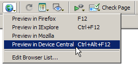
Preview in Device Central
With Device Central open, you can then see your page rendered in any of the handheld device emulators the program has available. For example, in the figure below, I have my completed index.html file displayed in a Motorola RAZR V3m, which happens to have a screen resolution of 176 x 220. Of course, I haven't created a handheld style sheet for it yet, so it looks pretty crummy!
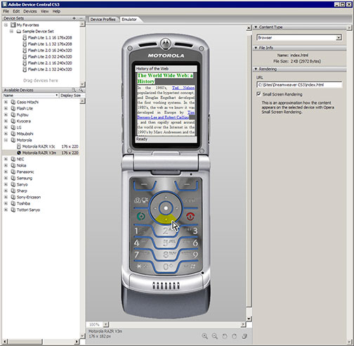
Adobe Device Central
The three-column interface provides the following:
To place one of the devices in the favorites section, simply drag the device listing from the bottom pane to the top pane in the left column.
Adding New Devices
Periodically, Adobe updates the list of devices available at their Web site. To check for updates, simply choose Devices > Check for Device Updates from the menu.
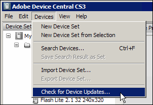
Check for Device Updates
This opens the Adobe Web site, where you'll be asked to log in (seen below).
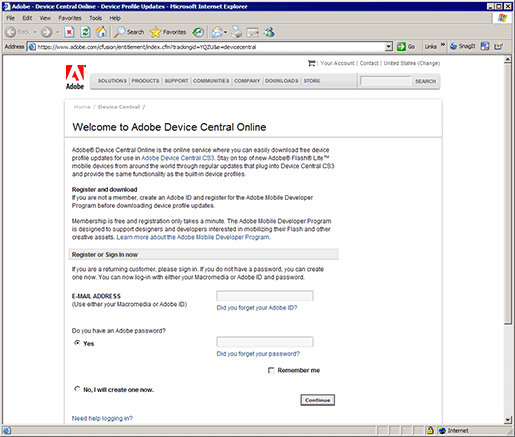
Welcome to Adobe Device Central Online
If you don't already have a login, simply register—it's free. You will have to wade through a couple of pages of market research-gathering forms. Most of it is optional, so you won't have to tell them anything crucial. Your patience will be rewarded, though, and you'll be presented with the Adobe Device Central Online download page seen here:
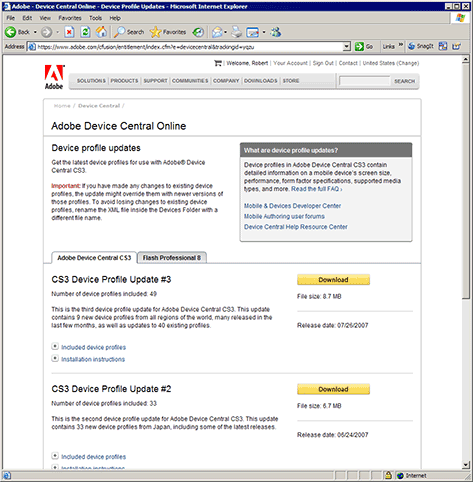
Adobe Device Central Online
To download a specific update, follow these steps:
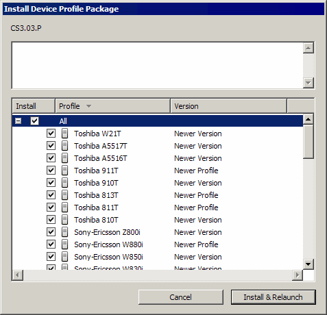
Install Device Profile Package
Just as I mentioned with the Style Rendering Toolbar, there are limits to what Device Central can do. This program is an emulator, which by its very definition means it doesn't show how your page will look on one of these handheld devices exactly. It is an approximation.
The bottom line: Nothing beats the real thing. If you need to design for handheld devices, make sure you have handheld devices to test on.
And remember our worst-case scenario approach. What's the lowest screen resolution a cell phone or PDA user is likely to have? The lowest one I can find in Device Central is 176 x 208. So, that's where I'd start and make sure my design looks good at that resolution.
Of course, there's more than just screen resolution to think about when designing for specific devices. The entire functionality of the device comes into play. A PC is not a cell phone, not a printer, and not a Braille tactile device.
Unfortunately, we can't discuss the various design considerations required for each of these devices. We'd need an entire class for each of them! But, I have included articles in the Supplemental Material section that should provide a good starting point for you.
From here on out, we're going to focus our discussion on one device we're all likely to run into on a daily basis—printers.
So, let's move on to Chapter 3 and look at how we go about attaching a printer-specific style sheet to our pages.
Chapter 3:
Attaching a
Printer-friendly
Style Sheet
Have you ever gone to a really cool site, tried to print one of the pages, and found the printout is virtually illegible? Oftentimes, a layout that works great on screen simply falls apart when printed. The solution is to create a printer-specific style sheet.
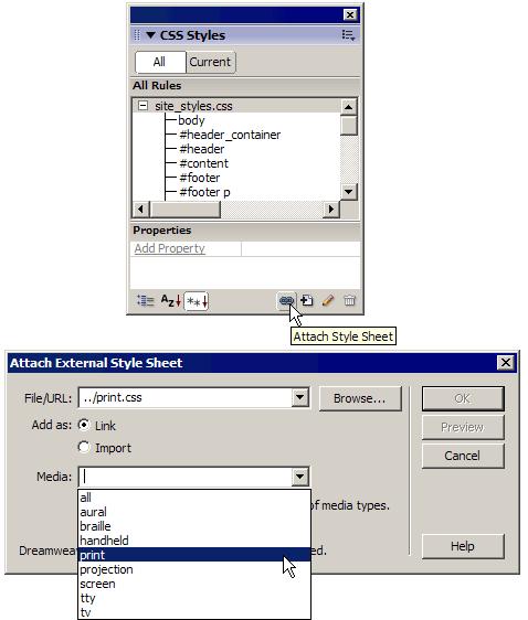
As we discussed in the earlier part of the lesson, we need to attach a style sheet and specify the appropriate value for the media attribute of the <link> tag. And, the only way to get access to that attribute (other than typing it into our code manually) is through the Attach Style Sheet dialog box, shown here:
Attach Style Sheet dialog box
If we simply click the New CSS Rule button and choose to create a new style and define it in a new style sheet document, Dreamweaver will attach the style sheet automatically, replace our original style sheet, and not include the media attribute. So, we need to create the blank style sheet document first, attach it with the proper media attribute value, and then start creating our styles there.
Let's create our new print-centric CSS file now. Follow these steps:
Create a new file
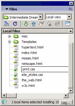
print.css
We
happen to be working with a template, so we need to attach this file to
our .dwt file so it's affecting all the pages of our site. In your
regular Dreamweaver life outside of class, if you aren't using a
template, simply attach this file to each of your site pages manually.
The operation is basically the same, however.
Note
Attach style sheet
Dreamweaver will then prompt you to update any files based on this template. Simply click the Update button. You'll then see a report of the affected files. Click the Close button in that dialog box.
Okay, now we've got a new CSS file attached to our template and, thus, all of our pages built from that template. The code used to link this style sheet to our documents references print media, so the style we create in this new style sheet will only be visible in print previews and on the printed pages themselves.
Now it's time to actually start styling the printer-friendly version of our site.
Ready? Let's move on to Chapter 4.
Chapter 4:
Styling for Print
What's the primary objective of a printer-friendly page? Legibility. That means doing away with any effects that are screen-specific (you can't mouse over anything in print, for example). And navigation is pointless in a printed page. If readers want to go to the next page, they simply flip, shuffle, or turn to it—no clicking here.
In my opinion, when I create a printer-friendly page, I want to reduce the Web page to the simplest rendering possible. Because I'm supporting black and white, as well as color, I tend to shoot for a black text with white page end product.
Of course, I often have difficulty dealing with links within body text. The reader can't click them, obviously, but typically, it's crucial that they be able to tell that the original Web page contained these links. If my original design relies on color instead of underlines, then I simply style the underlines back in the printer-friendly version.
So, how are we going to make our pages printer friendly? We're not actually going to have to do too much, since our original design is somewhat print design-centric to begin with. Here's what we'll do:
Just as we've always done, we'll work from the outside in. So, that means we start with the body tag. I want to do away with the off-white background color and reset the margins and padding.
Adding Our styles
If you look at the CSS Styles panel, you'll now see two style sheet lists—site_styles.css and print.css, shown here:
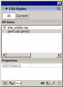
CSS Styles panel
As you can see, the print.css file has the media type for which it's been designated (print) listed in parentheses beside the filename.
The first thing I want you to do is call up the Style Rendering Toolbar, if you don't have it visible already. Choose View > Toolbars > Style Rendering if you need to display it. Then, click the Render Print Media Type button (shown below) so we can watch the effects of our styling as we work.
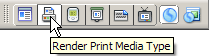
Render Print Media Type
Now let's create our styles. Follow these steps:
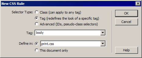
New CSS Rule dialog box
Now, because most of these DIVs are protected by the template, we won't be able to select them using the Tag Selector as we've done in previous lessons. We'll have to rely on memory. The next level inward in our DIV structure is the #header_container DIV. We want to hide this so that we can get rid of the logo and the navigation.
The next DIV in our sequence is the #content DIV. We need this one to expand to the full width of the document and remove any margin or padding values it could inherit from the default style sheet:
Within the #content DIV, we have the #text and #sidebar DIVs. We want to hide the sidebar and modify the text like so:
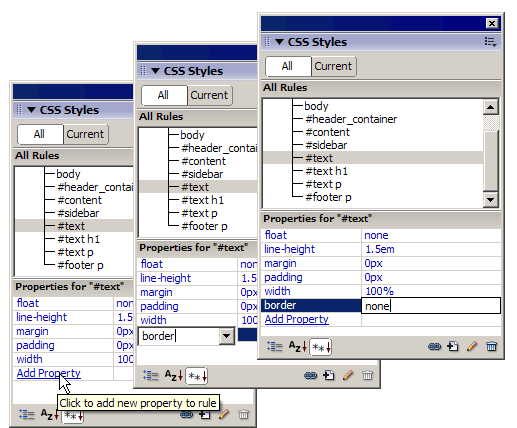
border: none
A Little Challenge
We have three styles left—all contextual selectors—for the #text h1 heading, the #text p paragraphs, and the #footer p paragraphs. See if you can build them without any help from me. Here are the style rules:
#text h1 {
font-family: Georgia, "Times New Roman", Times, serif;
font-size: 18pt;
}
#text p {
font-family: Georgia, "Times New Roman", Times, serif;
font-size: 12pt;
}
#footer p {
font-family: Georgia, "Times New Roman", Times, serif;
font-size: 10pt;
}
Your completed style sheet should look like this:
body {
background-color: #FFFFFF;
margin: 0px;
padding: 0px;
}
#header_container {
display: none;
}
#content {
width: 100%;
margin: 0px;
padding: 0px;
}
#sidebar {
display: none;
}
#text {
float: none;
width: 100%;
margin: 0px;
padding: 0px;
line-height: 18pt;
border: none;
}
#text h1 {
font-family: Georgia, "Times New Roman", Times, serif;
font-size: 18pt;
}
#text p {
font-family: Georgia, "Times New Roman", Times, serif;
font-size: 12pt;
}
#footer p {
font-family: Georgia, "Times New Roman", Times, serif;
font-size: 10pt;
}
If you run into any trouble, just holler in the Discussion Area. Of course, if all else fails, you can always copy and paste the three styles into the print.css style sheet manually. And as always, make sure you save your work when you're done.
Previewing Our Work
So, how do we actually see what we've accomplished here? Well, we could just print the thing out, but we can also use our browser's Print Preview feature. In most browsers, this command can be found on the File menu.
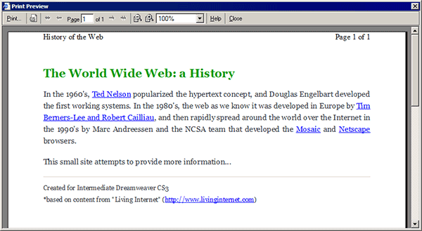
Print preview
The document title appears at the top of the page and looks just as good as the header logo does on the actual Web page. The links are still underlined and in a different color so readers know where they are. And, even when printed in black and white, the contrast level is high enough so that the heading, links, and remaining text are clear and easy to read.
Well, that's it for printer-friendly style sheets. I hope this lesson was helpful.
Let's jump to Chapter 5 for a wrap-up of what we've learned today.
Chapter 5:
Summary
In today's lesson, we talked about styling for devices other than the PC screen. We learned about the media attribute of the <link> tag, which allows us to attach secondary style sheets for specific types of devices, like printers, PDAs, and cell phones. In that discussion, we examined the 10 different values we could set for the media attribute and the types of devices those values corresponded to.
We then checked out some of the tools Dreamweaver provides for working with secondary style sheets. We saw how the Style Rendering Toolbar worked and then toured Adobe's Device Central, where we learned how to call up various emulators to see how our pages would look on various handheld devices. We also learned how to download and install updates for Device Central. Last, we attached a new printer-specific style sheet and developed a series of styles that optimized our pages for printout, and then we previewed our work in our browser's Print Preview window.
In
Lesson 7, we'll build on what we've learned in this lesson in examining
Section 508 of the Federal Rehabilitation Act, which governs Web site
accessibility for users with disabilities.
Supplementary Material
|
Pocket-Sized Design: Taking Your Web Site to the Small Screen http://www.alistapart.com/articles/pocket/ |
| Visit this site for insights on styling for handheld devices. |
|
Print Different http://meyerweb.com/eric/articles/webrev/200001.html |
| Here you'll read about the advantages of using CSS for print. |
|
Five Simple Steps to Typesetting on the Web http://www.markboulton.co.uk/journal/comments/five_simple_steps_to_typesetting_on_the_web_printing_the_web/ |
| Just like the title says . |
FAQs
Q: When I attach a secondary style sheet for another media device, it seems to override my main style sheet.
A:
Chances are you didn't use the Attach Style Sheet button in the CSS
panel. That dialog box is the only interface where you can specify what
media type you want a style sheet to handle.
Assignment
In today's assignment, I'd like you to read the article Pocket-Sized Design: Taking Your Web Site to the Small Screen. You can find it in the Supplemental Material section for this lesson. Then, sit down with Device Central, and create a handheld style sheet for our site. We can then talk about the experience in the Discussion Area.