I'm sure you've heard the word accessibility
mentioned in reference to creating Web content. And I'm also sure that
you have some idea of what it means. But, I also have a pretty good
hunch that you don't know enough about what it means for your Web site.
That's what I hope to address in this lesson.
By
the end, you'll know what Web site accessibility is and what it means
to you as a Web site developer. We'll examine the meaning of
accessibility.
We'll learn its basic concepts and how to keep Dreamweaver on the ball, accessibility-wise, so we don't make mistakes.
When
Web developers talk about accessibility, we're talking about Section
508 of the Rehabilitation Act. Here are the details from the
government's Web site (I've simplied some of the language a bit for
clarity):
In
1998, Congress amended the Rehabilitation Act to require Federal
agencies to make their electronic and information technology accessible
to people with disabilities. Inaccessible technology interferes with an
individual's ability to obtain and use information quickly and easily.
Section 508 was enacted to eliminate barriers in information
technology, to make available new opportunities for people with
disabilities, and to encourage development of technologies that will
help achieve these goals. The law applies to all Federal agencies when
they develop, procure, maintain, or use electronic and information
technology. Under Section 508 (29 U.S.C. ’794d), agencies must give
disabled employees and members of the public access to information that
is comparable to the access available to others.—http://section508.gov/index.cfm?FuseAction=Content&ID=3
In
short, if your Web site is directly connected to the federal
government, you must follow the rules set out in Section 508 of the
Rehabilitation Act. Most state and local governments adhere to Section
508 as well.
There
has been a call by advocates to bring these requirements to the U.S.
Federal Americans with Disabilities Act (ADA). The ADA is the act that
requires public accessibility to places like hotels, cinemas, and
banks. Most retail establishments voluntarily follow such rules, though
they may not specifically be required to do so. To date, attempts to
add Web sites to the list of venues that must conform to the ADA have
been unsuccessful. Still, within the bounds of the Rehabilitation Act,
many commercial Web sites follow the regulations voluntarily.
You
could argue that a site devoted to listening to MP3 audio files or
watching videos (think YouTube), by their very nature, could not be
made accessible. I'd have to agree. However, if the site is a
storefront for purchasing items (such as music, DVDs, and so on) or any
site where about 90% of the content is textual (readable information),
then you better believe you can make it accessible. Words can be read
(on screen and in print), felt (using Braille tactile devices and
printers), and heard (using text-to-speech synthesizers).
Think
about it. If you want to go someplace or do something and there is some
physical barrier in the way that could be easily removed, wouldn't you
be disappointed that it wasn't? If you use that scenario as a starting
point, it doesn't matter whether or not your site is municipal. If you can make it accessible, you should—don't you think?
I
like starting at the beginning. So why don't we actually take a look at
the law itself. The Section 508 standards as they apply to Web-based
content are as follows, with some short commentary by me:
- (a)
A text equivalent for every non-text element shall be provided (for
example, using "alt", "longdesc", or in the element content).
- This
means every time you insert an image, you add alt text for it. If the
image's context requires explanation (it's a picture of a pie chart,
for example), then include a link to a long description file.
- (b) Equivalent alternatives for any multimedia presentation shall be synchronized with the presentation.
- If
you have a link to a multimedia presentation, like a Flash
presentation, a video-based tutorial, or other multimedia feature, then
also provide a link that points to a text-based version that can be
rendered by some other assistive technology.
 Note Note In
the last lesson, we talked about text-to-speech synthesizers, Braille
tactile devices, and other technologies that help users with
disabilities use the Web. These are all examples of assistive technologies, so if you see me use that term again, you know what I'm talking about.
|
- (c)
Web pages shall be designed so that all information conveyed with color
is also available without color—for example, from context or markup.
- I've
seen plenty of beginner sites where there isn't a single heading tag
used, just tons of font tags with huge size attribute values and weird
colors. A text-to-speech synthesizer would just read those elements
like another sentence. Use the right markup for the right job, and
then, context is maintained—regardless if the site is seen in color or
black and white.
- (d) Documents shall be organized so they are readable without requiring an associated style sheet.
- In
short, a document's markup has to make sense even without a style
sheet. For example, in the last lesson, we saw what our layout looked
like without the style sheet. The logo was a Heading 1, the navigation
was a list, and the body text was properly formatted in paragraphs. It
was just as readable with the style sheet as without.
- (e) Redundant text links shall be provided for each active region of a server-side image map.
- If you've got an image map, create a text-based navbar too.
- (f)
Client-side image maps shall be provided instead of server-side image
maps except where the regions cannot be defined with an available
geometric shape.
- This
rule kills the one above it, doesn't it? The same rule applies, even if
they don't say so. Got an image map? Provide text links. (Better yet,
don't bother with image maps when you need to be accessible).
- (g) Row and column headers shall be identified for data tables.
- (h)
Markup shall be used to associate data cells and header cells for data
tables that have two or more logical levels of row or column headers.
- In a nutshell, don't use tables for anything but data, and all rows and columns must be properly labeled.
- (i) Frames shall be titled with text that facilitates frame identification and navigation.
- Dreamweaver
does this by default when you supply frame names. You can do this
manually, or you may set the preferences so you're prompted each time
you create frames. We'll look at this again in just a moment.
- (j) Pages shall be designed to avoid causing the screen to flicker with a frequency greater than 2 Hz and lower than 55 Hz.
- Believe
it or not, this is tied directly to tragic stories you may have heard
about. Apparently, some Japanese children's shows had blinking things
on screen, pulsing at just the right rate, and they triggered seizures
in some viewers with photosensitive epilepsy. The solution is
simple—never make anything blink!
- (k)
A text-only page, with equivalent information or functionality, shall
be provided to make a Web site comply with the provisions of this part
when compliance cannot be accomplished in any other way. The content of
the text-only page shall be updated whenever the primary page changes.
- In
short, if you don't use CSS, which provides for this sort of thing (as
we learned in the last lesson), then you have to make every page twice.
- (l)
When pages utilize scripting languages to display content or to create
interface elements, the information provided by the script shall be
identified with functional text that can be read by assistive
technology.
- If
you've got a JavaScript-based navbar, then you need a simple text-based
navbar too. Better yet, don't use JavaScript effects if you have to be
Section 508-compliant.
- (m)
When a Web page requires that an applet, plug-in, or other application
be present on the client system to interpret page content, the page
must provide a link to a plug-in or applet that complies with (a)
through (l).
- This
is just good practice, even for a non-accessible site. Again, better
yet, if you've gotta be 508-complaint, don't mess around with applets,
plugins, or multimedia.
- (n)
When electronic forms are designed to be completed online, the form
shall allow people using assistive technology to access the
information, field elements, and functionality required for completion
and submission of the form, including all directions and cues.
- By
this, they mean making forms navigable from the keyboard (Braille or
otherwise)—no mouse (and thus, no eyesight) required. This simply
requires adding the right attributes to the various form control tags.
Dreamweaver can be set to prompt you for these as well, which we'll see
in a moment.
- (o) A method shall be provided that permits users to skip repetitive navigation links.
- You've
seen sites where there are two identical navbars on the top and bottom.
People with sight don't care. But if you're listening to the page, it
can be a little annoying hearing the same navigation elements read
twice. Some designers simply insert a transparent 1x1 pixel GIF image
that's properly alt texted at the very top of their pages that links to
the beginning of the actual page content.
- (p) When a timed response is required, the user shall be alerted and given sufficient time to indicate more time is required.
- This
is more of a covering of the bases thing than anything else. How many
sites do you go to where you have to enter data, press a button, or
click something within a certain amount of time? It's bad design, even
for sighted people.
16 Rules—Pretty Simple, Right?If
you were a little unsure about the meaning of some of those rules,
that's okay. It's a government document, it's a little wordy, and some
parts are counter-intuitive. For example, it talks about server-side
image maps in part (e), then part (f) tells you to always use
client-side images maps instead, unless there's no other way to get
something done. It reminds me of tax forms!
The
fact that server-side image maps went the way of the dinosaur once
client-side image maps came on the scene isn't mentioned. Dreamweaver
creates client-side images maps with the image map tools in the
Property Inspector, just in case you're curious, so you're fine on that
one. Of course, as I said, if you need to be accessible, don't use
images maps. Period.
As
long as we're talking about Dreamweaver, let's discuss how we can use
Dreamweaver to keep us as accessibility-conscious as possible.
The
first step any accessibility-conscious Dreamweaver user should take is
to turn on all of Dreamweaver's Accessibility prompts. This way, every
time you insert an item that has associated accessibility attributes,
Dreamweaver will prompt you for their values. Let's turn those on now.
Here's what I'd like you to do:
- Choose Edit > Preferences (Win) or Dreamweaver > Preferences (Mac) to open your Preferences dialog box.
- In the Category list, on the left, click Accessibility to see the options shown here:
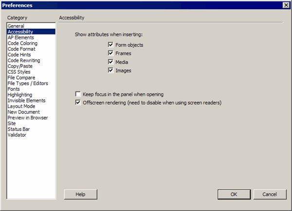
Preferences dialog box
There are four types of content for which you can ask Dreamweaver to prompt you for accessibility information:
- Form objects
- Frames
- Media files
- Image files
If you don't have all four selected, please check them now, and then click OK.
| Note Windows users have two more options that don't pertain to Web content but to Dreamweaver itself. The Keep Focus In The Panel and Offscreen Rendering
options are for Dreamweaver users who themselves use screen readers
(text-to-speech synthesizers) while working in Dreamweaver. Mac users
have OS-specific accessibility features, so the Mac version of
Dreamweaver doesn't have these options. |
Obviously
there's more to accessibility than a handful of attributes. But just by
turning these settings on, you've taken care of rules (a), (b), (i),
and (n). Every time you insert an image or multimedia object, create
frames-based content, or lay out a form, you'll be prompted to enter
the required accessibility information.
Okay—that's four of 16 issues covered. What about the rest of them?
Lets move on to Chapter 3 and discuss what else we can do.
As
I said previously, some of the issues raised in the 16 rules of
accessibility are really non-issues if you simply don't include the
type of content a rule warns about. Take images maps, for example. If
you're designing with text-to-speech or Braille tactile devices in
mind, design a clean, text-based site and style accordingly. Leave the
image-laden effects for another time and place.
Because
we've been designing our in-class site using CSS, much of the
accessibility work has been done for us. As noted previously, many of
the requirements of Section 508 hinge on structural markup. So,
headings should be made with heading tags, paragraphs with paragraph
tags, and tables should be used only for data (not for layout). Let's
run down the list of CSS practices you can incorporate into your tool
kit that will keep all your sites accessibility-friendly.
- 1. Always use style sheets.
- As
we've already discovered, CSS decreases maintenance and increases
design consistency. More important, as we learned in the previous
lesson, CSS lets us tailor the display of our site for various
assistive technologies. Always use linked style sheets instead of
embedded style sheets, and never use inline styles.
- 2. When styling for compliance, use relative units of measure.
- You
may have noticed that when I had you style text elements, I never had
you use points. Instead, I had you using percentages. Relative measure
(like percentages) allows objects to scale to a user's personal browser
settings better than absolute measures (like points). Only use absolute
length units when you know the physical characteristics of the output
medium—for example, standard printers. Then, using something like a
point size measurement for text is just fine.
- Here are some examples:
- For screen:
- h1 { font-size: 200% } or h1 { font-size: 2em } rather than h1 { font-size: 18pt }
- body { margin-left: 15%; margin-right: 10%}
- For print:
- h1 { font-size: 18pt }
- 3. Always specify generic fallback fonts.
- Look
at any location in Dreamweaver where you can specify fonts. You'll see
values like Arial, Helvetica, sans-serif. This value says, "Please use
Arial if you have it. If you don't have Arial, do you have Helvetica?
What? You don't have that either? Okay, please use your default
sans-serif font."
That
sans-serif option is what I mean by generic font. Dreamweaver,
obviously, takes care of this for you if you're using any part of the
Dreamweaver interface to set a font value. But sometimes, you may be
editing your CSS manually, in which case, don't forget to include a
generic font call.
- Here's my example:
- p { font-family: Arial, Helvetica, sans-serif }
- instead of:
- p { font-family: Arial }
- 4. Don't blink!
- Just
because the text-decoration property allows a value of blink doesn't
mean you should use it. Blinking is bad. Period. See rule (j).
- 5. Don't use images for text.
-
Using text instead of images means those words, and their meaning, will
be available to a greater number of users (with text-to-speech
synthesizers, Braille tactile devices, and so on). Using style sheets
will also allow users to override author styles and change colors or
font sizes more easily.
- 6. Maintain high levels of contrast.
- Make
sure that your text and background color combinations have a sufficient
level of contrast so viewers with color deficits don't have a hard time
reading your pages. Our in-class site has very high contrast between
text colors and background colors, for example. And the contrast is
such that even if the pages were rendered on a black and white screen,
it would still be just fine.
- Also,
if you're going to go to the trouble of specifying a text color, make
sure you specify a background color for the same region of the page
(and vice versa). If you don't, some browsers may default to a
background color that doesn't offer enough contrast.
 Tip Tip Use
hexadecimal or functional notation values for colors, instead of color
names. Hexadecimal and functional notation values correspond to
physical colors a computer can render. Color names are not exact. The
color one browser has designated as "green" may be different than
another browser. |
- Here are more examples:
- h1 { color: #0000FF }, or h1 { color: rgb(0,0,255) }, or h1 { color: rgb(0,0,100%) }
- instead of:
- h1 { color: blue }
- 7. Avoid dynamic HTML.
- When
we say dynamic HTML, we're really talking about the combination of CSS
and JavaScript to create movement or other kinds of non-standard
interaction. If you need to be Section 508-compliant, leave this kind
of eye candy alone.
That
covers the 16 rules of Web content accessibility, how to set
Dreamweaver's accessibility preferences, as well as seven CSS
guidelines for keeping your content Section 508-complaint.
In Chapter
4, we'll look at how those preferences we set earlier actually affect
your workflow where images are concerned, as well as Dreamweaver's
accessibility features for tables, which aren't part of your
preferences settings.
Once
you have Dreamweaver's accessibility features for images turned on,
every time you insert an image, you'll be prompted for both alternate
text and long description values. It's not like these two features
aren't available without the preferences setting properly turned on.
There are fields for these two values in the Property Inspector for all
inserted images. You simply get the added benefit of the prompts so you
don't forget.
For
example, with the accessibility features for images turned on, when you
insert an image, you'll see the Image Tag Accessibility Attributes
dialog box. In the fields provided, you'd enter your alternate text and
a link to a long description, if required.
So,
for our image of Marc Andreessen, I'd create an HTML file with nothing
but a short description of who he is, link to it using the Long
description field, and add his name in the alt text field, as shown
here:
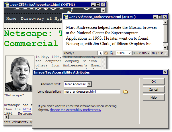
Image Tag Accessibility Attributes
Any
visitor using a text-to-speech reader would hear Marc Andreessen's name
and be able to follow a link to the long description where they'd be
able to listen to that as well.
Because
we've got whole lessons on forms and media objects coming up later in
the class, I'll talk about the accessibility features for those items
then. What I do want to show you now is Dreamweaver accessibility
features as they relate to rules (g) and (h), dealing with tables,
which are not explicitly covered by the Accessibility setting we turned
on—they're active all the time.
As
we noted earlier, tables shouldn't be used for layout if accessibility
is your goal. Instead, leave tables for displaying data (what tables
were designed for in the first place).
When you insert a table, the Insert Table dialog box appears, as shown here:
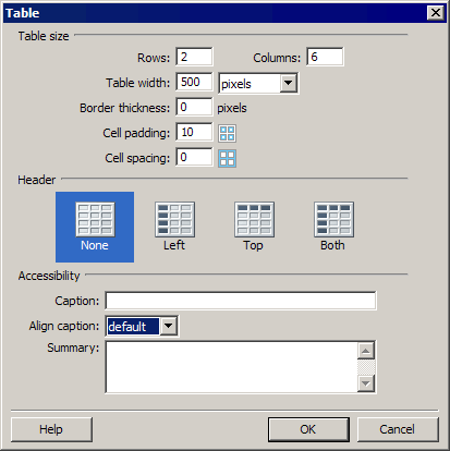
Insert Table dialog box
The
upper portion of the dialog box, as you're aware, is where you set the
basic table properties: the number of rows and columns, the width,
border thickness, and cell padding and spacing. The accessibility
features fall directly under that. The first is the Header section,
highlighted here:
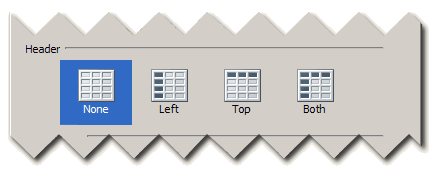
Table Header options
As rule (g) states, Row and column headers shall be identified for data tables.
This means you need to use <th> tags for header cells. The Header
section provides graphic icons to specify which cells you want set to
<th> tags for. This way, assistive technologies can differentiate
header information from data. Simply use the Left, Top, or Both options
to specify which cells should be converted to table header cells.
Don't
worry if you change your mind about your choice after the table has
been inserted. You can select any standard table cell while in the
Document window and convert it to a header cell by selecting the Header
check box in the Property Inspector, as shown here:
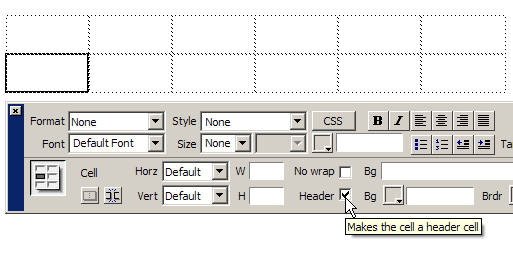
Table Cell Property Inspector Header check box
Below
the Header options section in the Insert Table dialog box sits the
Accessibility section. Here, you enter a caption that defines what the
table defines and set the alignment for that caption: Top, Bottom,
Left, Right, or Default (which is the same as top). Defining a caption
places <caption> tags right after the opening <table> tag
that contains your caption text. You'd then use the Summary field to
enter text that (you guessed it) summarizes the information found in
the table.
Speaking
of summaries, let's move on to Chapter 5. We've discussed enough
accessibility for one day.
Don't worry, though. We'll return to this
topic again at various points in future lessons, where different types
of content require it.
Today's
lesson introduced the subject of Web site accessibility. We examined
Section 508 of the Rehabilitation Act and familiarized ourselves with
its rules governing accessible Web page content. We learned how to turn
on some helpful features in Dreamweaver so the program can prompt us
for accessibility attributes for a handful of content types.
Then,
we talked a little more about CSS and how it facilitates accessibility,
as well as specific CSS methods we should use when making accessible
content. Last, we looked at Dreamweaver's tools for keeping our images
and tables assistive technology-friendly.
Have
you been watching videos at YouTube recently? Maybe you've been at
Amazon.com listening to some track from your favorite recording artist?
If so, you've been dealing with media objects. In Lesson 8, we'll
examine media objects and how to incorporate them into our sites.
Q: Can I use tables for layout in a site that needs to be accessible?
A:
Yes, but only in a very simple way. The order of the cells and their
content must flow left to right, top to bottom (in the order they are
meant to be read).
Time
to insert some accessible images into our pages. Download the following
Zip file, and unpack the images within it into your images folder.
Simply follow the instructions provided, and post any questions you
have in the Discussion Area.
Right-click or CONTROL-click this link to download the L07_assignment_images.zip folder into your images folder.
Assignment Instructions
We're going to create some accessible images.
First, do this: The images we're going to insert in our site pages require a
style for their border. Create a new advanced style with the following
properties:
- Name the style #text img.
- In the Border category of the CSS Rule Definition dialog box, set solid, 1 pixel, black borders for all four sides.
- In the Box category, set the margin values to 4 pixels for all four sides.
In your style sheet document, your finished style should look something like this:
#text img {
border: 1px solid #000000;
margin: 4px;
}
Now it's time to insert the various images . . .
hypertext.html
- Place your cursor at the start of the second paragraph.
- Insert the tednelson.png file, and enter Ted Nelson into the Alternate Text field in the Image Tag Accessibility Attributes dialog box.
- With the image selected, use the Align drop-down menu on the Property Inspector to set the image's alignment to Right.
the_web.html
- Place your cursor at the start of the first paragraph.
- Insert the cailliau-bernerslee.png file, and enter Tim Berners-Lee and Robert Cailliau into the Alternate Text field in the Image Tag Accessibility Attributes dialog box.
- With the image selected, use the Align drop-down menu on the Property Inspector to set the image's alignment to Left.
mosaic.html
- Place your cursor at the start of the third paragraph.
- Insert the eric-n-marc.png file, and enter Eric Bina and Marc Andreessen into the Alternate Text field in the Image Tag Accessibility Attributes dialog box.
- With the image selected, use the Align drop-down menu on the Property Inspector to set the image's alignment to Left.
netscape.html
- Place your cursor at the start of the first paragraph.
- Insert the marc_andreessen.png file, and enter Marc Andreessen into the Alternate Text field in the Image Tag Accessibility Attributes dialog box.
- With the image selected, use the Align drop-down menu on the Property Inspector to set the image's alignment to Left.
w3c.html
- Place your cursor at the start of the fourth paragraph.
- Insert the w3c.png file, and enter MIT Laboratory for Computer Science into the Alternate Text field in the Image Tag Accessibility Attributes dialog box.
- With the image selected, use the Align drop-down menu on the Property Inspector to set the image's alignment to Right.