
Insert bar Form category
Intermediate Dreamweaver CS3: Lesson 10
Chapter 1:
Introduction
Are you ready for an exciting lesson about forms? I know, there doesn't seem to be anything remotely interesting about forms. But I bet there's more to them than you think.
Forms allow information to be passed between the site visitor and the Web server. By inserting objects called form controls, you create the interface that visitors use to enter information and then submit it to the Web server. Want to know more?
A form requires more than just the interface. For the Web server to use the data visitors enter, a processing script must exist on the server. This script, or groups of scripts, accepts the data and does something with it. For example, in a message board script (like our Discussion Area), the input is collected and written into other files that are displayed.
Processing scripts are unique to the form pages that are coupled with them. In other words, there is no single, all-inclusive script you can download somewhere that does it all for you. It's just like designing Web pages. You sit down, decide what information you want to collect from your visitors, determine what you want to do with that information, and then write a unique script (a program) from scratch. Then you create a form page uniquely designed to capture the desired information and send it to the script.
The most common type of scripting is Common Gateway Interface (CGI) scripting. However, large Web applications (e-commerce sites, for example) use different methods. Perl is the most commonly used language for CGI scripting, while Web application programming (ASP, JSP, PHP/MySQL) makes use of languages like Visual Basic Scripting (VBScript), Java, and PHP.
Now, you may not be the one tasked with writing the script. That might be the responsibility of a programmer you work with. So, he or she might come to you and say, "Do you think you can lay out a form for me? It's going to collect X, Y, and Z information from the user. I've assigned these variable names in the script, so you need to use those in constructing the form."
Alright, so at this point, you may not fully grasp everything in that last bit of my hypothetical conversation. That's okay, because, by the end of this lesson, you will. Today, we'll discuss the creation of form pages, their formatting, and their layout.
You won't actually build any forms in this lesson until the assignment, but if it helps your learning to practice as you read, go ahead and create a new file in your misc folder and name it form_sandbox.html.
Then, play along if you want.
Chapter 2:
Inserting the Form
The Insert bar has a whole category devoted to inserting forms. To see the buttons available, choose the Forms tab on the Insert bar, as shown here:

Insert bar Form category
The first step in creating a form is defining where the form begins and ends. That might seem a bit confusing, so let me explain. On one level, the document you create containing the various text fields, check boxes, buttons, and other form interface elements is considered a form. However, at its technical heart, the true form is a region within that document defined by specific HTML code. This code delineates where and how the gathered information is sent and defines the different elements your visitors use to enter that information.
Sound complex? Don't worry; we'll start slow. Define the beginning and end of your document's form code using the Insert Form button on the Insert bar. Or, choose Insert > Form > Form from the menu bar.
In the Document window, this region is highlighted with a broken orange line (shown below), which runs the width of the page. It's one of Dreamweaver's visual aids, so it isn't a physical layout element. It's just a reference so that you know when you're inside or outside the form area of your document. If you don't see the orange outline after inserting a form, choose View > Visual Aids > Invisible Elements.
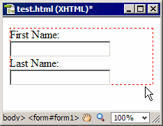
Form outline
The form itself has its own set of attributes that pertain to where and how the information it gathers is sent. Once you've inserted a form into a document, the Property Inspector swaps in the appropriate tools so that you can define these attributes, as seen here.

Property Inspector
The Name field identifies the form. When a form has a name, it has an identity and can be referenced by a script.
The Action field defines where the form data gets sent. Typically, you place the URL of the processing script in this field. However, this is not always the case. It depends on the type of scripting being done.
The Method drop-down menu is where you define how the information is sent to that processing script. Your choices are POST, GET, and Default. In most circumstances, you'll use the POST method, which is why Dreamweaver has it set as its default value.
 Note Note To get into the finer points of this issue would require a full discussion of the various scripting languages and server models at your disposal, and that's a whole other class in its own right. Feel free to ask me questions about this in the Discussion Area. |
After you have the initial form properties defined, the remainder of the form-creation process involves inserting and formatting the different form interface elements called form controls. If, at any time, you want to reselect the form itself, just click the form's orange outline.
Let's move on to Chapter 3 and look at the individual form controls we can use. Remember that when you're inserting these different form controls, you need to be working inside the form's orange outline.
Otherwise, the form controls aren't really part of the form you defined.
Chapter 3:
Working With Form Controls
We've discussed individual form control objects. But, form control is also the collective term for the various input elements you can place in a form, like text fields, radio buttons, check boxes, and drop-down menus. There's nothing too tricky about inserting these objects, so let's take a look at them and see how it's done:
Adding Text Boxes
The most common type of information gathered in a form is text-based. You gather text responses from your visitors using text boxes. And Dreamweaver gives us three varieties:
Getting any of these form controls into your document is done with one button on the Insert bar: the Insert Text Field button. You determine which kind of text box it will be by choosing the appropriate radio button in the Property Inspector, as shown here:
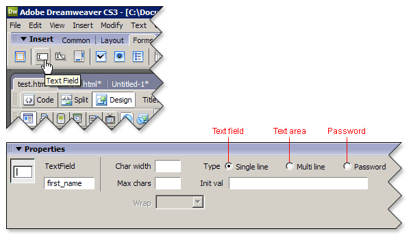
Text box options
The Name field for text boxes, or any other form control, is no different from the Name field on the form itself. You use it to supply an identity for the form control. All form controls must be named in order for a processing script to be able to reference the information that a form control gathers. This is what I was talking about back in Chapter 1.
What you're setting up is something called a name/value pair. If a text field is named address and a visitor enters "321 Main Street", then, you have a name/value pair of address = "321 Main Street". A processing script can then be written that includes a line of programming code that indicates what should be done with the value of address.
So, the script has a variable, called address. It's looking for a value for that variable, assigned by the user through the text field of the same name (address). Without the name half of the equation, the script won't know what to do with the data.
Let's get back to text fields again. The next two fields in the Property Inspector are the Character Width and the Maximum Characters fields. Character width simply means how many characters long your text field is. However, just because you set a text field's width to something like 15 characters doesn't mean you can't type more than 15 characters into it. This is where maximum characters fits in.
Maximum characters means the total number of characters a text field can accept. This is useful for preventing visitors from entering too much information into a field. For example, a base ZIP code has only five characters in it, so you wouldn't want users to be able to enter six characters.
To the right of the Property Inspector, running along the top edge, are the Type radio buttons. These let you choose which type of text box you want to create: single-line text field, multiline text area, or password field. Underneath these buttons is the Initial Value field. You can use this field to enter any initial text you want displayed in the field when the visitor first loads the document.
As I mentioned previously, Dreamweaver inserts a text field by default, and you simply choose either Password or Multiline to make a switch. The only difference between a text field and a password field is how the text typed into it appears on the visitor's screen. Obviously, the most common use of a password field is to collect—you guessed it—passwords. But you can use a password field for any type of sensitive information.
When you choose the Multi line radio button and create a text area, the Initial Value field expands to accommodate more text, and the Maximum Characters field changes to Number of Lines. As you might guess, you control the physical size of your text area using the Character Width and Number of Lines fields. Character Width isn't any different from what it is for text and password fields. Number of Lines determines how tall a text area is.
Other than its obvious size difference, the other most notable thing about the Multiline text area is the fact that you can't limit the amount of text a visitor may type into it. You can format a text area as 40 characters wide and 10 lines tall, but a visitor can type and type until the cows come home. You do, however, have some control over how that text is displayed in the browser window and how it gets passed to the processing script.
When you choose the Multi line radio button, the Wrap drop-down menu, which is dimmed when Single line and Password types are selected, becomes available. This menu offers four options to affect the way text inside the text area field wraps once it exceeds the dimension you defined with the Character Width and Number of Lines fields:
So, which of these do you select? It will depend on the processing script you use, what's being done with the data gathered from the field, and any aesthetic concerns you may have about how the data looks while the visitor is entering it. I've given you a link to a Web site in the Supplementary Material section for this lesson that points to information about scripting. After you have a firm understanding of that piece of the form puzzle, you'll be better able to make a choice.
More often than not, I find myself using Virtual or Physical. I prefer the way wrapped text looks in a text area, as opposed to making the visitor scroll the text area to the right in order to see what he or she might have written. The script I'm using then dictates whether or not I want line-break codes inserted into the data.
Adding Radio Buttons and Check Boxes
You've seen radio buttons used at various points in the Property Inspector. For example, we just saw them used above to choose between single-line, mulitline, and password text boxes. When they make up part of a Web form interface, they're providing a similar function. They allow a visitor to make one choice from a number of options.
The number of possible choices can be as high as you like—two, four, eight, or more. But when you've properly formatted the page, the visitor can click only one such button at a time. To insert a radio button, place the cursor inside the form outline, and then, either click the Insert Radio Button icon on the Insert bar or choose Insert > Form > Radio Button from the menu bar.
Radio buttons and check boxes have identical Property Inspectors, which provide the tools shown here:
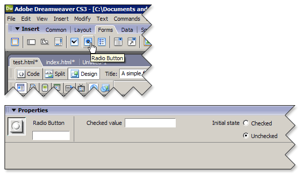
Insert Radio Button
The Name field, as with all form controls, is for defining the radio button's name. The Checked Value field specifies the value to be sent to the processing script when the radio button is selected. And the Initial State field specifies whether the radio button is selected when the page loads.
Radio buttons are used where only one valid selection is possible. Therefore, they're normally added in groups of two or more. Where most form objects should receive their own unique name, a group of radio buttons should share the same name. Defining a unique checked value for each radio button in a group will be what tells them apart.
By grouping radio buttons with identical names, you give them the ability to turn off when another in their group is selected. For example, in a form to gather information from college students, you could use a pair of radio buttons to determine if the student is a state resident.
Let's say you give both buttons the name resident. Then, one receives a checked value of yes, and the other the value of no. In the visible document, you'd have some kind of instructional text for visitors so that they know what they're supposed to do. For example, "Are you a state resident?" And then, Yes and No would appear next to the appropriate radio buttons, as shown here:
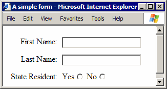
Radio buttons
With my radio buttons set up this way, there's no danger of both buttons being selected. If you create a group of radio buttons and you're able to select two of them, check to see that you've named them properly.
Now, Let's Look at Check Boxes . . .
Check boxes let the visitor make multiple selections from a range of possible choices. For example, in that fictitious college-student form, you may need to know which campus organizations or clubs a visitor belongs to. You could place a simple statement in the document, such as, "Please select each campus club and organization you belong to," and then follow with any number of appropriately labeled check boxes, as shown here:
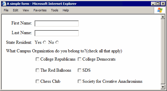
Check boxes
To insert a check box in a Dreamweaver document, place the cursor inside the form outline, and then, either click the Insert Check Box button on the Insert bar or choose Insert > Form > Checkbox from the menu bar (shown below).
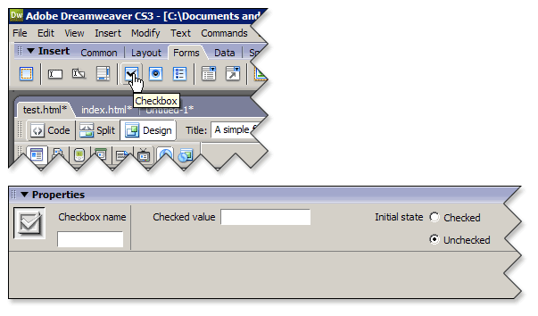
Insert Checkbox
Unlike radio buttons, more than one check box can be selected at a time, though they're often grouped using the same name value. Give each check box its own logical checked value too. When a check box is selected, its name and checked value are submitted to the processing script. If the check box isn't selected, no information about it gets submitted.
Adding Menus and Lists
A form menu is no different from the drop-down menus you've been using within the Dreamweaver interface, as shown below. They allow you to offer a large number of choices, but they occupy a small amount of space. I use them frequently for providing state abbreviations when gathering address information. They're better than just offering a two-character-wide text field, and you don't have to worry about typos.
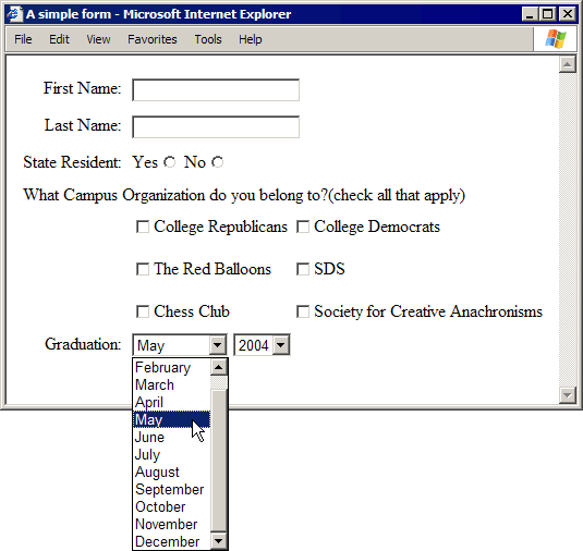
Form menu
Inserting a drop-down menu is done with the Insert List/Menu button on the Insert bar or by choosing Insert > Form > List/Menu from the menu bar.
Just like every other form control, a drop-down menu has its own unique set of tools in the Property Inspector, as shown here:
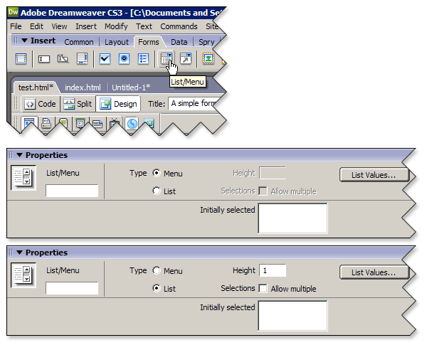
Insert List/Menu
There's a little more to creating a menu or list box than just inserting it using the Insert bar. You have to define the contents as well. Once you've inserted your menu and typed a name for it in the Name field of the Property Inspector, follow these steps to populate it with content:
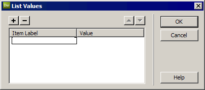
List Values dialog box
You can continue to use the TAB key to move through the dialog box, adding item labels and values until you have all the menu items you want. Or you can use the Add (+) and Remove (-) buttons to add or remove items and values. If you want to change the order of items, select an item label, and use the arrow buttons on the upper-right portion of the dialog box to move them up or down in the list. When you've finished adding items, click OK to close the List Values dialog box.
In the Initially Selected field of the Property Inspector, you'll see your item labels displayed. If you want one of the menu items to be displayed when the page loads, simply click one of them in the Initially Selected field.
Menus vs. the List Box
A list box is more than one line high and has scroll bars instead of an arrow that you can click to see the various list items. You turn a menu into a multiline list box by selecting the List radio button in the Property Inspector. The previously dimmed Height and Allow Multiple Selections check boxes are then available.
The Height field is where you indicate how many lines tall you want the list box to be. Let's say you have 25 items in your list and you set the height to 5. The first five items are visible in the list box, and a scroll bar appears on the right side to move down the list.
With a list box, you can allow multiple selections by selecting the Allow Multiple Selections check box. If you enable multiple selections, the visitor has no way of knowing that multiple selections are possible unless you tell him or her. That means you need to include instructional text in the document to let visitors know about it.
You should also tell visitors how to make multiple selections. This varies from OS to OS. In Windows, a visitor must hold down the CTRL key. On the Macintosh, a visitor uses the COMMAND key.
Adding Form Buttons
Your visitors use form buttons (shown next) to send the completed form to the server, to clear the form if they make a mistake, or to trigger some other behavior that you've programmed.
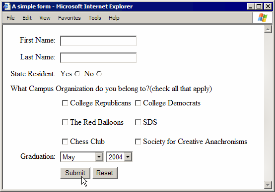
Submit and Reset buttons
To insert a Submit or a Reset button, place the cursor inside the form outline. Then, either click the Insert Button button on the Insert bar, or choose Insert > Form > Button from the menu bar. A default Submit button is placed in the Document window. The Property Inspector for a selected button provides the tools shown here:
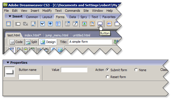
Inserting a button
The Name field, as you're already aware, is for naming the button, while the Label field defines the text you want displayed on the button face. Use the Action radio buttons to specify what a button does with the form data. Choose Submit form to create a button that sends the form data to the processing script, Reset form to create a button that clears the form if the visitor makes a mistake, or None if you plan on programming the button to trigger some other behavior.
There is another type of button you can create using something called an image field. When standard gray, rectangular buttons just don't fit your design, you can create graphic buttons with your favorite image editor and use them instead. However, you can use image fields to create Submit buttons only.
To insert an image field, place the cursor inside the form outline, and follow these steps:
The Property Inspector for an image field supplies the tools shown here:

Image field Property Inspector
The finishing touch for your graphic button is to enter the name Submit in the Name field.
Well, we've looked at the basics of inserting and formatting form controls, but we're far from finished with them. I have one remaining issue I want to discuss: how to actually go about laying out a form document.
That's what we'll tackle in Chapter 4.
Chapter 4:
Laying Out Forms
There is more to creating a form than inserting form objects and formatting them to accept specific pieces of information. A visitor must understand what the form is meant to do and what is expected of him or her when filling it out.
Even though this is a lesson on forms, every aspect of Web design is touched on when making a good form. You could insert every possible form object discussed in this chapter, but if there are no words to describe their function and they're just dropped on the page with no thought to their placement and relationship to each other, the form is useless.
Form objects don't really lay out cleanly when simply placed on a line next to text and images. For the most part, they are rectangular interface components and tend to stand out jarringly if not lined up evenly. Being that they are rectangular, they work quite well with another rectangular HTML element: tables.
When laying out a form, I'll usually create a two-column table and, then place my form controls in the cells of the right column and my instructional text in the cells of the left column. I don't like a lot of unnecessary white space between my text and my form controls. Therefore, I also set the horizontal alignment of the left-column cells to Right and the right-column cells to Left. This way, the text and form controls are directly next to each other. My last step in formatting my table is to set the border to zero, making it invisible.
The trick to remember when using tables to lay out forms is actually a don't. Don't insert your table first and then insert your form inside the table. That will send most browsers into a tizzy. Start with a new document; click the Insert Form button on the Insert bar; define the form's Name, Action, and Method attributes; and then insert the table inside the form. With the table placed squarely inside the form, you can then start inserting your form controls and instructional text.
That does it for our discussion of forms.
Let's move on to Chapter 5 and put everything together.
Chapter 5:
Summary
This lesson was dedicated to creating user forms. You learned how to define the boundaries of the form itself and how to insert and format the various form controls. You then learned how to use tables to help lay out your forms.
Just
as forms provided a certain level of dynamism to your site, so does
data organized with the Extensible Markup Language (XML). In Lesson 11,
we'll examine XML and how to incorporate XML data into our Web pages.
Supplementary Material
|
A Guide to HTML and CGI Scripts http://snowwhite.it.brighton.ac.uk/~mas/mas/courses/html/html.html |
| This British site offers a good introduction to understanding the relationship between HTML and CGI scripting. |
|
The CGI Resource Index http://www.cgi-resources.com |
| This site is a great resource for finding CGI sample scripts, documents, articles, books, jobs, and software programs for CGI programmers. |
|
The NMS Project http://nms-cgi.sourceforge.net/ |
| You'll find Web programs written by experts on this useful site. |
FAQs
Q: Is Perl the only language that CGI scripts are written in?
A: No, but it is the most common. CGI scripts can be written in a number of languages, including C, C++, Java, and VBScript.
Assignment
In this assignment, you'll be given the name attributes for a series of
form controls and the URL of a processing script. Your mission is to
build the form and test it.
Here are the attributes you'll need to set in order to get your form to process correctly:
The Form Itself:
Name: theform
Action: http://www.highstrungproductions.com/cgi-bin/ndr.pl
Method: POST
The Seven Text Field Names:
user
organization
address
city
state
zip
The Seven Check Boxes:
Give each check box the name instruments. The checked values are as follows:
guitar
bass
drums
piano
flute
oboe
other
The Four Radio Buttons:
Give each radio button the name favorite. The checked values are as follows:
Rock
Classical
Jazz
Other
The Drop-Down Menu:
Name: guitarist
Item labels: Chet Atkins, Jimmi Hendrix, B.B. King, Andres Segovia. For this script, no values are required.
The Text Area:
Name: comments
The Buttons:
Reset Button:
Name: Reset
Label: Reset
Action: Reset form
Submit Button:
Name: Submit
Label: Submit
Action: Submit form
If you run into difficulties, don't hesitate to knock on the Discussion
Area door. I'm here to help and would love to hear from you.