Where we look first
Intermediate Dreamweaver CS3: Lesson 12
Chapter 1: Introduction
Well friends, this is it. The last lesson! If I've done my job well, you know more about Dreamweaver now than you did six weeks ago. With any luck, significantly more.
So, how to wrap it all up? Up to this point, you've learned the technical aspects of Dreamweaver's various design and layout features. While having done so is certainly useful, all these new tools and skills are worthless if you can't design your way out of a paper bag.
So, it's time to close Dreamweaver and discuss actual design principles. In this lesson, we'll examine some facts about how humans take in information and discuss methods for capitalizing on those facts.
Without further ado, let's begin.
Chapter 2:
Humans and Our Habits
"Our greatest service to the viewer is to do as much of the thinking-work for them as possible—simply put, presenting the information they need clearly. Therefore:
|
Repeated research points out one simple fact: People are in a hurry. We want to get in, get what we need, and get out—ASAP. When we're in the store and trying to make up our mind about a book or a magazine, in the blink of an eye, most of us do a lightning-quick cost-benefits analysis:
"Does this book have the information I need?" vs. "How much time and effort will I have to invest to extract that information from this book?"
On a Web page, we do this even faster. Because the tactile experience of the book or magazine isn't there—the cover's gone, the pages don't caress our hands, and the back-and-forth of viewing pages is removed—users expect information to be delivered even faster. As designers, because we don't have those physical properties I just mentioned to help us pull a user in, we have fewer hooks to capture our audience. In a nutshell, we have to work twice as hard.
When we design, we have to juggle the following simultaneously:
Be Concise, Scannable, and Objective
| "People rarely read Web pages word by word; instead, they scan the page, picking out individual words and sentences.
We found that credibility is important for Web users, since it is unclear who is behind information on the Web and whether a page can be trusted. Credibility can be increased by high-quality graphics, good writing, and use of outbound hypertext links. Links to other sites show that the authors have done their homework and are not afraid to let readers visit other sites. Users detested "marketese", the promotional writing style with boastful subjective claims ("hottest ever") that currently is prevalent on the Web. Web users are busy: they want to get the straight facts. Also, credibility suffers when users clearly see that the site exaggerates. Studies of how users read on the Web found that they do not actually read: instead, they scan the text. A study of five different writing styles found that a sample Web site scored 58% higher in measured usability when it was written concisely, 47% higher when the text was scannable, and 27% higher when it was written in an objective style instead of the promotional style used in the control condition and by many current Web pages. Combining these three changes into a single site that was concise, scannable, and objective at the same time resulted in 124% higher measured usability."
|
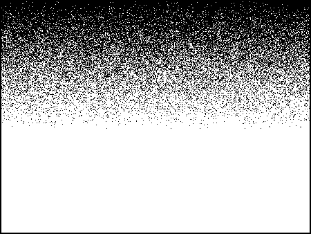
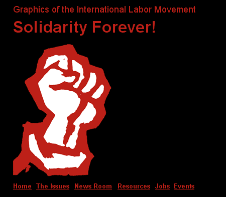
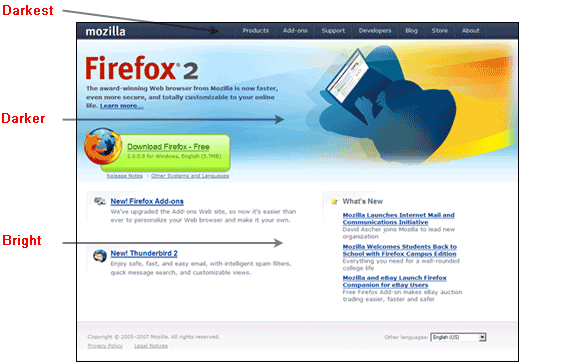
So, concise, scannable, and objective text is our goal. How does our design facilitate these goals? We have to put the important stuff where the people look, as diagrammed in this figure:
Where we look first
The most valuable pieces of screen real estate are the top corners. Why? Because the majority of the reading world starts reading from those locations. Their eyes are habituated to glancing at the top and then scanning down the page, their heads and eyes moving left to right (and sometimes right to left). Logically, our design should facilitate our reader's customary habits:
How we proceed from there
Points to Remember:
Mass your text, maintain strong alignment, provide strong contrast, and repeat the interface stuff—that's a lot to remember. Let's break it down into digestible bites, just like we've been discussing.
Hop on over to Chapter 3, and we'll focus on the massing and aligning parts.
Ready? Let's go!
Chapter 3:
Aligning and Massing Text
HTML and, by extension, Dreamweaver provide three alignment choices: left, right, and center. Without putting too fine a point on it, pick one and stick to it. But, let me push you in a particular direction—please don't center everything.
Granted, centered alignment creates a level of symmetry, equilibrium, and calmness. But, you know something? Symmetry is mindless. It requires no thought from us, demands little thinking from our audience, and more important, it dulls any active participation by the reader in the words themselves.
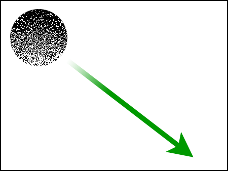
I started the last chapter saying we want to preprocess as much for the reader as possible. However, you don't want to process the information into much. Take a look at the following figure:
Symmetrical layout
This layout treats the words like lifeless bricks, creating a bland wall of text. This kind of arbitrary placement breaks the actual phrasing of the words, and their meaning becomes lost. This is no way to grab the reader's attention and suck them into your page. Contrast this with the following redesign:
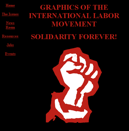
Asymmetrical layout
In this example, the asymmetrical arrangement of the text allows us to break the lines at the end of the true phrases, emphasizing the way we'd actually speak the words. Where's the weight of the layout pulling you? Right to the fist I would imagine. And where is that fist? Anchored strongly on the left side of the page—where you naturally want to look anyway. Then, you settle into the text, and the most powerful statements get the most emphasis.
In the symmetrical example, your eyes hop right to the image too, but do you feel settled after the fact? The words are a labor to absorb because they lack any force or weight. They're just a kluge above the image, and the navigation is more of a distracting hindrance than the help it should be.
The fact is, asymmetrical design is infinitely better suited to the display of words. It allows you to combine words and images in weighted, meaningful arrangements. Centering everything grabs the viewer's attention, but it focuses it on the shape of the word block, instead of facilitating the reading (and, therefore, the meaning) of the words themselves.
Allow me to borrow again from my idol, Jan V. White. The bracketed comments are mine:
"
[When laying out textual information:]
This way you assemble a vibrant, moving, magnetic page that the viewer finds interesting because you have emphasized those most magnetic bits and placed them so they are noticed."
|
Think you have a handle on massing and aligning? I'm sure you have questions. So, hit me with them in the Discussion Area. Let's look at repetition and contrast, shall we?
On to Chapter 4!
Chapter 4:
Repetition Is Our Friend
Repetition \Rep`e*ti"tion\ (r [e^] p` [-e] -t [i^] sh" [u^] n), n. [L. repetitio: cf. F. r ['e] p ['e] tition. See Repeat.]
|
The definition says it. Repetition makes a deeper impression on the audience. Repetition creates connections; it generates stability and fosters a sense of familiarity for the user. In short, repetition ties a site together. There should be no question in a user's mind that two pages belong to the same site, belong to the same organization, share a common identity.
Fortunately for the Web designer, there are certain elements that must repeat on every page for functionality's sake—navigation elements, for example. Without consistent, repetitive navigation, your users will never learn how to move through your site. But navigation isn't the only feature at your disposal. The physical layout you choose, the fonts you select, the colors you employ, the style of imagery you favor are all potentially repetitive elements you can employ to tie your site together.
Look at these screen shots from the Mozilla.com site. Pay attention to the repetitive elements in each of the pages. Can you pinpoint the characteristics these pages posses that tie them together?
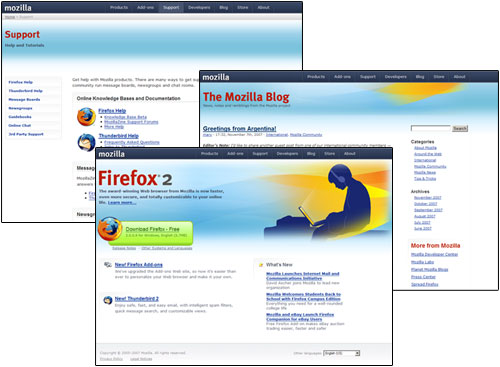
Mozilla.com
Here's what I see:
With repetition also comes contrast, and it's the contrast between elements in a page that draws you in and gets you to read the fine print. Let's look at that now.
Contrast Is King
The level of contrast you create between page elements helps you define order for the user—what's most important and what's secondary. This facilitates the fast and slow stream we talked about a moment ago. By building contrast, you help the user to effectively scan the content and pull out what they need. If they can quickly determine the page has relevance, they'll then settle in and read your fine print.
Contrast can be created in many ways. It can be the differences you create between headings and body text, as seen in the Mozilla pages above—large, crisp, red headings contrasted with tight, black body text for example. You can generate contrast with the backgrounds and images you choose (the stark white background color and ethereal blue imagery along the tops of the pages). Whatever path a designer takes, contrast must be strong. There is no point to creating minor differences between elements. If two items are to be different, make them very different. If they're almost the same, you've missed the boat.
Create a Focal Point
"Think of the page as if it were a billboard by the roadside. To do its work, it must attract attention and get its message across, not just at first glance, but at 65 mph. The viewer speeding by who doesn't know about the subject on the billboard—and probably couldn't care less—must be struck by it, captivated, interested, and hungry for more. Once users settle down to read, contrast and all the other attention-getting techniques don't matter anymore. They've accomplished their work of pulling the potential reader in."
|
There must be a dominating element within the page, followed by successively lesser forces. This creates the hierarchy of information within your page, drawing the user from one point to the next.
Understand that no single element exists in your page independent of the rest of the content. Readers see all the elements at once, mixed up yet interrelated to each other. They want to sort all of it out and make sense of it in the blink of an eye. And it's our job to help them do it. We have to accentuate the important stuff and shuffle the supporting details down in the hierarchy.
To use an obvious example, a tabloid newspaper clobbers the user with a stark, gigantic headline and some supporting gruesome image. Then, they pepper the edges of the front page with little tidbits you can find inside. Allow me to posit that such an approach to design is a bit heavy-handed and suggest that there are more subtle methods at your disposal.
Let's revisit the Mozilla.com examples we looked at previously. The Mozilla Foundation's site is a rarity among software sites. Virtually every page in their main site stands as a testament to good Web design.
Jan V. White, whose book Editing by Design I have been quoting virtually non-stop in this lesson, describes nine traditional forms of contrast in print design and layout. By and large, the same methods translate to Web design (with a little tweaking, since you don't have the advantage of two facing pages in a browser window, like you do in a book, magazine, or newspaper).
It just so happens that the Mozilla site demonstrates just about all of them in its layout. This makes it both an excellent example, as well as a testament to how widely read Mr. White is in design schools around the country. Mr. White's nine examples of contrast are as follows:
Emptiness/Fullness
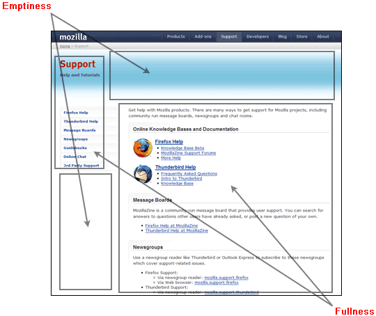
Emptiness/Fullness
Alignment/Randomness
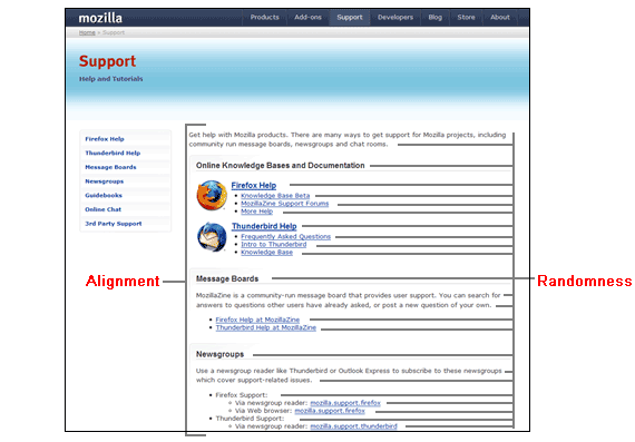
Alignment/Randomness
Horizontality/Verticality
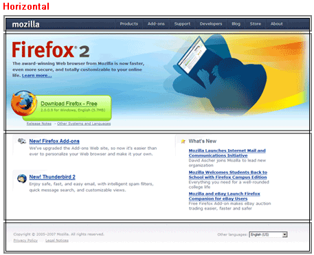
Horizontalness
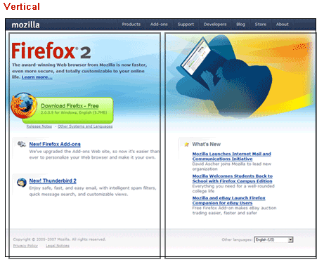
Verticalness
Flatness/Angularity
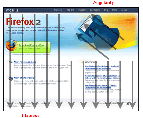
Flatness/Angularity
Pictures/Text
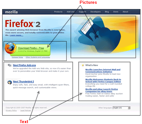
Pictures/Text
Darkness/Brightness
Darkness/Brightness
Looseness/Tightness
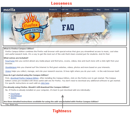
Looseness/Tightness
Color/Black and White
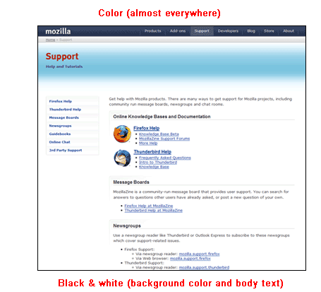
Color/Black and White
Each of these methods of contrast build tension, excite the eye, and entice the user to plunge deeper into the material in front of them. Do your pages require all of them at once? Of course not! These examples, pulled from a single site, simply show the enthusiasm of one designer for their work (and allowed me a little one-stop shopping while writing this lesson).
It may just be the subject matter. A browser isn't a particularly exciting piece of software—it's a unitasker. But the Mozilla site certainly makes it seem like every day is a party at the Mozilla Foundation.
If you learn one thing in this lesson, I hope it is this: The Web is a technologically enhanced reading medium. Consequently, it favors traditional layout techniques gleaned from the magazine and newspaper world. After all, that's what we've been reading for centuries, so we're habituated to information being delivered to us in a certain way. And the techniques the printing cultures of the world have honed to grab a reader's attention still work even after the reading material is placed on an LCD screen or cathode-ray tube.
Let's wrap things up in Chapter 5.
Chapter 5:
Summary
Today's lesson was about designing for readers—which is what Web surfers are. You learned that as a designer of pages, you must demonstrate their worth to a potential reader by making pages concise, scannable, and objective, highlighting their most significant aspects so the reader can absorb them at first glance. You examined how people look at written content and learned that they typically scan the page from the top left to bottom right and that our basic layout strategies should facilitate this tendency.
You then learned that the best way to do this was to favor strong alignments, mass text into digestible segments, build familiarity through repetition of styles and elements, and build strong contrast into those elements.
Well, it's taken six weeks, but I've finally run out of things to say! Okay, I could ramble on for another 12 lessons, but that requires I write another class—which I'd like. By all means, feel free to offer any suggestions in the Discussion Area.
I'm very grateful for the time we've spent together, and I hope you've found this material useful. Thank you for taking this course and for participating in the discussions. In doing so, you've helped me become a better teacher and improved this course for the students who follow you. I'll be available for at least two weeks after this lesson is released. If you run into trouble or have any questions whatsoever, please post them in the Lesson 12 Discussion Area for me.
 Final Steps Final Steps | ||
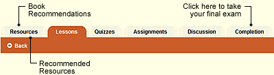
You still have a quiz and an assignment for this last lesson, so before diving into the final exam for the course, please allow some time to do those first. Also, if you haven't already checked out the book recommendations and recommended resources under the Resources link, I would encourage you to do that as well. One of the exciting things about Dreamweaver is that there is always something more to learn!
When you feel you're ready to take the final exam, click the Completion link at the top or bottom of any page in this classroom. The exam is open-book, so feel free to print your notes or have the classroom open in another window for easy reference. Also, you may print the final exam before taking it for additional study. Please take your time, because you get only one chance at the final. When you finish, be sure to print your completion letter. Last, I would appreciate it very much if you would take some time to evaluate this course. I pay close attention to my students' feedback; your input helps me tremendously as I continually fine-tune and improve this course material. So if you have any suggestions, comments, or concerns, please include those in your evaluation. If you'd like a response, please also post your comments or questions in the Discussion Area for this lesson. | ||
 | ||
| Other Courses | ||
If you enjoyed this course, here are a few other ed2go online courses you might be interested in: Introduction to CSS and XHTML | ||
| ||
Supplementary Material
|
The Principles of Beautiful Web Design http://www.sitepoint.com/article/principles-beautiful-web-design |
| This SitePoint article by Jason Baird expands upon many of the concepts discussed in today's lesson. |
|
White Space http://www.alistapart.com/articles/whitespace |
| White space, or "negative space," is part of the contrast concept of Emptiness and Fullness. This article discusses white space in detail. |
|
PowerPoint Is Evil http://www.wired.com/wired/archive/11.09/ppt2.html |
| I have a thing against PowerPoint. So does Edward R. Tufte, one of the modern era's greatest voices in information design, and his article tells you why. |
FAQs
Q: Is there a predefined standard layout for a Web site?
A: When a visitor hits any page in your site, they should be able to see the following:
And, they must be able to see this all in the first screen, with the browser
fully expanded, without having to scroll vertically. A visitor should
never have to scroll horizontally when the screen is fully expanded to
view content.
Of course, this raises the questions, "How do you
control the width of pages, and what dimensions do you use as a
standard since no one has their monitor resolution set the same?"
The traditional approach is to decide upon a worst-case scenario. First,
you want to ask yourself, "What's the smallest, most likely, resolution
my visitors are going to be using?"
Today, the average graphics
card comes set to 1024 x 768 (sometimes it's lower, 800 x 600, but
that's rare). This doesn't mean the card can't do better (like 1600 x
1200+), only that 1024 x 768 is the average setting found among the
majority of users.
That's your worst-case scenario.
Now, understand that a 1024 x 768 monitor resolution does not mean that is
the viewable space in someone's browser window. A fully expanded
browser on a monitor set to this resolution will have a viewable area
of approximately 955 x 600 when you take into account all the button
bars, status bars, address lines, scrollbar areas, and so on.
So, you want to be sure to have everything I mentioned above visible in a
zone roughly 955 x 600 when the browser is fully expanded. The users
may have to scroll down (which is okay), but they'll never have to
scroll side-to-side.
Is there one method for making sure everything fits in that space? Of course not.
Take a look at Amazon.com. They use a design that expands to the margins at
all resolutions. If you come to it at 1024 x 768, you can see all the
things I mention and then need to scroll down to get to the rest.
If you have a higher resolution, things are a little less crowded, the
spacing is a bit better, and you still need to scroll—just not as much.
Now, look at Yahoo!. They confine their content inside a fixed region that's
about 900+ pixels wide. This fixed-width region is, in turn, floated to
the center of the page. So, at 1024 x 768, the empty space on the left
and right sides is almost nothing, but as resolutions increase, the
content stays centered inside a bounding rectangle, and the empty space
on either side increases proportionally.
Are these the only two possible methods? No, but they are the most tried and true.
Assignment
This one is short and sweet: Go to the library and find these two books:
Editing by Design, by Jan V. White.
Envisioning Information, by Edward R. Tufte.
Learn them, live them, love them. Then, put your mind to re-tasking what you
learn from them toward Web design. I expect this should take a while.
It's taken me years.