"Of all the achivements of the human mind, the birth of the alphabet is the most momentous."
"Goudy drew all his
letters by hand."
"Goudy created
a total of 116
typefaces in his lifetime."
"In 1896 Goudy sold his first alphabet of letters
for 10 dollars."
Typography
F. W. Goudy is celebrated as one of the finest
and most prolific type designers in history.
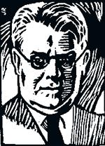
He produced his first typeface design in 1896, a display face called Camelot, for the Camelot Press in Chicago, which Goudy and his buddy, Lauren C. Hooper had opened the previous year.
His best and most popular types are Goudy Old Style and Goudy Text.
In 1911, Goudy produced his first font 'hit'. It was called Kennerly Old Style and was designed for an H.G. Wells anthology. His most popular and widely used type was Goudy Oldstyle. It was released by the American Type Founders Company in 1915 and became an immediate classic. The font was made with graceful letterforms that added to its appeal, and made it visually appealing.
In 1920 Goudy became the Art Director at the Lanstom Type Company, where he remained for over thirty years. At age seventy five Goudy was still lecturing at the Syracuse University's School of Journalism, and is still today considered America's most prolific type designer.
At the time of his death in 1947, Frederic W. Goudy
had 116 type designs to his credit.
Here are just a few samples of his many typeface designs:
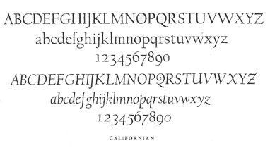
Californian
This typeface was designed by Goudy in 1938 for the University of California Press. The type has flat serifs and an italic of slight inclination.
Goudy Antique
This typeface Goudy designed in 1919. It is Venetian in some respests, but it was intended as a Bold Face, and has abbreviated desenders of such faces. The H has a high bar and there is the usual Goudy Q. In the lower case note the narrow f and the position of the dot over the i and j.

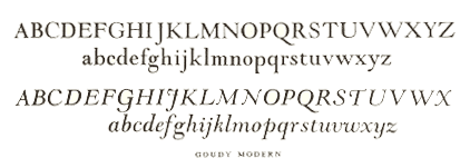
Goudy Modern
This typeface Goudy designed in 1918, the serifs are flat but strong and bracketed; the stress is niether vertical or abrupt. The capitals are shorter than the ascenders. The shadow version is GOUDY OPEN.
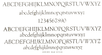
Goudy Old Style
This typeface Goudy designed in 1911. The capitals were modelled on Renaissance lettering, as F.W.Goudy himself relates. The serifs are small. The lower case is marred, as the designer himself says, by its short desenders. The ear of the g projects upwards. The italic is nearly upright, in fact m and n are upright.
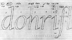
Here is an example of one of the very few remaining
actual sketches of a Goudy typestyle in progress.
